


05 Oct 2026
SaaS
SaaS Design: A Complete Guide to UX, UI & Product Design 2026


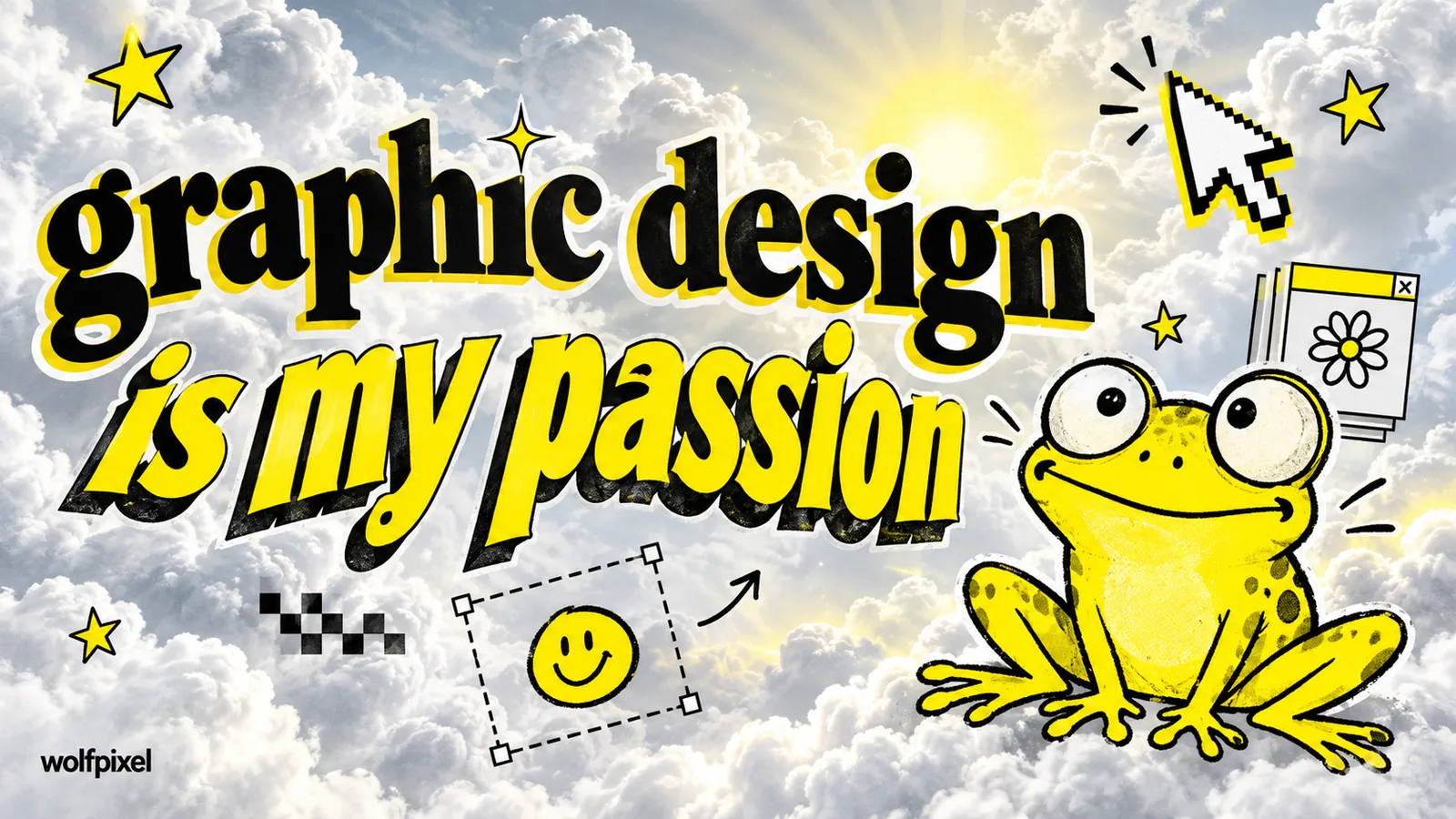
A graphic design meme is any joke, image, or format built around the daily reality of design work, from a badly cropped frog to a client asking you to "just make it pop."
We rounded up 41 of the ones designers actually send each other, sorted into categories so you can jump straight to whichever kind of pain you're currently living through.
If you've ever rebuilt three logo directions overnight because someone said "just play around with it," you already know the feeling behind most of this list. Client feedback that means nothing. Deadlines that were never realistic. A file naming system only the creator understands.
Design is genuinely fun, our team at Wolfpixel would tell you that, but sharing the right meme in a team chat has saved more working relationships than any style guide ever has.
Every meme below is described in our own words, and where we could recreate a format as an original graphic instead of reposting someone else's file, we did.
To build this list, we read through every graphic designer meme and memes about graphic design collection currently ranking on page one, kept the formats that actually still get shared, and added the ones our own team reaches for that nobody else had covered yet.
A graphic design meme is usually one of two things:
The second type is where the whole genre really took off, and it all traces back to one specific Tumblr post that is worth getting the facts straight on, because most articles about it get a detail or two wrong.
Here is what actually happened, confirmed against Know Your Meme's documented timeline rather than the vague "probably around 2014" version you'll find on a lot of blogs.
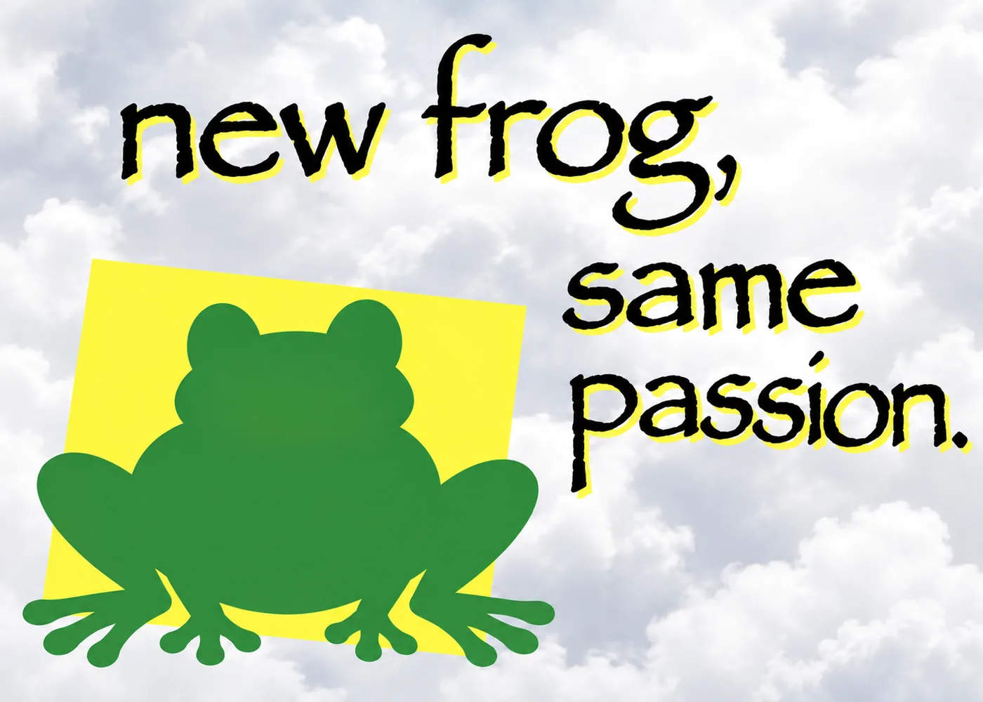
On July 7, 2014, Tumblr user Yungterra posted a green cartoon frog (sourced from the clip art site Classroom Clipart, dated 2011) over a cloudy gray sky background, captioned "graphic design is my passion" in Papyrus. The post picked up more than 352,000 notes over the following year.
It struck a nerve because the phrase sounds like a proud declaration, and the execution is the exact opposite: no alignment, no color theory, no typographic sense at all.
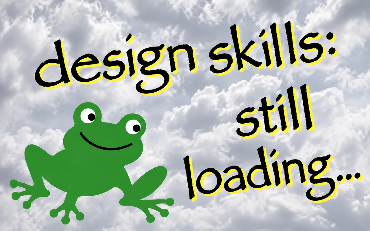
We still use this exact meme internally at Wolfpixel. When a first round draft comes back from a junior brief with three fonts, a drop shadow, and a gradient nobody asked for, someone on the team will post it in Slack with zero comment. Everyone knows exactly what it means.
Turn your ideas into professional, memorable visuals with Wolfpixel’s senior design team.


The single most relatable category for a reason. If you have freelanced or worked client side for more than a month, every one of these will land.
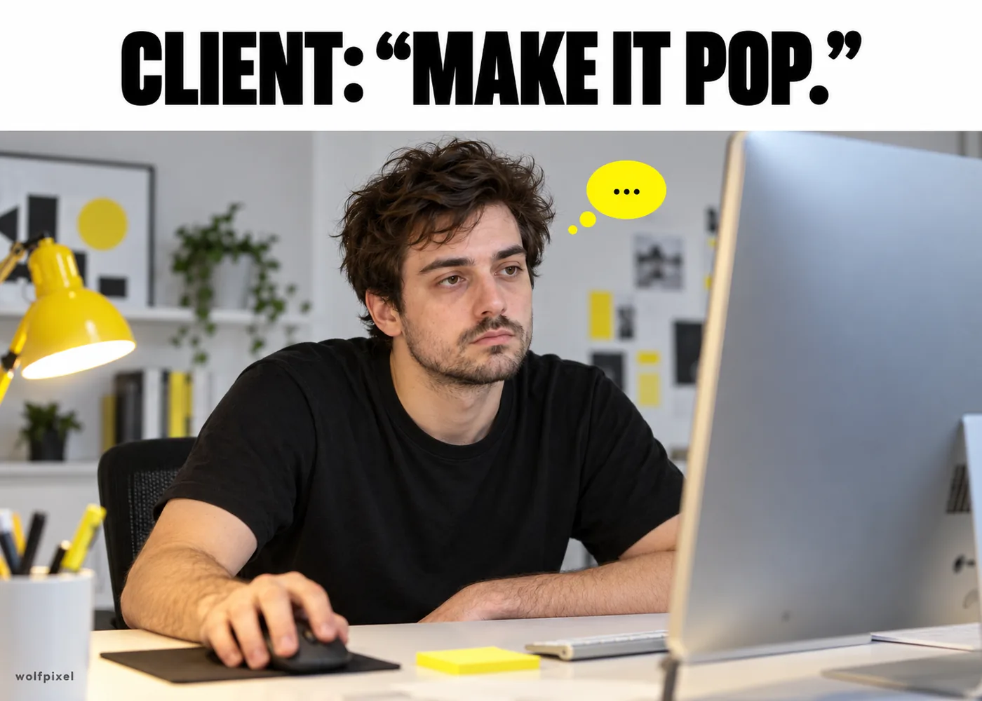
Three words, zero information, and somehow the most common note a designer will ever receive. We have never once found out what it means, and at this point we have stopped asking.
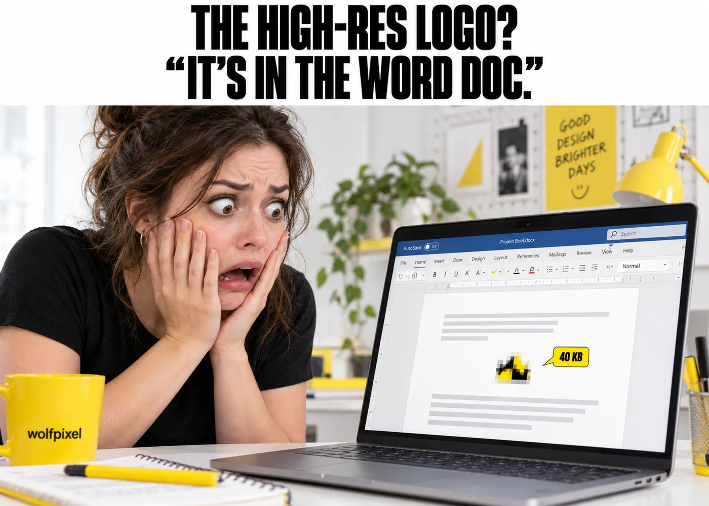
A client insists the file they are sending has everything you need. It is a 40kb JPEG pasted into a Word document, and somehow it is also blurry.
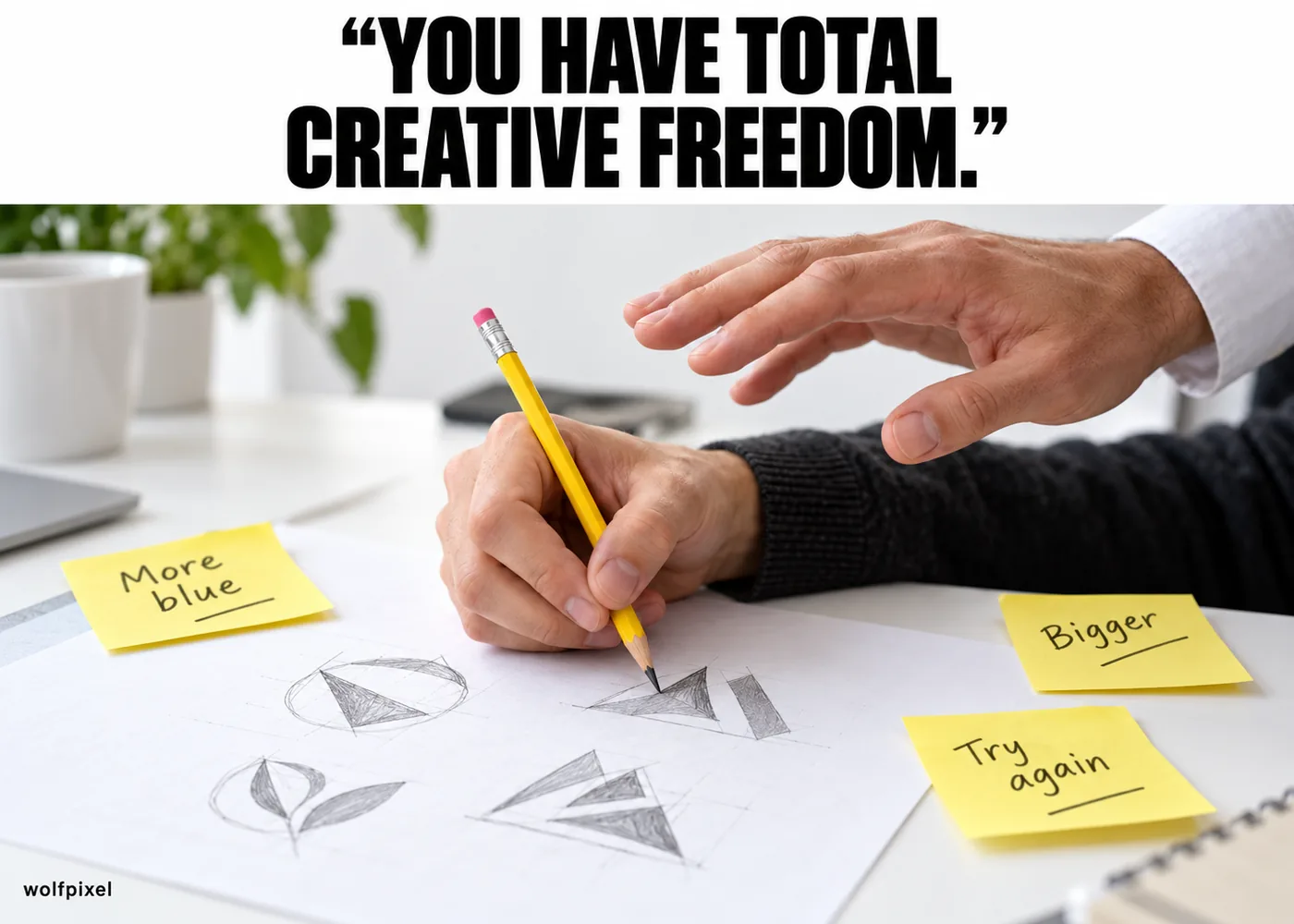
"You have complete creative freedom on this one" is usually followed by five calls in three hours about the exact shade of blue used in the footer.
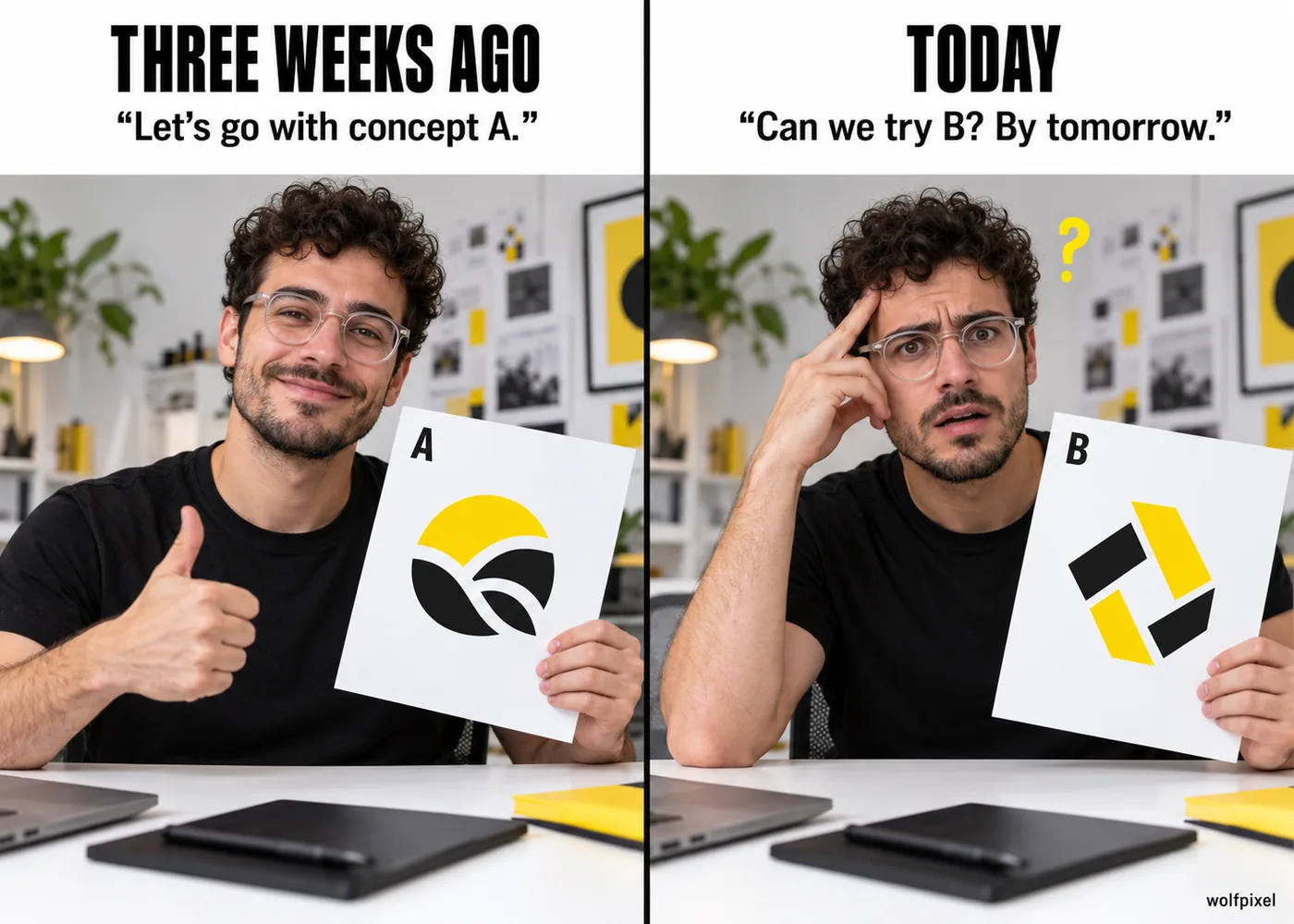
The client rejected concept B for concept A three weeks ago. They would now like concept B again, by tomorrow.
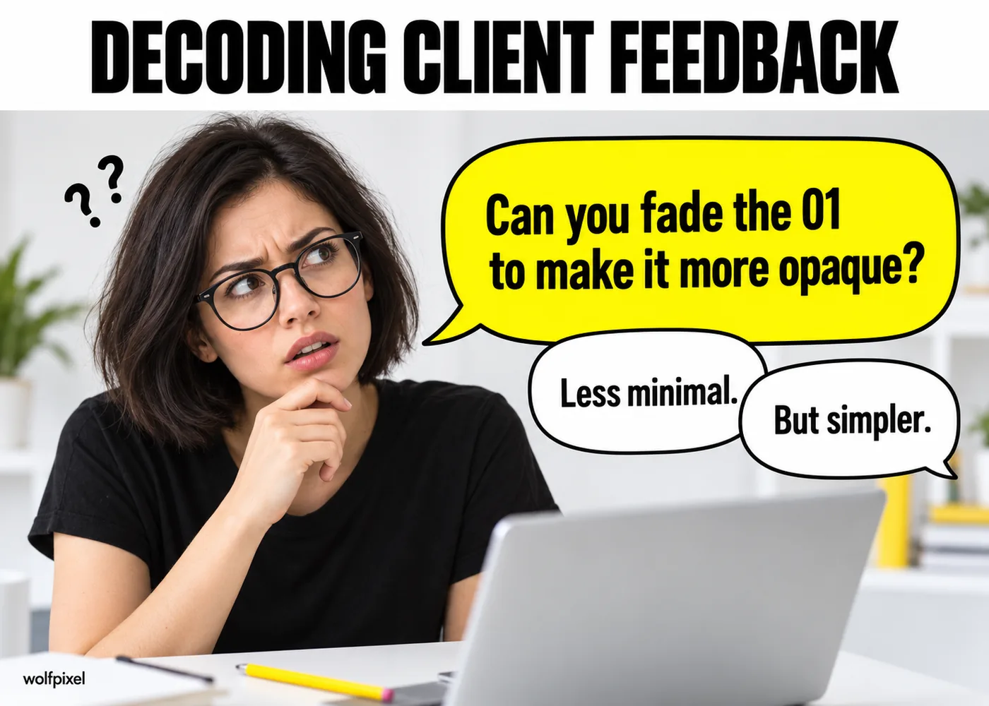
Notes like "can you fade the 01 to make it more opaque" get sent with total confidence, and the designer spends ten minutes just figuring out what element "the 01" even refers to.
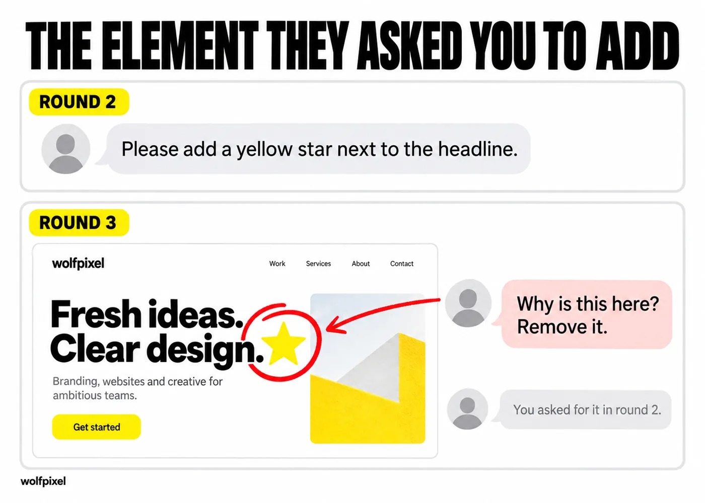
Nothing quite like a client circling, in red, the exact element they told you to add in round two.
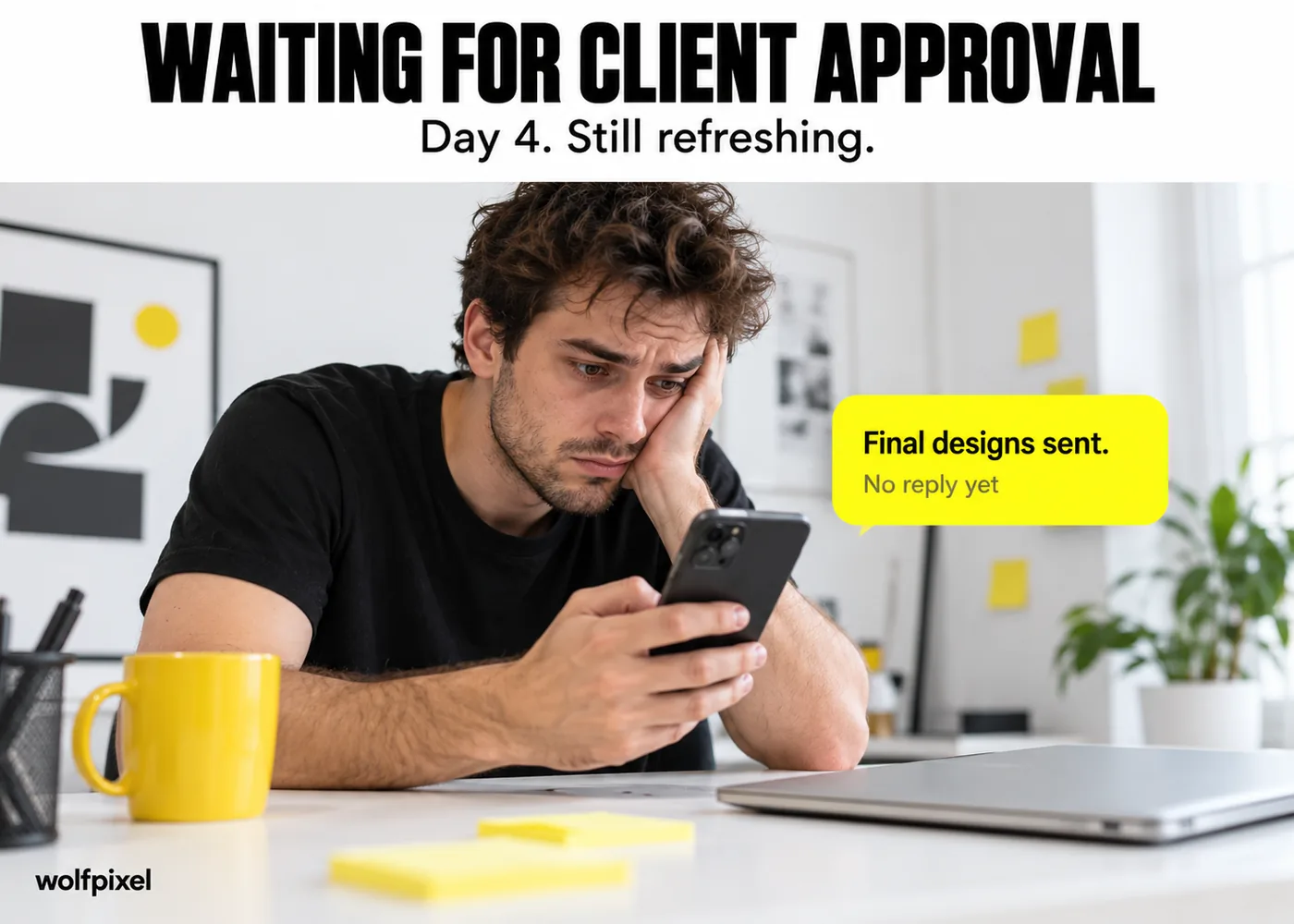
Files get sent. Client goes quiet for four days. You start assuming the worst, when really they just forgot to check their inbox.
This is the category that turns non designers into believers. Freelancing looks glamorous from the outside right up until you actually try it.
For what it's worth, our own turnaround times are public on our pricing page, specifically because the vague timelines behind most of these memes are the problem, not a personality quirk of freelancing itself.
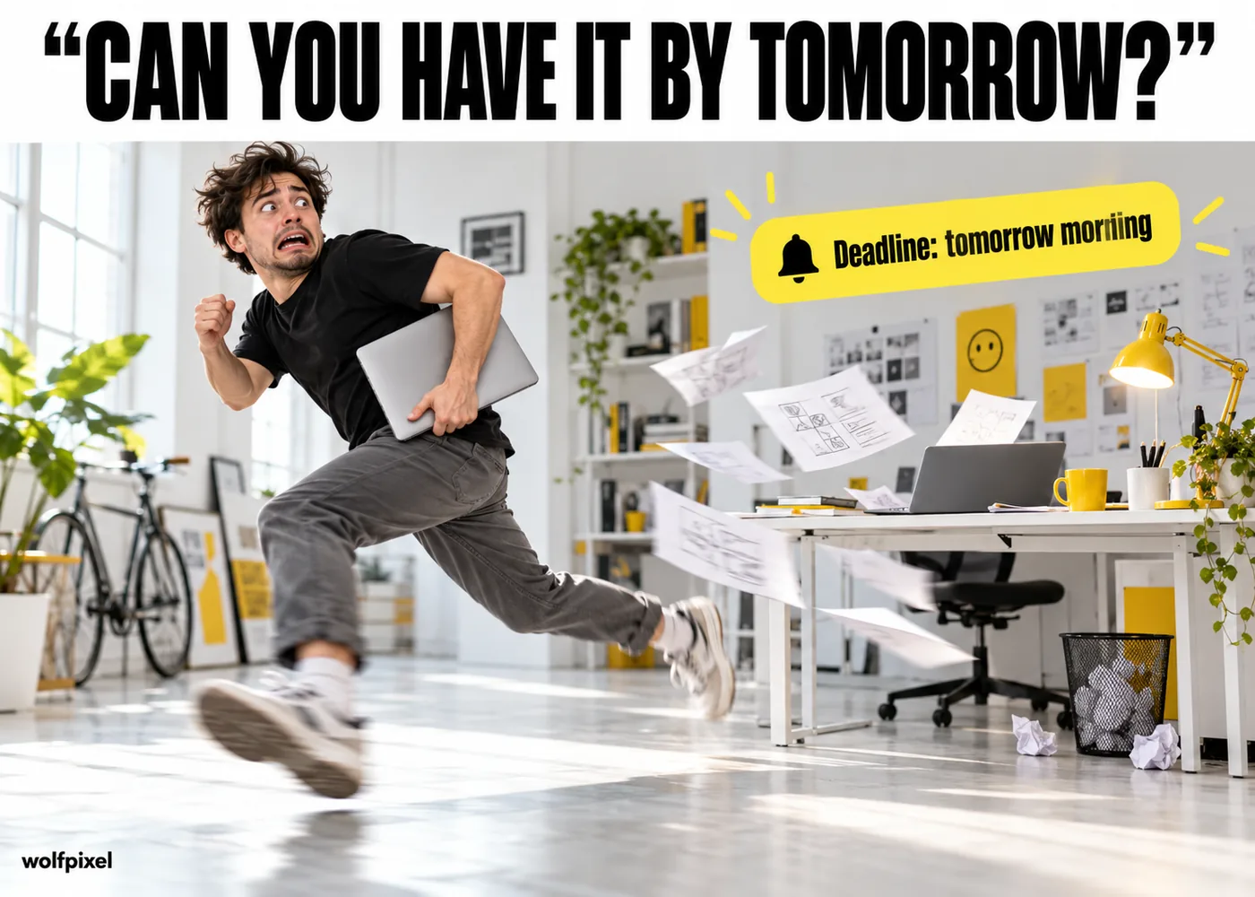
A deadline that was never mentioned in the brief suddenly exists, and it is always tomorrow morning.
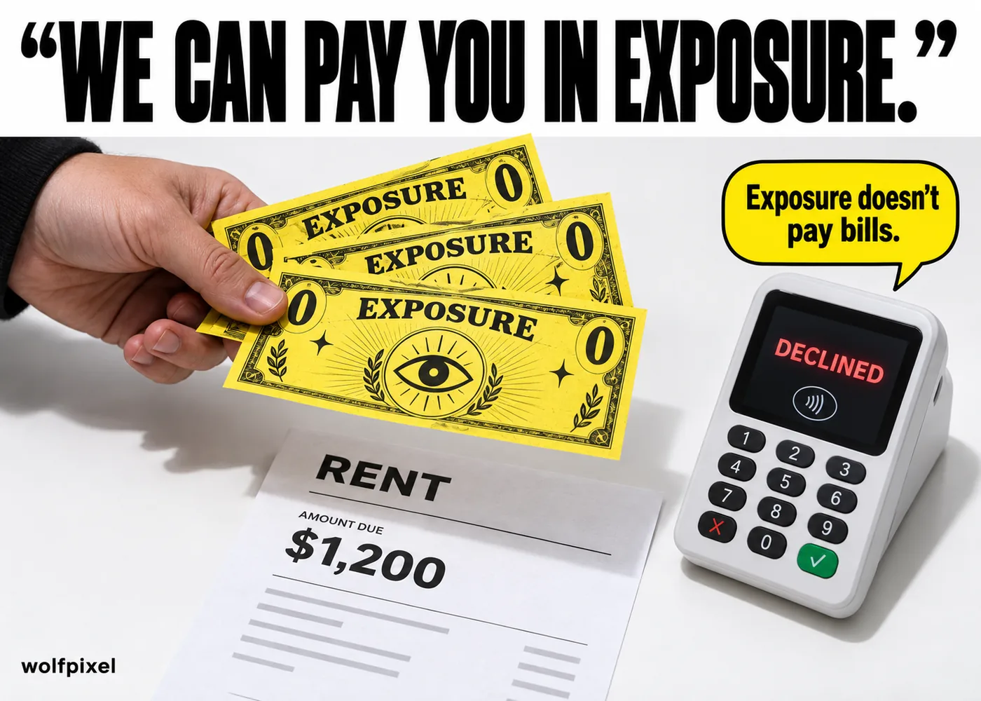
The offer of unpaid work in exchange for exposure, usually from someone with a very large following and a very small budget, remains the fastest way to end a conversation with a freelancer.
Payment terms say net 30. It is day 47. The client has posted twice on LinkedIn since then.

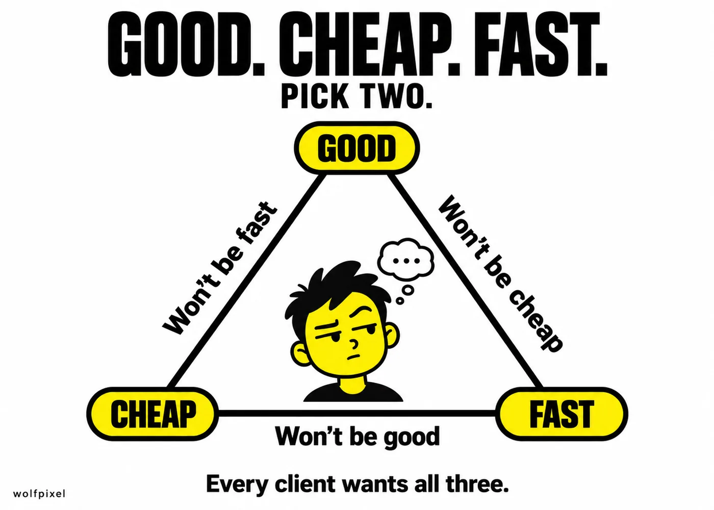
The oldest triangle in the business, and clients still act surprised every single time you explain it to them.
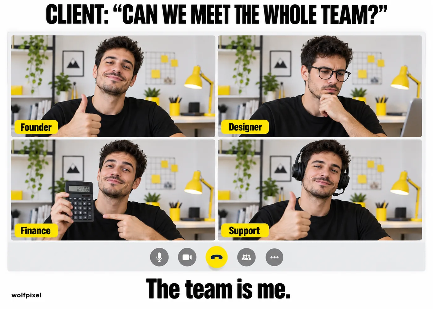
"It would be great to meet the whole team" hits differently when you're a one person studio and the whole team is currently making eye contact with itself in a laptop camera.
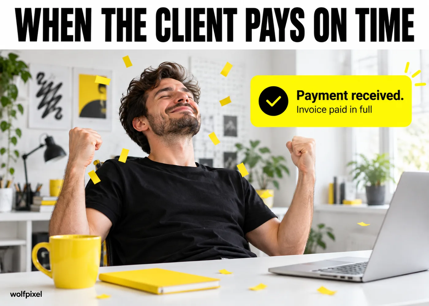
Passion project, sure. But there is a very specific relief that hits the moment a payment actually clears.
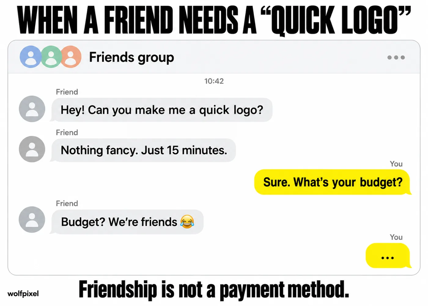
Quick, for a friend, as a favor, exactly like ordering a microwave burrito. It never once takes fifteen minutes.
Every tool has its own personality, and every designer has a specific trauma response tied to at least one of them.
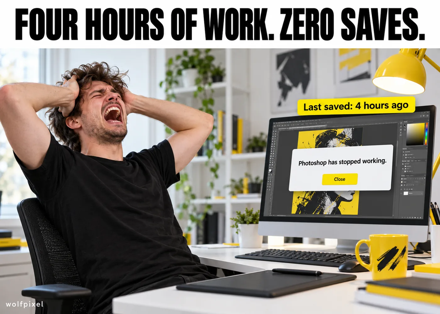
Four hours of work. One crash. Zero autosaves that actually caught anything useful.
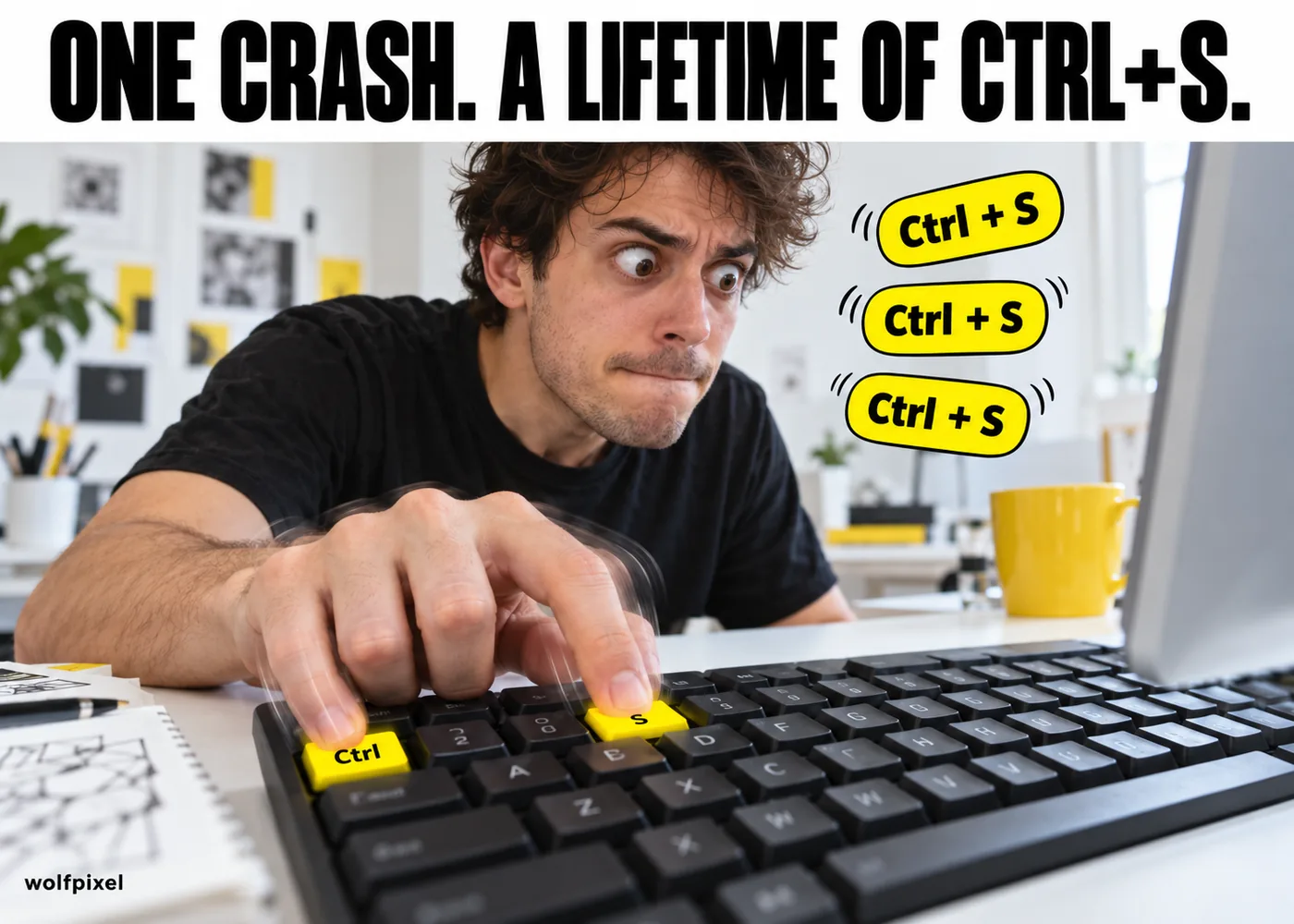
After the crash above happens once, you save every file every 90 seconds for the rest of your career, no exceptions.
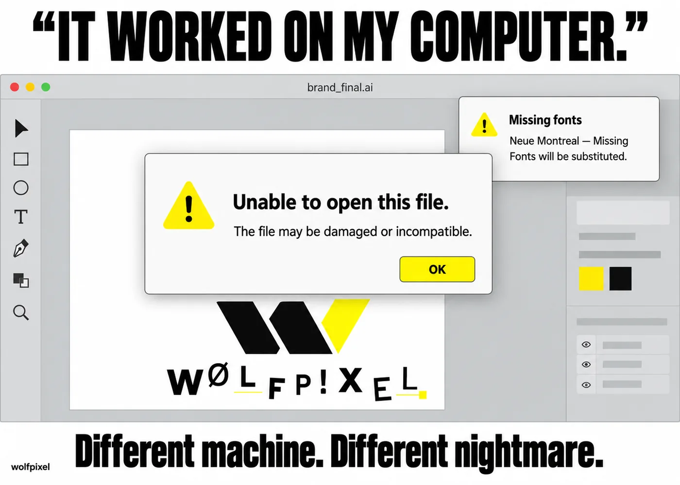
Sent from Illustrator on one machine, opened on another, and now every font is substituted and every layer is a different color than intended.
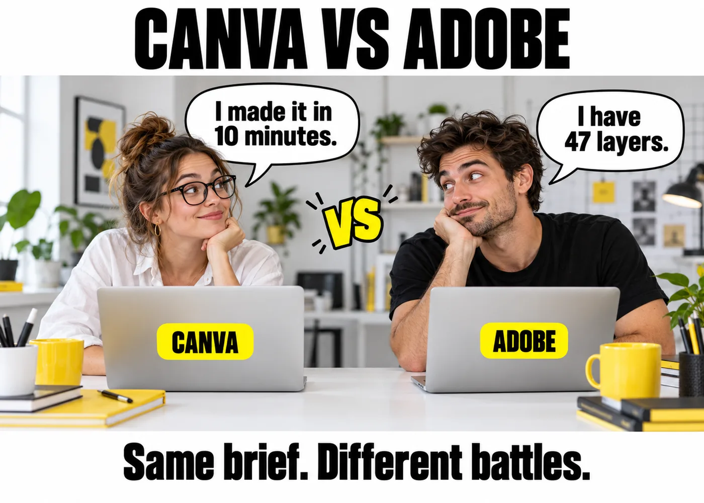
Canva gets the job done for a huge number of projects, and it also gets teased relentlessly by anyone who has spent a decade in the Adobe suite. Both things are true at once.
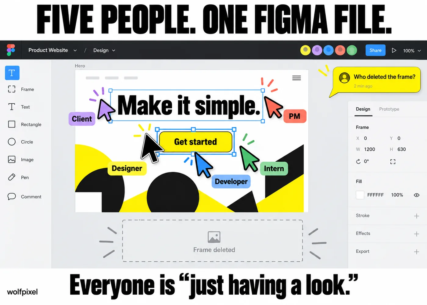
Five people editing the same file, five cursors moving in five directions, and someone always deletes the frame right as you were about to comment on it.
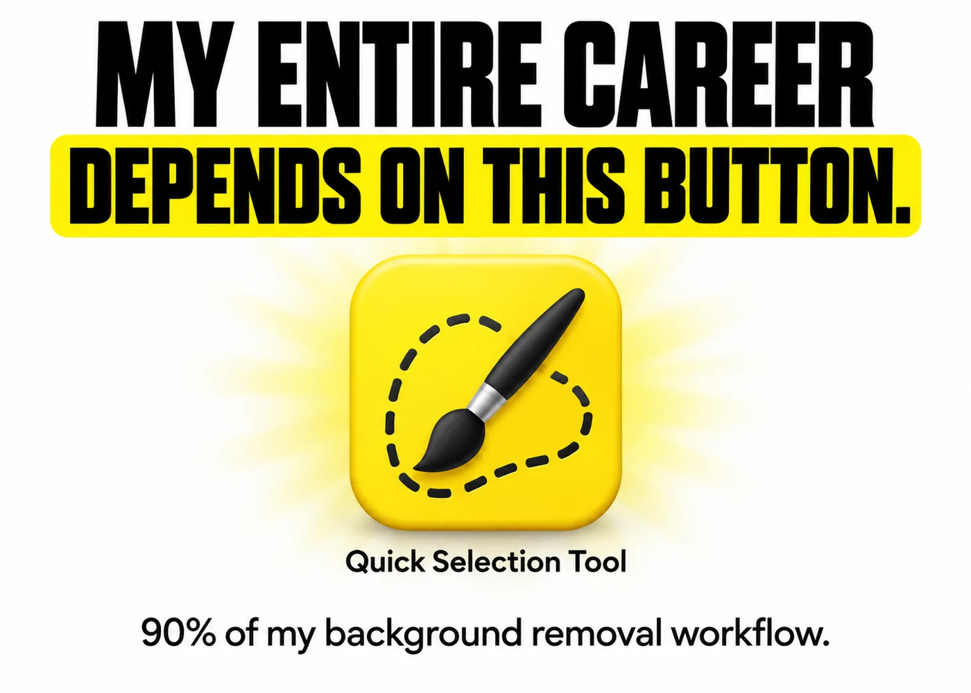
Ninety percent of every background removal job gets done with one tool, and every designer pretends their process is more sophisticated than that.
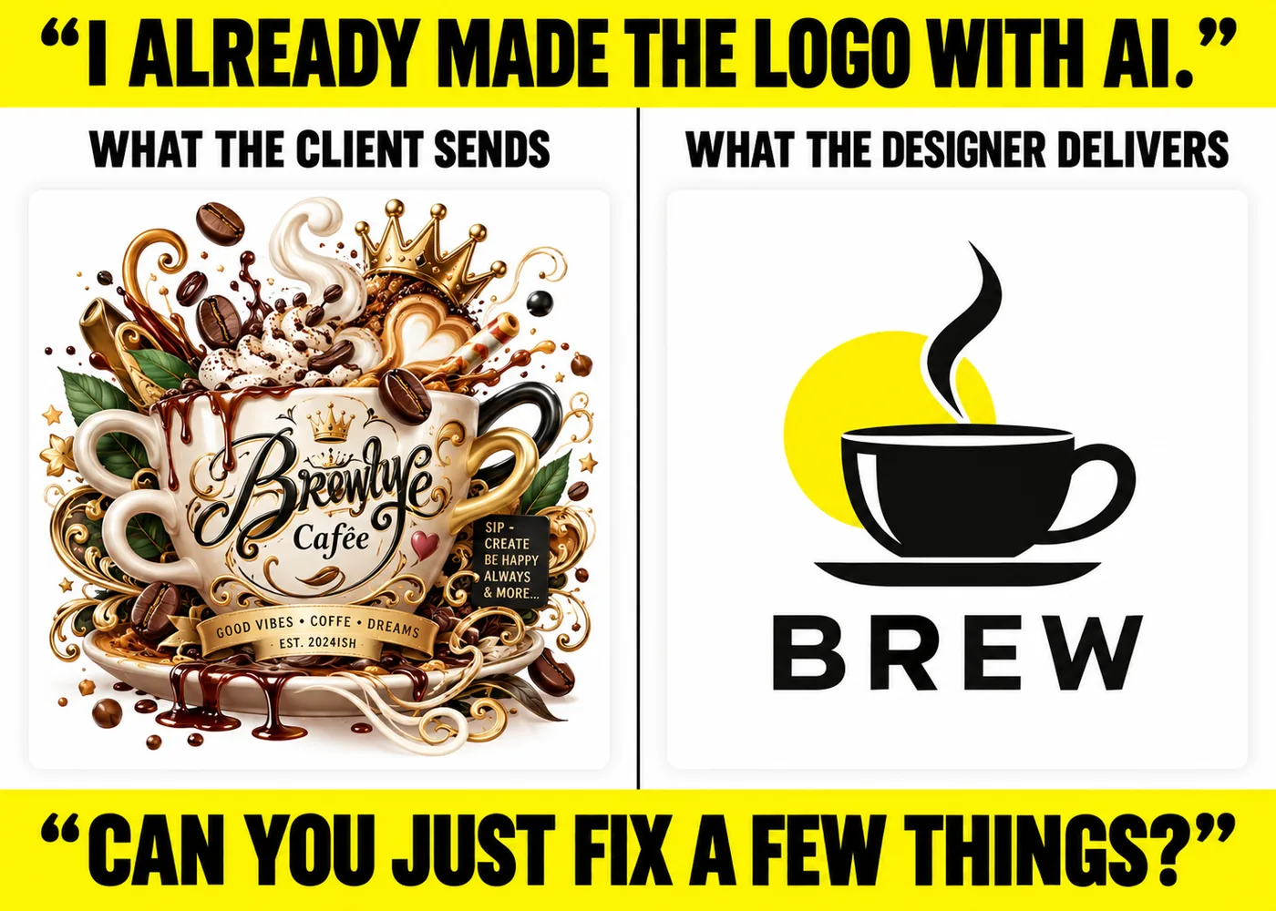
The freshest entry on this list. A client runs the brief through an AI image generator, gets something that technically resembles a logo, then hires a designer to explain why it can't be trademarked, printed, or used at more than one size.
If you want to start an argument in any design team's group chat, bring up kerning.
Nothing ends a serious creative review faster than realizing the client's "quick note" was typed in Comic Sans, and they are completely serious.
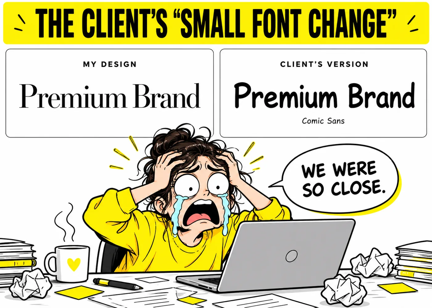
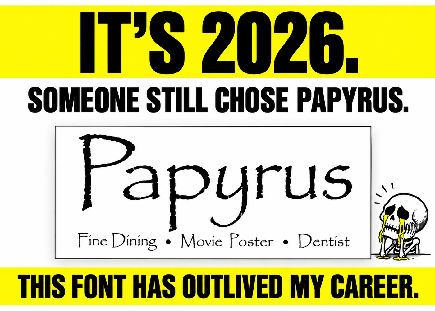
Widely mocked, rarely retired. Somewhere right now a menu, a movie poster, or a dentist's office sign is using it without a hint of irony.
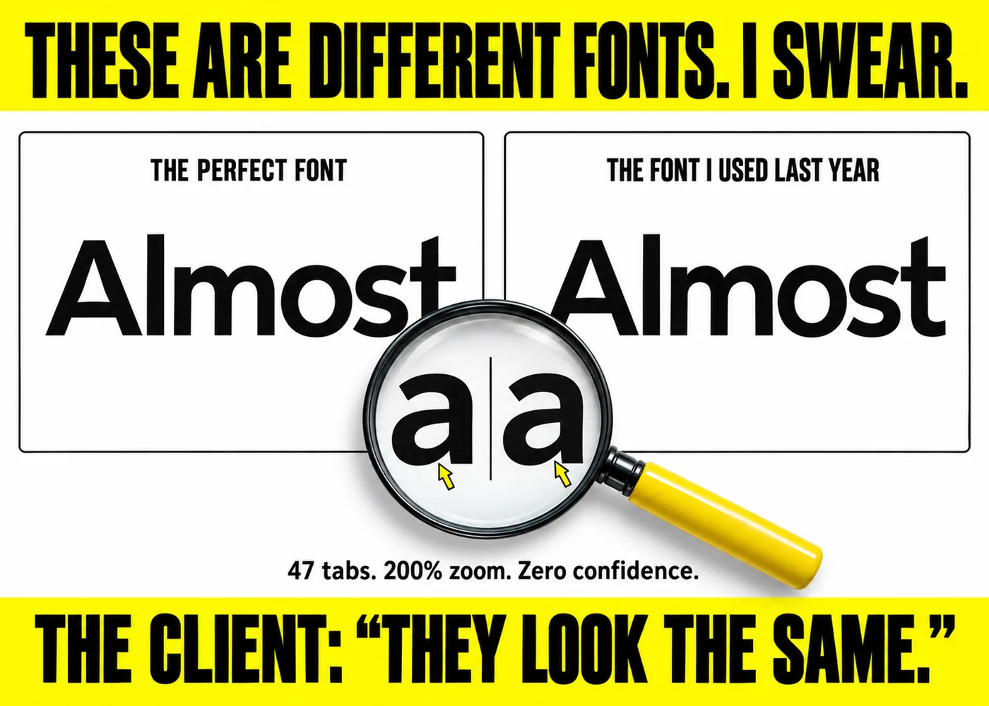
You finally land on the perfect typeface for a project, only to spend the next hour convinced it's actually a slightly worse version of a font you used two years ago.
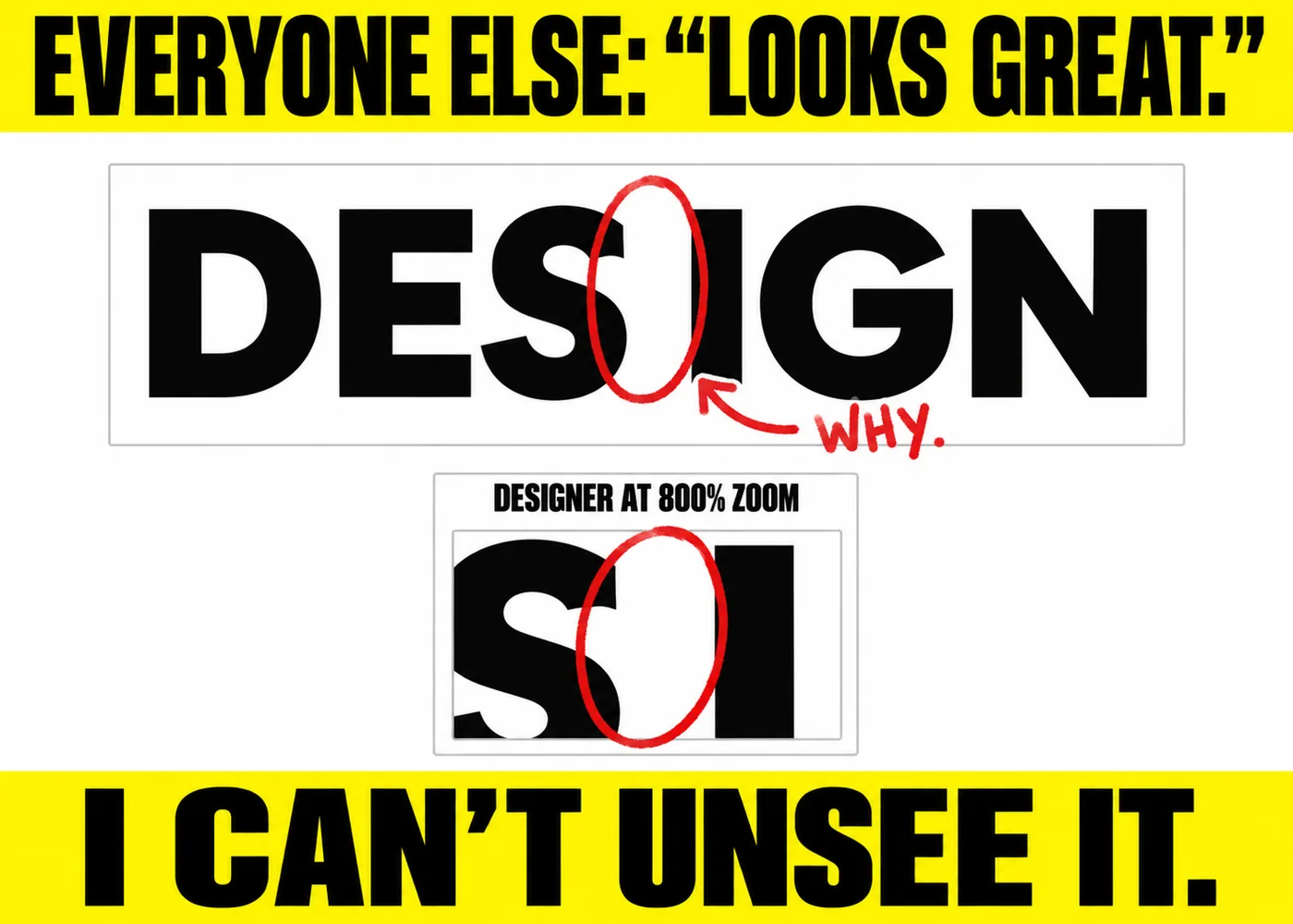
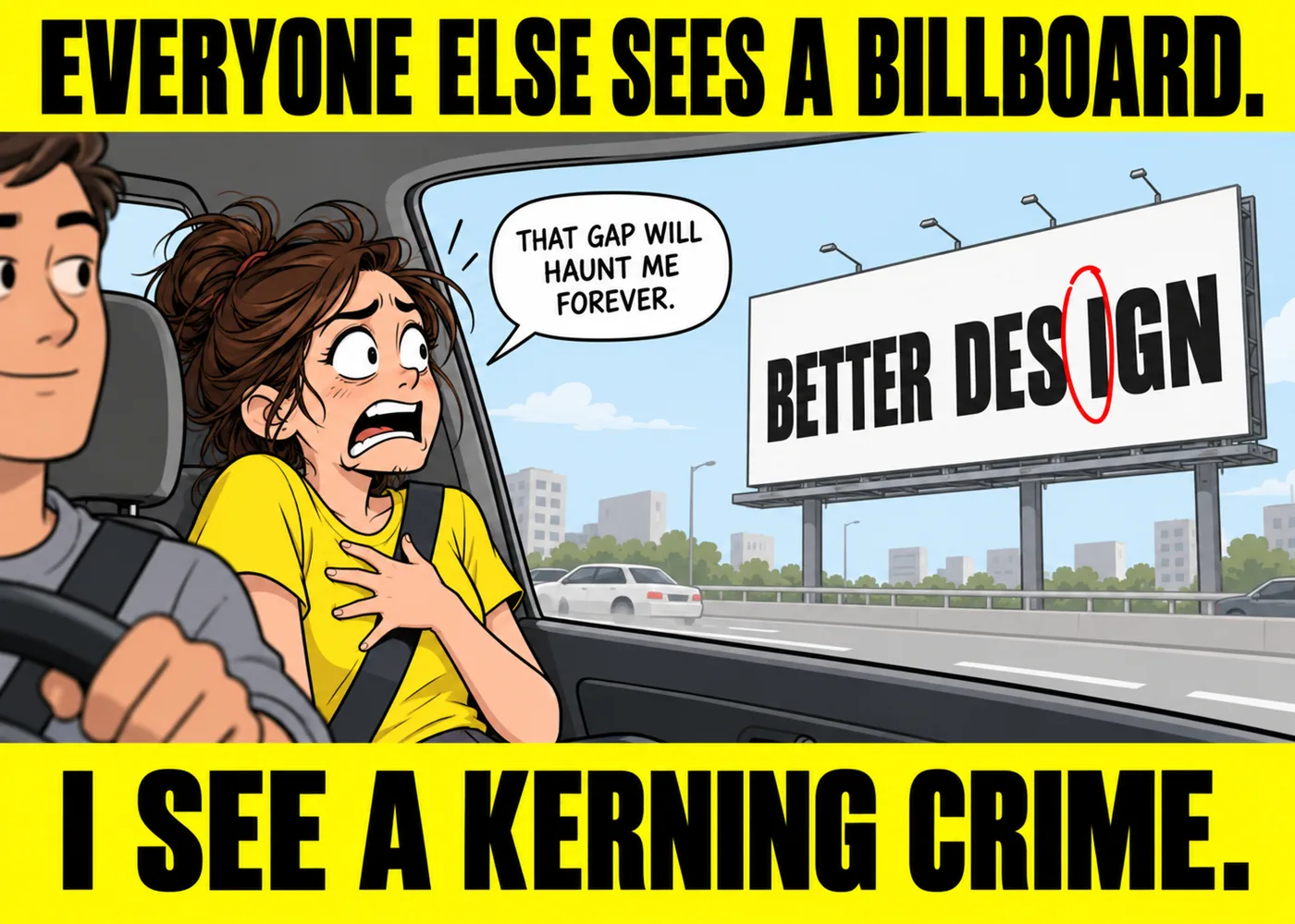
One letter sits half a pixel too close to its neighbor, and the entire design suddenly feels unusable, even though nobody else in the room will ever notice.
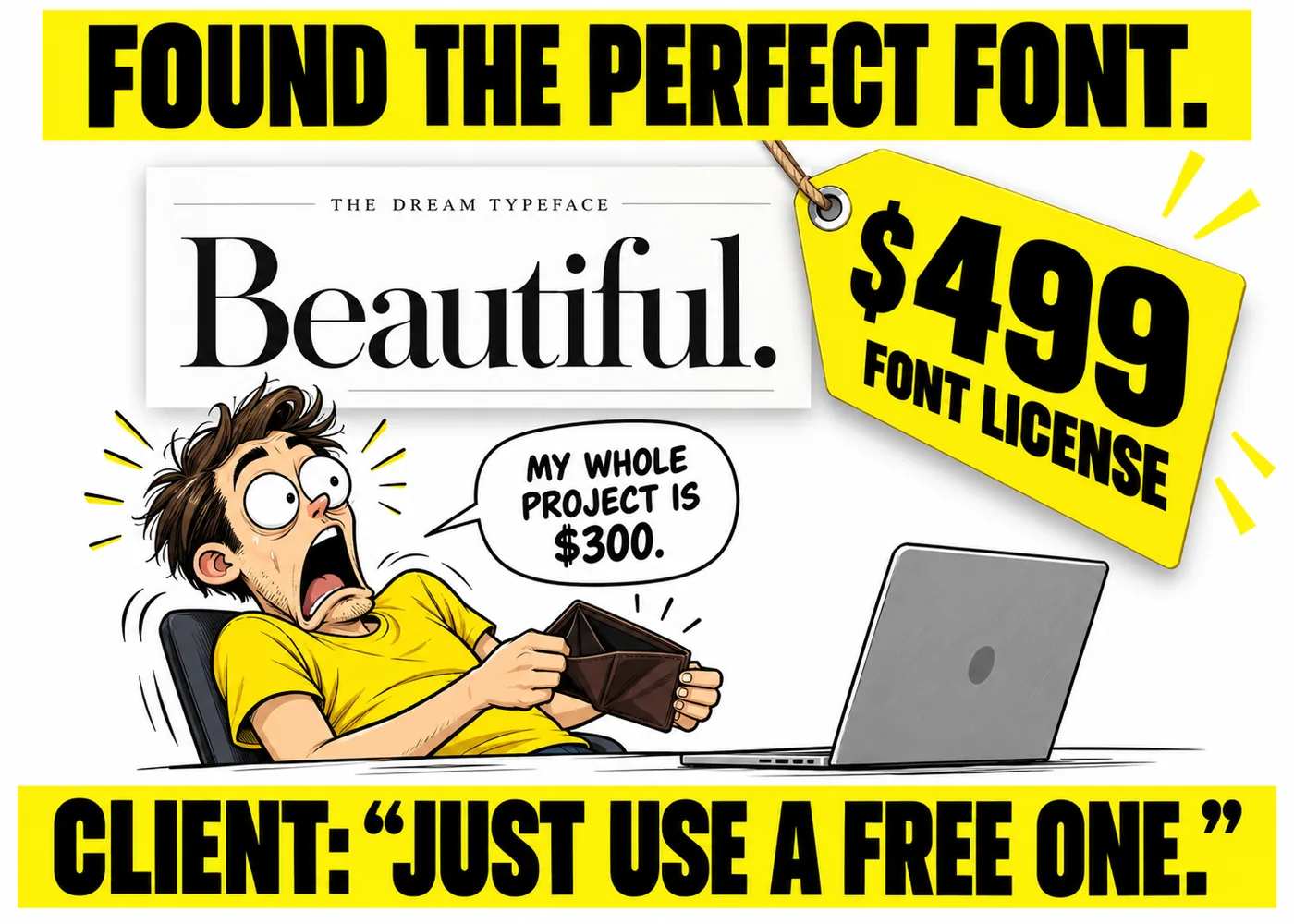
You find the exact typeface the whole concept was built around. It costs more than the entire project budget, and the client wants to know why you can't "just use a similar free one."
Every so often, someone recreates the format ironically and it is somehow funnier now than it was the first time around in 2003.
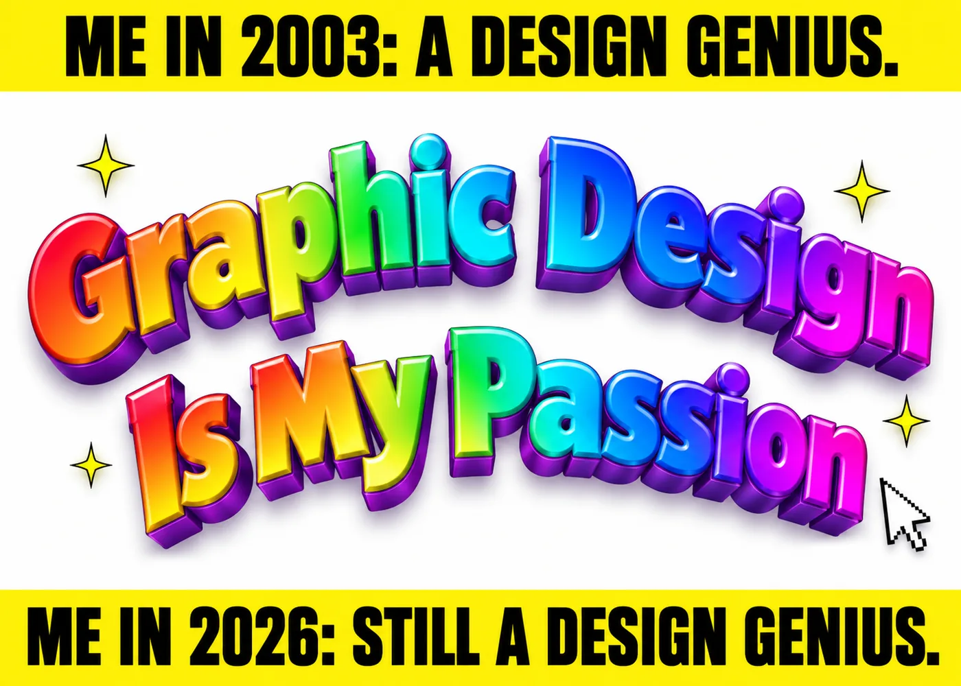
Turn your ideas into professional, memorable visuals with Wolfpixel’s senior design team.
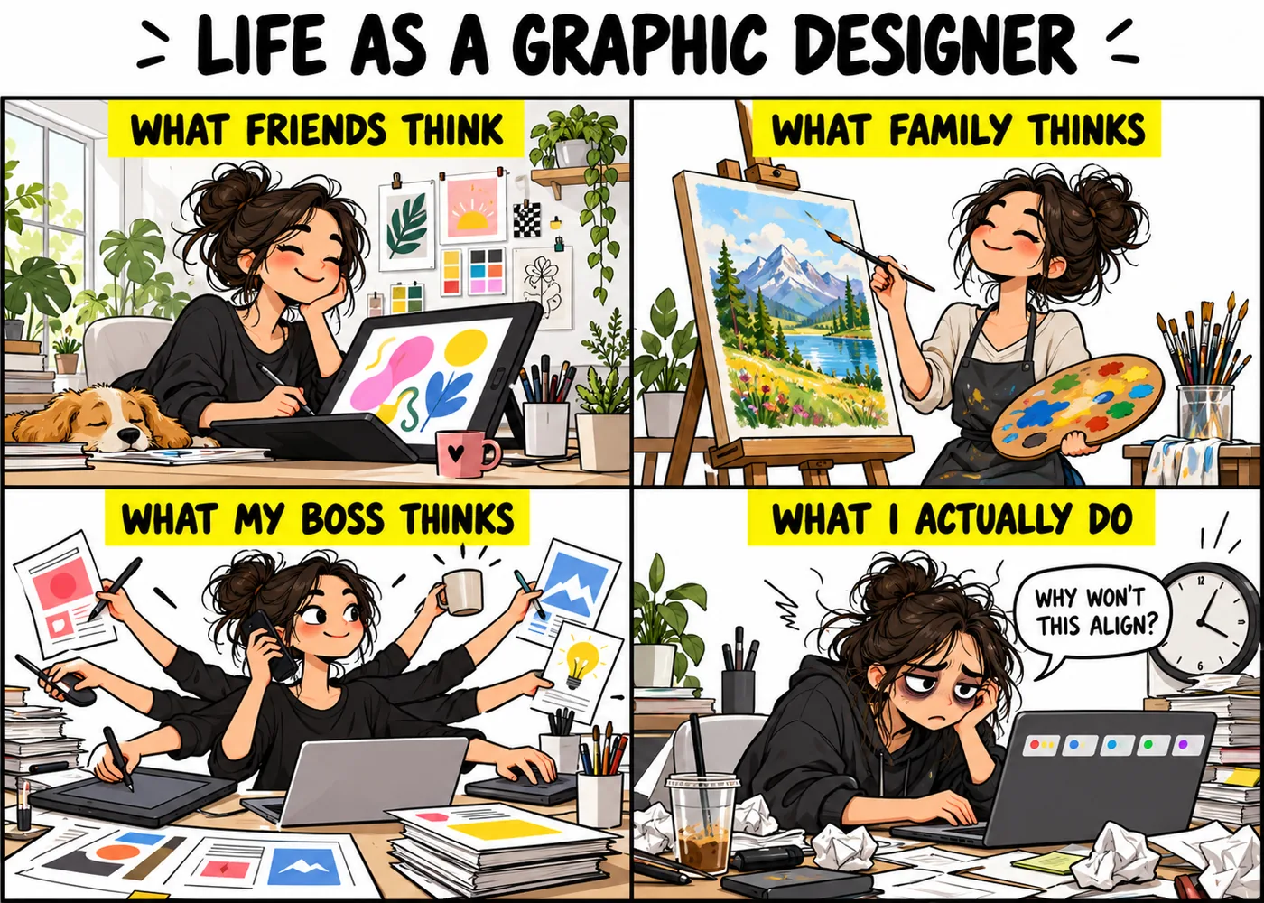
The gap between what people assume a designer does and what a designer actually does all day is basically its own comedy genre at this point.
The imagined version involves airy studios and inspiration boards. The real version involves five browser tabs of reference images and a very tight deadline.
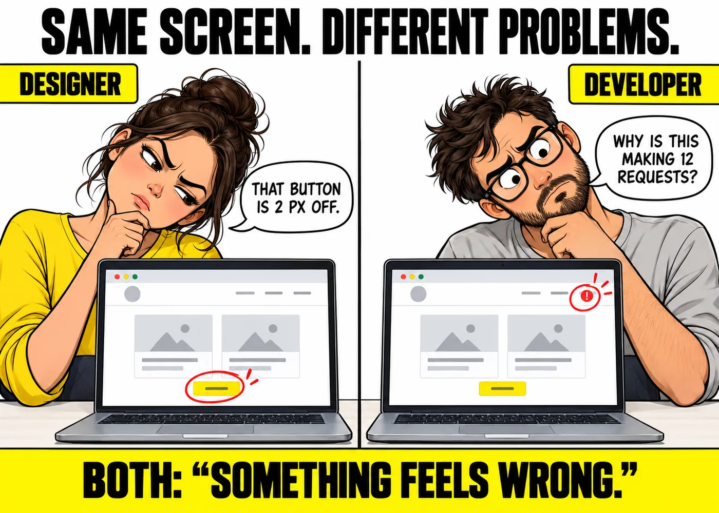
Handed the exact same interface, a designer and a developer will each tilt their head at a completely different part of the screen, for completely different reasons.
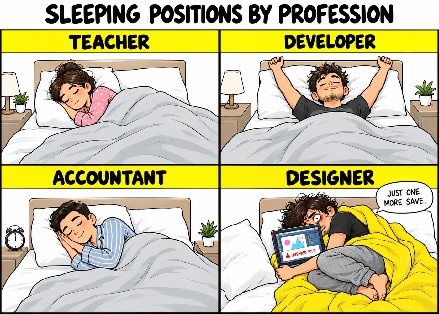
Every job apparently has a signature sleeping position, and the designer's involves being curled protectively around a laptop that is still open to an unsaved file.
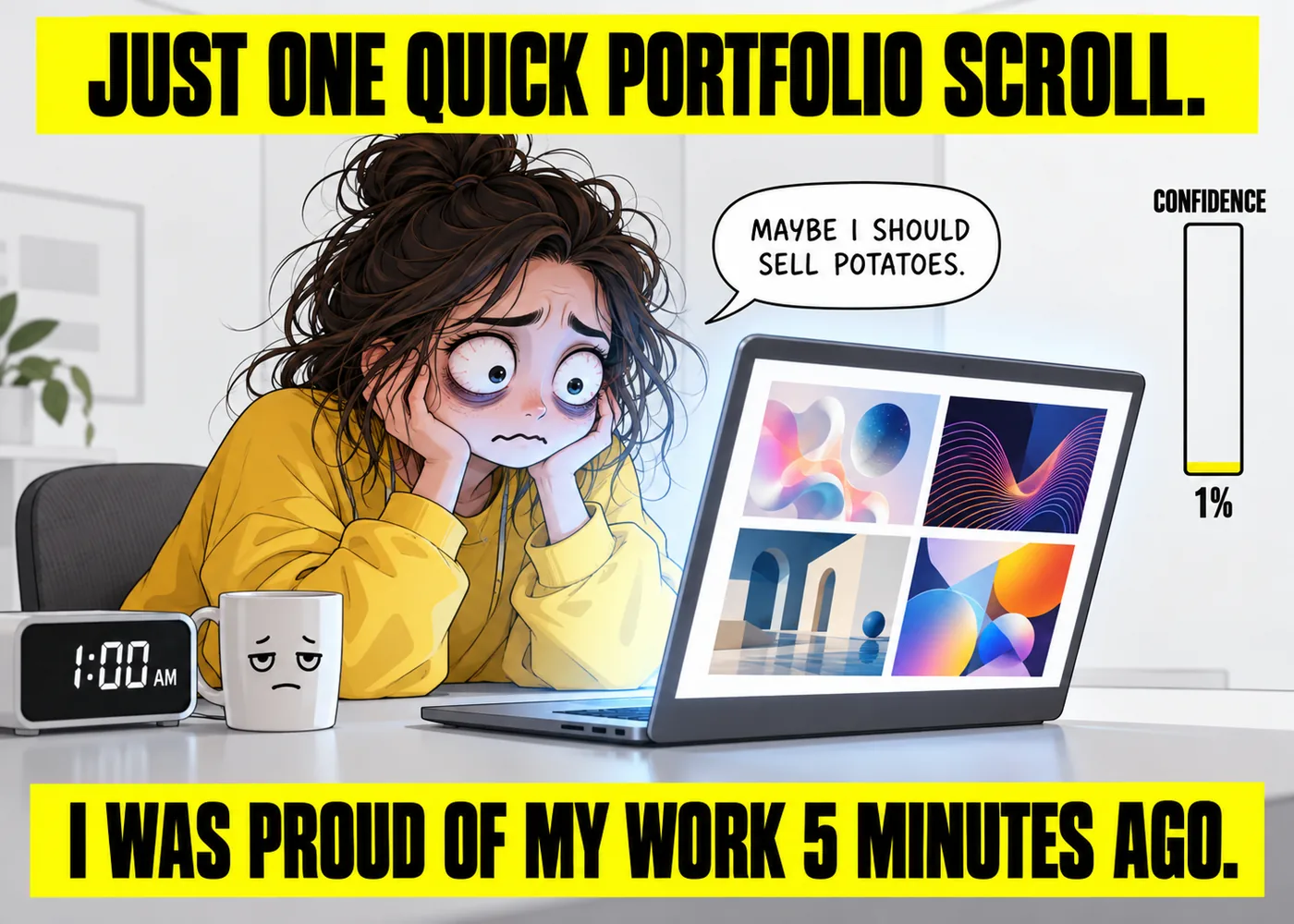
Confidence: high, right up until the scroll starts. Confidence after: gone.
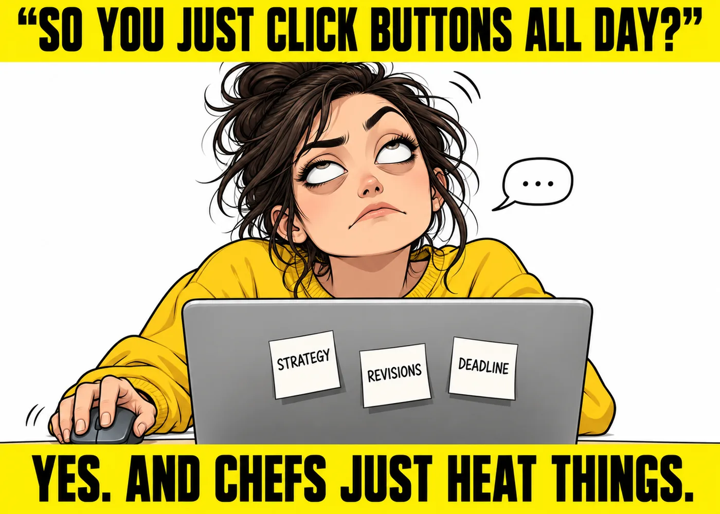
The most common, and most quietly infuriating, description of the job from someone who has never opened a design tool in their life.
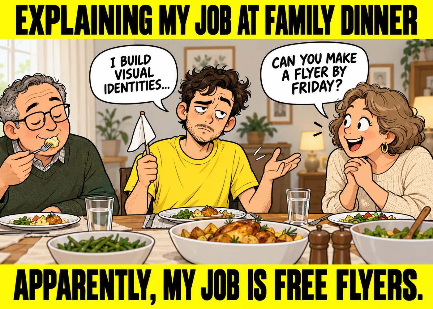
Three sentences into an explanation of what you actually do, someone asks if you can make them a flyer for their garage sale by Friday.
You cannot unsee it. You will now think about it every single time you drive past that intersection for the rest of your life.
The original still gets remixed constantly. Here are the variations that defined the genre.
More than a decade later, the original still circulates more than most of its imitators, which says a lot about how well the joke actually worked.
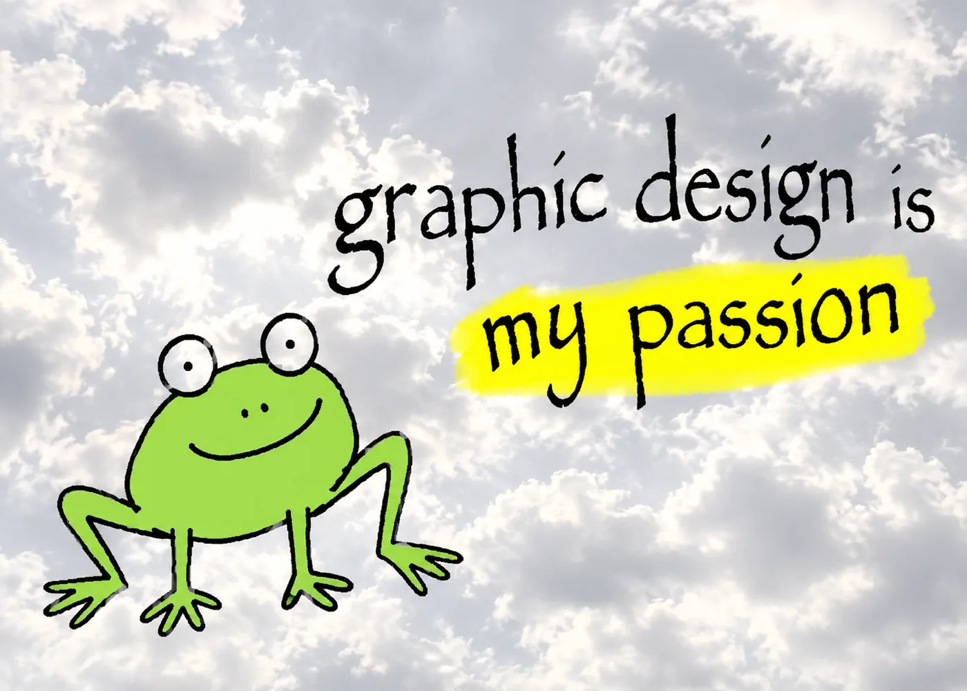
Swapping the caption to target a company, a platform, or a specific team turned the format into a general purpose complaint machine almost overnight.
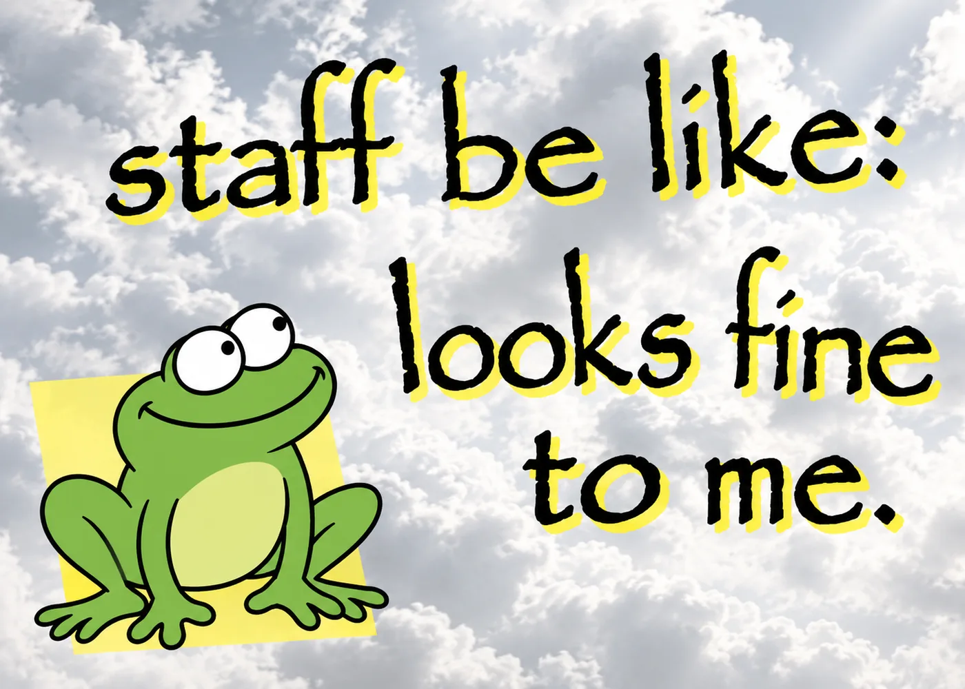
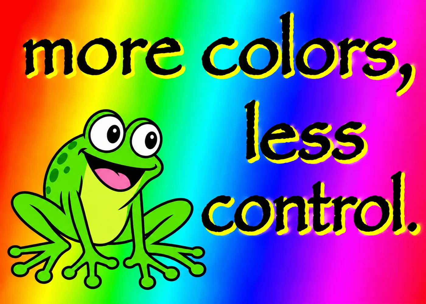
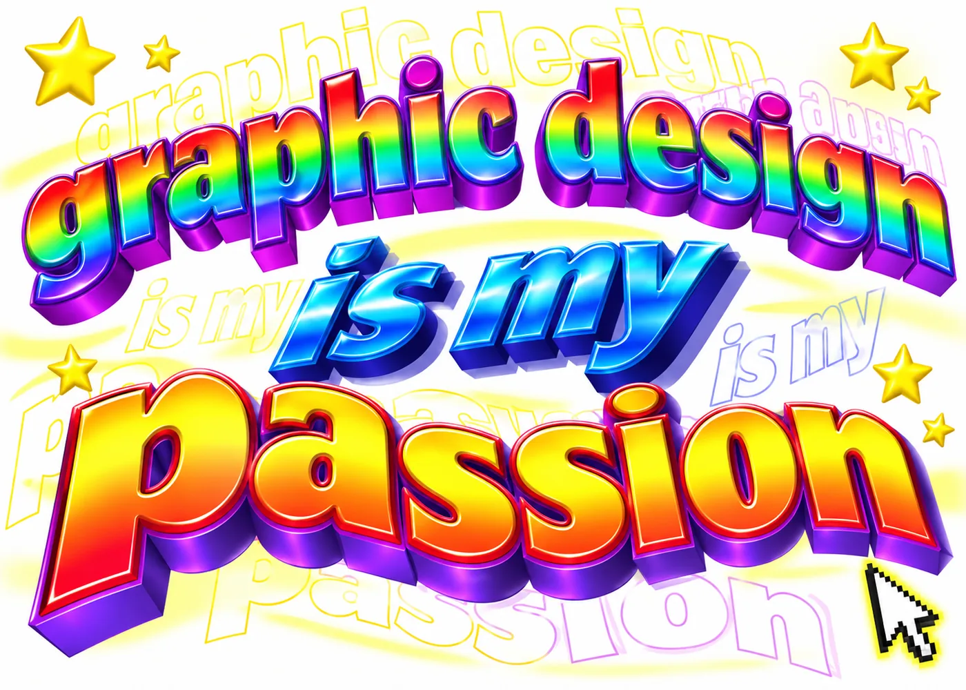
Somewhere along the way, someone decided cloudy gray skies were not quite chaotic enough, and the neon gradient version of the format was born.
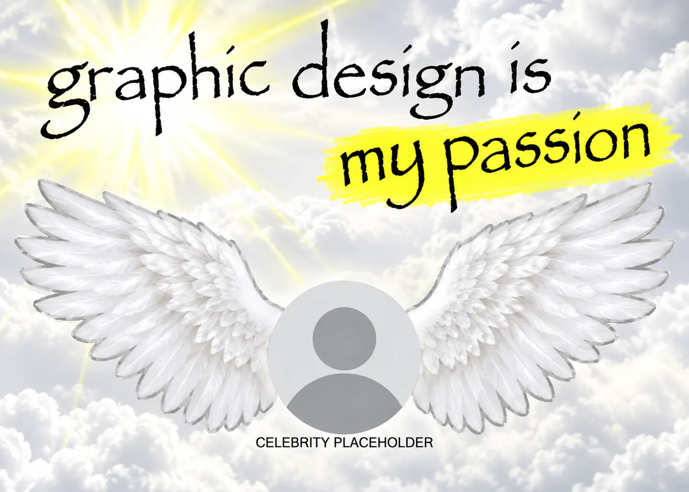
One of the stranger branches of the format, and proof that once a meme takes off, literally nothing is off limits for the remix.
A direct callback to the original chaos, this version leans entirely on layered WordArt text effects instead of clip art.
By August 2014, barely a month after the original post, a version swapping in Pepe the Frog had already picked up over 144,000 notes of its own.
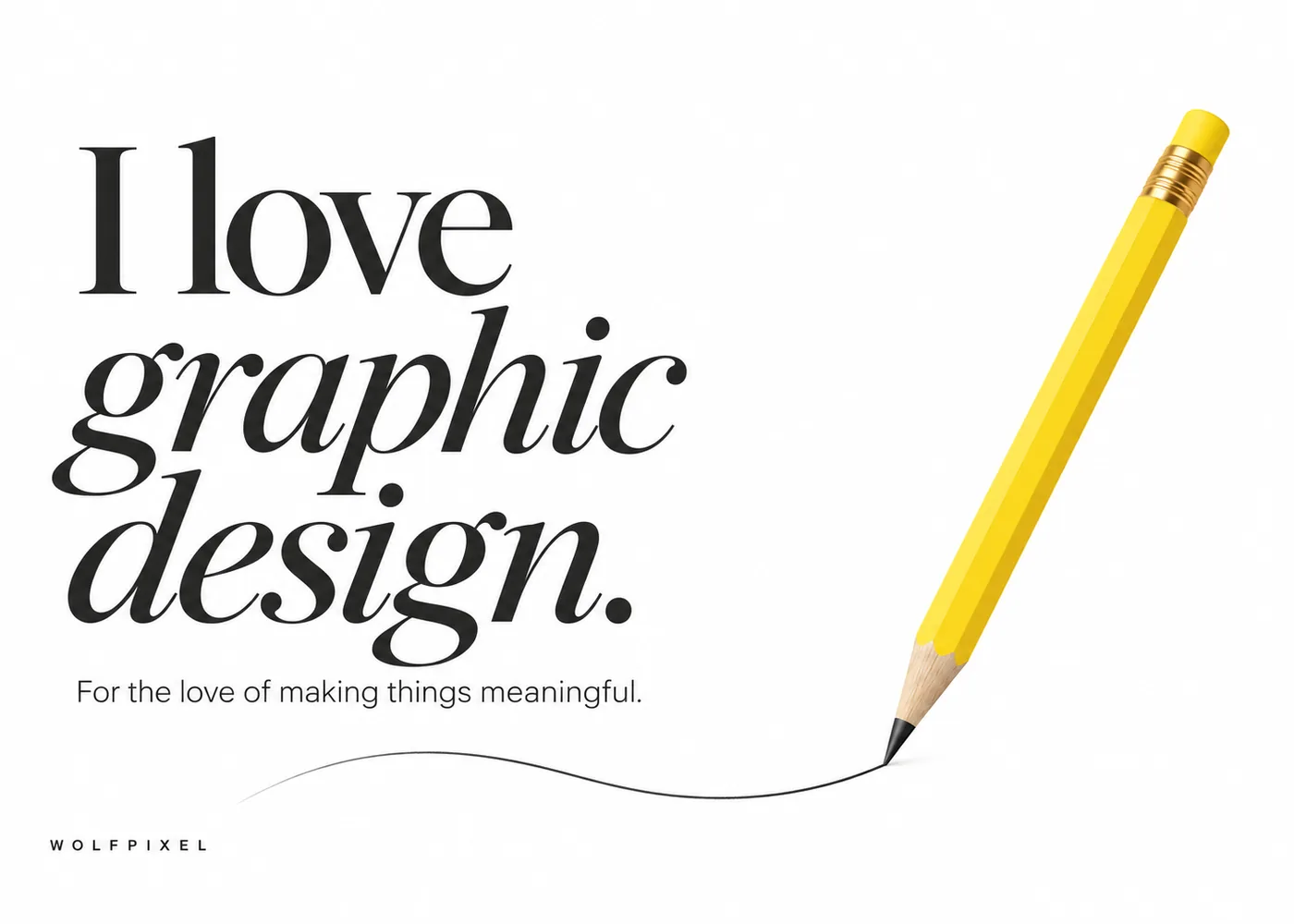
Every so often someone flips the joke entirely and posts an actually well designed "I love graphic design" quote graphic with an earnest line about loving the craft. It's funny purely because it breaks the pattern.
Most jokes about a profession only land with people inside that profession. Design memes are different because so much of the humor is visual.
Even someone who has never touched Photoshop can look at a badly kerned headline and feel that something is wrong, even without knowing why.
"We didn't have to guess which categories to include. We just looked at what our own designers already send each other." — Maniruzzaman Jubayer, Co-Founder, Wolfpixel
For our team, the client feedback and deadline categories get shared internally the most, mostly because we live inside both every day. We ran an informal tally of our own Slack history while researching this piece:
We run a senior only bench that works as a white label partner for other agencies, so the brief usually arrives secondhand and the feedback comes filtered through two or three people before it reaches us. That process, and the reasoning behind it, is the same one we walk through in our brand identity guide.
We built it around a four hour reply window and genuinely unlimited revisions because we got tired of watching good work die in slow feedback loops. So when a meme about "can we try the other direction, but faster" shows up in our group chat, it isn't really a joke, it's a Tuesday.
Design studios, software companies, and print shops have all leaned on this exact meme format for marketing, and it tends to work because the humor requires zero explanation to the target audience. A few patterns worth knowing if you are considering this for your own brand:
If you searched something like meme graphic design hoping to build your own instead of just browsing, here's the short version: you do not need anything more advanced than what you already have open right now.





.svg)



.svg)

.svg)

.svg)

.svg)

.svg)
.svg)
