


06 Oct 2026
Brand Design
What Is Brand Identity? A Complete Guide for SaaS Founders and Growth Teams in 2026


Ever stared at a logo, a poster, or an app screen and just felt something click?
That feeling is graphic design doing its quiet work. It is how a brand speaks before it says a single word.
I am Muhammad Jubayer, Co Founder and Head of Design at Wolfpixel. When I started, I thought design was Photoshop and pretty logos. Ten years and a lot of client projects later (Forex platforms, Fintech dashboards, AI tools, SaaS products),
I know it is really about solving problems people can see and feel. This guide is the one I wish someone had handed me on day one. No fluff, no theory dumps, just the fundamentals, the principles, the tools, and how to actually start.
Let's get into it.
Graphic design is the craft of combining text, images, color, and space to communicate a message clearly. That is the whole job in one line: take an idea and make it easy to understand and easy to feel.
Source: This definition lines up with the U.S. Bureau of Labor Statistics and the Interaction Design Foundation, which both describe graphic design as creating visual content to communicate a message.
It shows up everywhere once you notice it. The coffee cup in your hand, the app you scroll before bed, the road sign you trust without thinking. Someone designed all of it with a goal in mind.
Real design is not decoration. It solves a problem. A good logo builds trust in a second. A clean layout guides your eye without you noticing. A smart color choice makes you feel calm, excited, or ready to buy.
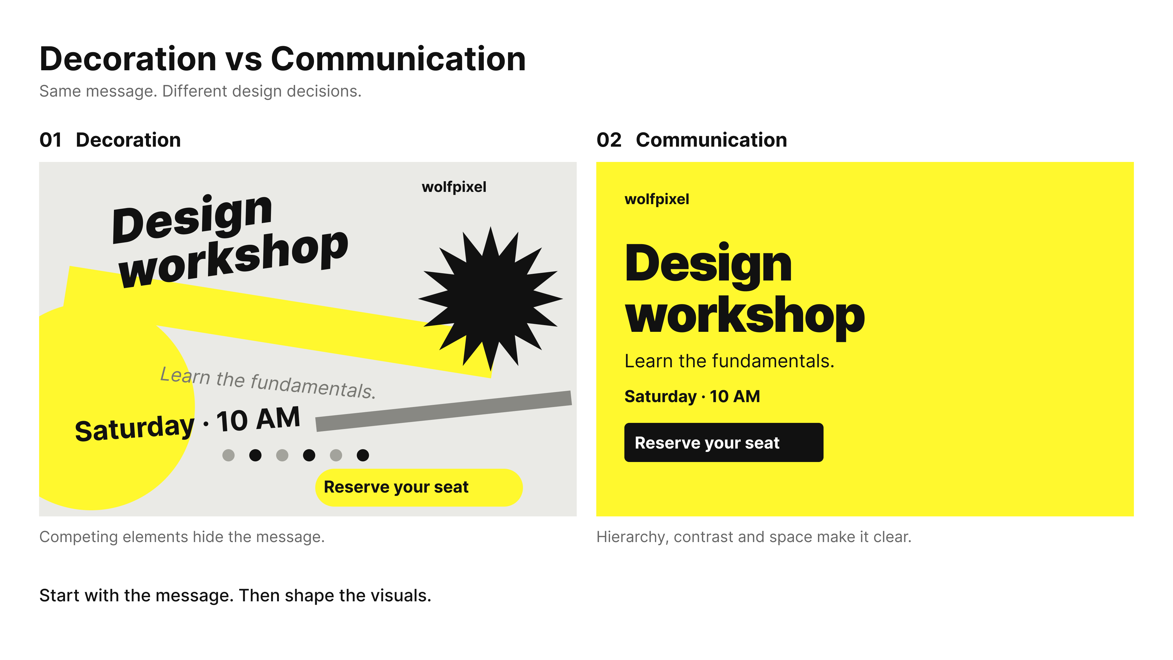
When we design at Wolfpixel, we start with the message first and the visuals second. Get that order right and the pretty part takes care of itself.
Understanding graphic design fundamentals is just the beginning. If you need professional designs that look polished, communicate clearly, and support your business goals, Wolfpixel can help. From branding and UI/UX to websites and digital products, our design team creates purposeful, conversion-focused experiences for growing businesses.


The fundamentals of graphic design are the raw materials every designer builds with: line, shape, color, type, texture, and space. Master these six and everything else gets easier, because principles are just smart ways of arranging them.
Here is what each one does and why it matters.
Line guides the eye and separates content. A single divider line can bring order to a messy layout, but lines also carry a mood on their own. Thick lines feel bold and confident, thin lines feel elegant, and a soft curve feels friendly. In interface work we use them constantly to group a menu, underline a key action, or quietly lead the eye from a heading down to a button.
Shape builds structure and sets a tone before a single word is read. Circles feel soft and friendly, squares feel stable and dependable, and triangles feel bold and directional. Once you start noticing shapes you see them everywhere, from a rounded button that feels approachable to a sharp angular logo that feels serious. On brand projects we usually settle on one shape language early and repeat it across the whole identity so everything feels related.
Color sets the mood and carries brand identity faster than any other element. Learning basic color theory, like warm versus cool or complementary versus analogous, is the fastest quality jump a beginner can make. Color also carries meaning before you read a word: blue reads as calm and trustworthy, which is why so many banks and fintech brands lean on it, while red grabs the eye and signals urgency. Pick two or three colors that work together and resist the urge to use all of them at once.
Typography is the voice of your design, and it does more heavy lifting than beginners expect. The right font can feel trustworthy, playful, or premium, and the wrong one quietly kills the message. A clean sans serif feels modern and easy to read on screen, a serif feels classic and editorial, and a script feels personal and handmade. Nail the pairing of one heading font with one body font and your work instantly looks more finished.
Texture adds depth and a real world feel, even on a flat screen. A subtle grain, a paper effect, or a soft shadow can make a design feel tactile and premium rather than flat and generic. Used lightly it adds warmth and personality. Overdone it turns into visual noise, so a little always goes a long way.
Space (the empty area, also called white space) is not wasted room, it is a tool. It gives a design room to breathe and tells the eye exactly where to look. The gaps around a headline and between sections do quiet, heavy lifting, grouping things that belong together and separating things that do not. When a beginner design feels cramped or cheap, adding space is almost always the fastest fix.
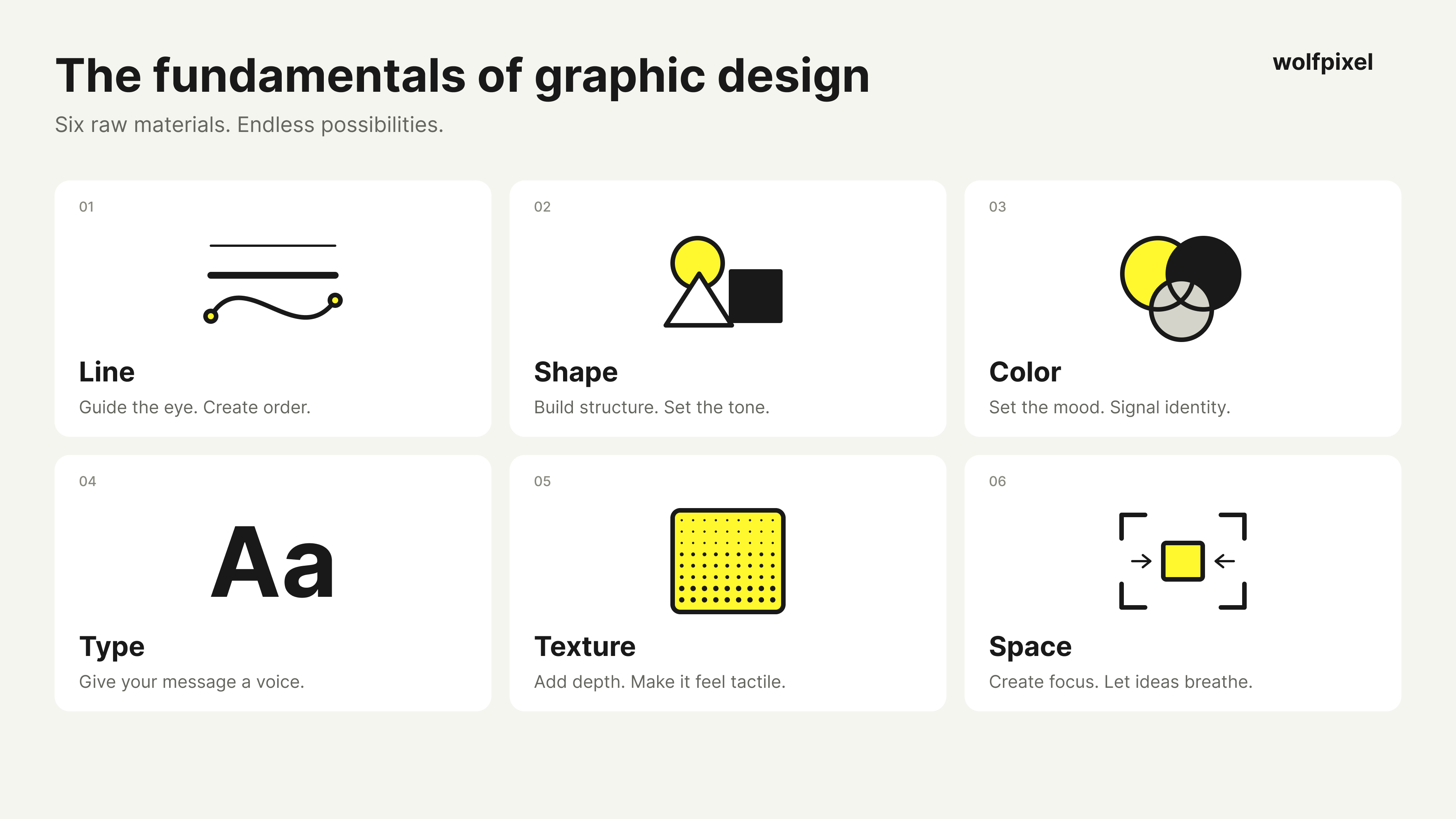
Everything you design is just these six materials arranged well. The principles below are how you arrange them.
The core principles of graphic design are the rules that turn raw elements into work that looks clean and professional. I ignored a few of these early in my career, and trust me, it showed. Here are the ten that carry the most weight.
Source: These principles align with the frameworks taught by Figma and the Interaction Design Foundation.
These ten principles work best together, not in isolation. Balance steadies a layout, contrast and emphasis direct attention, and hierarchy, alignment, and proximity keep everything readable. Repetition and unity build a recognizable brand, while white space and movement let the eye flow naturally. Master them, and every design you create will look intentional, polished, and professional, exactly what clients expect.
Graphic design splits into a handful of specialties, and most beginners find their favorite by trying a few. Here are the ones you will meet most often.
Branding and logo design is where identity begins. A logo is a first impression that speaks for a brand long before its owner does. Real branding goes well beyond the mark itself and includes the color palette, typography, and the rules for how it all gets used, so the brand looks consistent on a business card, a website, and a billboard. It is often the first thing a new company invests in, and getting it right shapes everything that follows.
Web and UI/UX design is about clarity and ease. A good website should feel like a helpful guide, not a puzzle. This is the space Wolfpixel lives in most, designing interfaces for SaaS products, dashboards, and web apps where every button and every screen has to earn its place. The goal is simple: help the user reach what they came for without a single confused pause.
Advertising and marketing design is design that persuades. Social posts, banners, and ads have seconds to stop the scroll and drive action. The best marketing design pairs a sharp visual with a clear message so the value lands instantly, whether it is a product launch, a seasonal sale, or a new feature. It moves fast and rewards bold, focused ideas over clever ones.
Packaging design is the moment a customer holds a brand in their hands. Strong packaging can sell a product on the shelf all on its own. It has to grab attention, show what is inside, and feel worth the price, all while surviving the practical demands of print and shipping. When it works, the box becomes part of the product experience rather than a wrapper you throw away.
Motion graphics add life and movement. A short logo reveal or app intro keeps people watching, which is gold in a fast scrolling world. Even small touches, like a button that reacts to a tap or a smooth loading animation, make a product feel polished and alive. As video and interfaces take over feeds, this is one of the fastest growing corners of design.
Editorial and publication design brings order to books, magazines, and reports so readers move through content with ease. It is the craft of turning long, dense information into something inviting through smart layout, typography, and pacing. A well designed annual report or magazine spread proves that even text heavy content can feel effortless to read.
You do not need to pick one forever. Start broad, notice what you enjoy, and specialize later.
You need one design tool and a laptop to start, and nothing more. The biggest beginner mistake is buying everything before making anything.
Here is what I recommend by budget.
Free and beginner friendly: Figma and Canva. Figma is where our whole team designs interfaces, it runs right in your browser with nothing to install, and the free plan is genuinely enough to learn on. Canva is perfect for quick social graphics and for understanding layout, with drag and drop templates that teach you spacing and hierarchy while you work. Start here and you can build real skills without spending a cent.
Industry standard (paid): Adobe Illustrator for logos and vector work, Photoshop for photo editing and retouching, and InDesign for multi page layouts and print. This is the toolkit most agencies expect you to know, so it is worth learning once you are past the basics. The only catch is the monthly subscription, which is why most beginners wait until they actually need it.
A solid middle ground: Affinity Designer is a strong one time purchase if you want to skip the Adobe subscription. It covers most of what Illustrator and Photoshop do for a single upfront price, which makes it a favorite for freelancers and hobbyists keeping an eye on their budget.
Gear: A mid range laptop and a mouse are plenty to begin with, and you do not need a top spec machine or a fancy setup to learn. Add a basic drawing tablet only if you enjoy sketching or plan to move into illustration. For everything else, a mouse handles the job just fine.
Pick one tool. Open it today. You learn design by moving pixels, not by watching tool reviews.
Understanding graphic design fundamentals is just the beginning. If you need professional designs that look polished, communicate clearly, and support your business goals, Wolfpixel can help. From branding and UI/UX to websites and digital products, our design team creates purposeful, conversion-focused experiences for growing businesses.
You can learn graphic design for free using YouTube, free courses, and daily practice, which is exactly how I started with no budget. Time and curiosity matter more than money at the beginning.
Here is the free path I trust.
Watch the right channels. The Future, Gareth David Studio, and Satori Graphics explain not just how but why. That "why" is what separates a designer from a button pusher.
Take a structured free course. Coursera and Canva Design School give you order and real examples so you are not learning at random.
Practice with free tools. Figma and Canva have free plans. Photopea is a free, browser based Photoshop alternative.
Do the redesign drill. This one grew my skills faster than anything: pick a real ad, poster, or logo you like, then rebuild it from scratch. You learn spacing, type, and hierarchy by doing, not by reading.
Fifteen focused minutes a day beats a weekend binge you never repeat.
In 2026, AI is a co-pilot for designers, not a replacement, and knowing how to use it is now a core skill. It handles the tedious parts so you can spend your energy on ideas and taste.
Here is where it actually helps in a real workflow.
Speeding up the boring work. Tools inside Photoshop and Illustrator now remove backgrounds, extend images, and recolor artwork in seconds, work that used to eat hours.
Generating starting points. Image and concept tools give you rough textures, moodboard visuals, and first drafts that you then refine by hand.
Writing and ideating faster. AI helps draft copy, name concepts, and brainstorm directions so you get to the good ideas sooner.
Here is the honest part. AI cannot replace a trained eye, brand strategy, or the human judgment that makes a design feel right. The U.S. Bureau of Labor Statistics does note that automated tools like AI may lower demand for some freelance contracting, so the smart move is to become the designer who directs AI rather than one who competes with it. In our client work, AI removes friction, but the thinking, the taste, and the final call are still ours. The designers who win in 2026 are the ones who direct AI, not the ones who fear it.
Here is how these ideas play out on a real project, not just in theory. On a recent Fintech dashboard, the first draft was cramped, low contrast, and hard to scan. Nothing was technically broken, it just did not communicate.
We fixed it with the exact principles above. We added white space so the numbers could breathe, built a clear hierarchy so the key metric led the screen, and used contrast to make the primary action impossible to miss. Same content, completely different result. Users found what they needed faster, and the client saw better engagement.
That is the whole point of this guide. Principles are not classroom theory. They are the difference between a design people ignore and one they trust.
The fastest way to improve is to design daily, keep it simple, and ask for honest feedback. These are the habits I wish someone had told me at the start.
Keep it simple. Clutter hides your message. When in doubt, remove something.
Limit your fonts. Stick to one or two typefaces. Too many fonts confuse the eye and cheapen the work.
Respect the space. Let elements breathe. Empty space is part of the design, not a mistake.
Build a portfolio from day one. Redesign ads, logos, anything, and post the work on Behance or Dribbble. Your portfolio matters far more than a certificate.
Ask for feedback. Honest critiques sting for a second and sharpen your eye for years.




.svg)



.svg)

.svg)

.svg)

.svg)

.svg)
.svg)
