


16-09-2026
UI/UX
Build your best healthcare web design with these 11 examples.


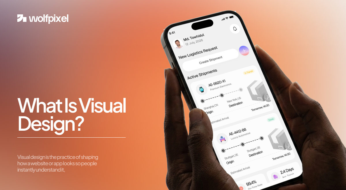
Visual design is the practice of shaping how a website or app looks so people instantly understand it, trust it, and know where to go next. It covers color, typography, layout, spacing and imagery, and it uses those pieces to guide the eye rather than just decorate the screen.
People judge a screen in a blink. If a page looks messy, they leave before they read a word. I have spent the last several years leading design at Wolfpixel, and the pattern never changes: clean, deliberate visuals earn trust, and cluttered ones burn it.
Below is how visual design actually works, with the same thinking we use on client projects.
Visual design is the layer that makes a digital product feel clear, credible and easy to use. It is not paint on top of a finished product.
It is the set of choices that tell a first time visitor "this is safe, this is organized, this is where you click."
There is a common mix up here, so let me settle it early. Aesthetics are part of visual design, but they are not the point.
The point is communication. Every color, font size and gap on the page is a signal, and good visual design makes sure those signals point users toward what matters.
Wolfpixel combines visual design and UX to create digital experiences that are clearer, easier to use, and built to perform.


Visual design matters because it decides whether users stay, trust you and take action. First impressions form in a fraction of a second, and that snap reaction is almost entirely visual.
This is not just a feeling from the studio. In a well known study published in Behaviour and Information Technology, Lindgaard and colleagues found that people form a visual opinion of a web page in about 50 milliseconds, roughly a twentieth of a second.
There is also the aesthetic usability effect, a documented pattern where people rate designs that look good as easier to use, even when the underlying flow is the same.
On one Wolfpixel project we barely touched the copy or the features. We fixed contrast, tightened spacing and gave the primary button room to breathe. The page suddenly felt trustworthy, and the client saw more people reach the next step.
That is the quiet power of visual design. It rarely gets credit, but it shapes the whole experience.
The elements of visual design are the raw building blocks you arrange on a screen. Think of them as the ingredients before you cook. There are seven that matter most.
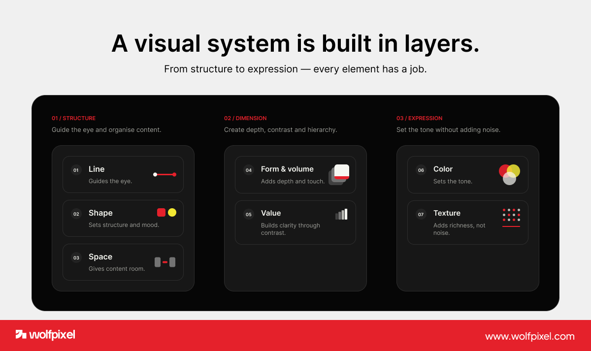
Line. Lines divide, connect and lead the eye. A thin divider or an underline can organize a page without a single word.
Shape. Shapes create structure and mood. Rounded shapes feel friendly, sharp ones feel serious, and both set expectations before anyone reads.
Space. Empty space, often called white space, is not wasted space. It gives content room to breathe and tells users what belongs together.
Form and volume. Depth cues like shadows and layering help elements feel tappable and real, even on a flat screen.
Value. Value is the range from light to dark. Strong differences create clarity, and gentle ones create calm.
Color. Color sets the tone and pulls attention. This is where color psychology comes in, since blue tends to read as calm and trustworthy while red reads as urgent, so the palette can say playful, premium or urgent before a headline does.
Texture. Texture adds subtle richness, like soft gradients or grain, without cluttering the layout.
The principles of visual design are the rules for arranging those elements so the whole thing works. If elements are the ingredients, principles are the recipe.
Hierarchy. Hierarchy shows what to look at first. Bigger, bolder or brighter elements pull the eye, so your most important message should never blend in.
Contrast. Contrast makes key things stand out. A bright button on a calm background is the difference between a click and a bounce.
Balance. Balance keeps a layout feeling stable instead of lopsided. You can spread weight evenly or off center, as long as it feels intentional.
Unity. Unity is consistency, and it leans heavily on repetition. Reusing the same colors, fonts and button styles across the product creates a rhythm that quietly signals you are professional.
Alignment. Alignment lines elements up so nothing feels random. Most strong layouts sit on a grid system, and a shared set of columns keeps spacing predictable and calm across every page.
Scale. Scale uses size to create emphasis, and it shows up most clearly in your typography scale. A steady jump from body text to subheads to headlines guides the eye and keeps a page from feeling flat.
Gestalt. Gestalt is how our brains group things, and proximity is the piece you will use every day. Items placed close together read as related, which is why smart spacing removes confusion faster than any label.
Dominance. Dominance gives every screen one clear focal point, so users always have somewhere to start.
The clearest way to understand visual design is to look at products that get it right. Here are examples we point to often, plus one from our own work.
Google's homepage. Google works because of restraint. Heavy white space, one dominant search box, and nothing competing for attention. The design does one job perfectly.
Spotify. Spotify feels polished because it is relentlessly consistent. Even spacing, repeating card shapes and steady typography make a dense app feel calm.
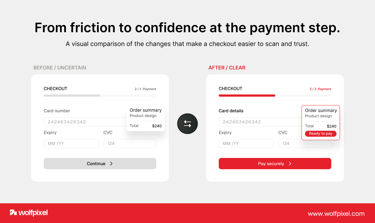
A clean checkout we rebuilt. On a recent Wolfpixel build, a checkout was losing people at the payment step. Nothing was broken, it just felt uncertain. We raised the contrast on the pay button, grouped the form fields with better spacing, and cut visual noise around the total. The flow felt trustworthy, and completions improved.
Notice the theme across all three. Good visual design is not about more. It is about clarity.
Wolfpixel combines visual design and UX to create digital experiences that are clearer, easier to use, and built to perform.
Visual design and graphic design overlap, but they solve different problems. Visual design focuses on digital products such as websites and apps, where the goal is a smooth, usable experience across screens.
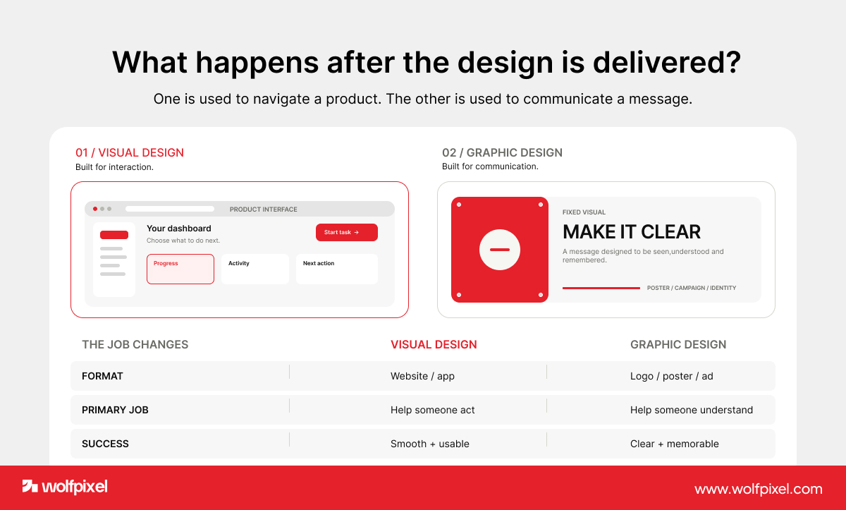
Graphic design leans toward standalone visuals like logos, posters, packaging and ads, where the goal is to communicate a message fast. Both use color, type and layout. The difference is that visual design has to stay usable and interactive, while graphic design often lives as a fixed image.
Visual design and UX design are partners, not rivals. UX design decides how a product works and flows, while visual design decides how it looks and feels at each step.
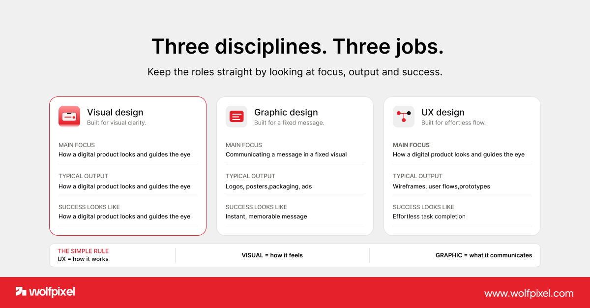
You need both. A brilliant flow can still fail if the screen looks confusing, and a beautiful screen means nothing if users cannot find the button. On our team the visual designers and UX designers sit close for exactly this reason.
If you want a deeper look at how the two connect, see our take on UI and UX design.
Good visual design has to hold up on every screen and stay consistent as a product grows. A layout that looks sharp on a laptop can fall apart on a phone, so responsive design is now part of the visual designer's job, not an afterthought.
We design mobile first on most projects, because if a screen works in a narrow space, it almost always works wider too.
Consistency at scale is where a design system earns its keep. A design system is a shared library of colors, type styles, spacing rules and components that keeps every screen feeling like one product. It is the difference between a site that looks handmade in the best way and one that drifts a little more off brand with every new page.
AI now generates layouts and images in seconds, which makes human visual design more valuable, not less. The tools can produce a screen, but they rarely produce clarity, brand feeling or trust on their own.
The real skill in 2026 is judgment. Knowing which AI output to keep, what to fix, and how to shape it into something people trust is the work. That taste is exactly what we bring to every Wolfpixel project.
At Wolfpixel we treat visual design as a trust engine, not decoration. Every screen we ship is meant to look clear, feel credible and move users toward action.
That approach shows up in the work. We hold a 5.0 rating on Clutch, we have been featured more than twenty times on Behance, and we sit among the Top 50 trending teams on Dribbble as a certified Webflow partner.
If you want your product to earn trust on the first glance, that is the standard we design to.
If you want to go deeper, two sources are worth bookmarking. The Nielsen Norman Group breaks down real interfaces against visual design principles, and the Interaction Design Foundation offers a thorough reference on the elements and principles.
We lean on research like these alongside our own project work, so the guidance here reflects both established theory and what we see and convert in the real world.




.svg)



.svg)

.svg)

.svg)

.svg)

.svg)
.svg)
