




16-09-2026
UI/UX
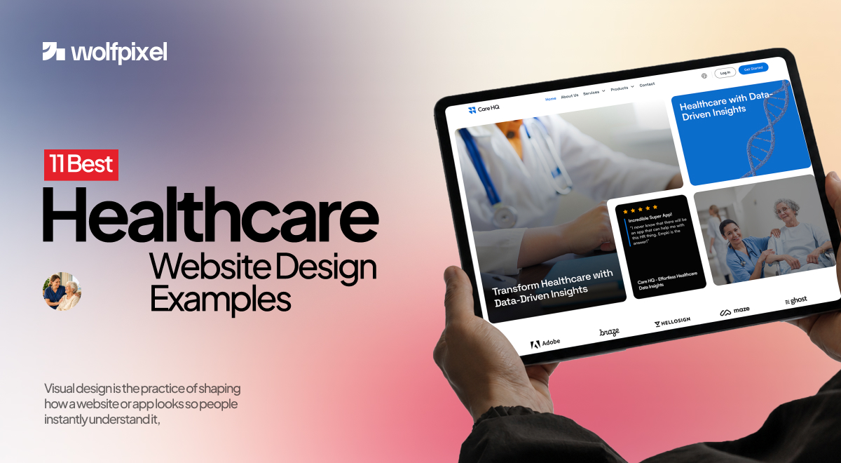
Build your best healthcare web design with these 11 examples.


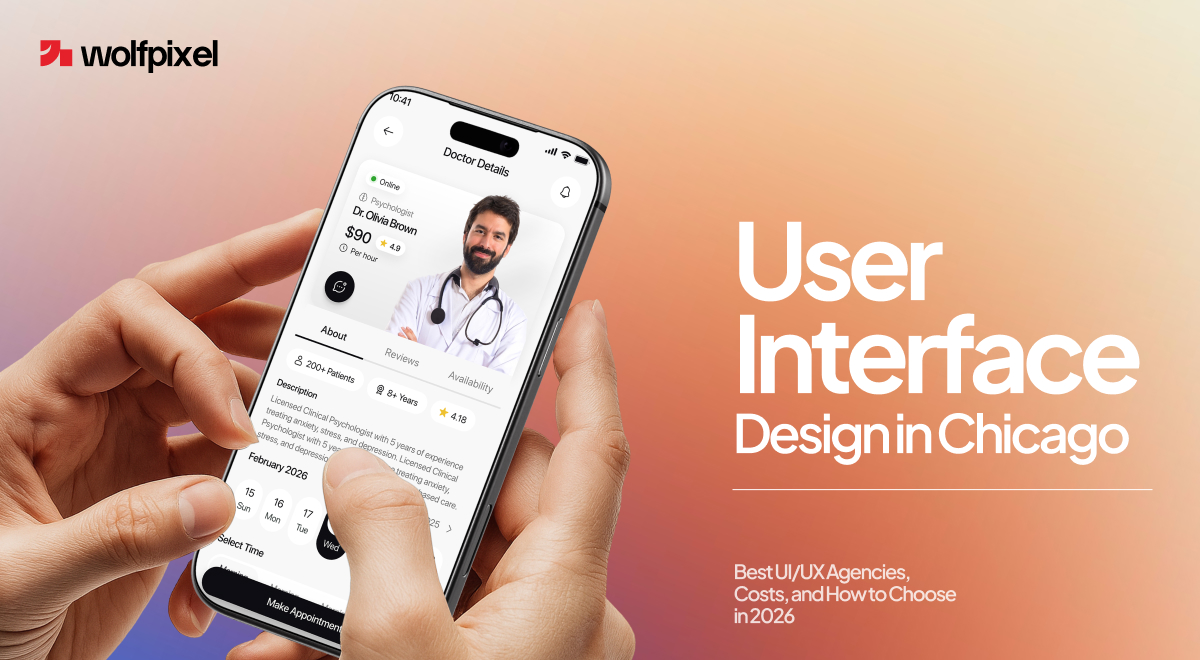
In Chicago's crowded product scene, user interface design is what decides whether someone trusts your app in the first few seconds or quietly clicks away. That first impression forms before anyone reads a word, and once it turns negative, most people are already gone.
And the competition here is real. Chicago startups raised more than 2.4 billion dollars in venture capital in 2023, the city added over 28,000 tech jobs since 2019, and LinkedIn now ranks it the third fastest growing city in the country for UX roles. When that many products chase the same users, the interface is often the tiebreaker.
Get it right and the payoff shows up fast, more signups, higher conversion, and users who actually come back. The strongest user interface design agencies in Chicago in 2026, including Wolfpixel, ArtVersion, Highland Solutions, Fuzzy Math, Grand Studio, Codal, and Intechnic, exist to deliver exactly that.
I lead design at a SaaS focused studio that works with founders here, so this guide is the practical version. It walks through what UI design involves, how the process works, what it costs in Chicago, and how to choose the right partner, and you can grab a free UX audit whenever you are ready.
User interface design is the practice of shaping everything a person sees and interacts with on a screen, the layout, the colors, the buttons, the spacing, and the feedback that tells them something worked. Its job is to remove friction so people can do what they came to do without stopping to think. When it is done well, you barely notice it, and when it is done badly, users leave.
That is the whole business case. People judge a product in seconds, and a confusing screen reads as an untrustworthy company. Strong UI design keeps people moving, which lifts signups, conversions, and retention. According to Forrester, every dollar invested in user experience returns between 2 and 100 dollars depending on the industry, which is why design now sits close to revenue rather than off to the side.
The order can flex, but skipping the early steps is the fastest way to a product that looks new and still does not convert.
Good UI design follows a clear process, and knowing the steps helps you tell a real partner from one that jumps straight to visuals. Here is how the work actually moves from idea to a shipped interface.
1. Discovery and research. Every strong project starts with questions, not mockups. The team learns your business goals, your users, and where the current experience breaks, through stakeholder interviews, analytics, and a look at competitors.
2. User research and definition. Next comes understanding the people who will use the product. Interviews, surveys, and simple personas turn assumptions into evidence, so the design solves real problems rather than guessed ones.
3. Information architecture and user flows. With the users clear, the team maps how everything connects, the screens, the paths, and the order people move through them. This is where confusion gets designed out before a single pixel is placed.
4. Wireframing. Wireframes lay out each screen in plain, low fidelity form, focused on structure and priority rather than color. It is the fastest and cheapest place to test whether a layout makes sense.
5. Prototyping and interaction design. Wireframes become clickable prototypes that behave like the real thing, so you can feel the flow, test the interactions, and catch problems while they are still cheap to fix.
6. Visual UI design. Now the interface gets its look, the color, typography, spacing, icons, and components, usually organized into a design system so everything stays consistent as the product grows.
7. Usability testing. Real users move through the design while the team watches for friction. A handful of sessions here catches the issues that would otherwise show up as drop off after launch.
8. Handoff, launch, and iterate. The team prepares clean files and specs for developers, supports the build, then launches and watches how real users behave, improving from there.
Chicago pairs deep design talent with a dense, fast growing tech scene, which makes it one of the better cities in the country to build a product. The city has a design culture that stretches back to its architecture, and that same care for how things are made now shows up in its digital work.
The ecosystem is real, not hype. Enterprise anchors like Morningstar, Grubhub, Groupon, and CME Group sit alongside a wave of B2B SaaS, fintech, healthtech, and logistics startups, many clustered around the West Loop and Fulton Market corridors. That mix means the local talent pool understands complex, regulated products, not just pretty marketing sites, and it is why demand for skilled UI and UX work here keeps climbing.
These are the user interface design agencies Chicago businesses turn to most, and each owns a clear strength. I picked these seven for portfolio depth, real Chicago client work, verified reviews, and clear specialization, not for who ranks highest in a directory. When you build your own shortlist, read recent user interface design Chicago reviews on Clutch and G2, since a pattern across many comments tells you far more than any single testimonial. Match the pick to your product and industry rather than to the biggest name.
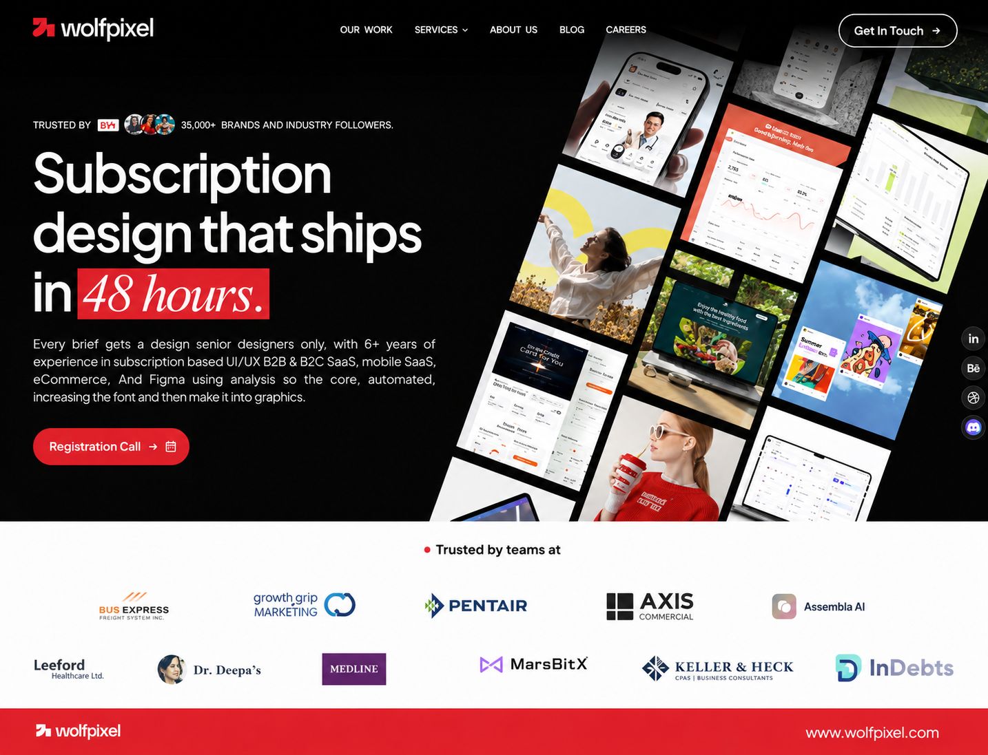
Wolfpixel is a product and brand design studio focused on SaaS.. We also designs interfaces to convert, not just to look sharp, and we work with Chicago founders the same way we work with teams anywhere, remotely and fast. Every brief lands on a senior designer, and before we start we run a free AI UX audit that shows where your product loses users. We are not a downtown Chicago firm, and we say so plainly, but for founders who care more about results and speed than a local address, that trade is an easy one.
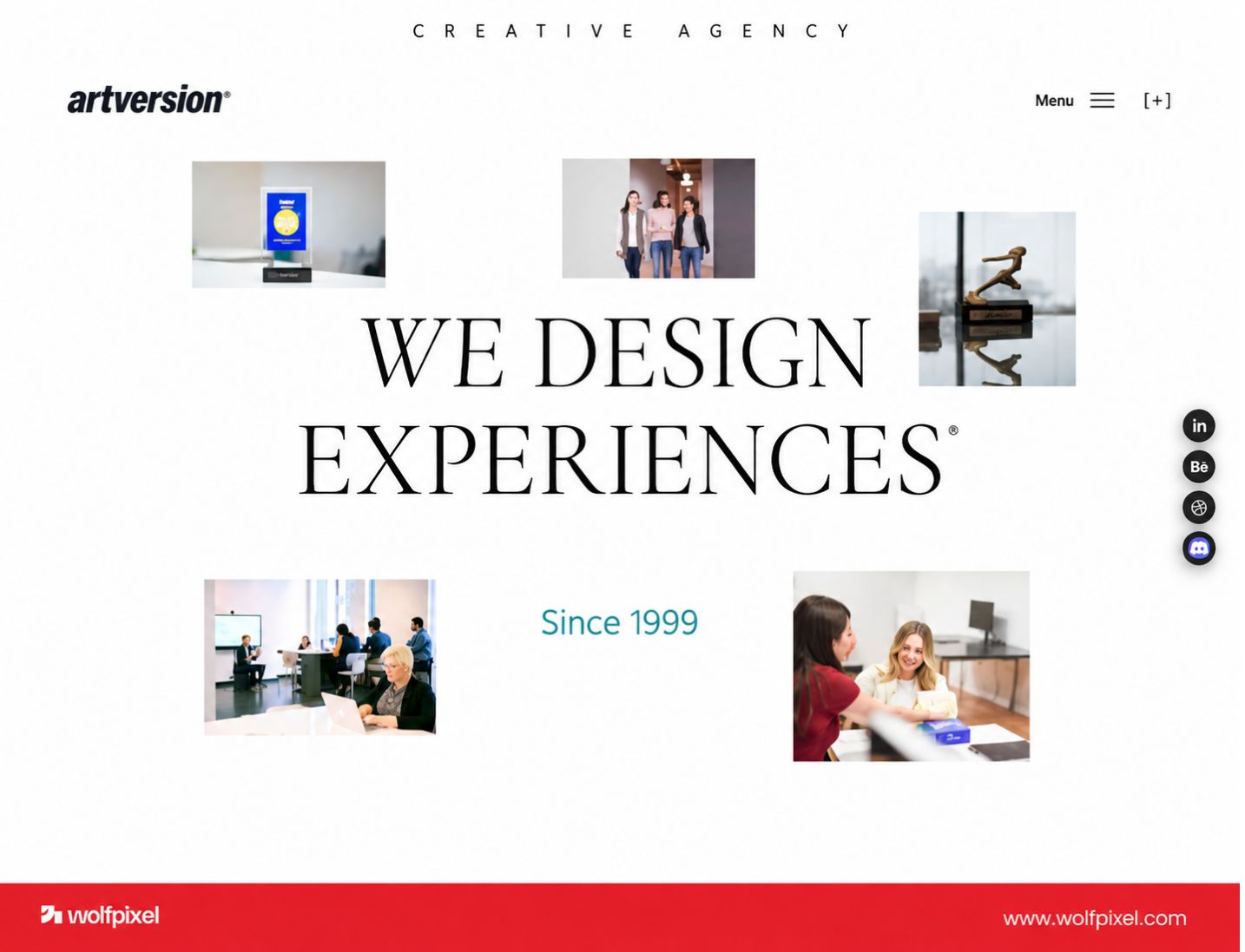
ArtVersion is a long running Chicago studio that blends branding with interactive interface design, so the work is polished and visually distinct. They are a strong fit for brands that want a product and identity that feel like one thing and stand out in a crowded market.
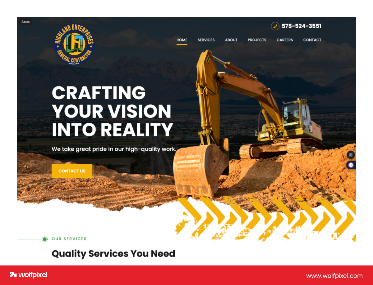
Highland is an established Chicago firm with more than 25 years of work and 300 plus products shipped, focused on enterprise design in finance, healthcare, and nonprofit. They pair user research with product development, which suits complex builds where usability and compliance both matter.
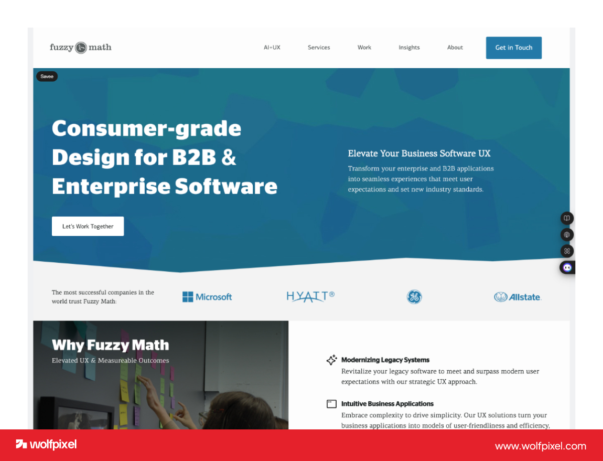
Fuzzy Math is a research first UX consultancy that grounds every design decision in user insight. If your product is dense with data or serves a niche audience, their discovery and usability work is where they earn their fee.
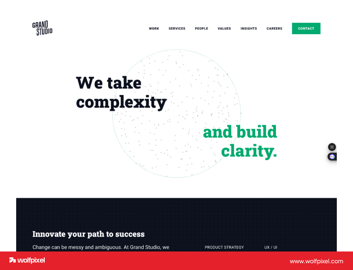
Grand Studio is a Chicago consultancy that combines UX and UI with product strategy and qualitative research. They are a good match when you need a partner to help shape what to build, not only how it looks.
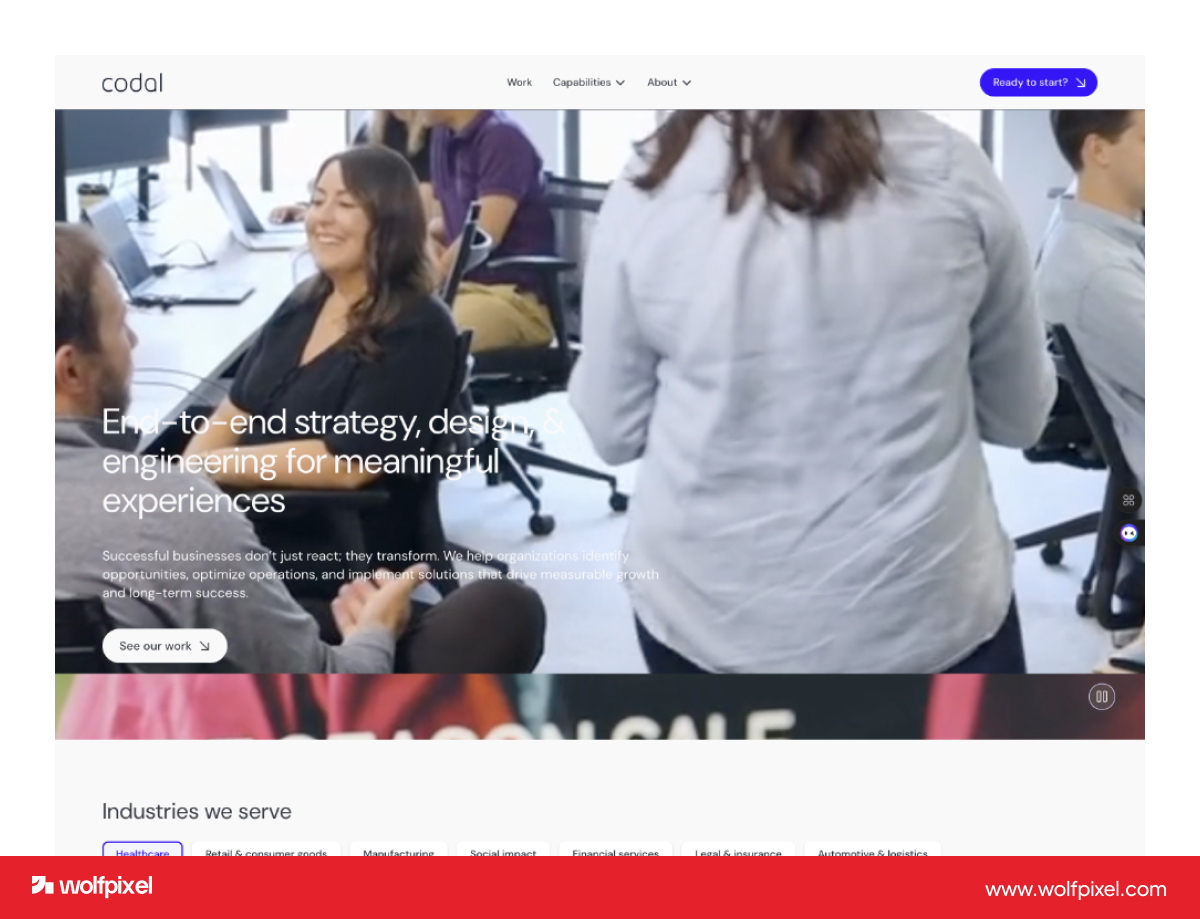
Codal brings UI and UX together with engineering, which removes the handoff gap between design and build. That makes them a fit for teams that want one partner to design and ship, especially on app and e commerce projects.
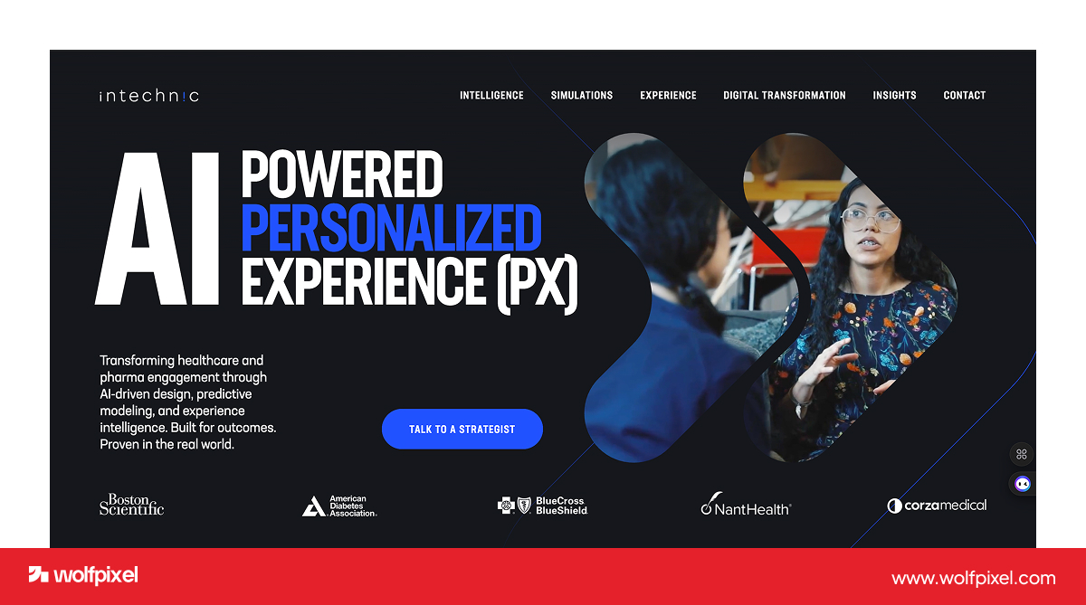
Intechnic has been designing digital products since the late 1990s and works with established enterprises on UX, UI, and custom software. Their longevity is the draw for larger organizations that want a steady, experienced hand.
Here is how the seven compare at a glance.
User interface design in Chicago typically runs 75 to 200 dollars per hour at a local agency, with full projects landing between 10,000 and 150,000 dollars depending on scope. A single landing page or a small feature sits at the low end, while a full product interface with research, a design system, and multiple flows sits at the top.
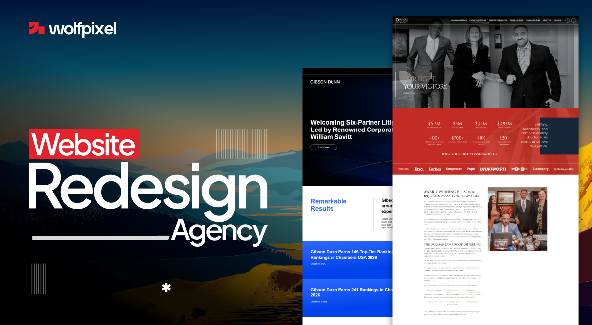
The honest takeaway is that a Chicago address adds cost, not always quality. Senior UX salaries in the city now sit between 95,000 and 135,000 dollars, and agencies pass that overhead through in their rates. Remote and subscription teams frequently deliver the same caliber of work for less, which is why more Chicago businesses now hire beyond the city each year. If your problem is an aging site rather than a brand new build, a website redesign may be the smarter place to start.
Start by matching the agency to your product and industry, because a portfolio built for retail may be wrong for a regulated healthtech app. The right fit shows up in the work, not the location pin.
Look at portfolio depth in your space. Ask to see products like yours, and pay attention to real interfaces and flows, not just marketing pages.
Ask about process and research. A strong partner starts with your users and goals, then designs, rather than jumping straight to visuals.
Check reviews and references. Verified Clutch reviews and an actual conversation with a past client tell you more than any pitch deck.
Decide local or remote. In person workshops have value, but most UI work happens in Figma and on calls now, so do not pay a premium for proximity you will rarely use.
Chicago founders work with Wolfpixel when they want senior, conversion focused UI without the wait or the downtown price tag. We are a SaaS focused studio, so we think in signups, activation, and retention, and every project is handled by a designer with five or more years of experience. We work with teams across the city and the suburbs, from the Loop and Fulton Market to Evanston and Naperville, all remotely.
Here is the pattern I see most with Chicago products. The design is rarely the real problem, the onboarding is. Founders polish the homepage while new users quietly stall on the first screen inside the app, so that is where we look first. Before we ever get on a call, our free AI UX audit scans your product and shows exactly where users drop off, with no meetings and no fluff. Between 2022 and 2026 the team earned more than 25 design badges and awards, holds a 5.0 rating across its verified Clutch reviews, and keeps live work on Dribbble and Behance across industries from real estate and automotive to fintech and PR. Clients describe the same result again and again, that we turned a confusing flow into one people move through without thinking. If you are building in Chicago and want an interface that earns its keep, that is exactly what we do.
A quick example. A B2B PR agency hired us to turn a dated site into a single focused page built to win higher value clients. We rebuilt it around their strongest proof, and after launch the client reported three real outcomes, a lower bounce rate, a longer average session, and more inquiries from high level clients seeking strategic partnerships. No vanity percentage, just the signals that actually matter, people staying, reading, and reaching out.




.svg)



.svg)

.svg)

.svg)

.svg)

.svg)
.svg)
