


01 Oct 2026
UI/UX
SaaS User Onboarding: How to Turn Signups Into Activated, Paying Users


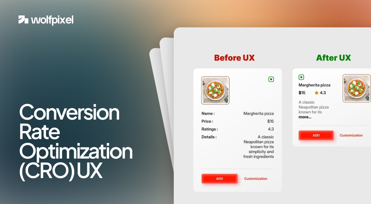
Conversion rate optimization UX is the practice of designing user experiences that guide more visitors toward a desired action, such as a signup, a purchase, or a booked call. In plain terms, it is where good design meets measurable results. You make the journey clearer and easier, and more people finish it.
I lead design at Wolfpixel, and over the past several years my team has shipped interfaces for Forex platforms, AI tools like our CareUp healthcare app, SaaS dashboards, and startup landing pages. The pattern repeats on almost every project. When we remove friction and make the next step obvious, conversions climb. This guide breaks down how that works, what to change first, and the one truth most CRO guides leave out.
Conversion rate optimization UX means using research and design to raise the percentage of people who complete a goal on your site. Your conversion rate is simply the people who take that action divided by total visitors, shown as a percentage.
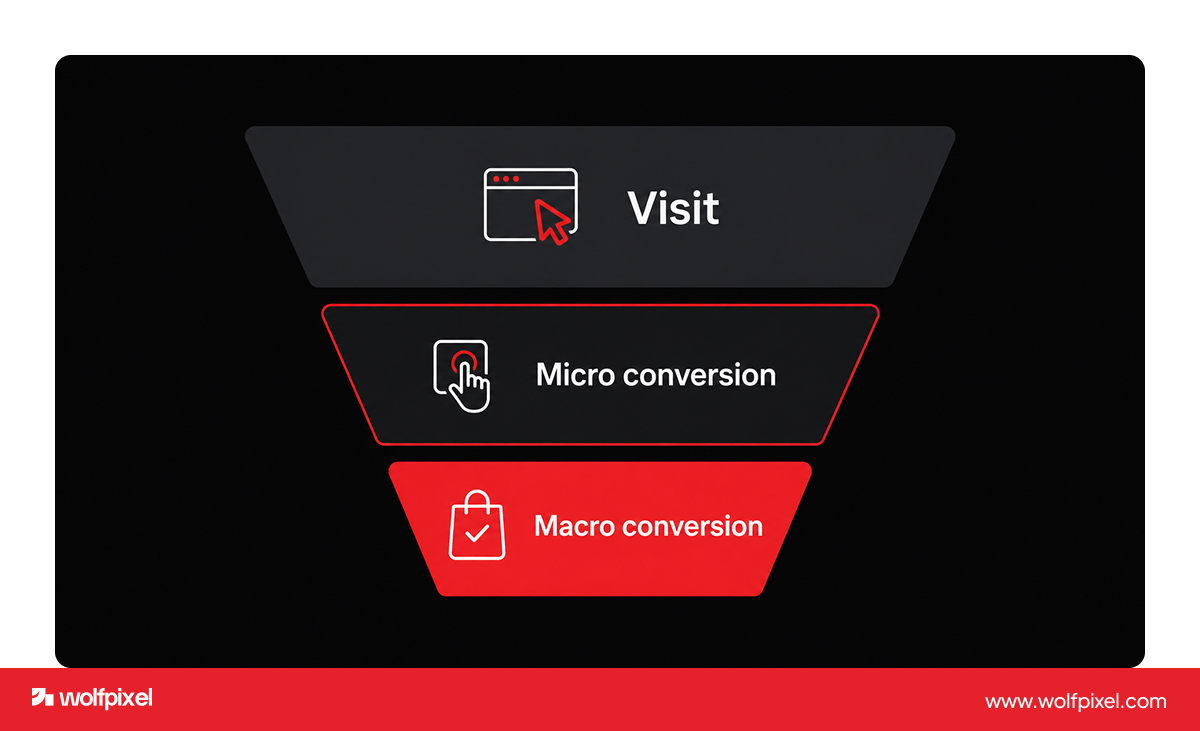
There are two levels worth tracking. Macro conversions are the big wins, like a paid signup or a finished checkout. Micro conversions are the small signals along the way, like clicking a pricing link, watching a demo, or scrolling past the fold. The small actions matter, because they show where interest builds and where people quietly give up.
The reason design carries so much weight is simple. Traffic gets people to your door. UX decides whether they walk in. You can pour money into ads, but if the page is confusing, slow, or asks for too much, the visit ends without a conversion.
One quick note on benchmarks. A good conversion rate depends heavily on your industry, traffic source, and goal, so chasing a single magic number is a mistake. Track your own rate over time and aim to beat your last baseline after each round of UX improvements.
Run your site through our free AI UX audit. It scans your pages and returns clear, actionable fixes in minutes, with no call required. Try the free UX audit.


UX and CRO are different disciplines that share one goal, which is helping people get things done with the least effort possible. UX focuses on usability, clarity, and satisfaction across the whole experience. CRO focuses on lifting a specific number, like checkout completions or form submissions.
Think of it this way. UX is the map of what your users need and how they behave. CRO is the work of smoothing the exact path they take to the goal. You need both, because a beautiful interface nobody acts on is not doing its job, and a page tuned only for clicks with a frustrating experience will not hold up over time.
This is also where the ethics line sits. Good UX conversion optimization is not about dark patterns or tricking people into clicks they will regret. It is about clarity, relevance, and timing. When the offer is right and the path is clean, the conversion feels natural to the user, and they come back. Manipulative tactics might spike a number for a week, but they cost you trust, and trust is what actually compounds.
UX design lifts conversions by removing the friction that makes people hesitate, second guess, or leave. Every point of confusion is a place where someone drops off, so the work is really about finding those points and clearing them.
A handful of forces do most of the heavy lifting, and the research backs each one up.
Here is a nuance I learned the hard way on client work. On a SaaS onboarding project, the biggest single gain came not from new copy or a prettier layout, but from cutting load time and trimming the signup form. People were willing to convert. We were just getting in their way.
The UX changes that move conversions the most are usually the simplest ones, not the flashy redesigns. Based on the projects we run at Wolfpixel, here is where I tell clients to start.
Simplify the forms. Every extra field lowers completion. Ask only for what you truly need, add autofill, and write plain error messages so people never feel stuck.
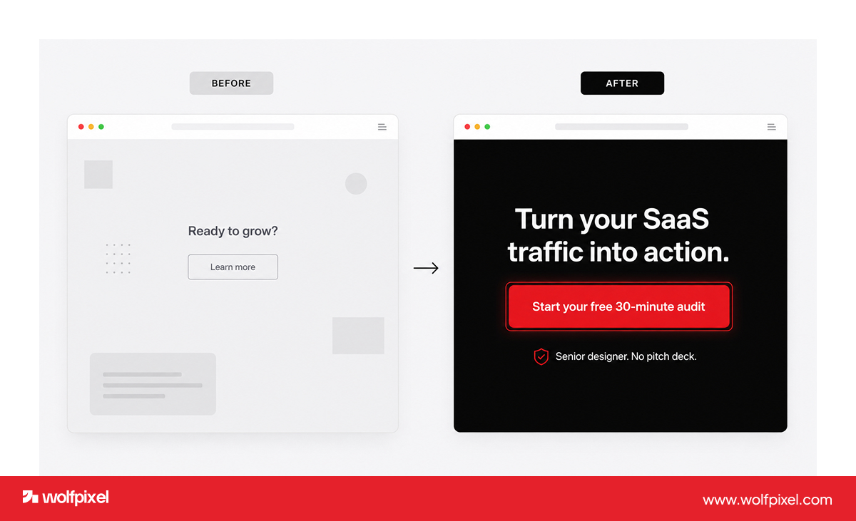
Make the call to action impossible to miss. Use a color that stands out, place it where the eye already lands, and write action language like "Start free trial" instead of "Submit." One clear primary action per screen beats five competing buttons.
Cut the clutter and set a clear visual hierarchy. Guide the eye with bold headlines, generous white space, and short scannable sections. A cluttered page hides the very thing you want people to do.
Earn trust on the page. Keep reviews, client logos, security badges, and real results near the decision point. People convert when they feel safe.
Design mobile first and fast. Test on real devices, keep buttons thumb friendly, and protect your load time. Most of your traffic is on a phone, so the phone experience is the experience.
Then test what you changed. Run A/B tests on high impact pages like pricing and checkout, watch session recordings, and keep what works. Nielsen Norman Group found that testing with as few as five users surfaces around 85 percent of usability problems, so you do not need a huge study to start.
Most conversion leaks come from a short list of repeat offenders, and almost every site we audit has at least two of them. Watch for these:
If you want a deeper look at how these play out in software specifically, we broke it down in our guide to the UX mistakes that make SaaS users drop off. Fixing even a few of these usually moves the needle faster than any redesign.
Run your site through our free AI UX audit. It scans your pages and returns clear, actionable fixes in minutes, with no call required. Try the free UX audit.
At Wolfpixel we treat conversion focused UX as a loop, not a one time redesign. We call our approach the Friction to Flow loop, and it runs in four moves.
This works because we design for people first and let the metric follow. On one recent project, a B2B agency came to us with a site that looked fine but barely converted. After we simplified the journey and clarified the value up front, they saw stronger engagement, more qualified inquiries, and a lower bounce rate.
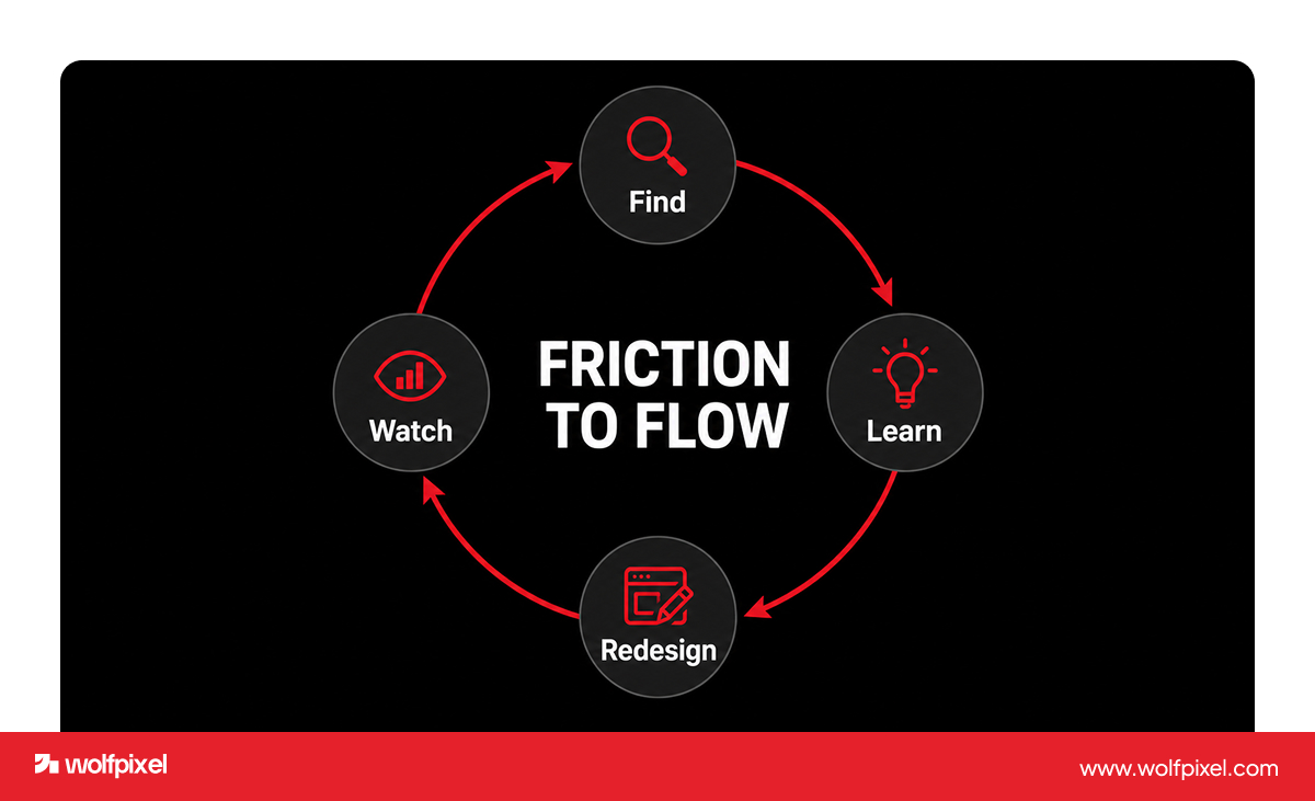
That people first approach is also why our work is rated 5.0 on Clutch, has been featured more than twenty times on Behance, and ranks among the Top 50 trending teams on Dribbble. We have shipped conversion focused design for startups and global teams across SaaS, fintech, and health tech since 2018. You can see how we run these projects on our UI/UX design service page, or explore related work in our real estate product design and website redesign guides.
Better UX does not guarantee more conversions on its own, and any guide that promises otherwise is overselling. Design removes friction, but it cannot fix a product nobody wants, a price the market rejects, or a message that never connects.
I say this to clients often. If the value proposition is unclear or the offer is wrong, a smoother button will not rescue it. The real wins happen when a genuinely useful offer meets a clean, trustworthy experience. UX is the multiplier, not the miracle. Get the offer right, then let strong design carry more people across the line.





.svg)



.svg)

.svg)

.svg)

.svg)

.svg)
.svg)
