.svg)

25-06-2026
UI/UX
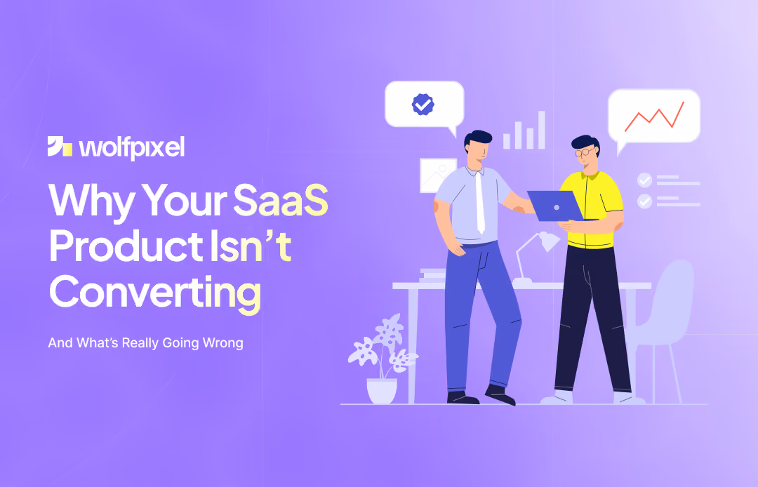
11 Best Healthcare Website Design Examples in 2026 (and the Design Principles That Make Them Work)


You build a SaaS product, put real effort into it, and finally launch. The design looks clean, the features are solid, and people are actually signing up. From the outside, it feels like things should start working.
But after a while, something doesn’t add up.
People come in, try a few things, and then quietly leave. No upgrade, no real engagement, no clear reason. Just a drop-off that’s hard to explain.
At that point, most people think it’s a marketing problem. Maybe the traffic isn’t right. Maybe the copy needs work. Maybe ads will fix it.
But when you look closely at how people behave inside the product, the issue usually isn’t marketing.
It’s what they experience after they sign up.
Here’s the thing most teams underestimate: users don’t try to understand your product.
They don’t explore deeply or read through everything. They move fast. They click around, try to get a quick sense of it, and make a decision.
If something feels confusing, even a little, they don’t push through it.
They leave.
There are too many other tools out there. If yours doesn’t feel easy right away, they’ll just try something else.
A lot of people think improving UX means making things look better. Cleaner UI, better colors, nicer layout.
That helps, but it’s not the main thing.
What really matters is how easy it feels to move forward.
When someone signs up, a few things should happen naturally. They should understand what the product does, feel like they’re making progress, and get something useful out of it quickly.
If any part of that feels slow or unclear, they lose interest.
That’s where most conversions break.
This is where things usually go wrong.
Users don’t sign up because they want to explore features. They sign up because they expect something to get better for them.

Maybe they want to save time. Maybe they want to fix a problem. Maybe they just want things to feel easier.
If that doesn’t happen quickly, they don’t wait around.
Even if your product is powerful, it won’t matter if the value feels delayed. From the user’s point of view, nothing useful has happened yet.
And once they feel that, they’re already leaving.
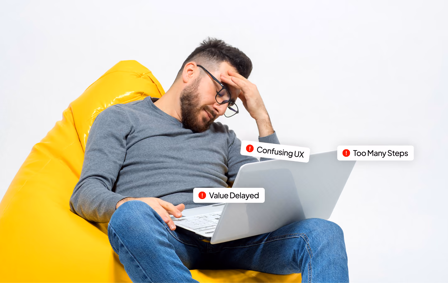
When you look at different SaaS tools, you start seeing the same problems again and again.
One big issue is onboarding. Instead of helping users get started, it often feels like something they have to complete. Too many steps, too much information, not enough progress. People don’t want a full explanation. They want to feel like they’ve already done something useful.
Another common problem is that the product doesn’t “click” right away. You open it, look around, and think, “What do I do here?” That moment of confusion is enough to lose people. Most won’t try to figure it out.
Then there’s the issue of showing too much. A lot of dashboards try to display everything at once. All features, all data, all options. Instead of feeling powerful, it feels overwhelming. When people don’t know where to start, they often don’t start at all.
Something else that gets ignored is direction. After signing up, many products don’t guide users. There’s no clear next step, no simple path. People just click around, don’t get anywhere meaningful, and leave.
And then there are the small things. Slight delays, unclear buttons, extra steps that don’t need to be there. None of these seem like a big deal on their own, but together they make the product feel harder to use than it should be.
Trust also plays a role. If the product doesn’t feel established or proven, people hesitate. Even if they don’t say it, that hesitation affects whether they upgrade.
The good news is you don’t always need to rebuild everything.
A lot of the time, it comes down to making things simpler and clearer.
When someone lands on your product, they should understand what it does without thinking too much. Not in a clever way, just in a clear way.
Onboarding should help them get a small win quickly. Not teach everything, just help them do something useful.
It also helps to remove anything that slows people down. Extra steps, unnecessary inputs, anything that feels like effort, it all adds up.
Another important shift is thinking from the user’s side. Instead of focusing on features, think about what people are trying to get done. When the product matches that, it feels easier to use.
And instead of guessing, it’s always better to look at what users actually do. Where they stop, where they leave, what they ignore. That’s where the real answers are.
From my experience working with SaaS products, the ones that truly perform don’t overwhelm users, they guide them. Everything feels intuitive, and users instinctively know the next step. They feel momentum from the start and, crucially, they experience real value almost immediately. That early clarity and quick payoff is what separates high-converting products from those that struggle to retain users.
Most teams don’t ignore UX on purpose, it just slowly becomes less of a priority. There’s always pressure to ship new features, grow faster, and bring in more users, so the focus naturally shifts there. But what happens after someone signs up often gets overlooked. Over time, I’ve seen the same issue again and again: what feels simple from the inside doesn’t feel simple to a new user. That gap is where most conversion problems begin.
At WolfPixel, ( top SaaS design company in USA) the goal isn’t just to make things look better.
It’s to make the product easier to understand and easier to use.
That starts with looking at how people actually use it. Where they get stuck, where they drop off, where things don’t make sense.
From there, the focus is on fixing those points. Sometimes it’s onboarding, sometimes it’s the flow, sometimes it’s just removing things that don’t need to be there.
Small changes in the right places can make a big difference in how a product performs.
If your SaaS product isn’t converting, there’s usually a reason hidden somewhere in the experience.
Something unclear. Something slow. Something missing.
A proper UX review helps you see that clearly, where people drop off, what’s confusing them, and what’s stopping them from moving forward.
If you want to fix conversion, that’s the best place to start.
You can reach out to Wolf Pixel for a UX audit and get a clear picture of what’s going wrong.
Getting new users isn’t the real challenge anymore. The real work begins once they’ve signed up. What matters most is guiding them forward, making sure your product feels simple, clear, and genuinely helpful right from the start. When people instantly “get it,” they don’t need extra persuasion. They keep exploring, they stay engaged, and they convert naturally, because everything just clicks.
A well-designed SaaS product often begins with a clear SaaS value proposition that drives interest during the SaaS free trial and sets the stage for effective SaaS onboarding through intuitive SaaS onboarding software. A streamlined SaaS dashboard enhances SaaS UX and reflects thoughtful SaaS product design, guiding the SaaS user journey toward higher SaaS adoption. To ensure long-term success, teams conduct a SaaS audit to identify gaps in SaaS conversion optimization and apply SaaS conversion rate optimization techniques that boost SaaS conversion while supporting a strong SaaS retention strategy. By analyzing a SaaS case study and leveraging tools like a SaaS ROI calculator, companies can measure impact, refine SaaS retention, and ultimately maximize growth through continuous improvement of the SaaS user journey
Why is my SaaS product not converting?
Most SaaS products don’t convert because users don’t understand the product quickly or don’t experience value early. Confusing onboarding, unclear messaging, and too much complexity often lead to drop-offs.
How can I improve my SaaS conversion rate?
You can improve SaaS conversion by simplifying your onboarding, reducing friction, improving clarity, and helping users achieve a quick result early in their journey.
What is SaaS UX and why is it important?
SaaS UX is the overall experience a user has while using your product. It directly affects engagement, retention, and conversion because it determines how easy and useful the product feels.
What is time-to-value in SaaS?
Time-to-value refers to how quickly a user experiences the core benefit of your product. The faster users see value, the more likely they are to convert.


.svg)


.svg)

.svg)

.svg)

.svg)

.svg)
.svg)
