


Lyvio
Brand identity & digital experience
VIEW CASE STUDY ↗

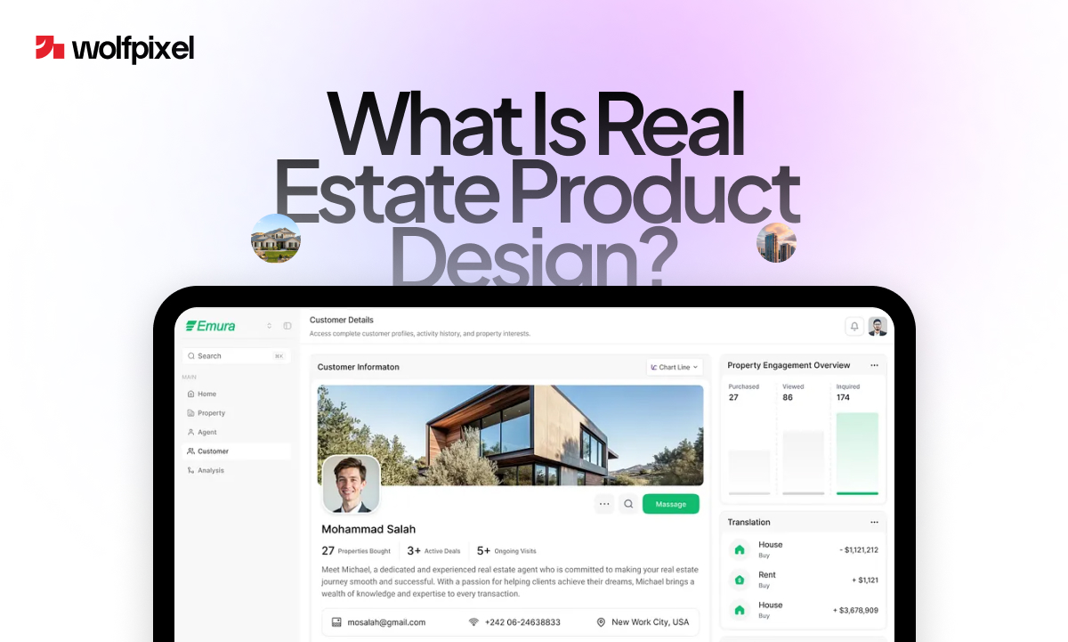
Real estate product design is the process of researching, structuring, and designing a real estate digital product (a property app, listing platform, agent dashboard, or CRM) around the real behavior of buyers, sellers, agents, and investors. It blends user research, UX flows, interface design, and brand into one product people actually want to use. It is broader than a pretty website and deeper than a logo. It shapes how someone searches a listing, books a viewing, signs a contract, and comes back next time.
If you run a proptech startup, a brokerage, or an agency serving property clients, this is the discipline that decides whether your platform converts or gets abandoned on the first screen.
Below is the full picture: what real estate product design is, why it matters more in 2026 than ever, the exact step-by-step process behind it, and how to tell good work from forgettable work. We have folded in lessons from the real estate products our own team has shipped, so you get a practitioner's view rather than a textbook one.
Real estate product design means designing the digital products people use to buy, sell, manage, or invest in property. That includes apps, listing platforms, agent dashboards, and CRMs, all built around how those users actually behave. It is not the building, the brochure, or the logo on its own. It is the software experience that ties everything together.

That distinction matters, because the word "product" gets used three different ways in this industry, and confusing them leads to hiring the wrong help. Here is how to tell them apart.
When a developer says "real estate product," they often mean a physical building or a unit type. When a marketer says it, they sometimes mean a brochure or a logo. When we say real estate product design, we mean the design of a digital product: the software a person opens to find a home, list one, manage a portfolio, or run a brokerage.
That digital product can be a lot of things:
Real estate product design is the work of making any of those genuinely usable. It starts long before anyone picks a color. It starts with the question every strong product answers: who is this for, and what are they trying to get done?
A first-time buyer, a busy agent juggling forty listings, and an institutional investor reading a yield report are three completely different people. Designing for all of them on one screen is the hard, valuable part, and it is exactly where generic templates fall apart.
Planning a property app, listing platform, agent dashboard, or redesign? Book a free 30-minute call with a senior designer. We’ll review your brief, show you relevant real estate work, and recommend the right package, no pitch deck, no obligation.


Here is the problem most property businesses still have not solved.
Buyers have already moved online, completely. According to the 2026 National Association of Realtors (NAR) Generational Trends report, 52% of buyers found the home they purchased through an online channel, and 46% said looking online was their very first step. Around 71% of buyers find properties on mobile devices, and the global proptech market is on track to grow from roughly $44.6 billion in 2026 to over $104 billion by 2034. People are not drifting toward digital property tools. They already live there.
Now the harder truth: most platforms still are not built for them. The same NAR data shows 56% of buyers said finding the right property was the hardest part of the process, and buyers searched for a median of ten weeks before purchasing. That is not enthusiasm. That is friction.
Confusing filters, slow mobile pages, missing neighborhood context, and clunky agent tools quietly bleed leads every single day. And it is far cheaper to catch those problems in design than to patch them after launch. In our own projects, the issues that surface in a one-hour usability test are the same ones that would otherwise cost weeks of developer time to unpick later.
That is what real estate product design solves. Done well, it turns a frustrating ten-week slog into a guided, confident path, for the buyer and for the agent on the other side of the screen. The product becomes the salesperson. A clear, trustworthy interface signals professionalism in seconds and keeps people coming back. That return loop is how property platforms grow without burning the marketing budget.
Strong product design rests on four pillars. Here is how each one looks when the product is built for property.
1. User research and empathy. Before a single screen is drawn, you learn who you are designing for (buyers, sellers, agents, investors) and where they get stuck. In real estate that means understanding what a buyer is really evaluating, such as neighborhood quality, commute, and schools, and what an agent needs to close faster.
2. Information architecture and flow. Real estate products carry enormous amounts of data: listings, photos, documents, messages, and financials. The second pillar is organizing all of it so the right thing appears at the right moment, and a search-to-viewing-to-offer journey feels like one smooth path instead of a maze.
3. Interaction and interface design. This is the visible craft: layouts, typography, spacing, components, and the small interactions that make a filter, a map, or a mortgage calculator feel effortless. It has to look right and work on a phone in someone's hand at an open house.
4. Brand and trust. Property is the biggest purchase most people ever make, so trust is not optional. The fourth pillar weaves your brand, including your real estate logo design and visual identity, into the product so it feels credible, consistent, and worth handing over personal and financial details to.
Skip any one pillar and the product wobbles. A gorgeous interface with bad architecture frustrates people. Great research with a weak brand fails to convert. The job of real estate product design is holding all four together.
This is the heart of it. Here is the process we run for property clients, step by step. The names of the phases change between agencies, but the logic does not.
Every project starts here. We deep-dive into your business goals, your users, and your technical constraints, then turn that into a clear project roadmap. For a real estate product, that means mapping the distinct people you serve and the one or two outcomes that matter most: more qualified leads, faster closings, or higher agent adoption. Get this wrong and everything downstream is beautifully designed in the wrong direction.
Next we structure the product. What are the core screens? How does a buyer move from a search, to a saved property, to a booked viewing? How does an agent move from a new lead to a closed deal? We sketch these flows before any visual design, because fixing a broken flow on paper costs minutes while fixing it after development costs weeks.
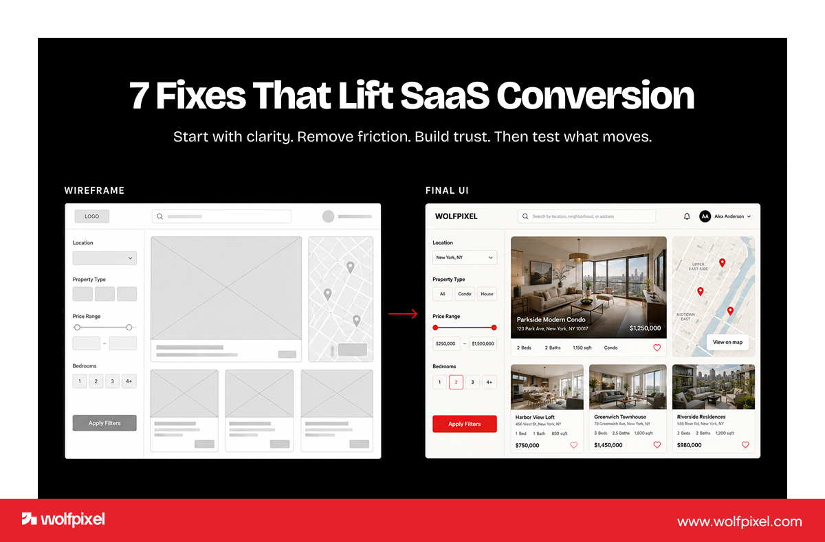
Now structure becomes something you can click. We build wireframes, the skeleton of the product, then interactive prototypes that let you and real users test the experience early. Nothing fancy yet. The goal is to learn, not to impress. This is where the bad ideas die cheaply.
This is where it starts to feel real. Colors, typography, spacing, imagery, and components come together into a high-fidelity design, and this is where your real estate web design and brand identity lock in. Good visual design here is not only attractive. It is accessible, fast on mobile, and consistent across every screen. For many clients this stage also covers the real estate website design and logo work, so the marketing site and the product speak the same language.
Designs get tested with real users and refined. We watch where people hesitate, mis-tap, or give up, then fix it. We share progress early and often, using short Loom walkthroughs and live design reviews, so feedback comes in fast and nothing gets built in the dark.
Real estate products especially benefit here. The difference between a 4-tap and a 7-tap path to "book a viewing" is the difference between a lead and a bounce.
A good design team does not just throw files over the wall. We deliver developer-ready assets, documented design systems, and design tokens, then stay close during the build to solve edge cases and keep the final product true to the design. For teams on Webflow or a component-based front end, the handoff is faster because the design is built to ship.
Launch is the start, not the finish. Once it is live, you watch the real numbers (sign-ups, search completion, viewings booked, and agent adoption) and keep improving. The metrics worth tracking for a property product usually include activation rate, search-to-saved-listing rate, viewing-request conversion, and, for agent tools, daily active use. Real estate product design is a loop, not a one-time deliverable.
Three things separate a property product that merely looks finished from one that earns trust at scale, and most teams treat all three as afterthoughts.
The first is accessibility. A listing platform should be usable by someone navigating with a keyboard, a screen reader, or low vision, which also happens to align with WCAG guidance that many organizations now treat as a baseline. Accessible design widens your audience and reduces legal risk, and it almost always makes the interface clearer for everyone.
The second is performance. With most buyers searching on a phone, slow image-heavy listing pages quietly cost you leads. Designing for fast load, lazy-loaded media, and lightweight maps is a design decision as much as an engineering one. A clean layout that loads in a second beats a richer one that stalls.
The third is data privacy and document handling. Real estate products collect sensitive information: income, identity documents, and financial details. The interface should make it obvious why data is being requested, where it goes, and how it is protected. Clear consent, visible security cues, and tidy document flows are part of the design, not a legal footnote bolted on later.
Planning a property app, listing platform, agent dashboard, or redesign? Book a free 30-minute call with a senior designer. We’ll review your brief, show you relevant real estate work, and recommend the right package, no pitch deck, no obligation.
People search these terms as if they are the same thing. They overlap, but they are not, and knowing the difference saves you money.
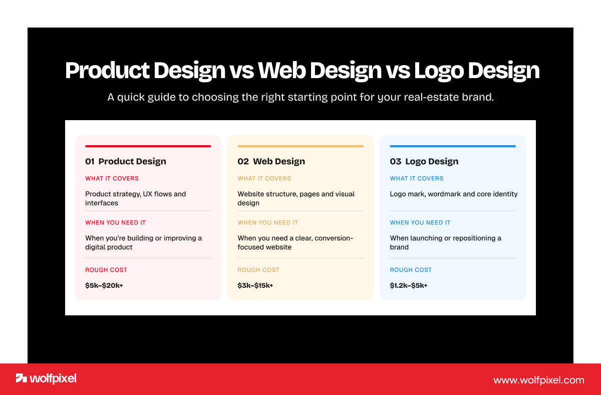
Real estate product design is the broadest. It covers the whole digital product: research, flows, UX, UI, and the design system behind an app or platform. It is what you need when you are building software people use, not just visit.
Real estate web design and real estate website design focus on the marketing or listing site, the public-facing pages that attract and convert visitors. A brokerage that needs leads usually starts here. Commercial real estate website design is a specialized branch of this, built for the dense data, tenant information, and longer sales cycles of commercial property.
Real estate logo design is one piece of brand identity, the visual mark that makes you recognizable. It lives inside the bigger product and web design work, but on its own it will not move a single lead.
Here is the simple rule we give clients. If you need to attract and convince, start with web design and brand. If you need people to do something complex, such as search, manage, or transact, you need full product design. Most growing property businesses eventually need both, which is why working with one UI/UX design agency for real estate that handles the whole stack keeps it consistent and fast.
Theory is easy. Let us make it concrete. Good real estate product design tends to share a few traits, and we have seen each one pay off in the property products our team has shipped.
It is built mobile-first. With roughly seven in ten buyers searching on a phone, the small screen is the real screen. When we designed a real estate landing experience for a property marketing client, the entire layout was shaped around what works in a thumb's reach, not a desktop mockup shrunk down later.
It surfaces the right data at the right moment. Buyers care most about fit, including neighborhood, commute, and schools, yet most platforms bury that context. The strongest real estate products bring it forward. On Emura, a real estate management platform we designed, the priority was making dense property and tenant data scannable instead of overwhelming.
It uses AI where it removes work, not where it shows off. AI in real estate is genuinely useful for matching, valuing, and recommending, but only when it disappears into a clean flow. On Lyvio, an AI-powered real estate product, the design goal was to make the intelligence feel like help, not homework. The same principle applies to newer AI features like automated valuations, smart search, and conversational assistants: the design job is to make the output trustworthy and easy to act on, not to add another panel of complexity.
It earns trust visually. Consistent branding, clear pricing, real photography, and an interface that does not feel cheap. People hand over their biggest financial decision here, so the product has to look like it deserves that.
Explore the work behind clearer real-estate experiences.
Brand identity & digital experience
VIEW CASE STUDY ↗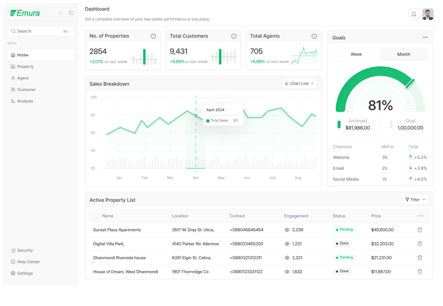
AI-powered real-estate product
VIEW CASE STUDY ↗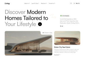
Conversion-focused web experience
VIEW CASE STUDY ↗After enough projects you start to see the same avoidable errors. These are the ones worth flagging.
The most common mistake is designing for the company instead of the user, packing the interface with every feature the team is proud of while the buyer just wants to filter listings without rage-quitting. Strong real estate product design ruthlessly protects the user's path.
The second is treating brand and product as separate projects. When the logo, the marketing site, and the app are designed by three different vendors, the result feels stitched together and trust drops. Keeping real estate logo design, website design, and product design under one roof keeps the experience coherent.
The third is skipping testing to "save time." Every untested assumption you ship is a bet you might be wrong, and in real estate a wrong bet means a lost lead on a six-figure transaction. Testing early is the cheapest insurance you will ever buy.
A fourth one we see often: launching and walking away. Teams pour everything into the first release, then never look at how real users behave once it is live. The products that keep winning are the ones whose owners read the analytics, run small tests, and keep refining month after month.
If you are hiring out, a few things separate a real partner from a vendor.
Look for real estate experience you can actually see: named projects, live products, case studies, and independent reviews on Clutch, Behance, and Dribbble, not just claims. Look for a clear, named process with real turnarounds, because vague "we will circle back" timelines are where projects die. Look for a team that handles the whole stack, including research, UX, UI, brand, and developer-ready handoff, so you are not coordinating four vendors. And look for honest communication, because progress shared early and often beats a big reveal at the end every time.
One more thing worth checking: ask who actually does the work and whether you can see their portfolio. A strong agency will happily put you in front of the designer who will be on your project, not just a salesperson.
At Wolfpixel, real estate is one of the industries we design for most, with a process built around discovery, fast Figma design sprints, collaborative reviews, and a clean developer handoff, backed by a 5.0 rating on Clutch and work featured across Behance and Dribbble. For smaller needs, a focused landing page can ship in 48 hours. Larger product UI typically runs 7–14 days, and full design systems 14–30 days.





.svg)



.svg)

.svg)

.svg)

.svg)

.svg)
.svg)
