



// About project
About the Project
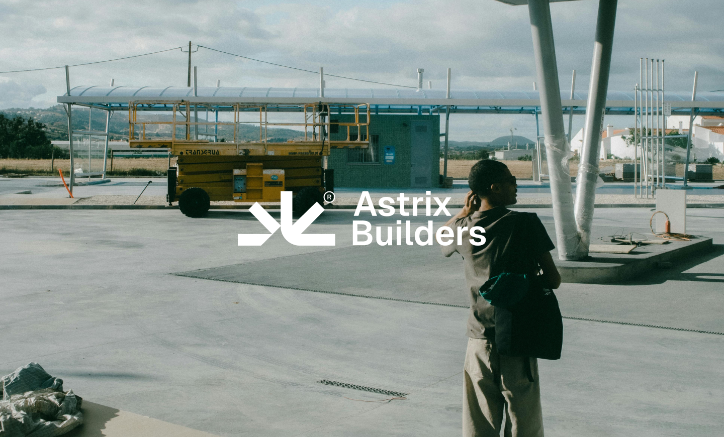
Astrix Builders is a modern construction brand created to communicate precision, reliability, and forward-thinking engineering. The identity brings together a structural symbol, a disciplined visual system, and a confident tone designed to help the company stand apart in a highly traditional market.
Challenge & Solution
Construction brands often rely on predictable visuals that make them difficult to distinguish. The solution was a cohesive identity built around architectural geometry, strong contrast, and flexible applications—balancing technical credibility with a more contemporary and memorable presence.
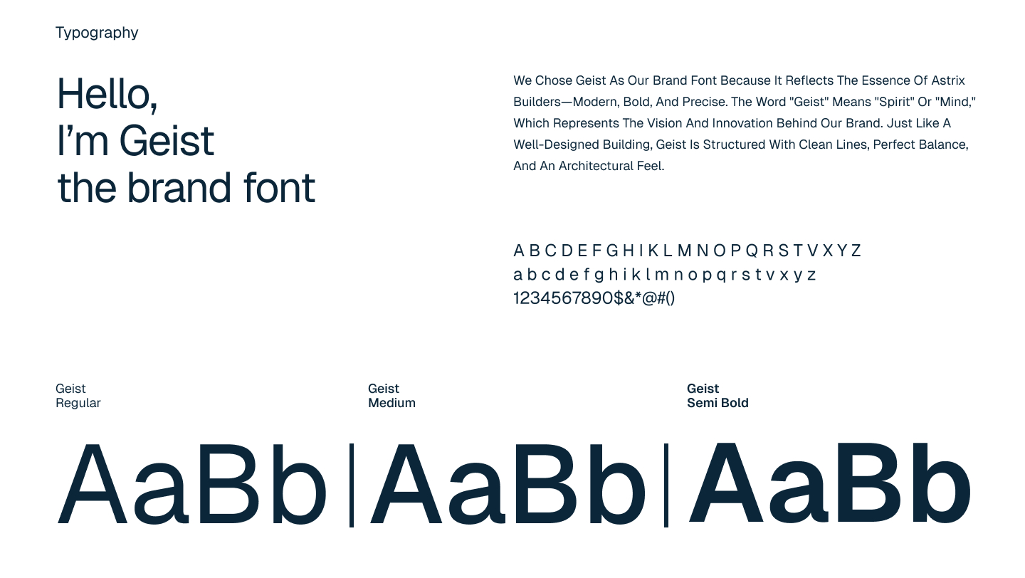
Brand Identity System
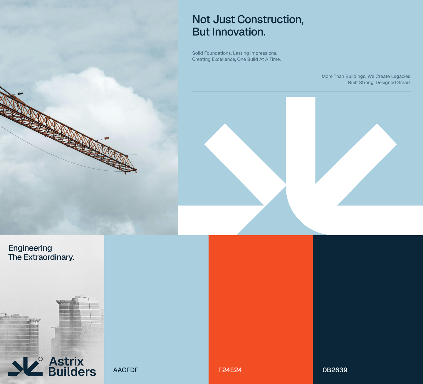
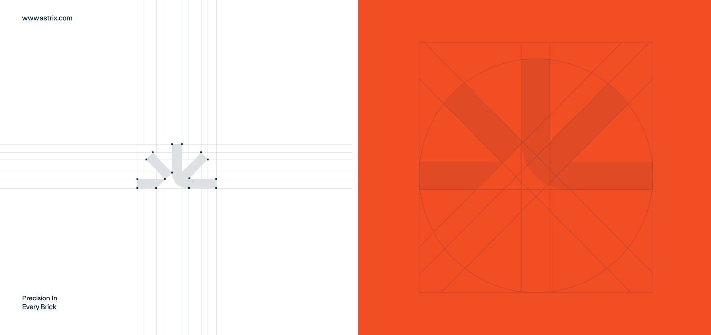
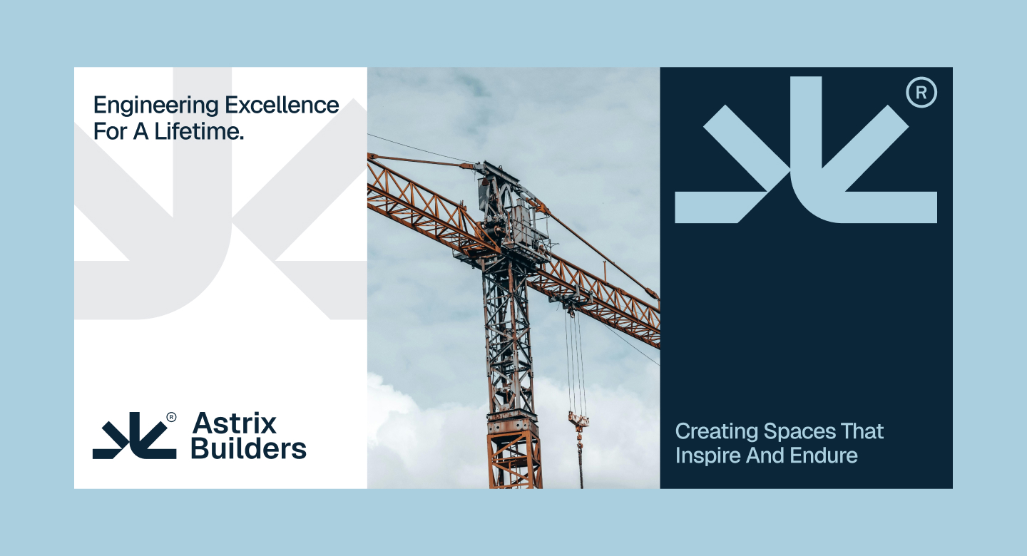
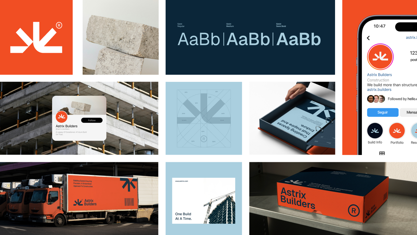
The system combines a precise geometric mark, Geist typography, and a distinctive palette of sky blue, high-visibility orange, and deep navy. Together, these elements create consistent recognition across editorial, digital, and physical brand touchpoints.
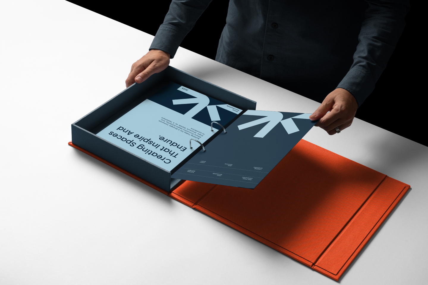
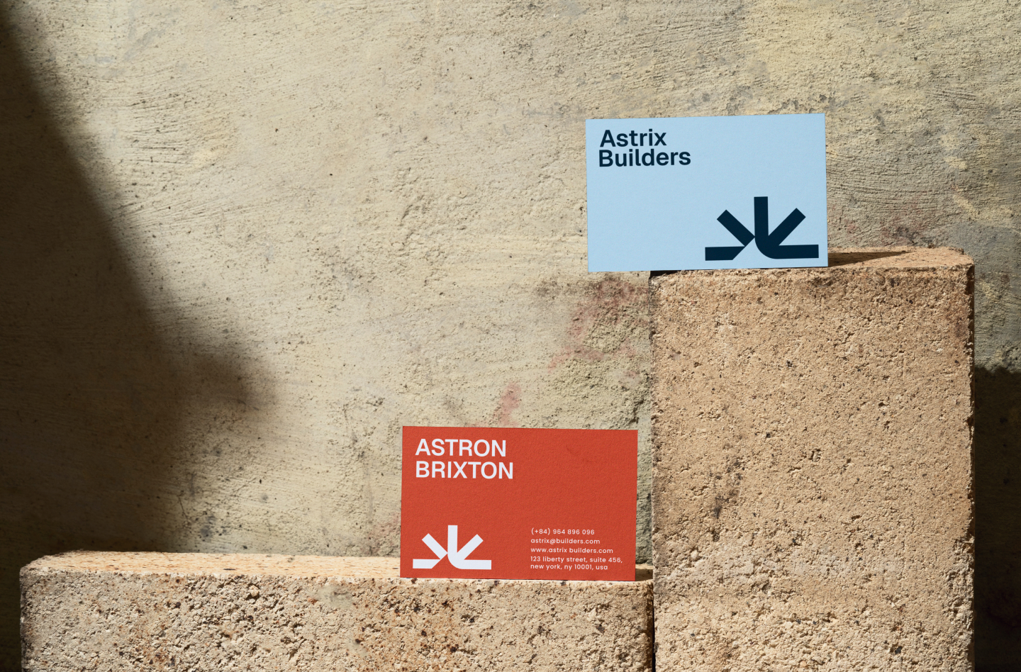
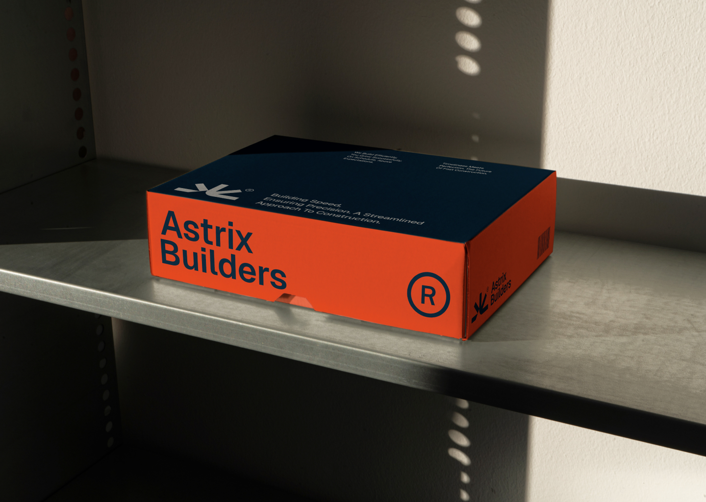
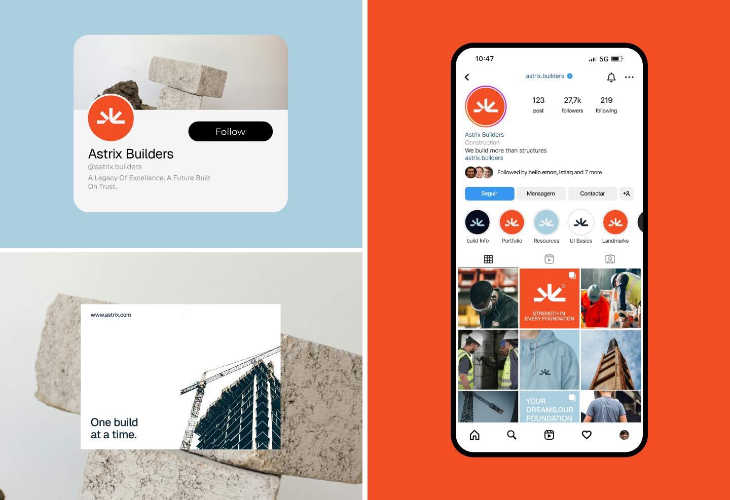
Brand in Action
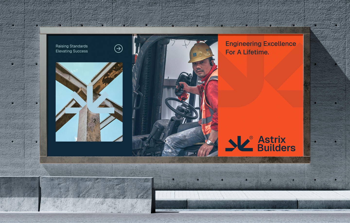
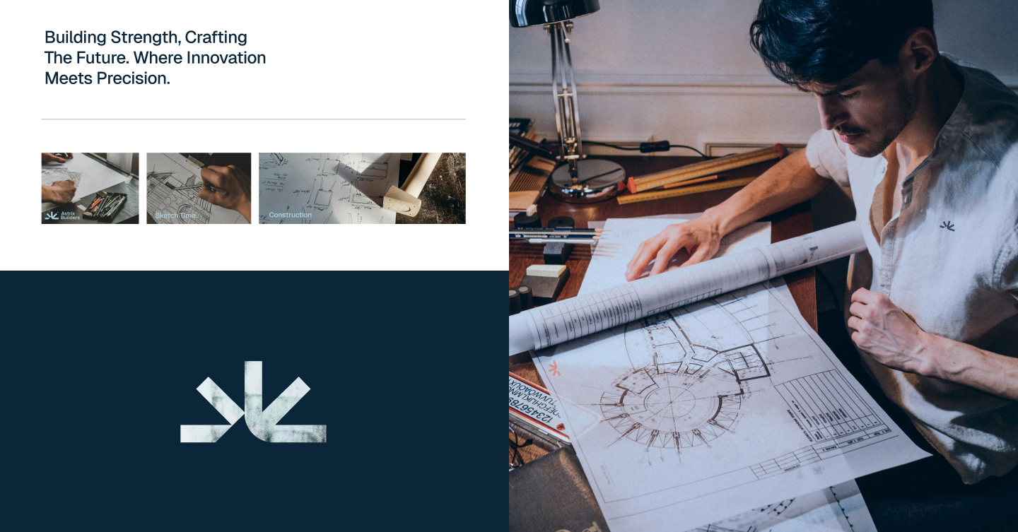
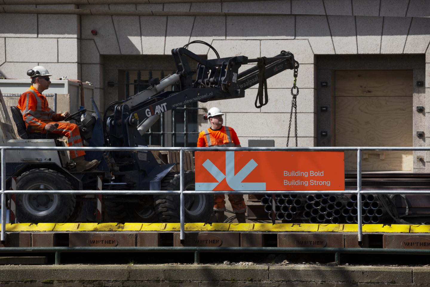
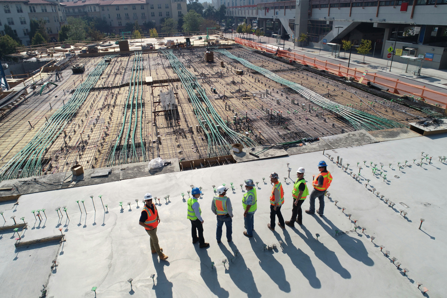
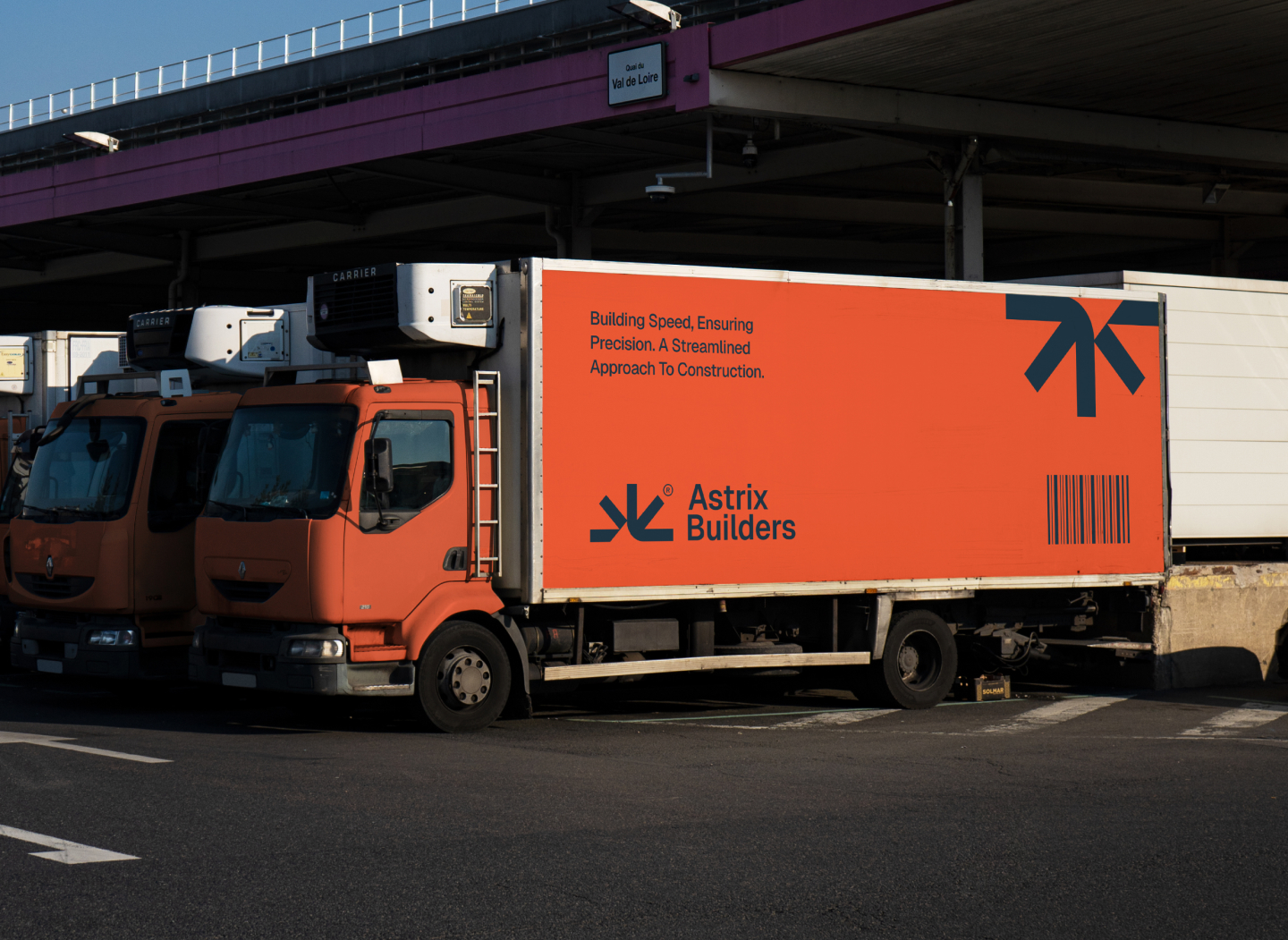
The identity was extended across construction environments, on-site communications, team imagery, vehicle graphics, and campaign materials—showing how the system remains clear and recognizable at every scale.
Result
The final identity positions Astrix Builders as a confident, modern construction company with a visual system built for long-term growth. It communicates engineering precision and dependable execution while giving the brand a distinctive presence across both operational and customer-facing touchpoints.
Related services and case studies
Explore Wolfpixel’s Brand Identity. See the related Happy Tail case study, or browse all Wolfpixel case studies.
Bring us the brief, We bring back the scope
Skip the call. Drop a one-pager — what your client needs, the metric you’d move, the timeline. Within 4 business hours, we send back a tailored package quote, the 3 cases closest to your client’s problem, and the next available slot.


.avif)
.avif)

.avif)

.avif)
.avif)
.avif)
.avif)
.avif)

.svg)



.svg)

.svg)

.svg)

.svg)

.svg)
.svg)

