


12 Oct 2026
Brand Identity
Brand Guidelines: What to Include, Real Examples, and How to Build Yours


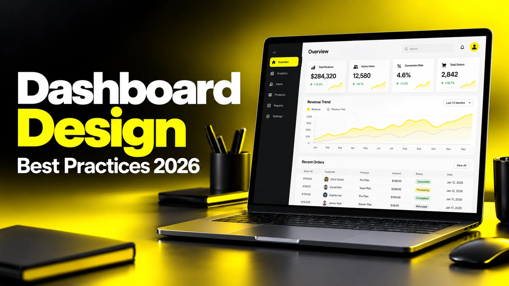
Dashboard design best practices start with decisions, not data. Identify the specific choices your users need to make, surface the two or three metrics that drive each one, and structure the screen so the most important answer is visible without scrolling, filtering, or interpretation. Then choose chart types that match the question being asked, keep the visual system consistent, and validate the result with real users on real data before you scale it.
Most dashboards fail quietly. Nobody files a bug. Nobody complains in a QBR. The dashboard just sits there, opened on Monday morning out of habit, scanned for four seconds, and closed. Meanwhile the person who needed the answer opens a spreadsheet instead.
That failure mode is expensive because it is invisible. Teams spend months on pipelines, warehouse modeling, and front-end engineering, then ship a screen that displays every number the business tracks and answers none of the questions the business actually asks. The data is correct. The design is not.
After enough dashboard projects, one pattern becomes hard to ignore. The difference between a dashboard people rely on and one they abandon is almost never chart library quality or data freshness. It is whether the design started from a decision or from a schema. Dashboards built from schemas show you what exists. Dashboards built from decisions show you what to do next.
This guide covers dashboard design best practices as they apply in production. It walks through the discovery work that prevents rework, the layout logic that makes screens scannable, the data visualization best practices that keep charts honest, the UI system decisions that keep a product coherent as it grows, and the patterns specific to SaaS dashboard design, KPI dashboard design, and admin dashboard design. It also covers what founders and product leaders actually need commercially: what drives cost, how to evaluate a design partner, and which mistakes are most expensive to fix later.
Planning a product dashboard? Explore our web app and dashboard design services.
A dashboard is not a data display. It is a decision support tool that happens to use data. Once you accept that framing, most dashboard design principles follow logically.
The test is simple. Open your dashboard and ask: what would a user do differently after looking at this? If the honest answer is "nothing, they would just know more," you have built a report. Reports are read occasionally and deliberately. Dashboards are glanced at repeatedly and habitually, and that difference changes every design decision downstream.
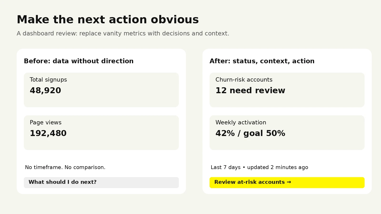
A dashboard should show what to do next, not only what happened.
Strong dashboards answer these in order, and the layout should reflect that order:
Is anything wrong? A status read the user can get in under five seconds.
How wrong, and since when? Context, comparison, and trend.
What do I do about it? A path to the detail, the segment, or the action.
Weak dashboards answer only the middle question. They present accurate trend lines with no baseline for "good," no threshold for "act now," and no route to the underlying records.
Different users need structurally different screens. Building one dashboard for all of them is the most common root cause of a cluttered interface.
| Dashboard type | Primary user | Time horizon | Refresh cadence | Design emphasis |
|---|---|---|---|---|
| Strategic | Founders, execs, board | Quarters and years | Daily or weekly | Few metrics, heavy context, goal comparison |
| Operational | Support, ops, on-call | Minutes and hours | Real time or near real time | Status clarity, alerting, high scannability |
| Analytical | Analysts, growth, data teams | Weeks and months | Daily | Filtering, segmentation, drill-down depth |
| Embedded / customer-facing | Your product's end users | Varies by workflow | Matches product usage | Onboarding, self-explanation, brand alignment |
| Admin | Internal staff, account managers | Immediate | On demand | Search, bulk actions, permissions, record access |
An executive dashboard with twelve filters is a failed executive dashboard. An analytical dashboard with no filters is a failed analytical dashboard. Visual polish applied to the wrong structure saves neither.
When a dashboard underperforms, the reflex is to add. Another chart, another breakdown, another tab. This almost always makes things worse, because the real cost of a dashboard is the interpretive effort each element demands, not the screen space it occupies. Every additional chart makes the important ones harder to find. Restraint is the feature.
Share your metric list, decision inventory or existing dashboard. We can discuss what to improve and help you define the scope.


The most expensive dashboard mistakes are made before anyone opens a design tool. They are made in the requirements conversation, when a stakeholder lists metrics and the team writes them down.
Metric lists are a trap. People name metrics they have heard of, metrics that already sit in the warehouse, and metrics that feel responsible to track. They rarely name the decision underneath. Your job in discovery is to work backwards from the decision to the metric.
Step 1 — Interview the people who will actually open it. Not the requester. The person whose Monday morning it changes. Five to eight thirty-minute conversations can reveal early patterns. Continue research if new findings keep emerging. Ask what they check today, where they check it, and what they do immediately after.
Step 2 — Watch the workaround. Almost every dashboard project has a shadow predecessor: a spreadsheet, a saved SQL query, a Slack channel where someone posts numbers manually. That artifact is your highest-value research input, because it shows what people needed badly enough to build themselves.
Step 3 — Build a decision inventory. This is the single artifact that keeps scope honest. It converts vague requests into testable requirements.
| Decision | Who makes it | Frequency | Metric that informs it | Threshold for action | Action taken |
|---|---|---|---|---|---|
| Escalate a churn-risk account | CS manager | Weekly | Usage change vs. 30-day baseline | Drop over 40% | Open account record, schedule call |
| Pause an ad campaign | Growth lead | Daily | CAC by channel vs. target | Above target 3 days running | Reallocate budget |
| Add support capacity | Support lead | Hourly | Queue depth and wait time | Wait over SLA | Page backup staff |
If a metric cannot be tied to a row in this table, it does not belong on the primary view. It can live in a secondary view, an export, or nowhere.
Step 4 — Lock metric definitions in writing. "Active users" means four different things to four people in the same company. Agree on the definition, time window, exclusions, and source table before design starts, then publish those definitions inside the interface as tooltips or a linked glossary. Ambiguous definitions are the leading cause of dashboards losing credibility after launch: two people quote different numbers in the same meeting, and both stop trusting the tool.
Step 5 — Rank ruthlessly, then cut. Force stakeholders to order metrics rather than group them into tiers. Grouping produces twenty "critical" metrics. Ordering produces a real hierarchy, and that hierarchy becomes your layout.
When a stakeholder insists on including a metric, ask: "If this number changed by 20% overnight, what would you do tomorrow?" If there is no answer, the metric is interesting rather than actionable. Interesting metrics belong in an analytics tool. Actionable metrics belong on the dashboard.
If this number changed by 20% overnight, what would you do tomorrow?

Layout is where dashboard design principles become visible. A well-organized dashboard with plain styling outperforms a beautiful one with no hierarchy, every time.
Borrow the structure from journalism. Lead with the conclusion, follow with supporting context, end with the raw detail.
Top zone: headline status. Three to five KPI cards with value, comparison, and trend direction. This zone answers "is anything wrong" without interaction.
Middle zone: the why. Time series, breakdowns by segment or channel, comparison against goal. This zone answers "how wrong and since when."
Bottom zone: the what. Sortable tables, record lists, drill-down entry points. This zone answers "what do I do about it."
Users scan in a rough F or Z pattern on data-dense screens, which means the top-left carries the most weight. Put the metric that most often triggers action there. Not the metric that is most flattering.
The primary status read must fit above the fold on your most common screen size, without horizontal scrolling. Below that, scrolling beats cramming. Cramming produces tiny type, dense charts, and unusable touch targets.
What does not work is the "everything on one screen" mandate. It is usually a proxy for avoiding hierarchy decisions, and it reliably produces the least usable version of the product.
Users think in workflows. Warehouses think in tables. Group cards and charts by the question they answer (acquisition, activation, retention, revenue) rather than by which system supplied the data. When a section header names a business concept instead of a data source, comprehension improves immediately.
Use a consistent grid. A 12-column grid with a fixed gutter keeps cards aligned across breakpoints and prevents the ragged look of hand-placed widgets.
Give charts room. Whitespace around a chart is what makes the chart readable. Tight packing forces the eye to work.
Cap primary metrics at five. Beyond that, none of them read as primary.
Use progressive disclosure. Secondary breakdowns belong behind a click, hover, or expandable panel.
Keep filters in one predictable place. Top bar or left rail, never both. Show active filters as removable chips.
Design the drill path explicitly. If nothing is clickable, users treat the dashboard as a dead end and go elsewhere for detail.
Shrinking a desktop dashboard rarely works. On mobile, drop to a single column, prioritize two or three metrics, and replace wide tables with stacked cards. Executives check status on phones; analysts investigate on laptops. Design the mobile view for the check, not the investigation.
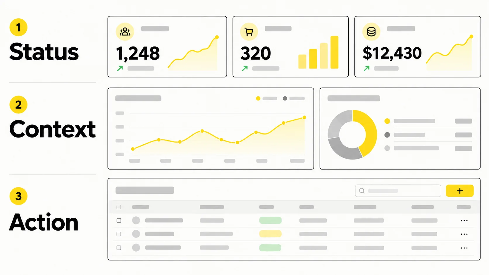
Chart selection is not a style choice. Each chart type encodes data through a specific visual channel, and human perception reads some channels far more accurately than others. Position along a common scale is read most accurately, length next, while angle, area, and color saturation are read poorly. This is why bar charts work and pie charts usually do not.
| The question | Best chart | Notes |
|---|---|---|
| How do categories compare? | Horizontal bar chart | Sort by value, not alphabetically. Horizontal handles long labels |
| How has this changed over time? | Line chart | One to four lines maximum before it becomes spaghetti |
| What is the composition? | Stacked bar or treemap | Pie only for two or three slices with obvious differences |
| Are we on track to goal? | Bullet chart or progress bar | Shows actual, target, and range in minimal space |
| How is this distributed? | Histogram or box plot | Averages hide the spread that usually matters |
| Is there a relationship? | Scatter plot | Add a trend line only when the relationship is real |
| What is the current value? | KPI card with sparkline | A single number plus direction beats a chart |
| What are the individual records? | Sorted data table | Tables are underrated. Precise values need precise display |
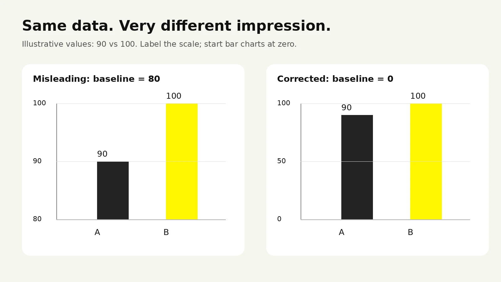
Start bar chart axes at zero. Truncated bars exaggerate differences. Line charts may use a narrower range when variation is genuinely small, but label the axis clearly.
Never use 3D or dual y-axes. Both distort comparison and invite false correlation.
Show comparison, always. Pair every KPI with a prior-period value, a goal, or a benchmark.
Label the timeframe on every chart. "Last 30 days" and "month to date" are not the same claim.
Include sample size on rates. A 100% conversion rate on two visitors is not a success story.
Order categories meaningfully. By magnitude for comparison, chronologically for time, by sequence for funnels.
Split your palette into two distinct roles. Semantic colors carry fixed meaning: one color for positive, one for negative, one for warning, one for neutral. Categorical colors distinguish series with no inherent good or bad. Mixing the two produces charts where green means both "revenue" and "good," and users misread them.
Keep categorical palettes to six colors or fewer. Beyond that, adjacent hues become indistinguishable and legends require constant reference. If you need more series, aggregate the tail into "Other" and let users drill in.
Never encode meaning in color alone. Red-green pairings are the most common failure for users with color vision deficiency. Pair color with an icon, a directional arrow, a text label, or a pattern.
The most valuable addition to a chart is often a single line of text. A reference line for target, a shaded band for the previous period, or an annotation marking a pricing change or outage turns a chart from data into explanation. Annotation is the cheapest way to make a dashboard feel authored rather than generated.
Dashboard UI design is systems work. A dashboard is not one screen, it is a family of screens that will grow for years. The decisions that matter are the ones that stay consistent as new charts, tabs, and teams get added.
Numbers behave differently from prose, and most type choices ignore this.
Use tabular figures. Fixed-width digits keep numbers aligned in columns and stop values from jittering as they update. Most quality typefaces offer this as an OpenType feature. Turn it on for every table and KPI card.
Right-align numeric columns, left-align text columns, and decimal-align currency where precision matters.
Establish a clear scale. Large for KPI values, medium for section headers, base for body and table content, small for labels and metadata. Four steps is usually enough.
Abbreviate large numbers consistently. Decide on 1.2M versus 1,200,000, apply it everywhere, and show the full value on hover.
Set precision by decision, not by data. Revenue to the cent is noise on an executive dashboard and essential on a billing screen.
Comfortable density suits executives and occasional users. Compact density suits analysts and operators who live in the tool. The best products offer a density toggle. If you must pick one, pick based on session length: long sessions favor compact.
This is where most dashboard projects underinvest, and it shows within a week of launch. Every data component needs:
Loading state. Use skeleton placeholders shaped like the eventual content rather than spinners.
Empty state. New accounts see empty dashboards first. Explain why it is empty, what will populate it, and what to do now. This is one of the highest-leverage onboarding surfaces in any SaaS product.
Partial state. Fail gracefully per component instead of blanking the whole screen.
Error state. Say what broke, when the data was last good, and what the user can do. "Something went wrong" is an apology, not a state.
No-permission state. Explain that access exists and how to request it, rather than hiding elements silently.
Stale-data state. Show a "last updated" timestamp and flag it when data is older than expected.
Dashboards are read all day by people with varying vision, in bright rooms, on bad monitors.
Meet WCAG AA contrast minimums: 4.5:1 for body text and 3:1 for large text. Meaningful graphical objects and UI component boundaries generally need 3:1 contrast against adjacent colors. See the WCAG text contrast guidance and non-text contrast guidance.
Ensure full keyboard navigation through filters, tabs, and table controls, with visible focus indicators.
Provide a data table alternative or accessible summary for complex visualizations.
Avoid conveying status through color alone, in charts and status badges alike.
Support text resizing without layout breakage. Fixed-height cards with overflowing numbers are a common failure.
Dark mode is not an inverted palette. Chart colors that read well on white often vibrate or lose distinction on dark backgrounds. Build both themes into your design tokens, test chart palettes in both, and treat dark mode as a second product surface rather than a CSS filter.
The general principles hold across products, but specific patterns differ by context. Here is what changes for the three most common categories.
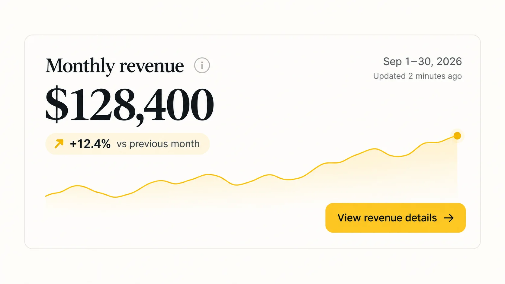
The KPI card is the most-used component in analytics dashboard design and the most frequently under-designed. A complete card includes:
Label using the business term, not the database field name.
Value as the visual anchor, in the largest type on the card.
Comparison against the prior period or the target, with direction and magnitude.
Trend as a compact sparkline showing shape over time.
Timeframe stated explicitly so there is no ambiguity.
Definition available on hover or via an info icon.
Drill link to the detail behind the number.
One subtlety worth getting right: up is not always good. Churn rising, latency rising, and support ticket volume rising are all negative. Color and iconography should reflect whether the change is favorable, not merely whether the number went up. Bind that logic to the metric definition rather than the direction of change.
SaaS dashboards carry structural requirements that generic analytics screens do not:
Account and workspace context. Users must know whose data they are viewing at all times, especially in multi-tenant tools where agencies switch between clients.
Role-aware views. An admin, a billing owner, and a read-only member need different defaults. Build the permission model into the design rather than hiding elements afterwards.
Lifecycle-aware defaults. Day one needs setup guidance and sample data. Year two needs a saved view.
Saved and shared views. Let users save, name, and share filter configurations. This single feature converts casual users into daily users more reliably than most visual improvements.
Export paths. People will put your data in a spreadsheet. Easy export keeps them in your ecosystem rather than rebuilding your metrics elsewhere.
Brand alignment. For customer-facing dashboards, chart palettes, card styling, and empty-state copy should read as the same product as your marketing site, not a bolted-on BI tool.
Admin dashboards serve internal teams doing operational work. Priorities shift accordingly:
Search is the primary navigation. Admins arrive knowing which record they want. A fast, forgiving search beats any menu structure.
Tables are the main interface. Invest in column sorting, column selection, sticky headers, pagination that preserves position, and readable row density.
Bulk actions with confirmation. Multi-select, clear counts of affected records, and confirmation for anything irreversible.
Audit trails. Show who changed what and when. Internal trust depends on it.
Recent items. Admins return to the same records repeatedly. Surfacing recent activity saves more time than any chart on the page.
Restraint on charts. Most admin dashboards need three or four status indicators and then a great table. Extra analytical depth here serves the designer's sense of completeness, not the user's workflow.
A dashboard is used habitually or not at all. Habits are fragile, and two things break them faster than poor visual design: slowness and doubt.
Long-standing research on human response time gives useful thresholds. Interactions under roughly 0.1 seconds feel instantaneous. Around one second, users notice the delay but keep their train of thought. Past ten seconds, attention leaves and the task is interrupted. Dashboard queries frequently land in the worst zone: too slow to feel responsive, too fast to justify leaving. These are general interaction guidelines, not a guaranteed threshold for every dashboard. See Nielsen’s response-time research.
Design decisions that help:
Load progressively. Render the layout and top KPI row first, then let heavy charts fill in behind them.
Use skeletons shaped like content, so the page does not reflow when data arrives.
Set sensible defaults. A default date range that returns quickly beats an "all time" default that times out.
Debounce filters. Do not re-query on every keystroke or checkbox toggle.
Cache and label. Cached results are fine when you display the timestamp. Silent staleness is not.
Cap what you render. Paginate or virtualize long tables.
Users abandon dashboards the moment they suspect the numbers are wrong, and that suspicion is rarely recovered. Build trust signals into the interface:
A visible last updated timestamp on every view.
Metric definitions accessible where the metric appears.
Honest gaps. When data is missing, show a gap rather than interpolating a line through it.
Consistency across surfaces. If your dashboard and billing page disagree by 3%, explain why in the interface before a user finds it themselves.
Usability testing on dashboards is faster than most teams expect, and the return is high.
Five-second test. Show the dashboard for five seconds, then ask what stood out and what the user thinks the status is. If the answer does not match your intended headline, the hierarchy is wrong.
Task-based testing. Give five to eight users a real task from your decision inventory and watch where they hesitate. Hesitation marks unclear labels and unexpected chart types.
Comprehension checks. Point at a chart and ask what it means. Misreadings cluster around dual axes, stacked areas, and unlabeled timeframes.
Real data, always. Placeholder numbers hide every layout problem that matters. Test with production-shaped data including the ugly cases: very long account names, negative values, zeros, nulls, and one customer a hundred times larger than the rest.
Instrument the product you built. Track which tiles get viewed, which filters get used, and which views get saved. After a month you will find components nobody touches. Remove them. A dashboard that gets smaller over its first quarter is usually getting better.

At some point the question stops being "what should this look like" and becomes "who should build it, and what should we budget."
| Option | Best suited for | Trade-offs |
|---|---|---|
| In-house product designer | Ongoing product work, deep domain context | Data visualization is a specialty; generalists often lack it |
| Specialist design studio | Redesigns, new products, design system foundations | Higher rate; requires clear scope and internal ownership after handoff |
| Freelance specialist | Focused scope such as chart system or one flow | Limited bandwidth; coordination overhead on larger projects |
| BI tool with templates | Internal reporting where speed beats polish | Limited branding and interaction control; weak for customer-facing use |
| Engineering-led with a component library | Early-stage internal admin tools | Ships fast, accumulates inconsistency that costs more to unwind later |
Dashboard design costs vary widely, and the variance comes from scope rather than hourly rates. Before requesting quotes, get clear on:
Number of distinct views and user roles. Three roles with different permissions is effectively three products.
Chart complexity and custom visualization needs. Standard charts from a library cost far less than bespoke visualizations.
Research depth. Stakeholder interviews and usability testing add time and remove risk.
Design system scope. Building reusable design tokens and components costs more upfront and less on every subsequent screen.
Responsive and accessibility requirements. Full WCAG conformance and mobile parity are real work, not checkboxes.
Handoff format. Static mockups are cheaper than a documented, coded component library.
Data readiness. If metric definitions are unresolved, design time gets spent on data governance. This is the most common source of overruns.
Look for evidence, not aesthetics:
Data-dense work in their portfolio. Marketing sites and mobile apps do not demonstrate dashboard capability. Ask for complex, information-heavy interfaces.
Process transparency. They should describe their discovery method before their visual style.
The questions they ask you. Strong partners ask about decisions, users, and data constraints on the first call. Weak ones ask about brand colors.
Engineering literacy. Do they know what your charting library can render and what your API can return? Designs that ignore technical constraints get silently rewritten in code.
Systems thinking. Ask what happens when you add a fifteenth metric next year. A good answer describes components and rules, not a new mockup.
Handoff quality. Ask to see a real handoff file, not a case study slide.
Presenting visual concepts before any user or decision research.
Portfolio dashboards showing only perfect states and no empty, loading, or error states.
Fixed-price quotes issued before metric definitions are settled.
No mention of accessibility anywhere in the proposal.
Reluctance to involve your engineers until final handoff.
Designing from the schema. Building around available tables rather than needed decisions produces complete, useless dashboards.
One dashboard for every audience. Executives and analysts get merged into a compromise screen that serves neither.
Vanity metrics in prime position. Metrics chosen because they look good crowd out metrics that trigger action.
No comparison context. Standalone numbers force every user to do interpretation the dashboard should have done.
Undefined metrics. Two people quote different numbers from the same screen, and trust never fully returns.
Skipping edge-case states. The dashboard demos beautifully and falls apart for new accounts and outliers.
Prototype data only. Layouts sized to tidy fake numbers break on real names, nulls, and outliers.
Treating launch as the finish line. Without instrumentation and pruning, dashboards accumulate tiles indefinitely.
Ignoring the brand layer. For customer-facing analytics, a generic BI aesthetic makes a sophisticated product feel unfinished.
The pattern behind almost all of these is the same: optimizing for the review meeting rather than for Monday morning. A dashboard that impresses in a demo and gets closed in four seconds a week later has failed, regardless of how it looked on the slide.
Design for Monday morning, not only for the review meeting.
For a broader budgeting framework, read our UI/UX design cost guide.
A dashboard is glanced at repeatedly to monitor status and trigger action. A report is read deliberately, usually once, to explain something in depth. Dashboards optimize for speed of comprehension; reports optimize for completeness. Problems start when a team asks one artifact to do both jobs.
Three to five primary metrics in the top zone, with supporting detail below and everything else behind drill-downs or secondary views. The constraint is not screen space, it is the interpretive effort each metric demands from the reader.
Embed a BI tool for internal reporting where speed matters more than experience and your users are comfortable with query interfaces. Build custom when the dashboard is customer-facing, when it is part of your product's value proposition, or when your workflows require interactions the BI tool cannot express. Many teams do both: BI internally, custom for customers.
Continuously in small ways, rarely in large ones. Review usage instrumentation quarterly and remove unused tiles. Reserve a full redesign for a genuine shift, such as a new primary user group, a new pricing or business model, or a data platform migration.
A named product owner plus a data owner. The product owner decides what appears and what gets removed. The data owner maintains metric definitions and pipeline accuracy. Dashboards without a single accountable owner drift toward clutter within months, because every request to add something is easier to approve than to decline.
AI tools produce competent layouts and component code quickly, which makes them useful for scaffolding. What they cannot do is conduct the discovery that determines which metrics belong on the screen, and that is where dashboard quality is decided. Use them to accelerate execution after the decision inventory exists.
Reduce the interpretive burden. Use plain-language labels, state the comparison in words alongside the chart, add reference lines for targets, annotate notable changes, and default to the view most users need rather than an empty filter state. Where possible, write the takeaway in a sentence above the chart. If a user needs to know what a percentile is to read your dashboard, the dashboard is doing too little work.




.svg)



.svg)

.svg)

.svg)

.svg)

.svg)
.svg)
