


12 Oct 2026
Brand Identity
Brand Guidelines: What to Include, Real Examples, and How to Build Yours


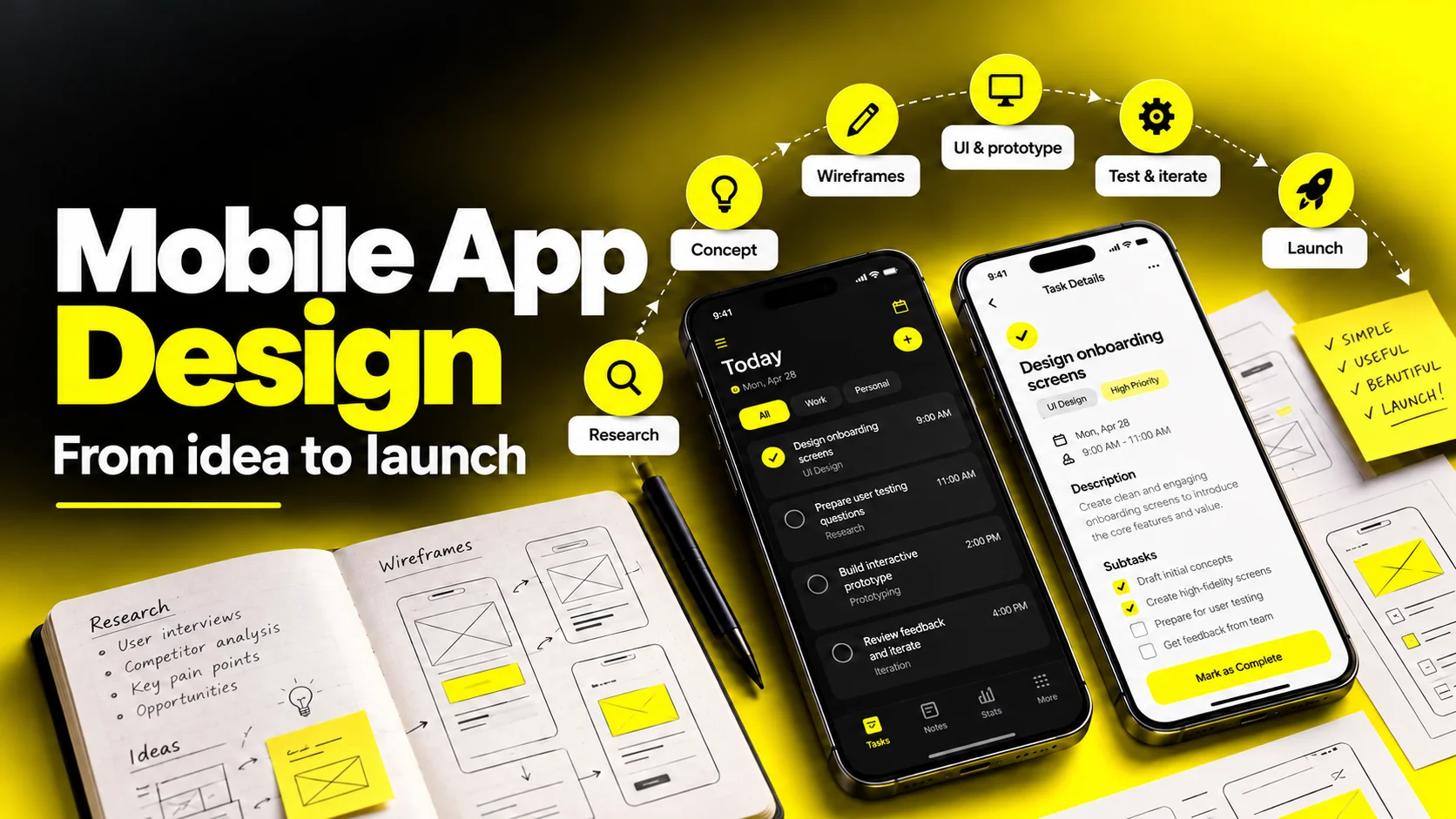
To design a mobile app, you move through eight connected stages: discovery and problem definition, user research, information architecture and user flows, wireframes, UI design and a design system, interactive prototyping, usability testing, and design QA through launch. Each stage produces a specific deliverable that the next stage depends on, which is why skipping steps is what usually causes rework later. For a focused first version, an illustrative planning range is 8 to 14 weeks of design work running alongside engineering, not before it. Scope, team capacity, recruitment, and review cycles can move this range.
Most app projects don't fail because someone chose the wrong shade of blue. They fail because the team started drawing screens before anyone agreed on what problem the app solved, who it solved it for, or how they'd know it worked.
If you're a founder, product lead, or head of growth about to commit real budget to design, the question you're actually asking isn't "what does a good UI look like." It's more like: what happens, in what order, who owns each part, what do I get at the end of each phase, how long does it take, and where does this usually go wrong?
This guide answers that. It walks the full mobile app design process from a blank problem statement to a shipped, instrumented, App Store–ready product. You'll get the app design process steps in sequence, a realistic mobile app design timeline, the app design deliverables you should expect to receive and review, how the mobile app prototyping process actually reduces risk, and how to evaluate a design partner before you sign anything.
Before the process makes sense, it helps to be precise about scope, because "app design" gets used to mean four different jobs.
Product design is deciding what the app should do and in what order a person encounters it. UX design is the structure: navigation, flows, hierarchy, and the logic of moving from intent to outcome. UI design is the visual layer: type, color, spacing, components, motion. Brand design sits underneath all of it, defining the personality those visual decisions express.
On a healthy team these overlap heavily. On a struggling one, someone is doing only the fourth while everyone assumes the first three happened.
Here's the shape of the full app design workflow:
| Stage | Core question it answers | Primary owner |
|---|---|---|
| 1. Discovery | What problem, for whom, and how will we measure success? | Product lead + design lead |
| 2. Research | What do real users actually do and struggle with today? | UX researcher / designer |
| 3. IA & user flows | How is the app structured and how do people move through it? | UX designer |
| 4. Wireframes | What's on each screen, and what's the priority order? | UX designer |
| 5. UI & design system | What does it look like, and how does it stay consistent? | UI designer |
| 6. Prototyping | Does this actually feel right in a hand, on a device? | UI/UX designer |
| 7. Usability testing | Where do people hesitate, misread, or quit? | Researcher + designer |
| 8. Handoff & design QA | Does the built product match the intended experience? | Designer + engineering |
Two things worth internalizing early.
First, this is not a relay race. The stages are sequenced by dependency, not by calendar. Research findings keep arriving while wireframes are underway. The design system keeps growing after the first screens ship. Engineering should be in the room from stage one, because a beautiful flow that requires an API you don't have is just an expensive drawing.
Second, design is a risk-reduction activity before it's an aesthetic one. Every stage exists to make a specific class of mistake cheaper to discover. Research kills the wrong-problem mistake. Wireframes kill the wrong-structure mistake. Prototypes kill the wrong-interaction mistake. Design QA kills the wrong-implementation mistake. The further down that list a mistake survives, the more it costs.
Design reduces risk before it adds polish.
Share your app idea or current designs. We can discuss what to research first, how to scope a first version, and what your engineering team needs for handoff.


This first block of work is where the leverage is. It's also the part teams under deadline pressure compress first, and then pay for twice.
Discovery aligns everyone on what you're building and why, in writing, before anyone opens a design tool.
Run it as a working session with the people who can actually make decisions, and come out with:
A competitive teardown belongs here too, but do it properly. Don't collect screenshots of competitors' home screens. Sign up, complete their core task, and document precisely where you got confused or bored. That's where the opportunity is.
Research answers one question: where does the current experience break for real people? You don't need an academic study. You need enough signal to stop guessing.
The methods that earn their keep on most app projects:
Turn findings into three artifacts you can hang on a wall: a journey map of the current experience with friction marked, a short set of user profiles or jobs-to-be-done statements, and a prioritized opportunity list. If research doesn't change at least one thing you were planning to build, you probably asked leading questions.
Now you structure the product. This stage decides whether the app feels obvious or exhausting, and almost none of it is visual.
Information architecture is the inventory and grouping of everything in the app — screens, content types, settings, states — plus the naming. Labels deserve real attention. "Activity," "History," and "Feed" can mean the same thing to you and three different things to a user.
Navigation model follows from IA. A tab bar suits three to five persistent, equally important destinations and keeps them one tap away. Deeper, task-oriented products may need stacked navigation or a mix. Drawers hide things; they buy screen space at the cost of discoverability, so use them for secondary destinations rather than your core value.
User flows map the paths through that structure. Diagram your critical paths first — onboarding to first value, the core repeated action, the conversion or checkout path — then push into what most teams skip:
Designing these paths now costs an afternoon. Discovering them mid-build costs a sprint.
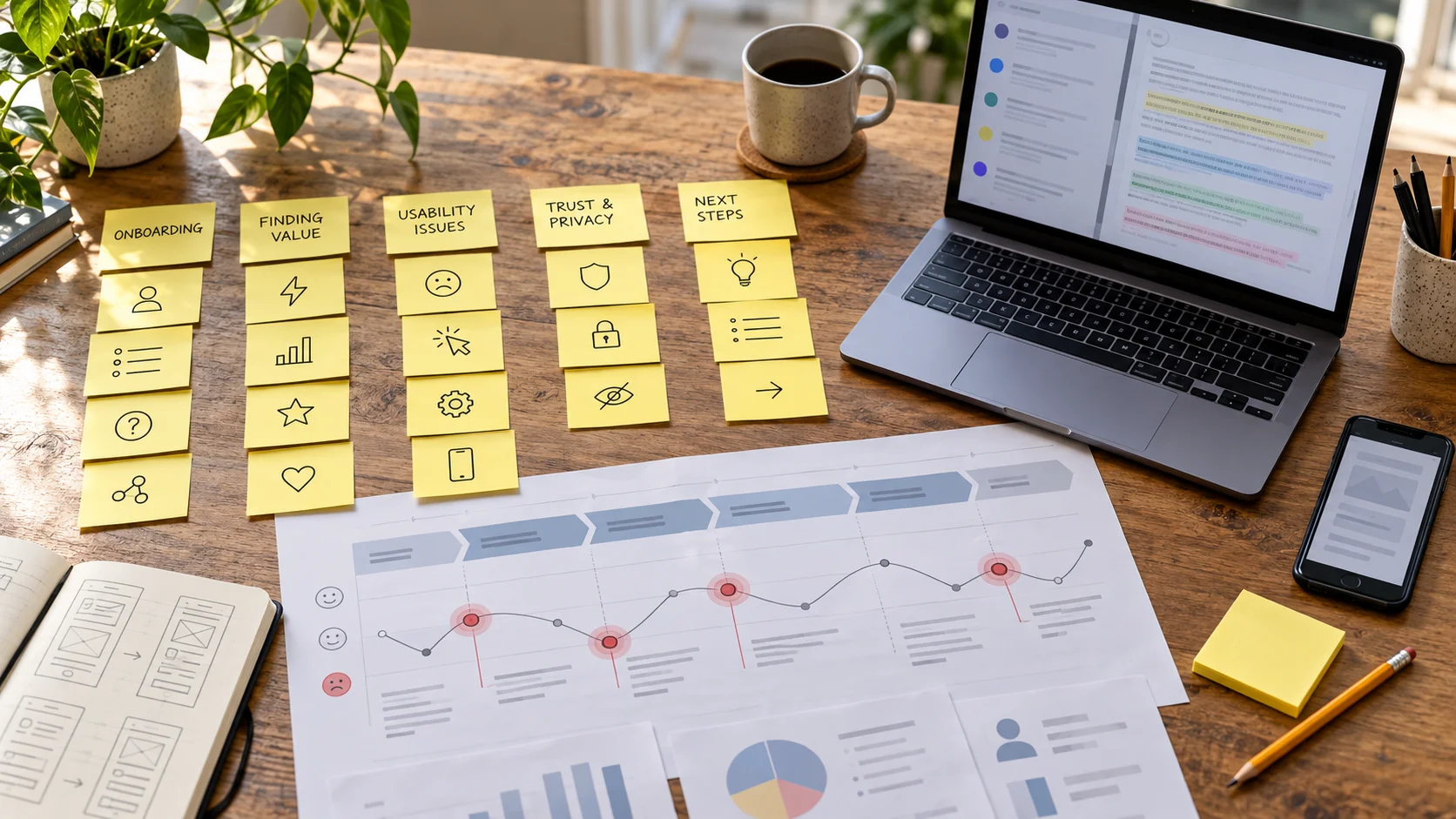
For focused test rounds, see Nielsen Norman Group’s usability-testing sample-size guidance. Recruit separately across distinct audiences and iterate.
With structure agreed, you start putting things on screens — first roughly, then precisely.
Wireframes are deliberately unfinished. They're grayscale, typically unstyled, and their entire purpose is to force conversations about content and hierarchy before color and polish make everything look decided.
What separates a useful wireframe from a decorative one:
Review wireframes on a phone, not a monitor. A layout that looks generous at 200% zoom on a 27-inch display can be unusable in a hand.
This is where brand becomes the interface. Strong app UI design isn't decoration applied at the end; it's a system of decisions that makes hundreds of future screens consistent and fast to build.
Build the foundations before the screens:
| Foundation | What it defines | Why it matters |
|---|---|---|
| Type scale | A fixed set of sizes, weights, line heights | Prevents 14 slightly different heading sizes across the app |
| Spacing scale | Increments on a 4pt or 8pt grid | Creates visual rhythm; removes per-screen guesswork |
| Color tokens | Semantic names like surface, danger, on-primary | Supports consistent dark mode and brand updates; review contrast and layouts |
| Components | Buttons, inputs, cards, sheets, nav — with all states | One fix propagates everywhere instead of 40 places |
| Elevation & depth | Shadow and layering rules | Keeps hierarchy legible across contexts |
| Motion | Duration and easing conventions | Consistent transitions read as "considered," not "flashy" |
Accessibility is a foundation, not a phase. Use at least 4.5:1 contrast for normal text and 3:1 for qualifying large text under WCAG AA, with the standard’s exceptions. Aim for comfortable touch targets: Apple recommends a 44×44pt hit region as a general rule for buttons, and Android recommends at least 48×48dp for touch interfaces. Support larger system text, meaningful screen-reader labels, and status cues beyond color. Check both light and dark modes. Consult WCAG contrast guidance, Apple button guidance, and Android accessibility recommendations.
Design dark mode alongside light mode if you intend to support it at all. Deriving it later almost always produces muddy contrast and a second set of bugs.
A prototype turns static screens into something you can actually operate. This is the cheapest place in the entire app design workflow to be wrong.
Think in a fidelity ladder and climb only as high as the question requires:
Practical guidance that saves weeks:
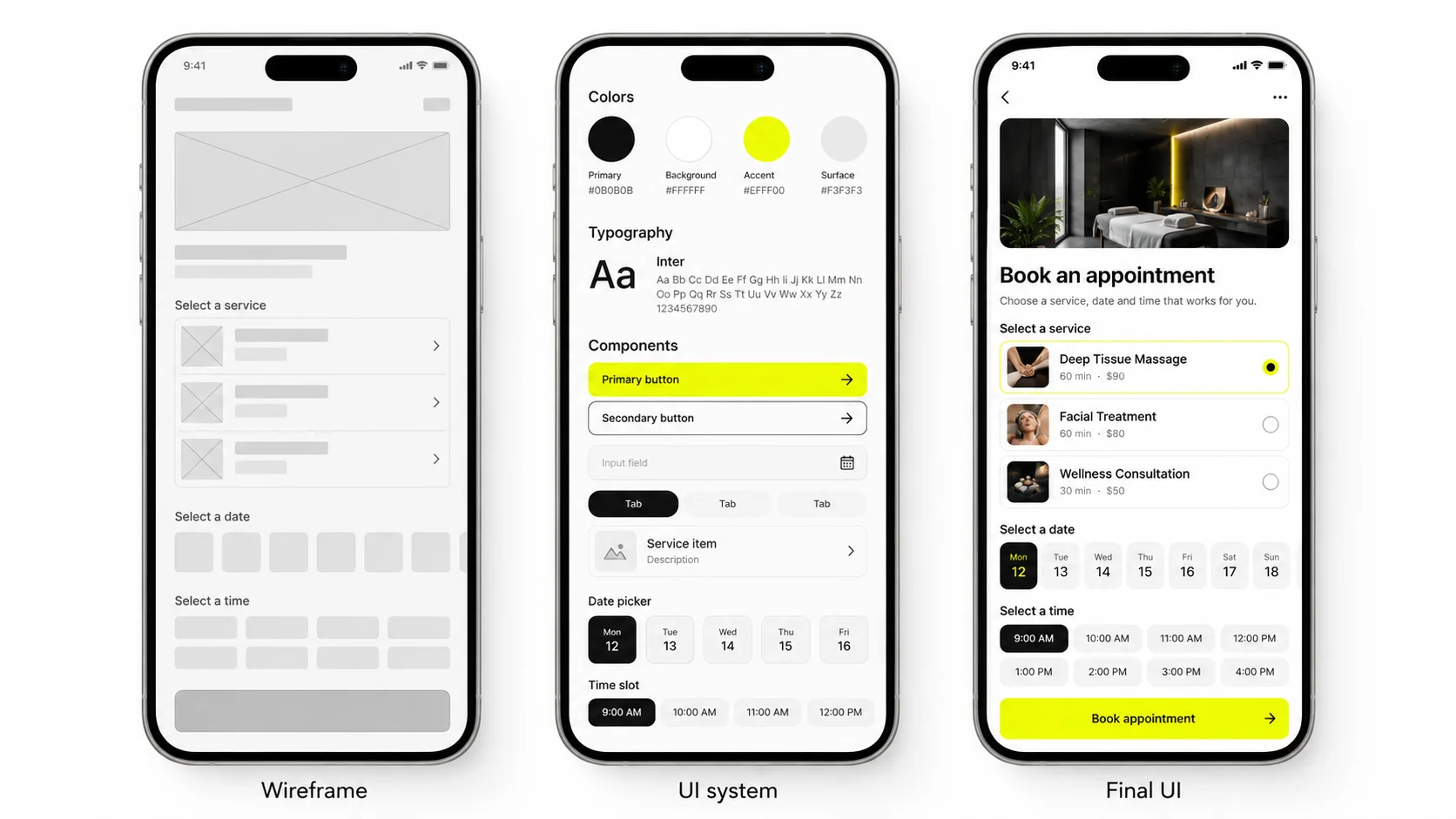
Review wireframes and prototypes on a phone, not only on a monitor.
The last block is where design either survives contact with reality or quietly gets diluted.
Usability testing isn't asking people if they like it. People are polite, and opinions about aesthetics are nearly useless. It's giving someone a realistic task and watching, silently, where they hesitate.
How to run a round that actually produces decisions:
Moderated sessions give you the "why." Unmoderated remote testing gives you volume and speed. Most teams benefit from a moderated round early and unmoderated rounds later for validation.
Handoff fails when it's treated as a file transfer. It works when it's treated as a relationship.
A complete handoff includes:
Design QA is the step that determines whether the app you designed is the app that ships. Once builds are testable, the designer reviews on real hardware across a device matrix — smallest supported screen, largest, older OS versions, dark mode, largest text size. Log discrepancies with the same seriousness as functional bugs, and separate "doesn't match spec" from "matches spec but feels wrong in motion." Both are real; they get fixed differently.
Launch design work is its own workstream, and it's frequently underestimated:
Then the loop restarts. Post-launch, your analytics and store reviews become the richest research input you will ever have.
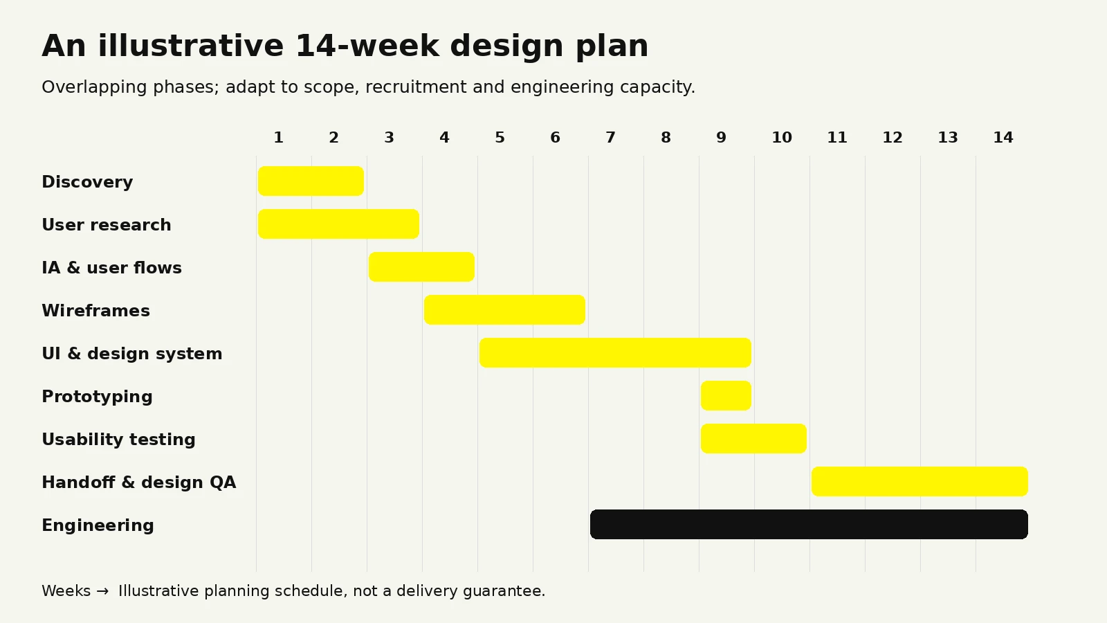
Timelines are the single most common source of misalignment between founders and design teams, usually because both sides are quoting different scopes without realizing it.
The ranges below reflect what an experienced team plans against for a focused first version — roughly 15 to 25 unique screens, one platform prioritized, one or two designers engaged. They're planning ranges, not promises, and they assume decision-makers are available for reviews.
| Phase | Illustrative duration | What pushes it longer |
|---|---|---|
| Discovery & alignment | 1–2 weeks | Multiple stakeholders, no agreed metrics, unclear ownership |
| User research & synthesis | 1–3 weeks | Hard-to-recruit audiences, regulated industries, multiple segments |
| IA & user flows | 1–2 weeks | Complex permissions, multi-role products, heavy content |
| Wireframes | 2–3 weeks | Large screen counts, many edge cases, late scope additions |
| UI design & design system | 3–5 weeks | No existing brand, dark mode, two platforms, custom illustration |
| Prototyping & usability testing | 1–2 weeks (often overlapping) | Extra test rounds, participant recruitment delays |
| Handoff & design QA | 2–4 weeks, running with the build | Long build cycles, wide device matrix, spec drift |
| Illustrative total for a v1 | 8–14 weeks | — |
Three things reliably change that picture:
Designing for two platforms adds platform-specific navigation, components, adaptation, and QA. Estimate this work from the actual scope and how much the iOS and Android experiences differ; there is no universal percentage uplift.
Approval structure matters more than headcount. A project with one decision-maker who reviews within 48 hours will finish faster than an identical project with a committee that meets fortnightly. If you want a shorter timeline, fix your review cadence before you add designers.
Design running parallel to engineering compresses the calendar substantially. Design one release ahead of the build: while engineers implement the flows that are finished, design works on the next set and does QA on the last. Sequential design-then-build is the slowest possible arrangement.
What doesn't work is deleting research and testing to save three weeks. Those three weeks reappear later as rework, and they bring interest.
If you're paying for design, deliverables are how you verify progress between demos. Vague deliverables are how projects drift.
Here's what a complete engagement should hand over, phase by phase:
| Phase | Deliverables you should receive |
|---|---|
| Discovery | Product brief, problem statement, success metrics, constraint list, assumption log, competitive teardown |
| Research | Interview findings summary, journey map with friction points, user profiles or JTBD statements, prioritized opportunity list |
| IA & flows | App map / screen inventory, navigation model, user flow diagrams for critical paths, edge case list |
| Wireframes | Grayscale screens with real content, all screen states, annotated interaction notes |
| UI & design system | Final screens (light and dark if in scope), type/spacing/color tokens, component library with states, iconography, accessibility specs |
| Prototyping | Interactive prototype of critical flows, device-tested and shareable via link |
| Usability testing | Test plan, session recordings or notes, severity-ranked findings, documented design changes |
| Handoff & QA | Developer-ready file structure, exported assets, motion specs, design QA log, store listing assets and app icon set |
Two clauses worth putting in the agreement itself.
Source file ownership. Confirm in writing that you own the editable design files, the design system, and the underlying assets on final payment — not just flattened exports. This becomes very important the day you switch partners.
Design QA participation. Specify that the designer stays involved through implementation review. A stunning file set with no QA involvement frequently ships as a mediocre app, and it's rarely the engineers' fault; nobody wrote down what the animation was supposed to feel like.
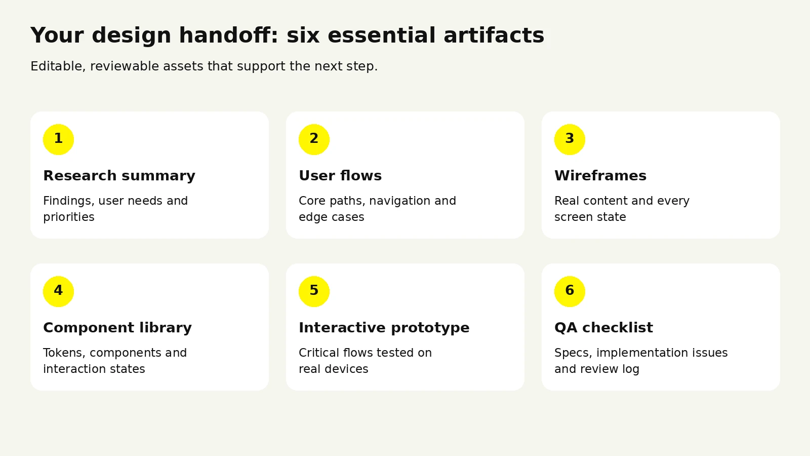
Ask for editable source files, component states, and a clear handoff—not just screenshots.
At some point the question shifts from what's the process to who should run it.
| Model | Best when | Watch out for |
|---|---|---|
| In-house designer | Design is core to the product and the roadmap is continuous | Slow to hire; a solo designer rarely covers research, UI, brand, and motion equally well |
| Design agency or studio | You need a full team fast, or a v1 built end to end | Ensure the people in the pitch are the people doing the work |
| Freelance specialist | Well-defined scope, or filling one specific gap | Capacity risk; usually no built-in research or QA support |
| Hybrid | An in-house lead who owns direction, with external depth on demand | Requires real internal ownership; without it, coordination overhead grows |
Many teams do best with an agency or studio for the first version — where velocity and breadth matter most — then bring design in-house once the product has a rhythm and a system to maintain.
Design cost is a function of scope and depth, not hourly rates in isolation. The variables that move it most:
The most expensive choice is usually the cheapest quote that excludes research, states, and design QA. You don't save that money; you defer it into engineering rework at a higher rate.
Portfolios are marketing. Evaluate the process instead.
Ask these, and listen for specifics:
Red flags:
Strong design and branding support does more than make the app attractive. It shortens time-to-value for new users, reduces support load by removing ambiguity, gives engineering a system that speeds up every future release, and makes store listings convert — which is where a great deal of acquisition spend is quietly won or lost.
Plan scope with our mobile app design cost guide, compare Wolfpixel’s design engagement options, or discuss your mobile app design project.
After enough projects, the failure patterns start repeating. These are the ones worth guarding against.
Designing on a desktop and reviewing on a desktop. Everything looks generous on a large monitor. Review on a phone from day one — ideally an older, smaller one.
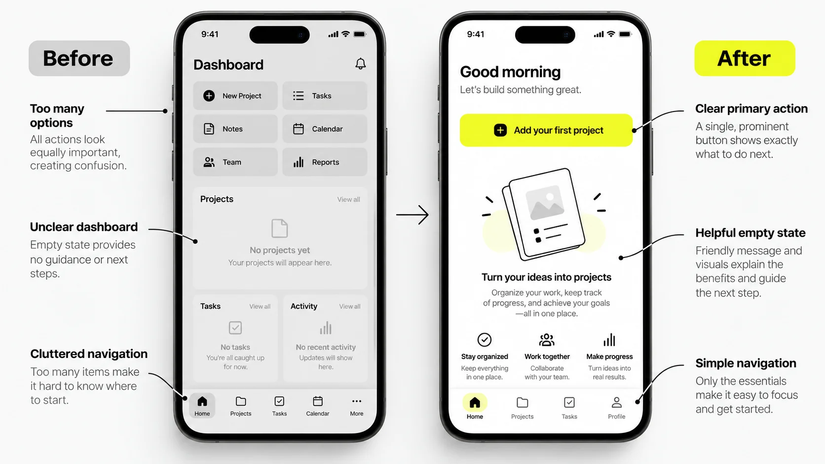
Skipping states. Empty, loading, error, offline, and permission-denied are not edge cases; they're the majority of a real user's early experience. A new account sees empty states before it sees anything else, and an empty state is one of the best onboarding opportunities in the product.
Feature-first thinking. Long feature lists produce cluttered navigation and diluted value. A first version that does one thing exceptionally well outperforms one that does six things adequately, every time.
Copying a competitor's interface. You inherit their constraints and their compromises without knowing which of their decisions were tested and which were rushed. Study them; don't trace them.
Ignoring platform conventions. Users hold your app to the standards of the operating system they use all day. An iOS app that behaves like an Android app feels off even to people who couldn't explain why.
Onboarding bloat. Long carousels, mandatory account creation before value, and permission requests fired on launch are among the most reliable ways to lose users in the first minute. Prime permissions in context — explain why you need location at the moment location makes the feature work.
Over-animating. Motion should orient people and communicate. When every element springs and bounces, the app feels slow and the animation becomes the thing users notice instead of their task.
No instrumentation. If the analytics events aren't specified during design, they get added later, badly, and you spend months unable to answer whether the redesign worked.
Treating launch as the finish line. Launch is when your best data starts arriving. Budget for a post-launch design cycle before you ship, because you will need one.
Building a design system too early — or never. Formalizing a system before you know what the product is produces components you throw away. Never building one produces inconsistency that compounds with every release. The pragmatic sequence: design a handful of real screens first, extract patterns as they repeat, then formalize.
What separates the apps that actually convert isn't visual novelty. It's usually the same short list, executed consistently: a fast, obvious path to first value; a single clear primary action per screen; honest, specific interface copy; states designed as carefully as happy paths; performance treated as a design concern; and a team that keeps testing after launch instead of defending the original plan.
You design one product with shared structure and content, then adapt platform-specific patterns: navigation behavior, back gestures, sheets, system fonts, and standard controls. Most teams share the design system across both and diverge only where conventions genuinely differ. Launching on one platform first is a reasonable way to reduce scope, and the second platform is significantly faster once the system exists.
Figma is one option for interface design, prototyping, and collaboration. Agree on tools and handoff formats with your engineering team. Beyond that, teams commonly add a testing platform for moderated or unmoderated sessions, a whiteboard tool for flows and workshops, and Lottie or similar for shipping complex animations. The specific tools matter far less than whether your designer and engineers work in the same file with the same tokens.
If no brand exists, define the core identity — name, logo, palette, typography, tone of voice — before UI design begins, because those decisions cascade into every component. If a brand exists but was built for print or web, expect a translation phase: web palettes often fail contrast requirements on small screens, and web type scales rarely survive a phone.
They meaningfully accelerate specific tasks — generating variations, drafting interface copy, producing placeholder content, summarizing research notes, and speeding up asset production. What they don't replace is deciding what to build, understanding a specific user's context, resolving trade-offs between business and user needs, or judging whether an interaction feels right in the hand. Treat them as leverage on execution, not as a substitute for judgment.
Heavily at discovery, decisively at review gates, and lightly in between. The most valuable thing a founder provides is fast, clear decisions and context about the business. The least valuable is directing pixel-level visual choices. Agree on a review cadence at kickoff and name a single accountable decision-maker — ambiguity about who approves what is a bigger schedule risk than most technical problems.
The process is the same, but stage two changes character: you have analytics, store reviews, and support tickets, which is far richer input than a greenfield project gets. Audit before you redesign, identify which screens actually drive your metrics, and consider a phased rollout rather than a big-bang redesign — abrupt overhauls frequently disrupt existing users' learned behavior and produce a temporary metrics dip that's hard to interpret.




.svg)



.svg)

.svg)

.svg)

.svg)

.svg)
.svg)
