


12 Oct 2026
Brand Identity
Brand Guidelines: What to Include, Real Examples, and How to Build Yours


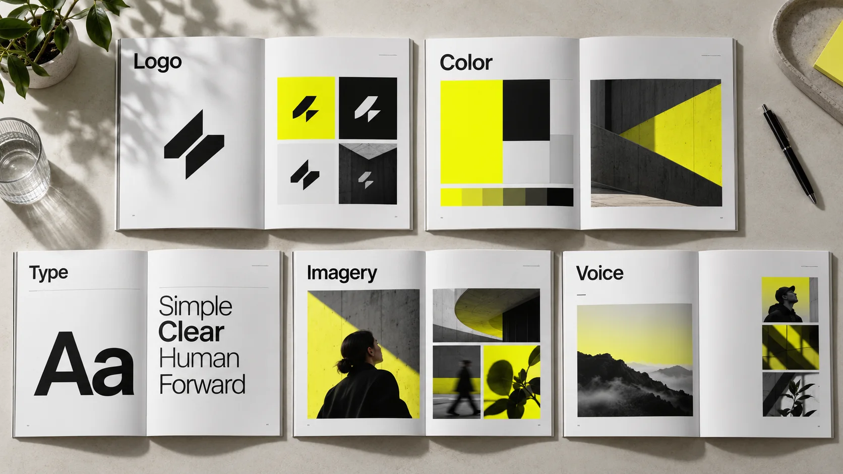
Brand guidelines are the documented rules that define how a brand looks, sounds, and behaves across every touchpoint, covering logo usage, color, typography, imagery, and voice. A useful set answers the practical questions people actually hit while working: which logo file to use, what the minimum size is, which type styles pair with which, and what the brand should never do. Length matters less than coverage: the document should hold every rule your team currently asks about, plus the assets and templates needed to apply them. Guidelines only pay off when they are specific, easy to find, and maintained as the brand evolves.
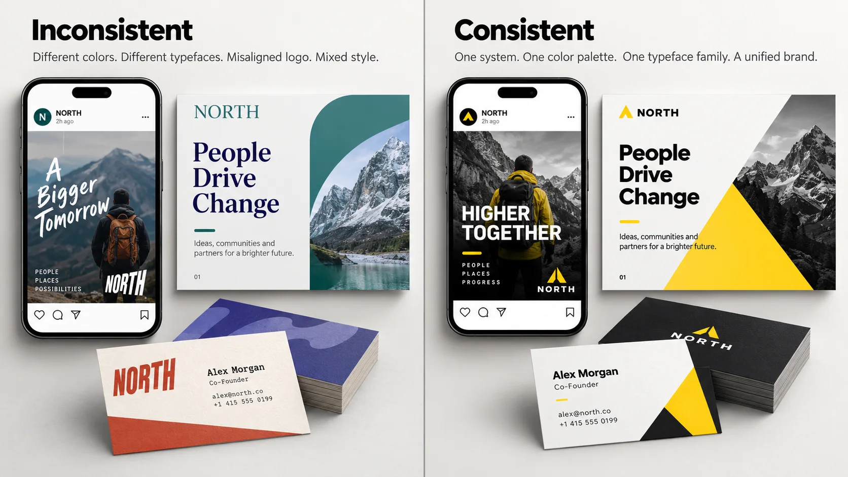
There is a moment most growing companies hit without noticing. A sales deck comes back from a partner with the logo stretched. A new contractor ships a landing page in a typeface nobody recognizes. A regional team orders signage in a slightly wrong shade of the primary color, and now the physical space and the website do not look like the same company.
None of these are disasters on their own. Together they are expensive. Every inconsistency forces someone to stop, ask, wait, and redo the work, and every new hire has to reconstruct the brand from context clues instead of reading it.
Brand guidelines solve this, but only when they are built as working documents rather than decorative ones. Plenty of companies commission a beautiful 40-page PDF and watch it go unopened, because it explains the philosophy behind the mark without telling anyone what the clear space rule is.
This guide covers what belongs in a set of brand guidelines, how logo and typography rules are actually written, how to run the process from audit to rollout, how formats compare, and what to look for if you hire a studio. It is written for founders, product leaders, heads of growth, and design teams who need the document to hold up under real use.
Brand guidelines are the rulebook for how your identity gets used. They translate a set of design decisions into instructions that someone outside the original design team can follow correctly, without asking anyone.
That last part is the whole test. The designer who built the identity does not need guidelines. The freelance motion designer starting Monday, the agency building your booth, and the sales engineer assembling a deck at 11pm all do. If the document does not survive contact with those people, it has not done its job.
These terms get used interchangeably, which causes real confusion when scoping a project. They are different artifacts with different audiences.
The brand book is closer to strategy: positioning, values, audience, personality, and the story behind the identity. It is the document you hand someone to explain the brand.
The brand style guide is closer to operations: clear space, minimum sizes, hex and CMYK values, type scales, do-and-don't examples. It is the document you hand someone to execute the brand.
The design system is a different animal. Code and components, tokens and states, accessibility behavior and interaction patterns. It consumes brand decisions and expresses them in a product context, but it solves an engineering problem rather than a brand consistency problem.
A combined document can work well when teams share the same audiences and update cycle. Split strategy, application rules, and product documentation when their owners and needs diverge; headcount alone is not a useful threshold.
They are not a mood board. A mood board explores direction; guidelines fix decisions.
They are not a logo presentation. The deck that sold the identity internally is a persuasion document. Guidelines are a reference document, and they need far more detail and a different structure.
They are not a one-time deliverable. A brand shipping new products or entering new markets will outgrow a frozen PDF within a year or two.
Share your current brand assets. We can help you identify whether you need clearer documentation, a stronger identity system, or both.


At five people, everyone sits near the person who made the design decisions and consistency happens through proximity. At fifty, with contractors, agencies, and regional teams in the mix, consistency only happens through documentation. The business case comes down to four effects that compound.
Recognition accumulates instead of resetting. Consistent color, type, and logo treatment means every impression reinforces the previous one. Inconsistent application means each touchpoint earns recognition from scratch. A color or shape or typeface only becomes yours through repetition.
Production speed increases. The most reliable return on guidelines is time. When the type scale is defined, the color tokens are named, and the templates exist, teams stop relitigating settled decisions and review rounds shorten.
Onboarding cost drops. New designers, marketers, and vendors get productive faster because the answers are written down. This matters most with external partners, who otherwise absorb hours of your team's time asking questions a good document answers in ten minutes.
Quality holds at the edges. The brand is rarely broken at the center. It is broken at the periphery, in the recruiting one-pager, the conference banner, the partner integration page, the regional social account. Guidelines are how quality reaches places the core team never sees.
For founders and growth leaders there is a fifth effect, visible in diligence and partnership conversations. A company that can hand over a coherent, current brand system reads as operationally mature. One that sends a zip file of mixed logo files does not.
Scope should match how the brand is actually used. A B2B SaaS company with a product, a website, and a conference presence needs a different document than a consumer brand with packaging, retail, and paid social. Everything in the core column below belongs in almost every set of guidelines; the extended column depends on your channels.
Two sections get skipped most often and cause the most downstream pain.
Governance. Without a named owner and a request process, guidelines drift immediately. One page listing the current version, who maintains it, where master files live, and how to request an exception prevents most of the decay.
Accessibility. Building contrast requirements into the color section is far cheaper than retrofitting a palette after a compliance review. If your primary color fails contrast on white at body size, say so and specify the darker variant to use instead.
Every section should answer a decision, not describe an aesthetic. Compare these two ways of writing the same color rule.
Weak: Our blue is confident and optimistic, and should be used generously throughout the brand.
Strong (illustrative): Primary Blue (#1B4DE4) is reserved for primary actions, key headlines, and the logo. Aim for roughly 10 percent of this example composition. On white, its calculated contrast is about 6.5:1, exceeding WCAG AA’s 4.5:1 threshold for normal text. Recheck every approved foreground/background pairing; do not infer contrast from the color name.
The second version can be followed by someone who has never met your design team. That is the standard to write to, section by section.
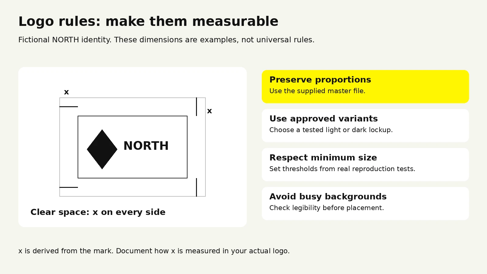
Logo usage guidelines are the section people open most and the one most often written too loosely. Here is what a complete one contains.
Show the primary lockup first, then every approved variant with a plain-language note on when to use it. A typical set covers the horizontal lockup, a stacked version for narrow spaces, a symbol-only mark for avatars and favicons, and black and white monochrome versions.
State the rule for each. An illustrative rule such as “use the stacked lockup when available width is under 160px” is actionable, but the threshold must come from testing your actual mark.
Define clear space as a proportion of the mark itself, never a fixed pixel value, so it scales. The common convention is a measurement derived from the logo, such as the symbol height or the wordmark's cap height, required on all sides. Include a diagram; this rule is faster to understand visually than verbally.
Specify separately for digital and print, because they fail at different thresholds:
State which backgrounds are approved: solid brand colors, white, black, and a defined contrast threshold for photography. If the logo must sit on imagery, give the rule, such as a scrim at a specified opacity or restriction to image areas below a certain brightness.
The don't page is the most-referenced spread in most guidelines. Make it specific to mistakes people will actually make with your mark, not a generic list. Typical entries:
That sixth one catches more teams than any other. If your wordmark has custom kerning or letterform modifications, say so explicitly, because otherwise someone will retype it and be genuinely confused about why it is wrong.
If you run partnerships, integrations, events, or channel sales, define this: divider treatment, relative sizing, minimum separation, and who approves new lockups. Without it, every partnership generates a one-off improvisation that lives on someone's website forever.
Guidelines fail at the file level more often than the rule level. Ship the asset package alongside the document:
If the correct file is harder to find than a screenshot of the logo from your homepage, people will use the screenshot.
These two sections look straightforward and consistently cause the most real-world failures. Both fail for the same reason: the guidelines document the taste and skip the operations.
A typography section needs six things.
1. The typefaces and their roles. Name each one and state exactly where it is used. Display typeface for headlines above a certain size. Text typeface for body and UI. A monospace face if you show code. Two families is usually enough. There is a ceiling. Beyond that, enforcement collapses.
2. Licensing reality. Record the actual license for each typeface: permitted desktop use, web hosting or embedding, app embedding, seat or traffic limits where applicable, and rules for collaborators. Terms differ by foundry and provider; do not assume one license covers every use. Name the license owner and explain how team members and vendors obtain permitted access.
3. The fallback stack. Specify system fallbacks for email, for environments where the brand face cannot load, and for partner platforms that enforce their own type. If you do not define this, someone else will, and it will be Arial.
4. A defined type scale. Give actual values, not adjectives. A working scale specifies size, weight, line height, and letter spacing for each level.
Values above are illustrative. Yours should be derived from your actual typefaces, since optical sizing varies significantly between families.
5. Hierarchy rules. How many levels can appear in one composition, the minimum size difference between adjacent levels, when to use weight rather than size for contrast, and the maximum line length for body copy.
6. Real examples. Show the scale applied to a real headline, paragraph, and UI screen. Abstract specimen pages do not teach application.
The failure mode in color is almost always the handoff between media.
Specify values for the media you actually produce: HEX and RGB for screens, and approved CMYK values with the intended print profile and stock. Use a spot-color reference where required. Print conversion is context-dependent; review proofs rather than assuming a universal HEX-to-CMYK match.
Define usage ratios, not just palettes. Most palettes look balanced on the swatch page and turn garish in application because nobody said how much of each to use. A neutral base should carry the majority of any layout, with the primary color reserved for emphasis and action and accents used sparingly.
Name colors semantically where they map to function. Naming a color "Primary Action" instead of "Blue 600" means it survives a palette change without breaking every downstream reference. Semantic tokens are what let brand evolution happen without a full engineering rewrite.
Publish contrast pairings. Provide a small matrix of approved text-on-background combinations that pass at body size. This turns accessibility from a per-decision check into a lookup.
Account for material. The same color reads differently on coated stock, uncoated stock, fabric, and a backlit screen. If you produce physical goods, specify the tolerance and reference standard.

Use WCAG contrast thresholds and exceptions when documenting approved text pairings. For a provider-specific licensing example, consult Adobe Fonts’ licensing guidance; check the license for your own fonts.
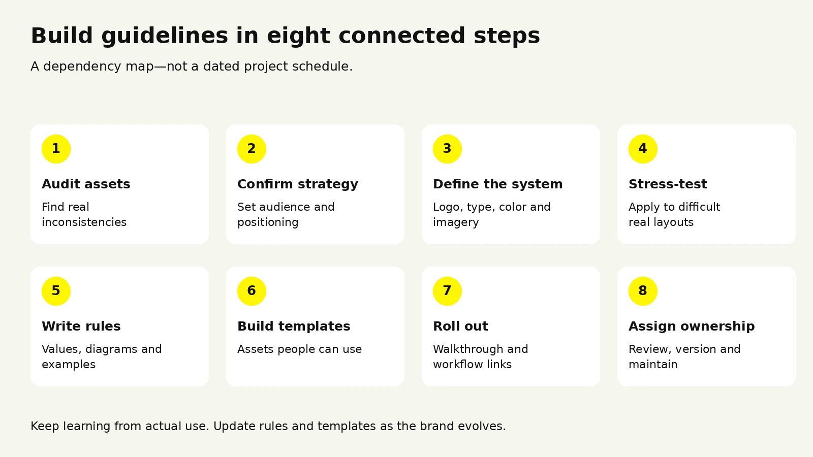
Whether you build in-house or hire a studio, the sequence is the same. Skipping the early steps is what produces documents that look finished and fail in use.
Collect every brand asset produced in the last twelve months. Website, decks, social, email, ads, product UI, print, swag, recruiting materials. Lay them out together.
This exercise is uncomfortable and extremely useful. It shows how many logo variants are actually circulating, how many blues you are using, and which channels have drifted furthest. It also tells you which sections need the most attention. If half the inconsistency sits in sales decks, the deck template matters more than the packaging section.
Guidelines encode decisions, so unsettled positioning produces documented ambiguity. Confirm the audience, positioning, personality attributes, and competitive context first. This need not be a six-week engagement, but it must be settled and written down.
Lock the logo set, palette, type system, and imagery direction, and resist expanding. Systems are enforceable in proportion to how small they are. Six colors and two typefaces will be followed. Eighteen colors and four typefaces will not be, however well documented.
This is the step that separates guidelines that work from guidelines that look good. Apply the system to the hardest real cases you have before you write it up:
Constraints surface here that never appear on a specimen page. Type scales that look elegant in isolation collapse in dense UI. Palettes that feel balanced in a swatch row turn out to have no viable warning state. Fix these before documenting.
Draft section by section. For each rule, ask whether a competent stranger could follow it without clarification; where the answer is no, add a diagram, a value, or a worked example. Write the misuse pages from the audit in step one, since real mistakes your team has already made are far more instructive than generic ones.
Templates are what make adoption happen. Guidelines describe correct work; templates make correct work the fastest available path.
Prioritize by usage volume: presentation template first for most companies, then social formats, email, and document templates. A well-built deck template with master slides, correct type styles, and a chart palette prevents more brand damage than any other single asset.
Publishing is not rolling out. Run a short walkthrough for everyone who produces branded material, agencies and contractors included: fifteen minutes on where things live, the three most common mistakes, and how to ask a question. Then link the guidelines everywhere work happens, including the onboarding doc, the design tool, the project brief, and the vendor contract.
Name one person accountable. Set a review cadence, quarterly for fast-moving companies and annually for stable ones. Version the document visibly so people can tell whether their copy is current.
These durations are illustrative planning ranges for documenting an existing identity, not measured averages or a guaranteed schedule. Phases can overlap. A full identity redesign adds work before documentation.
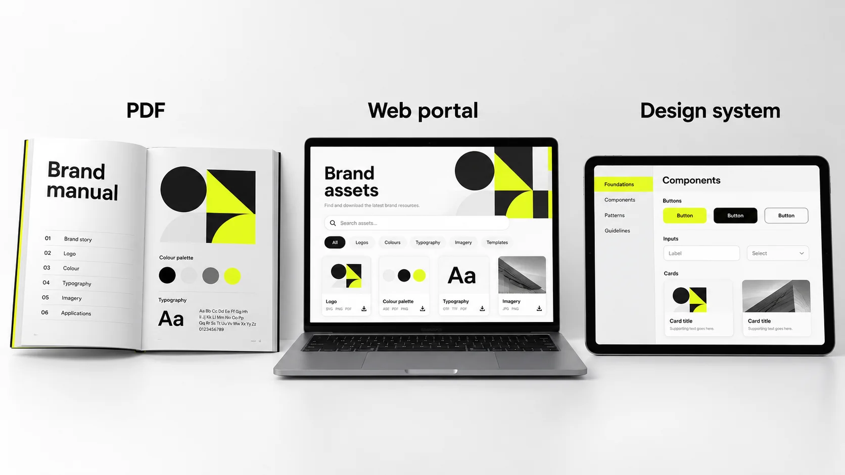
The format question comes up early and matters more than most teams expect, because it determines whether the guidelines stay current.
A hosted web version can serve as the current source of truth, with an exportable PDF for vendors and print partners. Label PDF versions and dates so old copies are easy to identify. Evaluate a dedicated portal when multiple teams or regions need governed access. A page on your own site still requires hosting, setup, and maintenance.
Public brand guidelines are genuinely useful reference material, and many well-known companies publish theirs openly. When studying them, the trap is admiring the design rather than reading the structure.
A more productive way to review examples:
Read the misuse pages first. They reveal the brand's real-world failure modes, which is a direct window into what that team learned the hard way.
Check how specific the rules are. Count how many statements contain an actual number. Strong guidelines are dense with values; weak ones are dense with adjectives.
Note what they omitted. A focused document covering logo, color, type, and three applications thoroughly beats a sprawling one covering fifteen superficially.
Look at asset delivery. Can you tell immediately which file to download and why?
Categories worth studying: content and voice guides from editorially strong companies, which model actionable tone rules; product design systems from large software companies, which show how brand decisions become component specifications; broadcast and public institution guidelines, which are unusually rigorous because many independent production teams enforce them; and historical graphics standards manuals from the 1960s and 70s, several of which have been reprinted and remain among the clearest rule-writing ever produced.
Search for brand guidelines PDF examples in your own category specifically. A direct-to-consumer brand's guidelines will teach you more about packaging hierarchy than a software company's will, and vice versa.
A brand guidelines template is a reasonable starting point and a poor finishing point. It gives you structure, page order, and a reminder of sections you might forget, which has real value for a small team documenting an identity for the first time.
Templates go wrong when content gets shaped to fit the template rather than the other way round. Signs this is happening:
Use a template to scaffold, then delete every section you do not need and expand the two or three sections that carry the most weight for your business. A tight 24-page document covering your real surfaces beats a padded 60-page one.
For implementation examples, explore Wolfpixel’s recent branding and product design projects.
Most teams eventually bring in outside help, either because internal design is fully allocated to product or because the brand needs a level of rigor the team has not built before. Here is how to approach that decision well.
Outside help is usually justified when the identity itself needs work rather than just documentation, when you are entering a new market, when inconsistency is measurably slowing production, or when you need the objectivity of someone without internal history with the existing design.
In-house makes sense when the identity is settled and well-liked, when you have a designer with systems experience and the time to do it, and when the gap is documentation rather than design.
Pricing varies enormously by market, studio size, and scope, so the variables matter more than any single number:
Get quotes structured against these variables rather than as a single number. It makes proposals comparable and surfaces where scope is quietly different between them.
Ask for guidelines they have produced, not just identities they have designed. These are different skills, and plenty of excellent identity designers write poor documentation.
Then evaluate against these criteria:
These recur across companies of every size.
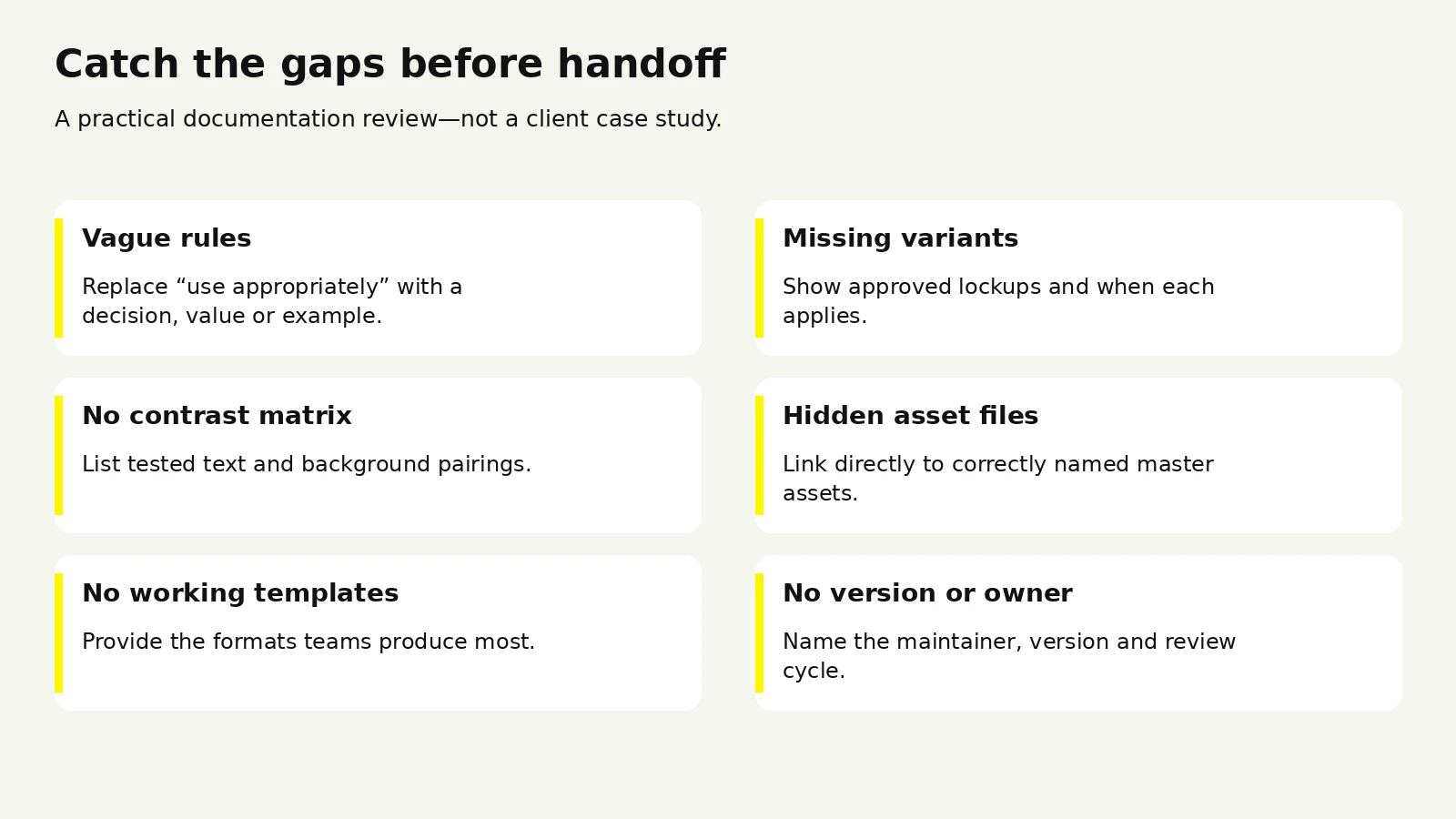
Documenting an identity nobody has pressure-tested. Guidelines lock in decisions, and locking in an untested system makes its problems expensive to fix.
Writing philosophy where rules belong. If a section cannot be executed against, it is not a guideline. Keep narrative to a short opening chapter.
Building a system larger than the team can maintain. A twelve-color palette with four typefaces and nine logo variants will be applied inconsistently within two quarters.
Shipping without templates. If following the rules takes more effort than ignoring them, people ignore them.
No named owner. Documents without owners go stale silently, until someone notices the primary color changed eight months ago and the PDF still shows the old one.
Hiding the asset library. If assets live in a nested folder most people cannot access, you will get screenshots and recreations forever.
Treating rollout as an email. One announcement does not create adoption. A short walkthrough plus links embedded in existing workflows does.
Freezing the document. A set of guidelines untouched in three years is being routed around, not followed. Plan for versioning from the start.
Compare scope with our design engagement options, or request a review of your brand guidelines.





.svg)



.svg)

.svg)

.svg)

.svg)

.svg)
.svg)
