


12 Oct 2026
Brand Identity
Brand Guidelines: What to Include, Real Examples, and How to Build Yours


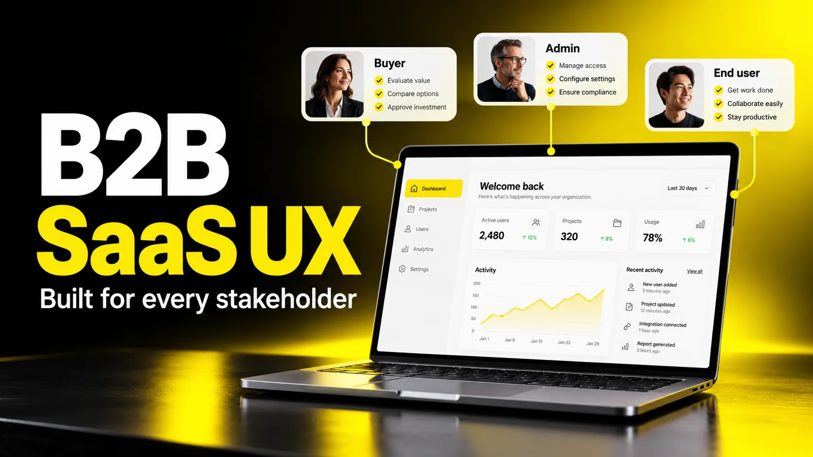
B2B SaaS UX is the practice of designing software experiences for business buyers and their teams, where multiple stakeholders, complex workflows, and long buying cycles all shape the product. Good B2B SaaS UX reduces the effort it takes to evaluate, adopt, and get ongoing value from a product, which ultimately drives conversions, retention, and expansion revenue. Unlike consumer apps, it must serve the buyer, the admin who configures it, and the everyday user who lives in the tool.
Most B2B software isn't chosen because it's beautiful. It's chosen because a team believes it will make their work measurably easier—and then it's kept only if that belief turns out to be true. That gap between "looks promising in a demo" and "actually reduces friction on a Tuesday afternoon" is where B2B SaaS UX lives.
If you've ever watched a promising deal stall because a technical evaluator couldn't figure out your integration setup, or seen a healthy trial go quiet during onboarding, you already understand the stakes. In B2B, the user experience isn't a coat of paint applied at the end. It's the mechanism by which value gets discovered, proven, and delivered across an entire organization.
This guide is written for founders, product leaders, heads of growth, and teams deciding how much to invest in design. We'll cover what makes B2B UX genuinely different, how the buyer journey works, the design principles that hold up under real complexity, how to run onboarding and research that move numbers, and how to think about hiring or partnering with design help without wasting budget. The goal is practical: patterns you can apply this quarter, and a clear way to evaluate the trade-offs.
The biggest mistake teams make is assuming that "good UX is good UX." The fundamentals of clarity, feedback, and hierarchy do carry over. But the context around B2B software changes what "good" means, and applying consumer instincts blindly can quietly hurt you.
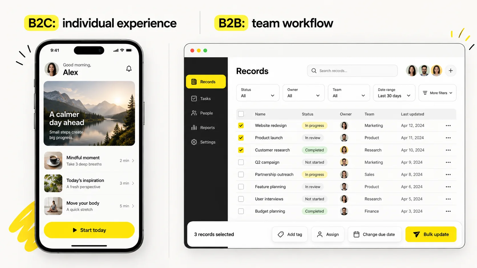
Here's the core difference: in consumer apps, the person using the product is usually the person who chose it. In B2B, those roles split apart—sometimes across three or four people who never sit in the same room.
Consider a typical purchase. An economic buyer approves the budget. A technical evaluator kicks the tires. An admin configures roles and permissions. And a group of end users actually spend their days in the interface. Each of these people has different questions, different definitions of success, and different tolerance for friction. A design that delights the end user but confuses the admin can still lose the account.
A few more distinctions worth internalizing:
To make the contrast concrete:
| Dimension | B2C Product | B2B SaaS Product |
|---|---|---|
| Decision maker | Usually the user | Often a committee separate from users |
| Primary emotional driver | Desire, delight, identity | Confidence, reduced risk, credibility |
| Usage pattern | Occasional, exploratory | Frequent, repetitive, deep |
| Cost of a bad experience | One lost user | A stalled deal or a churned account |
| Onboarding stakes | Get the person to a first win | Get an entire team productive |
| Success metric | Engagement, delight | Time-to-value, adoption, retention, expansion |
None of this means B2B software should be dull. It means the aesthetic serves a purpose: to communicate reliability and reduce cognitive load, not to entertain. The best enterprise SaaS UX feels calm and confident precisely because it respects how much its users have on their plates.
B2B SaaS UX differs from B2C because the buyer, the admin, and the end user are often different people—so the design must reduce risk for decision-makers while reducing daily friction for the people who use the product most.
Share your product or current challenge. We can discuss opportunities across onboarding, conversion and the enterprise experience.


You can't design a great experience if you only think about the moment someone is logged in and clicking around. The B2B buyer journey starts long before signup and continues well past the first successful use. Each stage carries its own UX questions.
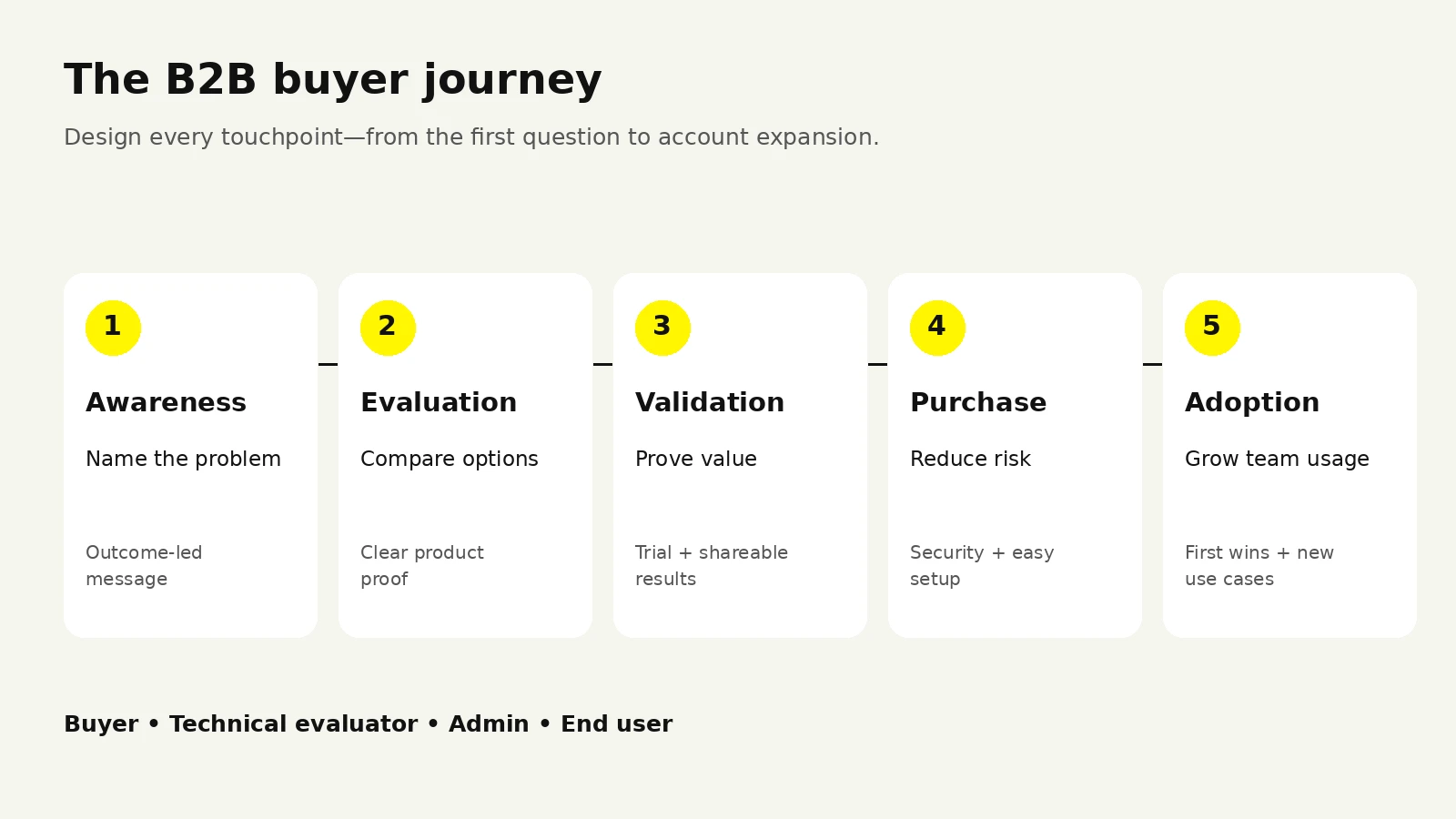
Think of the journey in five broad stages. Below is a working map you can adapt to your own funnel.
| Stage | What the buyer is doing | The UX job to be done |
|---|---|---|
| Problem awareness | Realizing a workflow is painful or costly | Help them name the problem and see themselves in it |
| Evaluation | Comparing options, building a shortlist | Make capability obvious and comparison easy |
| Validation | Trialing, demoing, looping in stakeholders | Prove value fast; make it shareable internally |
| Purchase | Getting internal sign-off and security review | Reduce friction in procurement, security, and setup |
| Adoption & expansion | Rolling out to the team, growing usage | Drive time-to-value; surface new use cases over time |
A few things fall out of this map that teams routinely miss.
First, your website is part of the product experience, not a separate marketing artifact. During evaluation, prospects form judgments about how well your software will work based on how well your site works. If your pricing page is confusing or your demo booking flow is clunky, they extrapolate.
Second, the champion needs to sell internally. Often the person most excited about your product is not the one signing the contract. Your UX should give that champion easy ways to demonstrate value—clean exports, shareable dashboards, an ROI or usage summary they can forward. When you design for the "share this with my boss" moment, you turn one user into an internal advocate.
Third, procurement and security are UX surfaces too. A slow, opaque security questionnaire process or a confusing SSO setup can kill momentum right when a deal is warmest. Treating these as experiences worth designing—clear documentation, self-serve security pages, a smooth admin console—removes friction exactly where deals die.
The practical move is to hold a working session where you place every touchpoint from ad to renewal on a single timeline, then ask one question at each point: What is the user trying to accomplish here, and what's in their way? That question, repeated honestly, surfaces most of the meaningful work.
For the marketing touchpoints in this journey, see our landing page structure and UX guide.
There's no shortage of generic advice about "intuitive design." Below are B2B UX best practices that hold up specifically under the density and stakeholder complexity of business software. Think of these as principles, not a checklist—each one is a lens for making trade-offs.
Business users don't wake up wanting to use your software. They want to close the books, resolve the ticket, ship the release, or run payroll. Structure your product around those jobs and the sequences they require, rather than around the internal architecture of your feature set. When navigation mirrors how work actually flows, users stop translating between "what I want to do" and "where the software hides it."
Consumer design often optimizes for the first-time user forever. B2B power users grow into the tool. Good design supports both: gentle defaults and guidance for newcomers, plus keyboard shortcuts, bulk actions, saved views, and density controls for people who live in the product. Hiding all complexity behind wizards frustrates the very users who drive retention.
In business tools, actions have weight—money moves, records change, other people are affected. Users need to always know what state they're in, what a click will do, and how to undo it. Clear confirmation for destructive actions, visible system status, and reliable undo aren't nice-to-haves; they're what let anxious users act decisively.
The old "three-click rule" is a myth. Users happily click many times through a path that feels obvious. What exhausts them is thinking—decoding jargon, holding numbers in their head, guessing what a setting does. Prioritize plain language, sensible defaults, inline explanations, and progressive disclosure over raw click-count minimization.
Every unique pattern is something the user must learn and remember. A consistent design system—predictable buttons, tables, forms, and empty states—lets users transfer knowledge from one part of the app to another. Consistency is a feature; novelty is usually a bug.
Errors, empty states, permission blocks, expired sessions, and edge cases are where trust is won or lost. A helpful empty state that shows a user what to do next can be the difference between adoption and abandonment. Budget real design time for these, not just the pristine "everything works" screens.
A quick way to pressure-test any screen:
If a screen fails any of these, you've found your next iteration.
Reduce cognitive load, not just clicks.
Onboarding is where most of the value—and most of the risk—concentrates. A prospect who reaches a genuine first win is far more likely to convert and stay. A prospect who gets lost in setup rarely comes back to try again. Strong B2B SaaS onboarding is less about tooltips and more about engineering the fastest honest path to value.
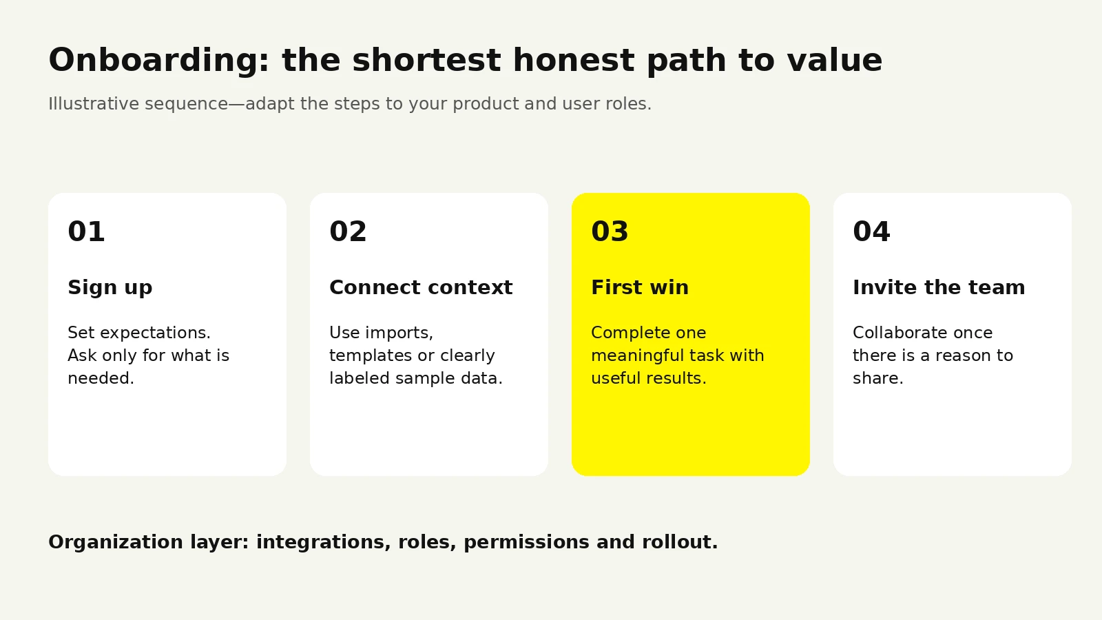
Before designing anything, articulate the specific moment when a user first experiences real value—not signup, not a completed profile, but the moment the product does the thing they came for. For an analytics tool it might be seeing their own data visualized. For a support platform it might be resolving a real ticket. Everything in onboarding should bend toward that moment as fast as possible.
B2B onboarding is really three layered experiences, and conflating them is a common failure:
A brilliant individual onboarding that ignores team rollout leaves you with pockets of usage that never become an account-wide habit—exactly the kind of shallow adoption that leads to churn at renewal.
The instinct is to layer product tours on top of a heavy setup process. It's usually better to remove the setup burden first: smart defaults, pre-filled examples, sample data or templates, and integrations that pull in real context so the product feels alive on day one. Guidance should point people toward value, not narrate a tedious configuration.
Use this as a step-by-step starting point, then adapt to your product:
A word on tours: interactive walkthroughs help, but they can't rescue a confusing product. If users need a tour to find the primary action, the underlying design—not the tour—is the problem. Treat guidance as a complement to clarity, never a substitute for it.
Onboarding should deliver a first win, not narrate a setup process.
You cannot design a great B2B experience from assumptions, because the person specifying the software often isn't the person using it, and neither may fully understand the other's reality. Solid SaaS UX research closes that gap. The good news: you don't need a large research team to do it well. You need discipline and regular contact with real users.
Because B2B decisions involve multiple roles, your research must too. Interview economic buyers about the outcomes and risks they care about. Interview admins about setup and governance pain. And—crucially—observe end users doing their real work, because they'll rarely tell you about friction they've learned to tolerate. What people say they do and what they actually do frequently diverge; watching reveals the truth.
You don't need every method at once. Pick based on what you're trying to learn.

| If you want to learn... | Use this method | Why it fits |
|---|---|---|
| Why users struggle with a workflow | Contextual interviews / observation | Reveals real behavior and unspoken friction |
| Whether a design is usable | Moderated usability testing | Surfaces confusion as it happens |
| Which of several options performs better | Unmoderated tests or A/B tests | Compares at scale with real behavior |
| Where users drop off | Product analytics and funnels | Quantifies the "what," pointing to the "why" |
| What the market and buyers value | Buyer/win-loss interviews, surveys | Connects UX to purchasing decisions |
| How support pain maps to UX gaps | Support ticket and session review | Cheap, continuous signal already in-house |
Before commissioning anything new, sit with your support team for an afternoon. Read closed tickets. Watch a handful of session recordings. Read sales-call notes for the objections that recur. B2B companies are usually swimming in qualitative signals they never analyze. This "found research" is fast, free, and often points directly at the highest-impact fixes.
The teams that build great B2B UX aren't the ones that run a giant study once a year. They're the ones who talk to a few users every couple of weeks, keep a running list of observed problems, and let that evidence shape the roadmap. A steady drip of contact beats an occasional flood. A small round of task-based usability tests can reveal recurring issues in a focused flow. Recruit separately across distinct roles and iterate; five conversations are not a guarantee of coverage. See guidance on iterative usability-test sample sizes.
Research only pays off if it changes what you build. Close the loop: summarize each study into a short, shared artifact—top findings, severity, and a recommended action. Tie observations to specific screens or flows. When research lives in a doc nobody reads, it becomes theater. When it drives the next sprint, it compounds.
Your website is often the first real interaction a buyer has with your product's quality, and it does double duty: it must rank and attract, and it must convert a skeptical, comparison-shopping evaluator. Strong B2B SaaS website design treats the site as the top of the product experience, not a brochure.
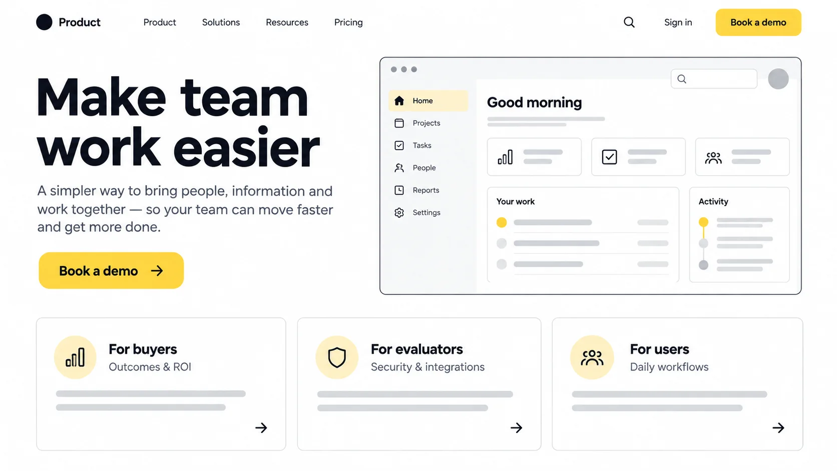
Evaluators arrive asking "will this solve my problem?" A homepage that opens with the concrete outcome you deliver—stated in the customer's language—outperforms one that opens with a clever tagline or a feature dump. Say what job you do and who you do it for within the first screen. Clarity beats cleverness almost every time in B2B.
Different stakeholders need different proof. A well-structured B2B site gives each of them a path:
Real interface screenshots and short product visuals build more confidence than stock imagery, because they let evaluators picture themselves using the tool.
Whether your motion is self-serve trial, demo request, or both, the path forward should be unmistakable and appropriately low-commitment. If your product benefits from a guided demo, make booking effortless. If self-serve trial is your motion, reduce the friction to start. Offering the right next step to the right visitor matters more than cramming multiple competing calls to action onto every page.
B2B buyers are risk-averse by nature. Trust elements—clear security and compliance information, real customer logos and stories, transparent pricing where possible, and straightforward answers to common objections—do real conversion work. Hiding pricing entirely, for instance, is a legitimate strategic choice for some enterprise motions, but it introduces friction you should adopt knowingly, not by default.
A slow, cluttered, or inaccessible site quietly signals a slow, cluttered product. Fast load times, clean information architecture, mobile responsiveness, and accessible design aren't just SEO and compliance concerns—they're the first demonstration that your team sweats the details. In B2B, that impression carries into the buyer's expectations of the software itself.
As you move upmarket, the experience has to absorb more complexity without collapsing under it. Enterprise SaaS UX is where design maturity really shows, because the challenges are less about surface polish and more about structure, permissions, and scale.
In smaller accounts, the person who sets things up is often the person who uses the product. In enterprise deals, administration becomes its own discipline: managing hundreds or thousands of users, roles, permissions, and policies. The admin console deserves the same care as the core product. A confusing permissions model or a fragile bulk-provisioning flow can sink a large rollout even when the everyday experience is excellent.
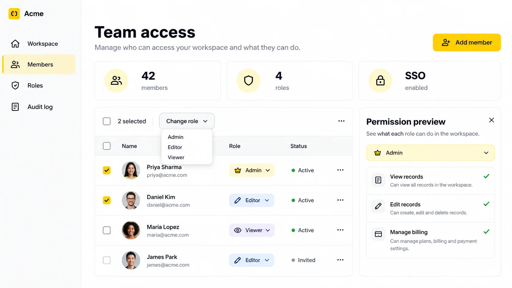
Enterprise-grade capabilities that carry real UX weight include:
Enterprise users work with far more data than a demo account ever shows. Tables that look elegant with ten rows become unusable with ten thousand if you haven't designed for filtering, sorting, saved views, search, and performance. Always design and test with realistic data volumes; the pretty empty state is not the real product.
Large organizations want to tailor the product to their processes, but unlimited flexibility creates chaos and support burden. The craft is offering meaningful configuration within sensible guardrails—so an admin can adapt the tool without being able to break it for everyone else. Thoughtful defaults matter even more at scale, because they set the baseline experience for thousands of people who will never touch the settings.
Enterprises don't adapt once and freeze. Teams reorganize, policies change, and usage grows. Enterprise UX should make ongoing administration—reassigning ownership, deprovisioning departed employees, adjusting policies—routine and safe rather than a source of anxiety. Designing for the full lifecycle, not just the first install, is what separates software that expands within an account from software that quietly gets replaced.
For data-heavy interfaces, read our dashboard design best practices.
At some point every growing SaaS company faces the question: how much should we invest in design, and should we build the capability in-house, hire, or partner with a specialized studio or agency? There's no universal answer, but there is a clear way to think about the trade-offs.
Consider dedicated design investment—whether a senior hire, a design team, or an external partner—when you notice signals like these:
Done well, design investment pays back in ways that show up across the funnel: shorter time-to-value in onboarding, higher trial-to-paid conversion, lower support burden, stronger retention, and a product story that's easier to sell and expand. Perhaps most importantly, a mature design practice reduces the cost of future change, because a solid design system and clear patterns let you ship new features faster and more consistently.
Whether you're interviewing a candidate or vetting an agency, the same criteria apply. Look for evidence, not adjectives.
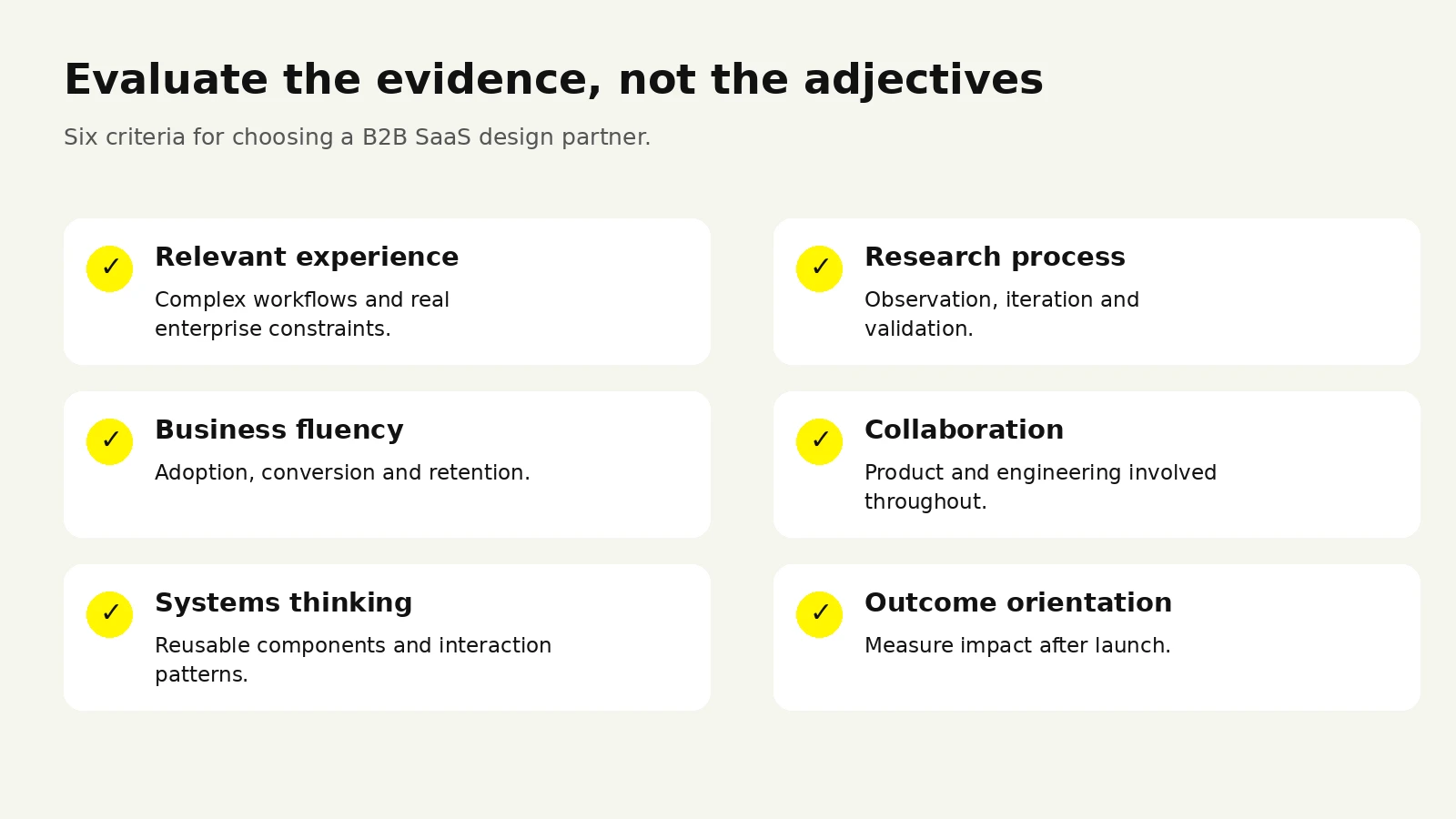
| What to evaluate | What good looks like | Red flag |
|---|---|---|
| Relevant experience | Real work on complex, workflow-heavy B2B or enterprise products | A portfolio of only marketing sites or consumer apps |
| Process | A clear approach to research, iteration, and validation | "We just make it look nice" |
| Business fluency | Talks in terms of adoption, conversion, and retention | Talks only about aesthetics and awards |
| Collaboration | Works closely with product and engineering | Delivers pretty files that can't be built |
| Systems thinking | Builds reusable components and patterns | One-off screens with no consistency |
| Outcome orientation | Wants to measure impact after launch | Considers the job done at handoff |
Ask to walk through a past project in depth: what the problem was, how they learned about users, what they tried, what failed, and how they knew it worked. The story reveals far more than a polished portfolio ever will.
Investing in design can still go wrong. The most frequent pitfalls:
Rather than asking "what will design cost," ask "what is the current experience costing us"—in stalled deals, churned accounts, support hours, and slow feature adoption. Framed that way, the conversation shifts from expense to return, and it becomes much easier to size the right level of investment for your stage. Early-stage teams often get far with a strong generalist and disciplined research; scaling and enterprise-focused teams typically need deeper, more specialized design capability.
If you're weighing whether to build this capability internally or partner with people who do B2B product design every day, the right choice depends on your timeline, your stage, and how central design is to your differentiation. The important thing is to decide deliberately, with a clear picture of what the current experience is costing you—and to treat design as an ongoing practice rather than a one-time project.
Ask what the current experience is costing you before sizing the investment.
Compare scope and delivery models in our UI/UX design investment guide, or talk through your B2B SaaS product with our team.
The most useful metrics tie directly to the value the product delivers: time-to-value in onboarding, activation rate, trial-to-paid conversion, feature adoption, task success and time-on-task in usability testing, support ticket volume for usability issues, and ultimately retention and expansion. Vanity metrics like raw pageviews or session count matter far less than whether users are reaching outcomes efficiently.
Small, targeted fixes—an onboarding step, a confusing form, an empty state—can move activation or support metrics within weeks. Larger structural changes, like a navigation overhaul or a new admin experience, take longer to design, build, and adopt, and their impact shows up over a quarter or more as users adjust and new cohorts flow through.
Not on day one, but sooner than most teams think. Even a lightweight set of shared components, spacing rules, and interaction patterns pays for itself quickly by keeping the product consistent and speeding up how fast you can ship new features. As you scale toward enterprise, a maturing design system becomes essential rather than optional.
Neither extreme works. Hide complexity by default so newcomers aren't overwhelmed, but make it accessible through progressive disclosure so power users can reach advanced capabilities quickly. The goal is a floor that's easy to step onto and a ceiling that's high enough for experts to grow into.
Ground decisions in research and behavior rather than the loudest internal voice. When a sales-driven or executive request conflicts with observed user needs, bring evidence—session recordings, support patterns, test results—to the conversation. Framing trade-offs around adoption, conversion, and retention keeps the discussion focused on outcomes rather than opinions.




.svg)



.svg)

.svg)

.svg)

.svg)

.svg)
.svg)
