25-06-2026
UI/UX
11 Best Healthcare Website Design Examples in 2026 (and the Design Principles That Make Them Work)


Looking for healthcare web design that actually turns worried visitors into booked patients? Most people land on a medical site late at night, stressed and on a phone, and decide whether they trust you within seconds, before they read a single word. Great healthcare websites are built for exactly that moment. Updated June 2026, we pulled together 11 of the best healthcare website design examples worth studying right now and broke down why each one works, so you can copy the thinking instead of the screenshots. We design healthcare products and clinic websites ourselves at WolfPixel, so treat this as a practitioner's honest take, not a roundup written from the sidelines.

If you run a clinic, market a medical practice, or you're building a health product and figuring out how your front door should look online, this one's for you. Let's get into it.
A regular business website has to look professional and explain what the company does. A healthcare website has a harder job. It has to do all of that while calming someone down.
The numbers back this up. Recent reports suggest roughly three out of four patients research a provider online before they ever pick up the phone, and around 65% say they'd switch to a different provider just to get better digital tools, things like online booking, easy access to records, and quick messaging. People aren't only comparing you to the clinic down the street anymore. A growing share are asking AI tools for health advice first, which means your site now competes for attention with ChatGPT, Gemini, and a dozen search summaries.
So the bar has moved. A healthcare site in 2026 needs to load fast, feel calm, work flawlessly on a phone, let people book in a couple of taps, and be readable by both a nervous human and an AI that's summarizing your page. That's a lot to ask of one homepage. The sites below pull it off.
Before we'll call a healthcare site good, we run it through the same short mental checklist we use on our own projects. It keeps us honest, and it's a useful lens as you read through the examples.
It earns trust in the first scroll. Real doctor photos, credentials, reviews, and clear "who we are" signals, not stock images of strangers in lab coats.
It feels calm, not clinical. Soft color, generous white space, and clean type lower the temperature for someone who's already anxious.
The navigation disappears. Good navigation is the kind you never notice, because you found what you needed and moved on. If a visitor has to think about where to click, it's already too complicated.
It's built phone-first. Most people open these sites on a smartphone, often one-handed. If the booking button is hard to reach with a thumb, the design failed.
It's accessible and compliant by default. WCAG-level contrast, readable text sizes, keyboard support, and HIPAA-safe forms aren't extras. In healthcare they're the floor.
It gets people to "book" fast. The path from "I'm interested" to "I have an appointment" should be short, obvious, and friction-free.
Keep that list in your head. You'll see every site below hitting most of these, just in different ways.
Want to know why visitors drop off? Our AI audit tool scans your website and gives actionable UX insights fast — no meetings, no fluff.
One quick note before the list: these aren't ranked, and they're a deliberate mix. A few are household names with budgets the size of a small country; others are younger brands that simply made smarter choices. We picked each one because it nails at least one thing worth stealing, and most of them quietly nail several. So don't get stuck on whether your clinic could ever look like Mayo Clinic, look at the single decision behind each example and ask whether your own site makes the same one.
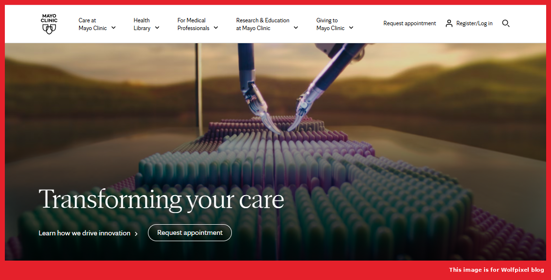
Mayo Clinic is one of the most content-heavy health sites on the planet, and that's exactly why its search matters so much. The search bar sits front and center, with autocomplete, suggested terms, and filtering that breaks results down so you can scan them quickly. For a site with thousands of pages on conditions and treatments, that strong search is the whole experience.
What to take from it: if your site has a lot of content, treat search as a primary feature, not a small icon in the corner. Make it easy for a worried person to find the one page they came for.

Cleveland Clinic keeps a famously clean layout, but the smart part is how obvious the two most important actions are. "Find a Doctor" and "Book Now" are visible the moment you land, and the search makes it simple to look up a service or a specific physician. Nothing competes with the actions patients came to take.
What to take from it: decide on the one or two things you most want visitors to do, then make those impossible to miss. Everything else can wait below the fold.
Zocdoc made a bold choice by walking away from the wall of blue that most medical sites default to. The white-and-yellow palette feels fresh and approachable, and the design is built entirely around one job: search for a provider, filter by specialty, availability, and insurance, then book. Patient reviews and clear in-network filtering tackle the two things people stress about most, quality and cost.
What to take from it: booking should feel as easy as buying something online. And you don't have to look like every other clinic to be taken seriously.

One Medical leans hard into minimalism. Short blocks of text, bold icons, lots of breathing room, and a homepage that quietly personalizes what it shows you. The mobile experience is clean enough that browsing on a phone never feels cramped, and the membership model is explained without a wall of fine print.
What to take from it: when in doubt, cut. A calmer, emptier page often communicates "modern and trustworthy" better than one stuffed with features.

Maven works in family, fertility, and maternity care, and the design speaks to that audience before you read a single line. The soft green palette is doing real psychological work, it reads as calm and reassuring. A sticky top navigation keeps key links and plans within reach, and the photography is warm and human rather than stocky and sterile.
What to take from it: color isn't decoration. Pick a palette that matches the emotional state of the person visiting, and let it set the tone.
Hims & Hers took categories people are often embarrassed to talk about, hair loss, mental health, sexual wellness, and built a brand that feels more like a modern lifestyle company than a pharmacy. Confident typography, warm tones, and plainspoken copy strip the shame out of the experience, and the path to a product or consultation is short and direct.
What to take from it: tone is design. The way your words and visuals make someone feel about a sensitive topic can be the difference between a booking and a bounce.

Alto's site mirrors its mobile app so closely that the two feel like one product. Clean lines, intuitive navigation, and a clear focus on the things people actually want from a pharmacy: medication reminders, delivery scheduling, insurance transparency, and same-day service. It's designed for busy, tech-comfortable patients who expect their healthcare to keep up with the rest of their phone.
What to take from it: if you have an app, your website should feel like its sibling. Consistency between the two builds confidence and reduces the learning curve.

athenahealth sells complex healthcare software, which makes its restraint impressive. The main navigation has just three primary links plus a few logins, where plenty of competitors cram twenty items into the top bar. Subtle motion design carries you through the value proposition, and the messaging stays crisp the whole way down. It's proof that even dense, technical products can feel simple.
What to take from it: a short navigation menu is a gift to your visitors. Every extra link is one more decision you're asking a tired brain to make.

Teladoc has to speak to individuals, employers, and clinicians at the same time, and somehow the site never feels chaotic. Clear CTAs like "Get care now" sit up top, content is sorted into clean lanes for each audience, and a patient-story section adds the human warmth that telehealth can sometimes lack.
What to take from it: if you serve more than one kind of visitor, give each group an obvious path from the homepage instead of forcing everyone through the same door.

Ada's AI symptom checker could easily feel like a black box, and the design works hard to make sure it doesn't. The experience is mobile-first with large, easy touch targets and fast loading, and crucially, it's open about how it handles your data and how the AI reaches its suggestions. That transparency is what turns a skeptical first-time user into a returning one.
What to take from it: if you're using AI anywhere in the experience, explain it in plain language. People trust what they understand, especially with their health.

We'll include one of our own, because it taught us a lesson worth passing on. Hoslev Clinic uses AI-powered diagnostics, and the brief was to make advanced technology feel simple and trustworthy rather than intimidating. We built clear messaging around the AI, visual sections that turn patient data and test results into something readable, and a structured, modern layout that never overwhelms. The goal wasn't to show off the tech. It was to make people feel safe using it.
What to take from it: innovation only lands when it feels approachable. The smartest technology on your site still has to be explained like you're talking to a friend.
Read those entries again and a pattern shows up. None of these sites are winning on flashy visuals alone.
They all start by building trust, fast. They all keep navigation short and the most important action obvious. They all respect the phone as the primary screen. They all treat speed and accessibility as non-negotiable rather than nice-to-have. And every one of them writes for a human being who's a little stressed and short on patience.
In other words, great healthcare web design isn't a style. It's a set of decisions made on behalf of someone who's having a hard day. Get those right and the visuals almost take care of themselves.
We've audited a lot of healthcare sites, and the same problems keep dragging good practices down. None of them are dramatic. That's why they go unnoticed.
Too many menu items. A top navigation with fifteen links isn't thorough, it's paralyzing. Trim it to the handful of things people actually need.
Hiding the booking button. If "Book an appointment" isn't visible without scrolling, you're losing people who were ready to convert. Make it sticky and make it loud.
Stock photos instead of trust signals. Generic smiling models build nothing. Real doctor photos, credentials, and reviews build everything.
Tiny text and weak contrast. A lot of healthcare visitors are older or reading in a bright room. If they have to squint, they leave. Accessibility isn't a checkbox here, it's whether people can use your site at all.
Slow pages. A worried person won't wait for a heavy homepage to load. Compress images, cut the bloat, and treat speed like a feature.
Copy written for the clinic, not the patient. "Comprehensive multidisciplinary care solutions" means nothing to a scared parent. Plain words win.
IMAGE — A WolfPixel work collage or a Care HQ / b.well case-study shot. ALT: "WolfPixel healthcare UI and web design work". Internal link "WolfPixel" to your healthcare service page, and link the project names to their case studies if public.
A lot of what we just described, we learned the hard way, on real projects with real constraints.
When we worked on b.well's Health Information Network, we didn't design one sign-up flow. We built three separate identity-verification flows for three different kinds of users, because a patient, an admin, and a caregiver simply don't think the same way. We also designed the data-collection steps to explain why each piece of information was being asked for, and that one change measurably cut the number of people who abandoned the process. People finished when they understood the reason. They quit when they didn't.
On Care HQ, a healthcare analytics platform, the whole challenge was clinician burnout. Doctors were spending nearly as much time on documentation as on patients, so we designed a fast, low-friction interface with AI-generated notes and smart inputs that took work off their plate instead of adding to it. The lesson stuck with us: in healthcare, speed and simplicity aren't cosmetic, they directly affect the quality of care someone receives.
That's the thread running through our work, and why our healthcare designs have been featured in industry roundups and across the design community. We don't treat healthcare like just another industry to design for. The stakes are higher, the users are more vulnerable, and the details matter more. We design like we know that.
If your site needs work, don't try to fix everything at once. Start with the few things that move the needle most.
Look at it on your phone first, the way most of your patients will. Time how long it takes to load. Then ask a friend who's never seen it to book an appointment, and watch where they hesitate. Those hesitations are your roadmap. Fix the booking path, clean up the navigation, add real trust signals, and make sure a stressed person can find what they need in seconds. Most healthcare sites don't need a bigger budget. They need clearer decisions.
And if you'd rather not guess your way through it, that's the kind of work we do every day.
Want a second set of eyes on your healthcare site? Book a free discovery call with the WolfPixel team and we'll walk through what's working, what's quietly costing you patients, and what to fix first.
Want to know why visitors drop off? Our AI audit tool scans your website and gives actionable UX insights fast — no meetings, no fluff.
Q. What is healthcare web design?
A. Healthcare web design is the practice of building websites for clinics, hospitals, and health brands that earn patient trust, meet HIPAA and accessibility rules, and make booking easy. It pairs calm, clear design with the strict requirements ordinary business sites don't have.
Q. How much does healthcare web design cost?
A. Most single-practice healthcare websites cost about $4,000–$10,000, while large custom or multi-location builds run $30,000 to $100,000+. Features like online booking, patient portals, and compliance drive the price far more than page count.
Q. How do I create a healthcare website?
A. Decide who you're building for and the main action you want them to take, then plan your core pages, design mobile- and trust-first, and add HIPAA-safe forms. Test the booking flow on a phone before you launch.
Q. What makes a good healthcare website?
A. A good healthcare website builds trust fast, loads quickly, works perfectly on mobile, and makes booking effortless. Calm color, short navigation, and real doctor photos do most of the heavy lifting.
Q. Why is web design important in healthcare?
A. Because most patients judge your credibility within seconds and research you online before they ever call. A clear, fast site wins appointments; a slow, cluttered one sends them to a competitor.
Q. What is the best color for a healthcare website?
A. Blue is the most common choice because it signals calm and trust, but green, teal, and warm neutrals work just as well. Pick the palette that fits how you want patients to feel, and keep the contrast accessible.
Q. What pages should a healthcare website have?
A. At minimum: home, about, services, provider bios, contact with location and hours, and an easy way to book. Many practices also add patient resources, insurance info, testimonials, and a secure patient portal.
Q. What makes a healthcare website HIPAA-compliant?
A. Secure HTTPS hosting, encrypted forms for any health information, controlled data storage and access, and signed agreements with third-party tools. Most of it lives on the back end, so plan for it before launch.
Q. Are there templates for healthcare web design?
A. Yes, Webflow, Squarespace, Wix, and WordPress all offer healthcare and medical templates. They're fast and affordable but shared with other practices, so growing clinics often outgrow them.
Q. Can I build a healthcare website for free?
A. You can start free on builders like Wix or WordPress.com, but a professional, HIPAA-safe site needs a paid plan, a custom domain, and secure forms. Free tiers aren't safe for handling patient data.
Q. How do I choose a healthcare website design company?
A. Pick one that can show real medical projects, knows HIPAA and accessibility, and talks about patient conversions, not just visuals. Ask for case studies with results and confirm what's included before you sign.