Brand Design

How to Create a Brand Identity: The Complete Process, Step by Step

Blog Author
Maniruzzaman Jubayer
Publish date:
06 Oct 2026
Single Blog Image

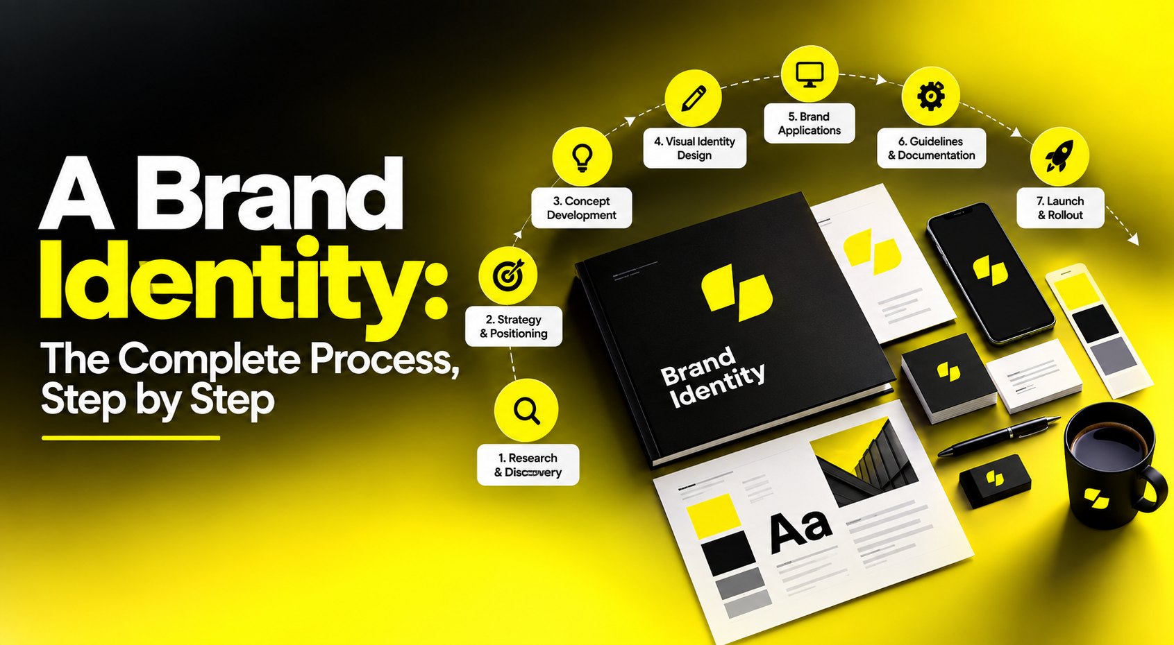
To create a brand identity, you work through seven connected stages: discovery and research, brand strategy and positioning, verbal identity, visual identity exploration, system design, guidelines and asset production, and rollout. Strategy comes first because every visual decision that follows needs a reason behind it — without that, you're choosing logos by taste. For most companies, a complete identity takes 8 to 16 weeks, and the logo is the smallest part of the work.

Ask ten people what a brand identity is and you'll get ten answers, most of them describing a logo. That confusion is expensive, because it's why so many identity projects start in the wrong place: with a designer showing marks in week one, a founder picking the one they personally like best, and a team six months later unable to explain what any of it means.

If you're a founder, product lead, or head of growth about to invest in branding, the useful question isn't “what is brand identity.” It's the practical one: what happens, in what order, who's involved, what do I actually receive, how long does it take, what does it cost, and how do I tell good work from expensive decoration?

‍

This guide answers that. It covers the full branding process steps from a blank page to a live, governed identity — the brand discovery workshop and how to run one, the brand identity design process that turns strategy into a system, the brand identity deliverables you should expect to own, how long branding takes in realistic terms, and how to evaluate a branding partner before you commit budget.

What a Brand Identity Actually Is (and What It Isn't)

Four words get used interchangeably and shouldn't be.

  • Brand is the reputation that exists in someone else's head — what people believe and feel about you. You don't own it; you influence it.
  • Branding is the deliberate activity of shaping that belief: strategy, design, communication, behavior.
  • Brand identity is the tangible system you build to do that shaping. It's the sum of everything expressible: name, logo, typography, color, imagery, iconography, motion, tone of voice, messaging, and the rules governing how they combine.
  • Logo is one asset inside that system. An important one, and the smallest.

That last distinction matters commercially. A logo can be produced in a week. A brand identity is the system that makes every future piece of work — a landing page, a job ad, a pitch deck, a product screen, a packaging refresh — faster to produce and recognizably yours. The logo is a signature; the identity is the handwriting. (For a deeper look at the definitions, see our guide to what brand identity is.)

What a complete brand identity contains

Layer What it includes What it does
Strategy Purpose, positioning, audience, values, personality, brand architecture Gives every downstream decision a reason
Verbal identity Name, tagline, messaging framework, tone of voice, terminology Determines how you sound in every sentence you write
Visual identity Logo system, typography, color, imagery style, iconography, layout, motion Determines how you look at every touchpoint
Governance Guidelines, asset library, ownership, review process Determines whether any of it survives contact with real teams

Most projects that disappoint have covered layers two and three and skipped one and four. Strategy is skipped because it's abstract and feels slow. Governance is skipped because it happens after the exciting part is finished and the invoice is paid.

Thinking About Your Brand Identity?

Get an honest read on what's working, what's missing, and what a realistic scope and timeline would look like, before the budget is committed. No pressure, no obligation.


Free 30-min call
primary-btn__arrowprimary-btn__arrow

Brand Strategy Before Design: The Foundation Everything Rests On

The single highest-leverage decision in this entire process is refusing to look at visual concepts until brand strategy is agreed in writing.

Here's the practical reason. Without a strategy document, design reviews become taste contests. Someone says “I don't love the blue,” nobody can say whether the blue is right or wrong, and the loudest or most senior opinion wins. With a strategy document, the question becomes “does this express approachable expertise better than that one?” — which is a question a room can actually answer.

What brand strategy produces

  • A positioning statement. The widely used template popularized by Geoffrey Moore still works: For [target audience] who [need or situation], [brand] is the [category] that [key benefit], because [reason to believe]. One paragraph, argued over for days, then settled.
  • A defined primary audience. Specific enough to picture. “SMBs” is not an audience. “Operations leads at 20–200 person logistics companies who still run scheduling in spreadsheets” is.
  • A competitive landscape map. Not a feature comparison — a distinctiveness map. Plot how competitors look, sound, and position, so you can see where the crowded territory is and deliberately avoid it.
  • Brand personality. Three to five traits, each with an explicit boundary. “Confident, not arrogant. Warm, not casual. Precise, not clinical.” Those boundary clauses do more work than the traits themselves.
  • Values and behaviors. Values only matter if they cash out into behavior. Pair each with what it looks like in practice.
  • Brand architecture, if you have more than one product or sub-brand. Decide early whether you're a branded house (one master brand, everything endorsed by it), a house of brands (independent identities), or a hybrid. Retrofitting architecture after launching sub-brands is one of the more painful corrections in branding.

The research that makes strategy real

Strategy built entirely in a boardroom is just opinion with better formatting. Ground it with:

  • Internal interviews. Founders, sales, support, long-tenured staff. Sales and support hear the language customers actually use — that language often becomes the messaging.
  • Customer conversations. A handful per segment. Ask why they chose you, what they nearly chose instead, and how they describe you to a colleague. That last answer is your real positioning, whether you like it or not.
  • Competitive and category audit. Collect competitors' homepages, palettes, typography, and taglines side by side. In most categories the sameness is striking, and that's the opportunity.
  • Perception gap check. Compare what leadership believes the brand stands for against what customers say. The gap is the brief.

How to Run a Brand Discovery Workshop

The brand discovery workshop is where strategy gets built collaboratively and, more importantly, where alignment gets manufactured. A brilliant strategy that leadership wasn't part of creating tends to die quietly in a slide deck.
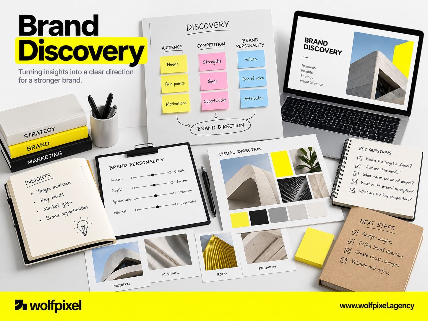
Brand discovery workshop with personality sliders, sorted reference imagery and key questions

Before the workshop

  • Invite decision-makers, not delegates. Six to eight people maximum. If the person who can veto the outcome isn't in the room, you're scheduling a second workshop you haven't budgeted for.
  • Send pre-work. A short questionnaire completed individually beforehand surfaces disagreement before the room can converge socially. Ask each person to write, independently: what the company does, who for, and why it matters.
  • Do the audit first. Walk in with the competitive landscape, customer language, and existing asset audit already prepared. Workshop time is for judgment, not data collection.

A working agenda

Block Exercise Output
Grounding Read out the pre-work answers anonymously Visible alignment gaps — usually the most useful 20 minutes of the day
Purpose & origin Why the company was started; what would be lost if it disappeared Raw material for purpose
Audience Define primary audience; map their situation, not their demographics Audience definition
Competitive distinctiveness Review the landscape; identify crowded territory and open space Positioning direction
Personality Trait selection with boundary clauses; sliders between opposing attributes Personality framework
Visual territory Sort reference imagery: “us / not us / aspirational,” with reasons stated aloud Design direction inputs
Constraints Legal, technical, cultural, budget, existing equity to preserve Scope reality check

Facilitation notes that make the difference

  • Have everyone write before anyone speaks. Silent individual writing, then reveal. This prevents the first speaker from anchoring the room.
  • Force trade-offs. Ask people to rank rather than rate. Everything can be “important”; only three things can be top three.
  • Ban “and.” When a group wants to be innovative and trusted and affordable and premium, the strategy hasn't been made yet.
  • Capture verbatim language. The offhand sentence a founder says at 2pm is frequently the tagline.
  • Interrogate the visual sorting. When someone rejects a reference, the reason matters far more than the rejection. “Too cold” is a strategy input; “I don't like green” is not.

After the workshop

Deliver a written strategy document within about a week, while the room is still warm, and get explicit sign-off before any design begins. That sign-off is the thing you point back to when someone questions a design decision in month three.

The Brand Identity Design Process: Turning Strategy Into a System

With strategy signed off, design begins. The brand identity workflow below moves from broad territories to a tightly specified system.

Step 1: Verbal identity first (or alongside)

Design and language should be developed in parallel, because they express the same strategy and each sharpens the other.

  • Naming, if it's in scope. Names sit on a spectrum from descriptive (immediately explanatory, hard to protect, easy to outgrow) to suggestive, to abstract or coined (highly protectable, requires marketing investment to give meaning). This isn't only a creative choice — in trademark terms, distinctive and fanciful names are generally far easier to defend than descriptive ones. Screen candidates for trademark conflicts, domain and handle availability, and unintended meanings in your target markets before anyone falls in love.
  • Messaging framework. A hierarchy: one-line positioning, a short elevator description, three supporting pillars with proof points, and boilerplate. This is the document your sales, marketing, and recruiting teams will actually use daily.
  • Tone of voice. Not adjectives — demonstrations. For each principle, show a “we say this / not this” pair drawn from real contexts: an error message, a pricing page, a rejection email. Voice guidelines without examples get read once and ignored.

Step 2: Visual territories

Rather than jumping to logos, explore two or three distinct directions — each a complete mini-world with a type direction, palette, imagery style, and rough applications, plus a written rationale tying it to strategy.

Three brand identity design territories showing different typography, color palettes and imagery directions

Present territories, not options. The difference matters: options invite pick-and-mix (“that logo with that color”), which produces incoherence. Territories invite a strategic choice, then refinement.

Present them applied, too. A mark floating on white tells a client almost nothing. The same mark on a phone screen, a document header, a piece of merchandise, and a social avatar tells them everything — which is why we test identities inside real product and mobile app design contexts early.

Step 3: Logo system design

Once a direction is chosen, the mark gets built properly. A logo is a system, not a file:

  • Primary lockup, plus horizontal and stacked variants
  • Standalone symbol or monogram for small spaces and avatars
  • Monochrome versions — solid black, solid white, and a single-color variant that survives embroidery, engraving, and fax-quality reproduction
  • Clear space and minimum size rules, tested at real sizes, not on a large monitor
  • Favicon and app icon treatment, checked at 16px on a busy browser tab and at actual size on a crowded home screen
  • Misuse examples — stretched, recolored, on busy photography, with added effects

Test every mark against reality early: shrink it to 20 pixels, print it in black and white, place it on a photograph, and view it on a low-quality screen. Marks that only work at hero size will fail you constantly.

Step 4: The supporting system

The system is where identity work either becomes usable or stays decorative.

Element What to specify Common oversight
Typography Primary and secondary typefaces, full type scale, weights, line heights, pairing rules Licensing — desktop, web, and app licenses are separate purchases with different terms
Color Primary, secondary, and functional palettes with HEX/RGB, CMYK, and spot references Colors chosen on screen that shift badly in print, or fail contrast requirements in UI
Imagery Photography direction, art direction rules, illustration style, sourcing guidance Direction so vague that any stock photo qualifies
Iconography Grid, stroke weight, corner treatment, sizing Mixing icon families, which breaks visual coherence instantly
Layout Grid, spacing scale, composition principles, hierarchy No layout guidance at all, so every team invents their own
Motion Logo behavior, transition principles, easing and duration conventions Skipped entirely, despite most brand exposure now being on screens

Brand Identity Deliverables: What You Should Receive and Own

If you're paying for branding, deliverables are how you verify you received a system rather than a slideshow.

Phase Deliverables you should receive
Discovery & research Audit findings, competitive landscape map, internal and customer interview synthesis, perception gap summary
Strategy Positioning statement, audience definition, personality framework with boundaries, values and behaviors, brand architecture (if relevant)
Verbal identity Name rationale and screening notes (if in scope), messaging framework, tone of voice guide with real examples, terminology and naming conventions
Visual identity Chosen territory rationale, final logo system with all variants and formats, type system, color system with all color modes, imagery and illustration direction, icon set, layout principles, motion principles
Guidelines Brand guidelines document, ideally digital and linkable rather than a static PDF nobody opens
Asset production Templates for the things you make weekly: slide deck, document, email signature, social templates, business collateral, ad formats
Rollout Application checklist, migration plan, launch messaging for internal and external audiences
Handover Editable source files, font licenses, asset library structure, and written confirmation of ownership

Three contractual points worth agreeing upfront

  1. Ownership and transfer. Confirm in writing that full rights to the final identity transfer to you on final payment, including editable source files — not just flattened exports. Clarify what happens to unused concepts, which usually remain the designer's.
  2. Font licensing. This one causes real problems. Typefaces are licensed, not owned, and desktop, web, app, and broadcast uses are typically separate licenses priced by seats, page views, or installs. Establish who purchases the license, in whose name it's registered, and what your usage tiers permit. A brand built on a typeface you aren't licensed to use at scale is a bill waiting to arrive.
  3. Trademark responsibility. Designers and studios are not law firms. Most will run preliminary screening; formal clearance and registration should involve a trademark attorney. Agree explicitly who is doing what, because “I assumed you'd checked” is a bad conversation to have after launch.

Thinking About Your Brand Identity?

Get an honest read on what's working, what's missing, and what a realistic scope and timeline would look like, before the budget is committed. No pressure, no obligation.

Free 30-min call
primary-btn__arrowprimary-btn__arrow

How Long Does Branding Take? A Realistic Timeline by Phase

Timelines are where founders and studios most often talk past each other, usually because they're quoting different scopes.

The ranges below reflect what an experienced team plans against for a complete identity for a small to mid-sized company with an engaged, decisive stakeholder group. They're planning ranges, not guarantees.
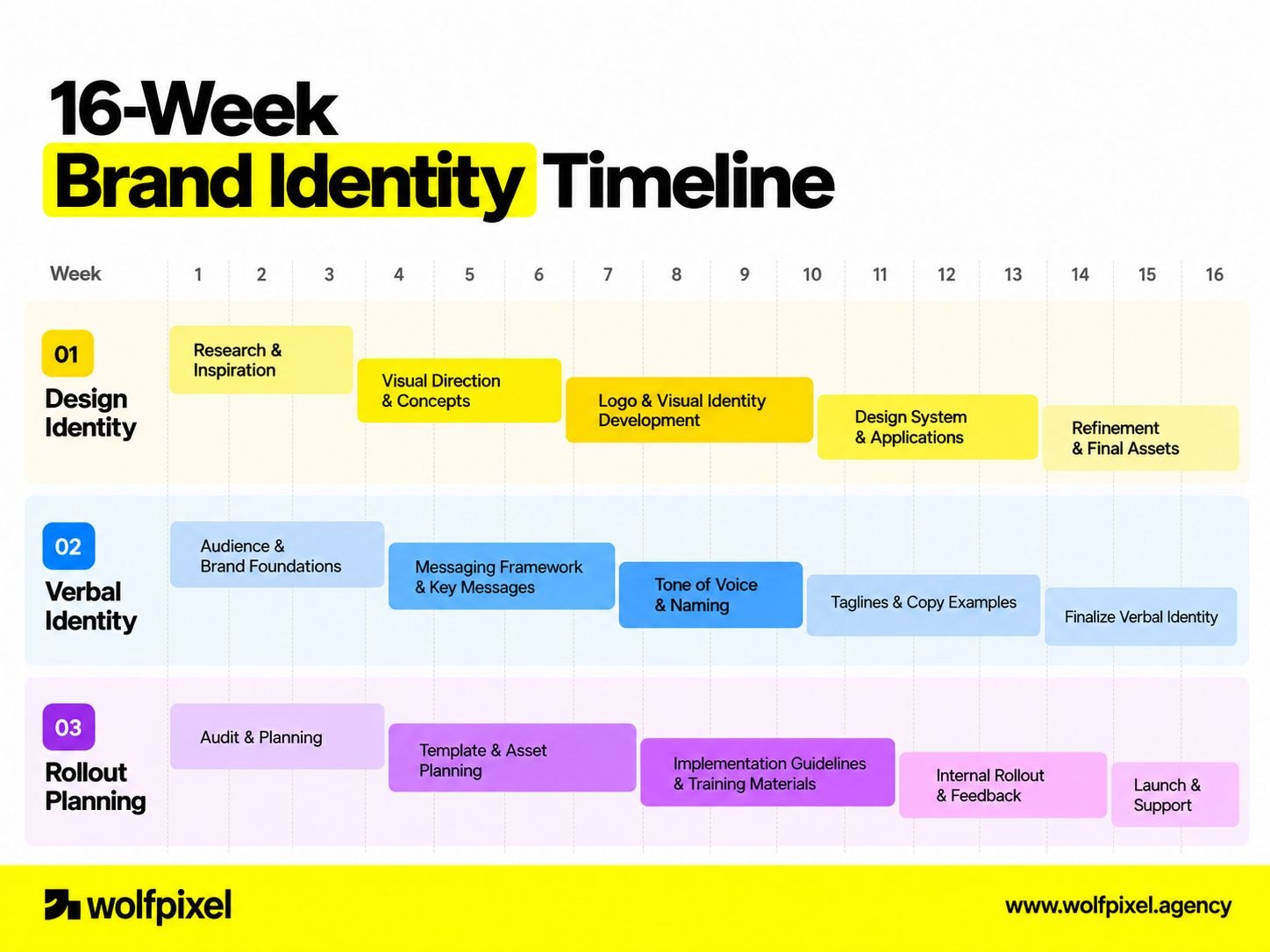
Phase Typical duration What extends it
Audit & research 1–3 weeks Many stakeholders, customer recruitment, regulated categories
Strategy & positioning 1–2 weeks Unresolved leadership disagreement about the business itself
Naming (only if in scope) 3–6 weeks Trademark conflicts forcing repeated rounds
Verbal identity & messaging 1–2 weeks (often parallel) Multiple audiences or markets
Visual territory exploration 2–4 weeks Additional rounds, added decision-makers
Refinement & system design 2–4 weeks Broad application scope, packaging, environmental design
Guidelines & asset production 2–3 weeks Large template libraries, multiple languages
Rollout planning 2–6+ weeks (parallel) Physical assets, retail, signage, legal entity changes
Typical total 8–16 weeks —
Brand identity timeline chart showing design, verbal identity and rollout phases across sixteen weeks

Realistic variations on that baseline:

  • A focused identity for an early-stage startup, no naming, limited applications: roughly 4–6 weeks.
  • A full identity including naming and trademark work: 12–20 weeks, with the naming and legal track driving most of the variance.
  • A large organization with multiple business units, committee approvals, and physical estate: commonly 4–9 months, sometimes longer.

The other reliable delay is scope arriving late — packaging remembered in week nine, a sub-brand mentioned in week eleven. Inventory every application you'll need at kickoff, even the ones you consider minor.

Rollout and Governance: Launching an Identity That Stays Consistent

The identity is finished. This is the phase most likely to be under-resourced, and it's where the value is either realized or lost.

Launch internally first

Employees are your highest-volume brand touchpoint. If they can't explain the new positioning, no amount of external campaign will hold.
  • Present the strategy and the reasoning, not just the reveal. People defend what they understand.
  • Give teams what they need on day one: signatures, deck templates, document templates, social assets. Nothing undermines a launch faster than staff being told to use a new brand they haven't been given the files for.
  • Run short practical training for the people producing the most material — marketing, sales, recruiting, support.

Choose a rollout approach deliberately

  • Big-bang switches everything simultaneously. It's cleaner for perception and better suited to significant repositioning, but it requires everything to be ready at once and costs more upfront.
  • Phased migrates by priority tier: digital properties first, then high-frequency collateral, then physical and long-life assets as they're replaced naturally. It's cheaper and lower-risk, but you live with visible inconsistency for a while, so set expectations internally about that.
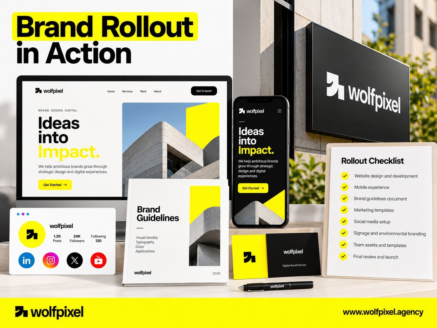
Brand identity rolled out consistently across website, mobile app, documents, signage and social profiles

Either way, build a migration checklist and work it methodically: website, product UI, app stores, email, social profiles, ad accounts, documents and contracts, invoices, packaging, signage, vehicles, uniforms, trade show materials, partner and directory listings, third-party marketplaces. The forgotten assets are almost always the ones another department owns.

Governance: the part that decides whether this lasts

An identity degrades by default. Every quarter without governance adds a slightly-off deck, a reinvented icon, an unauthorized color.

  • Name an owner. One person accountable for brand consistency, with real authority to approve or reject. Shared ownership means no ownership.
  • Make assets easier to find than to recreate. People go off-brand out of friction, not defiance. If the correct logo is three clicks away and the wrong one is in someone's downloads folder, you'll get the wrong one.
  • Keep guidelines living and linkable. A dated PDF attachment is a governance failure. A maintained, searchable, versioned resource gets used.
  • Write guidelines for the people using them. Enough structure to protect coherence; enough flexibility to handle situations you didn't anticipate. Over-restrictive rules get broken creatively; no rules get broken constantly.
  • Audit periodically. A brief quarterly sweep of live touchpoints catches drift while it's still cheap to correct.
  • Plan for evolution. Identities need refinement every few years — a palette extension, a type update, new application patterns. Treat the system as maintained infrastructure, not a monument.

Investment, Choosing a Partner, and the Mistakes That Undo Good Branding

At some point the question shifts from process to people and budget.

In-house, studio, or freelance?

Model Best when Watch for
In-house designer Ongoing brand production is constant and high-volume Rarely covers strategy, naming, and identity design equally well; too close to internal politics
Branding studio or agency Creating or repositioning an identity end to end Confirm the people pitching are the people doing the work
Freelance specialist Clear, contained scope, or filling one gap Limited capacity for research, rollout, and governance support
Hybrid External partner creates the system; in-house team runs it afterward Needs a named internal owner from day one, or governance collapses

Most companies are best served by an external partner for creation — where breadth, objectivity, and category perspective matter most — then bringing production and governance in-house once the system exists. That's the model behind our brand identity design services.

What drives investment

Branding cost tracks scope and depth far more than day rates. If you want reference points for how much branding costs, these are the variables that move the number:

  • Whether naming is included — this is a substantial, separate workstream with legal dependencies
  • Research depth — desk review versus a full internal and customer research program
  • Number of applications — a digital-only brand versus one spanning packaging, retail, signage, or vehicles
  • Brand architecture complexity — one brand versus a portfolio of sub-brands
  • Custom assets — bespoke typefaces, illustration systems, photography direction, and motion are separate crafts with separate budgets
  • Trademark and legal work — screening, clearance, and registration across jurisdictions
  • Rollout support — whether the partner produces templates and supports implementation or hands over and leaves
  • Stakeholder count — more decision-makers genuinely means more rounds, and it should be priced honestly

How to evaluate a branding partner

Portfolios are marketing. Evaluate reasoning.

  1. “Walk me through the strategy behind this project, not the visuals.” Strong partners talk about the business problem first and reach for the logo last.
  2. “Show me the work between strategy and the final logo.” Territories, rationale, application testing. Anyone can show a finished hero image.
  3. “Who specifically is doing this work, and what's their availability?”
  4. “How do you handle trademark screening and font licensing?” Vague answers here predict expensive surprises.
  5. “What happens after handover?” Listen for guidelines, templates, training, and governance — not just a file delivery.
  6. “How will we know it worked?” They should reach for your business objectives, not their awards shelf.

Red flags: presenting logo concepts before strategy exists; dozens of options with no rationale; design contests or crowdsourced marks; portfolios with no strategy artifacts anywhere; reluctance to hand over source files; a fixed price quoted before scope is defined; no mention of accessibility or small-size legibility.

The mistakes that undo good branding

  • Starting with the logo. Every downstream problem in branding traces back to this one.
  • Designing around personal taste. The founder's favorite color is not a strategy. Anchor every decision to the signed-off document.
  • Chasing category trends. When every competitor adopts the same geometric sans and pastel gradient, following them makes you invisible. Distinctiveness is the entire point.
  • Skipping trademark screening. Discovering a conflict after launch means redoing the work and eating the rollout cost.
  • Ignoring small sizes and hostile contexts. Test at favicon size, in one color, on photography, embroidered, and printed badly.
  • No dark-background or dark-mode version. In a digital-first world this isn't optional.
  • Choosing a palette that fails contrast. Beautiful in a presentation, unusable and non-compliant in a real interface.
  • Forgetting the internal audience. A rebrand that surprises your own staff on launch day starts with resistance instead of advocacy.
  • Guidelines nobody can find or apply. A 90-page PDF with no examples is a document, not governance.
  • Rebranding to solve a business problem. If churn is caused by the product, a new identity buys you a better-looking version of the same churn.
  • Treating launch as the finish line. Consistency is maintained, not achieved.

Thinking about your brand identity?

If you're weighing up where to start — whether you need a refresh or a full rebrand, how to scope it, or whether your current identity is holding the business back — it's usually worth a conversation before the budget is committed rather than after.

We're happy to look at what you have and give you an honest read: what's working, what's missing, and what a realistic scope and timeline would look like. No pressure to work together, and no obligation either way.

Talk to our brand team →

Frequently Asked Questions

What's the difference between a rebrand and a brand refresh?

A refresh evolves an existing identity while retaining its core recognition — updating typography, extending a palette, modernizing a mark, adding digital and motion patterns. A rebrand changes the fundamentals, often including positioning, name, or architecture, and it resets recognition. Refreshes suit brands with real equity that simply look dated; rebrands suit genuine strategic change such as a shift in audience, a merger, or a reputational reset. Choosing a rebrand when a refresh would do throws away accumulated recognition you already paid for.

Can we create a brand identity without hiring anyone?

You can, and for a very early-stage venture testing an idea, a lean self-built identity is a reasonable stopgap. What you'll typically lack is objectivity, category perspective, and systems thinking — templates and generators produce a mark, not a coherent system with strategy behind it. Treat a DIY identity as temporary infrastructure, and plan to invest properly once positioning is validated and you're spending real money on acquisition.

Should the brand identity or the website come first?

Identity first, because the website is an application of the identity. Building a site before the brand system exists usually means designing a visual language ad hoc under deadline pressure, then reworking it a few months later. If timing forces overlap, lock strategy and the core visual system first, then let website design and development proceed while guidelines and secondary assets are finalized.

How do we measure whether a brand identity is working?

Brand effects are indirect, so measure a combination rather than a single number. Useful indicators include unaided and aided awareness in your category, branded search volume, how consistently customers describe you in their own words, conversion rate on brand-led pages, sales cycle friction around credibility objections, recruiting quality and inbound applications, and internal consistency measured through periodic audits. Set a baseline before launch — most teams forget, and then can't demonstrate any change afterward.

How many people should be involved in approving the identity?

As few as can legitimately make the decision — ideally one accountable decision-maker supported by a small input group. Consensus-driven identity work tends toward the safe middle, because the option nobody objects to is rarely the option anyone remembers. Gather broad input during discovery, then narrow sharply for approval.

What if our team disagrees strongly about the final direction?

Return to the strategy document rather than debating preference. Reframe the disagreement as a strategic question: which direction better expresses the agreed positioning and personality for the defined audience? If that still doesn't resolve it, the disagreement is usually about strategy, not design, and the honest move is to go back a step. Testing directions with customers can help, but treat the input carefully — people reliably prefer the familiar, so unfamiliarity is not the same as failure.

Single Blog Author Img
Maniruzzaman Jubayer
COO & Co-founder

Maniruzzaman Jubayer is the COO & Co-founder of Wolfpixel, where he leads operations and helps the senior team deliver conversion-focused UI/UX, SaaS, web, and brand design for startups and growing businesses worldwide.