


06 Oct 2026
Brand Design
What Is Brand Identity? A Complete Guide for SaaS Founders and Growth Teams in 2026


Brand identity is the complete system of visual, verbal, and experiential elements a company uses to present itself and become recognizable. It includes assets like the logo, color palette, typography, imagery, voice, and messaging, all working together so people can identify, understand, and remember a business.
Unlike a logo, which is a single symbol, brand identity is the coordinated set of signals that shapes how a brand looks, sounds, and feels across every touchpoint.
This guide is written for founders, product leaders, heads of growth, and teams investing in design. It covers the definition, the real difference between a logo and a brand, the core elements, five examples worth studying, and a step-by-step framework you can use to build an identity that scales with your product.
Brand identity is the tangible, designed expression of who your company is. It is the collection of assets and rules that determine how your business shows up in the world, so that a customer can recognize you whether they land on your homepage, see an ad in their feed, open your product, or read an email from your support team.
A useful way to think about it: your brand is the reputation and set of associations that live in people's minds. Your brand identity is what you deliberately create and control to shape those associations. You cannot directly install a feeling in someone's head, but you can design the signals that guide it.
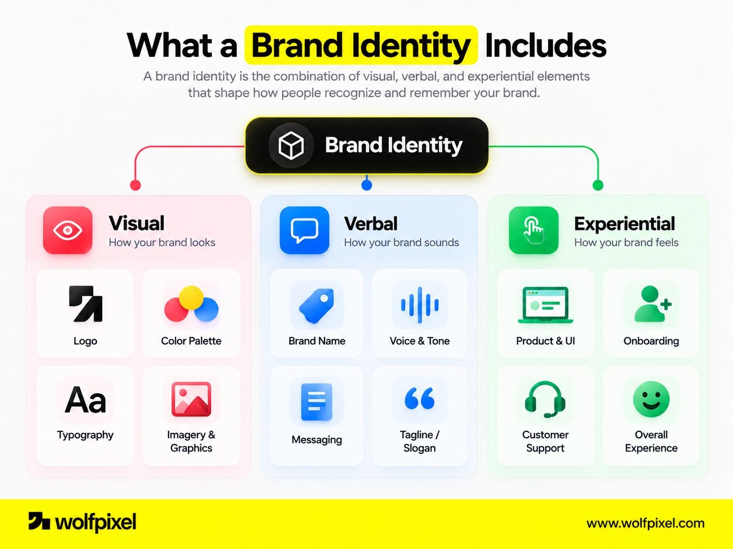
Those signals fall into three connected layers:
When these three layers are consistent and intentional, they compound. A prospect who reads a confident, plainspoken landing page and then meets that same clarity inside your product experiences one coherent brand. When the layers contradict each other, trust leaks. The homepage promises simplicity; the signup flow feels clunky; the invoice email sounds like it came from a different company entirely.
For an early-stage SaaS company, brand identity often starts small and informal, a founder's instinct expressed through a homepage and a pitch deck. That is fine at first. The risk appears at scale: as more people join the team and more surfaces get created, the absence of a defined identity means every new page, deck, and feature is designed from scratch, inconsistently, by whoever happens to be building it. A defined brand identity is essentially a shared system that lets a growing team stay recognizable without a central bottleneck.
Turn a scattered brand into a coherent, product-ready identity system. Wolfpixel's senior team designs brand identities built for the realities of software, from strategy and logo to guidelines and product UI.


These four terms get used interchangeably, and the confusion causes real problems, especially when a founder asks a designer for “a logo” when they actually need a full identity system. Getting the distinctions right helps you scope the work correctly and spend your budget where it matters.
Here is how the concepts relate:
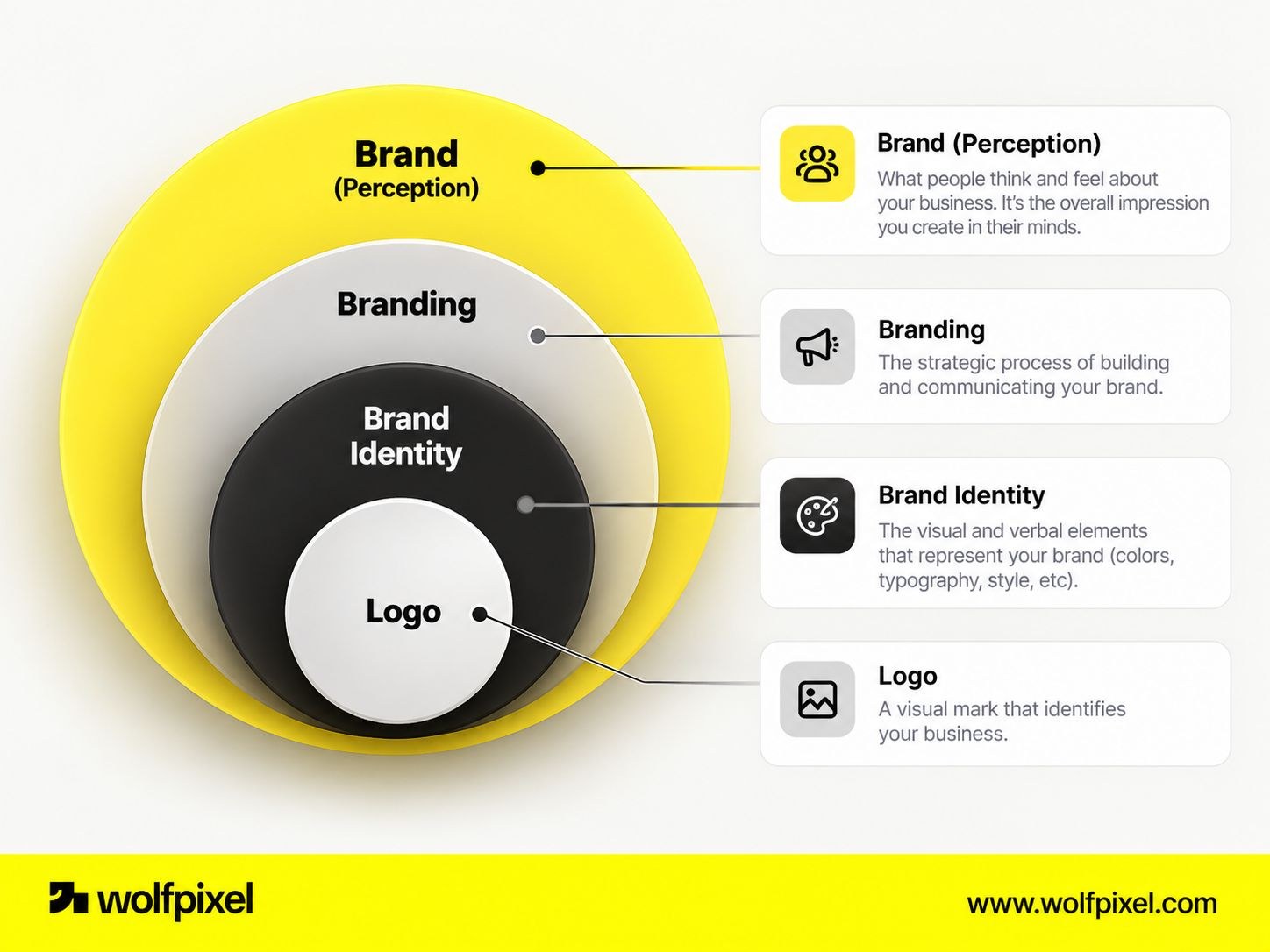
Reading that table top to bottom shows the hierarchy. The brand is the outcome. Branding is the verb, the work you do to influence the outcome. Brand identity is the toolkit you build to make that work consistent. And the logo is one tool inside the toolkit.
No. This is the single most common misconception, so it is worth stating plainly. A logo is one element of your visual identity. Branding is the entire practice of building perception, which includes your identity system, your positioning, your product experience, your pricing, and the reliability of what you deliver.
Treating a logo as your brand is like treating a front door as a house. It matters, it is often the first thing people notice, but it is not the structure.
A logo is a fixed mark. Brand identity is a flexible system. The logo answers “what is the symbol for this company?” The brand identity answers “how does this company look, sound, and behave everywhere it appears?”
Put simply:
Understanding this chain matters commercially. If you invest only in a logo, you get a symbol. If you invest in a brand identity, you get a reusable system your whole team can build on. If you commit to branding, you turn that system into a durable reputation. Each layer builds on the one before it.
When people ask what a brand identity includes, they usually expect a short list of visual assets. The complete picture is broader. A strong identity has verbal and experiential components alongside the visual ones, and the best systems document all of them.
Below are the brand identity elements that matter most, grouped by layer.
The element that ties everything together is documentation, usually called brand guidelines or a brand book. This is the reference that tells anyone, an internal designer, a new hire, or an external contractor, how to use the system correctly. Good guidelines cover logo usage, color specs, type rules, voice examples, do's and don'ts, and often a component library for the product.
Without guidelines, every element above degrades over time as different people interpret the brand differently. With them, consistency becomes the default rather than a constant negotiation.
Abstract definitions get clearer when you look at how strong identities behave in practice. The examples below are well-known software and consumer brands whose identities are publicly observable. The point is not to copy them, but to notice what makes each system coherent.
Stripe's identity is built around clarity and technical credibility. Its restrained palette, generous whitespace, precise typography, and signature gradient work convey a product that developers can trust with something as sensitive as payments. The identity reinforces the positioning: serious infrastructure, elegantly presented. Notice that the recognition comes from the whole system, not any single logo.
Slack pairs a playful, colorful mark with an approachable, human voice. Its identity signals that workplace software does not have to feel corporate or cold. The visual friendliness and the conversational tone are consistent, which is exactly why the brand feels the same in an ad, in the app, and in a help article.
Notion's identity leans into simplicity and a hand-drawn, almost editorial illustration style, set against clean typography and lots of white space. It communicates flexibility and calm, matching a product that is essentially a blank canvas. The minimalism is a deliberate identity choice, not an absence of one.
Mailchimp is a useful example of personality-forward identity. Its distinctive illustration style, bold use of a single strong color, and quirky voice give it a character that stands out in a category full of utilitarian tools. The visuals do heavy lifting that the wordmark alone never could.
Beyond consumer travel, Airbnb is often cited for building an identity around a single idea, belonging, and expressing it through its symbol, warm photography, friendly type, and consistent tone. It shows how a clear brand concept can unify visual and verbal choices under one theme.
What these examples share is not a style, since they look nothing alike. What they share is coherence: every element supports one clear idea, the visual and verbal layers agree, and the identity extends all the way into the product experience.
That is the real lesson. A memorable brand identity is not the most decorated one; it is the most consistent expression of a well-defined idea.
For software companies, brand identity is often undervalued because the product feels like the “real” work. But in crowded, subscription-based markets, identity does measurable strategic work. Here is why it matters.
Features can be copied in a quarter. A recognizable, trusted identity takes years to build and is far harder to replicate. That's what makes it one of the few durable advantages in SaaS. Treat your brand with the same rigor you apply to your product roadmap, and it will keep paying returns long after any single release.
Turn a scattered brand into a coherent, product-ready identity system. Wolfpixel's senior team designs brand identities built for the realities of software, from strategy and logo to guidelines and product UI.
Building an identity is a process, not a single design deliverable. The following sequence works whether you are creating a brand from scratch or rebuilding one that has drifted. Skipping the early strategy steps is the most common reason identities look nice but fail to perform.
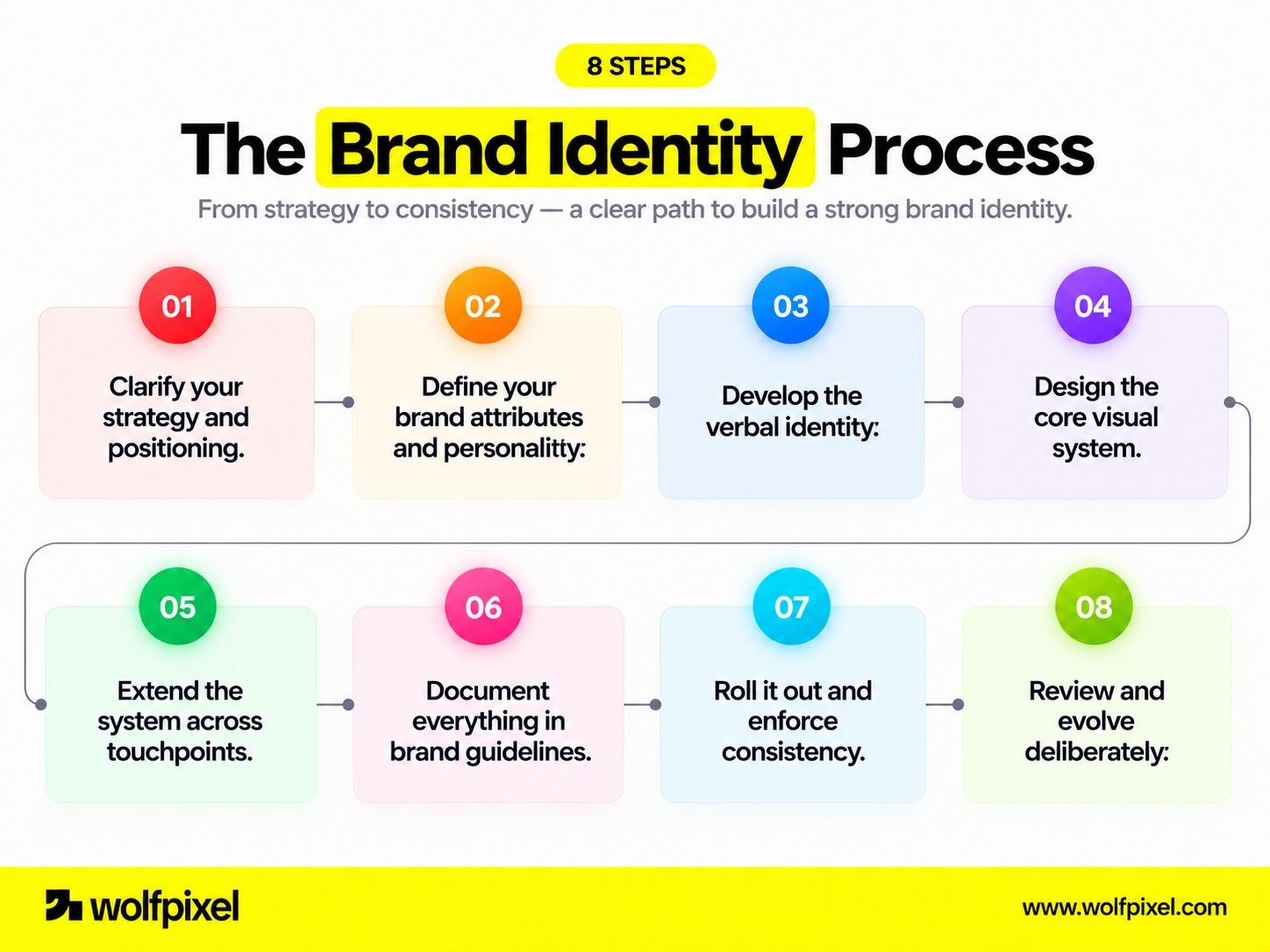
Here are 8 essential elements of brand identity, explained in detail. Each element plays an important role in creating a consistent, recognizable, and memorable brand. From visual design to messaging and brand guidelines, these components work together to shape how your audience perceives, connects with, and remembers your brand.
Plenty of founders start with a DIY identity, a logo tool, a template, and instinct. That is a reasonable way to begin. The question is not whether DIY is allowed, but when it starts to cost you more than it saves.
When two or more of these are true, professional support usually pays for itself, both in output quality and in the time your team gets back.
Not every design studio is a fit for software companies. Use these criteria to choose well:
If you want a shortlist to start from, we compared several studios in our roundup of the best branding agencies for brand design.
Pricing for brand identity work varies widely based on scope, seniority, and whether you need marketing-only or full product coverage. A logo alone sits at the low end; a complete identity system with guidelines and product design language sits much higher. Rather than anchoring on a number, define the scope you actually need, then evaluate proposals against that scope. (For reference, our own published pricing separates logo-only work from full brand systems.)
The most expensive mistake is usually paying for a beautiful logo when what the business needed was a usable system, or paying for a full system before the positioning is settled enough to design against.
If you are weighing whether to invest in professional SaaS brand identity design, the honest test is whether inconsistent or amateur perception is currently costing you deals, trust, or team velocity. When it is, the investment tends to return itself.
Even well-intentioned teams undermine their own identities. These mistakes rarely announce themselves; they erode recognition and trust gradually. Watch for them.
The throughline across every mistake is the same: treating brand identity as a one-time visual task rather than a coherent, documented, consistently applied system. Avoiding these traps is less about talent and more about discipline.
Brand identity is the deliberate system of visual, verbal, and experiential signals that make your company recognizable and trusted. It is far more than a logo: the logo is one tool inside a toolkit that also includes color, typography, imagery, voice, messaging, and, for software companies, the product experience itself. When those elements are coherent and consistently applied, they compound into recognition, credibility, and preference. When they are inconsistent, that value quietly leaks away.
For founders and growth teams, the practical takeaway is straightforward. Get your strategy clear first, build a documented system rather than a single asset, extend it all the way into your product, and apply it with discipline over time. Do that, and your identity becomes one of the few assets that grows more valuable the longer and more consistently you use it. The companies that treat brand identity as infrastructure, not decoration, are the ones whose brands eventually feel inevitable.
If inconsistent branding is costing you credibility, deals, or team speed, a well-designed identity system can change that, especially one built for the realities of software. If you're evaluating professional support, start by defining the scope you actually need, then look for a partner with proven SaaS and systems experience. When you're ready to turn a scattered brand into a coherent, product-ready system, get in touch with our design team to talk through your goals.
Brand identity is the complete system of visual, verbal, and experiential elements a company uses to look, sound, and feel recognizable. It includes the logo, colors, typography, imagery, tone of voice, messaging, and the product experience, all working together.
No. A logo is one element of your visual identity. Branding is the ongoing practice of shaping perception, which includes your identity system, positioning, product experience, pricing, and the reliability of what you deliver.
Yes, but keep it lean. Early on, focus on clear positioning, a simple and legible visual system, and a consistent voice, rather than an elaborate identity you may need to rework once your audience and product sharpen. A lightweight but coherent identity is enough to look credible; the comprehensive system can come once your direction is settled.
Deliberately and infrequently. Minor refinements can happen as you grow, but a full rebrand should be driven by a real shift in positioning, audience, or product maturity, not by boredom or trend-chasing. Frequent changes reset the recognition you are working to build.
No, though they overlap. A brand identity is the broad system of visual, verbal, and experiential expression across all touchpoints. A design system is a more technical, component-level toolkit for building consistent product interfaces. For SaaS companies, the design system should be a downstream expression of the brand identity, so the two stay aligned.
Even a short guide is worth it. A one-page reference covering logo usage, colors, type, and voice prevents drift the moment a second or third person starts creating assets. You can expand it into full guidelines as the team grows.
Neither in isolation; they must agree. Marketing earns the click and sets expectations, and the product either fulfills or breaks them. A strong SaaS brand identity spans both, so the promise on the landing page is confirmed the moment someone enters the app.





.svg)



.svg)

.svg)

.svg)

.svg)

.svg)
.svg)
