


07 Oct 2026
Landing Page
Landing Page Conversion Rate: Benchmarks, Diagnostics & How to Actually Improve It


A landing page conversion rate is the percentage of visitors who complete the page's single intended action — conversions divided by total visitors, times 100. Across the largest public dataset available, Unbounce’s Q4 2024 Conversion Benchmark Report (41,000 pages, 464 million visitors, 57 million conversions), the median landing page conversion rate is 6.6%, with industry medians spanning roughly 3.8% to 12.3%. But a single number is close to meaningless without context: your realistic benchmark depends on your industry, your traffic source, your page type, and what you count as a conversion. Compare like with like, or you'll optimize the wrong thing.
Most teams find their landing page conversion rate the same way: someone opens analytics before a board meeting, sees 2.4%, Googles “average landing page conversion rate,” finds a number like 6.6%, and concludes the page is broken.
Sometimes it is. Often it isn't. And occasionally the page is fine while the traffic, the offer, or the definition of “conversion” is doing the damage.
This guide is written for founders, product leaders, heads of growth, and teams about to spend real money on design. It does three things in order: gives you properly sourced benchmarks and explains why the widely circulated numbers disagree; walks through the diagnostic sequence we use when auditing an underperforming page, which is mostly a design and information-architecture problem rather than a button-colour problem; and covers the practical side of investing in professional design support.
The goal isn't a number to feel good or bad about. It's a defensible target, a ranked list of what to fix, and a way to tell whether the change worked.
A landing page conversion rate is the ratio of visitors who complete the page's primary action to the total number of visitors who arrived. The formula is simple:
Conversion rate = (Conversions ÷ Total visitors) × 100
If 4,000 people land on your demo request page and 96 book a demo, that's 96 ÷ 4,000 = 0.024 = 2.4%.
The arithmetic is trivial. The definitions are where teams lose months.
Scroll depth, video plays, and FAQ expansions are useful diagnostics. They are not conversions, and reporting them as such is how teams end up with a “12% conversion rate” and no pipeline. Track micro-conversions to explain why the page performs the way it does; report the primary action as your conversion rate.
If you're a B2B or SaaS team, connect that primary action to a downstream quality metric — MQL-to-SQL, demo-to-opportunity, trial-to-paid. A page that doubles form fills while halving lead quality has made your business worse, not better.
If your landing page is getting traffic but not enough conversions, the problem may not be your traffic—it may be the page. Wolfpixel helps SaaS and B2B teams design conversion-focused landing pages built around clear messaging, strong UX, trust, and measurable business outcomes.


Search this topic and you'll be handed figures ranging from 2.35% to 10.76%, all presented as “the average.” They're not contradicting each other. They're measuring different universes.
Here's what the major public datasets actually cover:
Three things explain nearly all the variance between them.
Three cuts of the data matter far more than the headline average. Run all three before you decide your page needs a redesign.
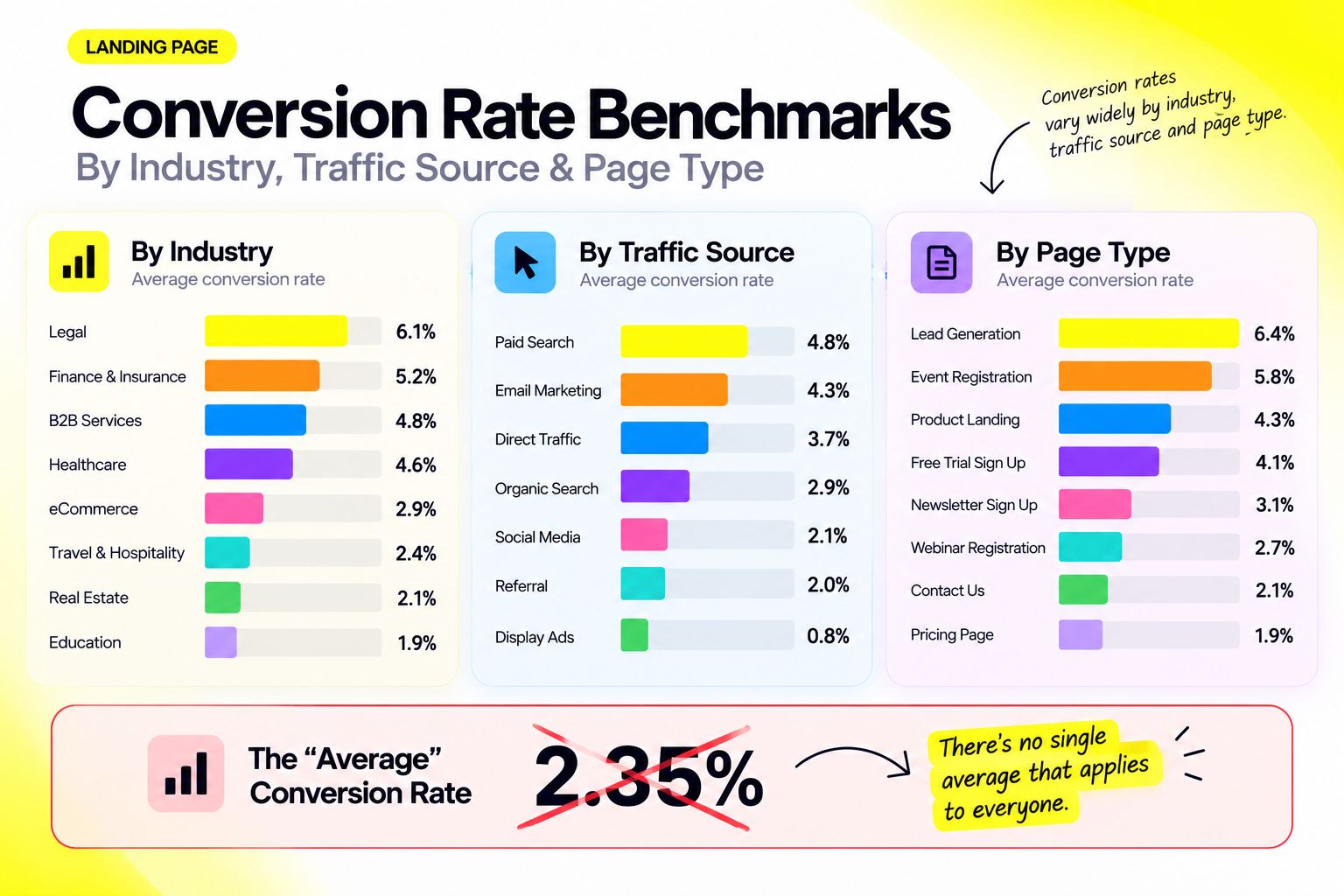
In Unbounce's dataset, industry medians span roughly 3.8% to 12.3% — a threefold spread driven by purchase complexity, price point, and how many people have to say yes.
Two things stand out here. First, SaaS is the lowest-converting category Unbounce tracks. If you're a SaaS founder sending paid traffic to a 3.5% page and measuring against 6.6%, you're not failing — you're near your category median. Worth knowing before you commission a redesign for the wrong reason.
Second, the spread within SaaS is narrow: Unbounce reports hardware pages converting best at around 4.1% and data/infrastructure pages lowest at roughly 3.3%. The variance inside an industry — between a well-built page and a poor one — is much larger than the variance between industries. Your fundamentals matter more than your vertical, which is why SaaS website design done well routinely beats the category median.
Most articles will tell you email always converts best and paid social always converts worst. The data doesn't support that universally.
Unbounce's legal-industry breakdown is the clearest counterexample: paid search converts at around 8.3%, paid social at 4.8%, and email at just 2.7% — email is the worst channel in that vertical. Legal need is acute and immediate; someone searching for representation converts now, while a nurture email arrives long after the moment has passed.
The lesson: channel benchmarks are industry-specific. Don't import a rule from an ecommerce blog into a B2B context. Segment your own pages by source and let your data tell you where the intent is.
One near-universal finding does hold: mobile dominates landing page traffic in the Unbounce dataset while converting roughly 8% worse than desktop. That gap is a design problem — see the speed and mobile step of the diagnostic sequence.
For B2B and SaaS teams, page type is the most predictive cut of all — and the one that matters most in B2B web design. Daydream's benchmark work across companies in the $5M–$50M ARR range breaks it down usefully:
A 3% demo request page and a 3% free trial page are not the same story. The first is performing solidly. The second is underperforming and probably has a friction problem in the signup flow.
Here's the honest version: a good landing page conversion rate is one that clears your category median for that page type and traffic source, and produces a customer acquisition cost your business can sustain.
That second clause is the one most benchmark articles skip, and it's the one your CFO cares about.
The benchmark tells you what's plausible. Your economics tell you what's sufficient. Run this before setting a target:
Now you have a required conversion rate rather than an aspirational one. A page that needs 6% to be profitable and sits at 2.1% has a defined, fundable gap. A page at 4.8% that's already profitable at 3% doesn't need a redesign — it needs more traffic.
This also protects you from chasing conversion rate at the expense of lead quality. Removing qualifying fields from a B2B form nearly always raises the raw rate. Whether it raises pipeline is a separate question, and the only one that matters.
Conversion rate improvements are multiplicative against your entire traffic spend, which is why they're usually the cheapest growth lever available.
Same traffic. Same media budget. Same team. Two percentage points is a doubling. That's the argument for treating conversion rate optimization as a standing investment rather than a one-off project — and it's why design work that lifts a page from median to top-quartile usually pays for itself faster than an equivalent spend on acquisition.
Single-number targets encourage cherry-picking and premature celebration. Use a three-tier band per page instead:
Review the band quarterly — traffic mix drifts, and yesterday's benchmark stops describing today's page.
When we audit a page that's converting below its band, we work through the same sequence every time — in this order, because the earlier items are both cheaper to fix and more likely to be the actual cause. Most teams start at the bottom of this list, which is why so much CRO effort produces so little.
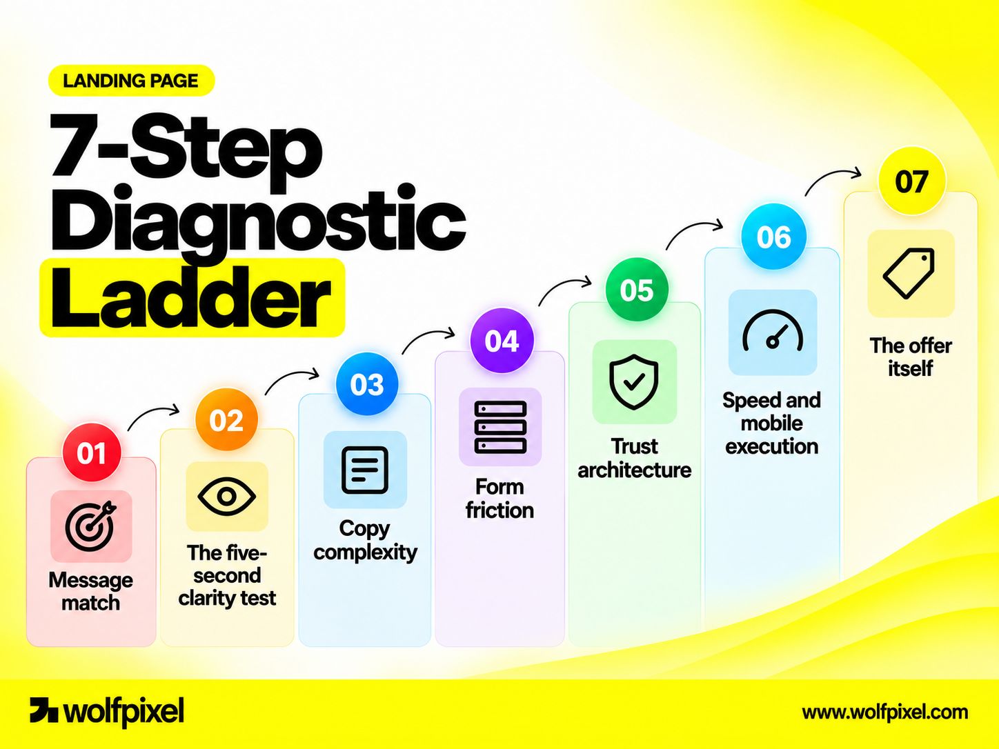
The most common cause of a below-benchmark rate is a relevance gap between the ad, email, or search result that produced the click and the headline that greets the visitor.
The test takes thirty seconds: open your ad copy in one window and your page in another. Does the page headline carry the same core promise, in recognisably similar language? If the ad says “cut close time by half” and the page says “the modern revenue platform,” you have a message match failure, and no amount of visual polish will fix it. The visitor's first job is confirming they're in the right place. If that takes more than a couple of seconds, they leave. It's also the cheapest fix here — usually a headline rewrite, not a redesign.
Show the first viewport to someone unfamiliar with the product for five seconds, take it away, and ask three questions: What is it? Who is it for? What happens if I click the button?
If they can't answer all three, your hierarchy is failing — almost always because the page is trying to say too much at once. The most common structural fault we see in B2B and SaaS pages is a hero carrying four competing messages at the same visual weight: headline, subhead, feature badge row, logo bar, nothing clearly dominant. The eye has nowhere to land.
The fix is subtraction: one dominant headline, one supporting line, one primary action, one visual that shows the product doing something. (It's the same problem we unpack in why most startup websites fail.)
This is where design and language stop being separable disciplines. Unbounce's SaaS analysis found pages written at a fifth-to-seventh-grade reading level converted at around 12.9%, while pages at a professional reading level converted at roughly 2.1%. Their data also points to a productive range of about 250–725 words for SaaS pages.
Read your page aloud. Every sentence you stumble over is costing you conversions. “Leverage our unified orchestration layer” isn't more credible than “connect your tools in one place” — it's just harder to process, and processing effort is friction.
Every field is a small negotiation. The productive question isn't “how few fields can we have?” but “does this field earn its place in qualification or routing?”
Instrument the form itself. Field-level drop-off analytics tell you exactly which question is losing people, and it's frequently not the one anyone guessed.
Trust isn't a testimonial section at the bottom of the page. It's a system of proof placed adjacent to the moments of doubt: the specific proof next to the specific claim. A security claim needs the compliance badge beside it, not in the footer. A results claim needs the named customer beside it, not three screens down. Generic logo bars establish category credibility, but named outcomes from recognisable peers do the persuading.
For B2B, name the customer, the role, and the outcome. Anonymous testimonials read as fabricated whether or not they are.
Mobile carries most landing page traffic and converts meaningfully worse. That gap isn't a law of nature — it's an accumulation of decisions made on a desktop monitor: hero text requiring three scrolls before the value proposition appears, tap targets under 44px, sticky elements eating a third of a small viewport, forms triggering the wrong keyboard.
Audit on a mid-range Android phone on a mediocre connection, not the newest iPhone on office Wi-Fi. Then fix what's slow: image weight, font loading strategy, and render-blocking third-party scripts are usually where the real gains are — and where Core Web Vitals will show you exactly what's hurting.
Occasionally the page is well designed, fast, and clear, and still underperforms — because the ask is disproportionate to the trust the visitor has at that moment. A cold audience asked to book a 45-minute sales call is being asked to skip several steps. Offering an intermediate commitment — an interactive demo, a self-serve trial, a short assessment — often beats optimizing the original ask.
If your landing page is getting traffic but not enough conversions, the problem may not be your traffic—it may be the page. Wolfpixel helps SaaS and B2B teams design conversion-focused landing pages built around clear messaging, strong UX, trust, and measurable business outcomes.
Diagnosis tells you what's wrong. This is how you fix it without burning a quarter on tests that can't reach significance.
Segment by traffic source, page type, and device. Record at least four weeks of data, or one full sales cycle for longer B2B motions. You cannot claim a lift against a baseline you never established.
Session recordings for rage clicks and dead zones, scroll maps for where attention dies, and an on-page exit poll asking one question: what nearly stopped you from signing up today? Five real answers beat fifty assumptions.
“Change the CTA” is a task. “Visitors don't know what happens after clicking, so specifying the next step will increase form starts” is a hypothesis. Only hypotheses generate learning you can reuse.
Score each hypothesis 1–5 on all three and sort. Message match and hero clarity almost always rise to the top. Colour and micro-copy tests almost always sink, which is exactly where they belong.
If the page is slow, broken on mobile, or has a message match failure, fix those outright. Don't A/B test whether working is better than broken.
With realistic landing page traffic, small changes rarely produce detectable results. Test structurally different variants — a different hero framing, a different offer, a different form structure. Calculate sample size before you launch and run full weeks to avoid day-of-week effects. A test you stop early because it “looks like it's winning” is a coin flip you've paid for.
Check every reported lift against qualified leads or revenue, not just form fills. This is what separates conversion optimization from vanity optimization.
Log every test: hypothesis, variant, result, conclusion. After a year that log — failures included — is more valuable than any benchmark report, because it describes your actual audience rather than an aggregate one.
At some point the question stops being “what should we change?” and becomes “who should do this?” Here's a straight assessment — from a team that offers landing page design services, so weigh it accordingly.
Landing page design engagements vary enormously in price, and the variation is usually explained by scope rather than quality. (For reference points, see our published pricing.)
Ask for these five things. The answers are diagnostic.
Red flags: guaranteed percentage lifts (nobody can promise this honestly); portfolios of visually striking pages with no stated outcomes; a process that starts in Figma rather than in research; and reluctance to be measured on business metrics.
Design investment carries real downside when handled poorly. A rebrand that abandons recognisable equity can depress conversion for months. A visually ambitious page can cost more in load time than it gains in appeal. A system your team can't maintain decays as untrained hands modify it. And a full-page redesign means that if the rate moves, you won't know which of thirty changes caused it.
Mitigate all four by insisting on measurement, staging significant changes where traffic permits, and treating documentation and handoff as deliverables rather than afterthoughts.
These are the faults we see most often, roughly in order of how much damage they do relative to how easy they are to miss.
Want to see what the fixes look like in practice? Browse our landing page and product case studies, or book a free strategy call and we'll review your page against its real benchmark.
Foundational fixes — message match, hierarchy, page speed — often show movement within two to four weeks of shipping, provided you have enough traffic to detect a change. Structural A/B tests typically need four to six weeks per test to reach a defensible result.
For B2B teams tracking downstream quality, add one full sales cycle before you judge whether a lift translated into pipeline.
It depends on your baseline rate and the size of the effect you're chasing, but as a rule, detecting a modest relative improvement on a low-converting page requires far more traffic than most teams have.
If a sample size calculator tells you a test would run for four months, don't run it — ship your best-reasoned version, measure the before-and-after, and accept the lower rigour.
Several, once you can support them. Segmented pages that match a specific campaign, persona, or competitor comparison consistently outperform one general-purpose page, because message match improves.
The constraint is maintenance: three well-maintained pages beat twelve neglected ones. This is where a reusable design system earns its cost.
Indirectly, yes. Ad platforms factor landing page experience and relevance into quality scoring, which influences what you pay per click and how often you're shown.
A page that's slow, thin, or mismatched to the ad can raise your effective cost per click on top of converting worse.
Usually not, and benchmarking one against the other will mislead you. Homepages serve many audiences and intents, and convert far lower — B2B SaaS site-wide conversion is often reported around 1.1%.
Dedicated pages built for one message and one action convert several times higher, which is precisely why they exist.
Weekly at the channel level to catch breakages, since a tracking failure or form error can go unnoticed for weeks. Monthly for trend. Quarterly for a full benchmark review, including resetting your target band.
AI is genuinely useful for producing variants, drafting copy alternatives, and accelerating research synthesis. What it doesn't do is know your buyer's specific objections, your competitive positioning, or which proof point defuses the doubt that stops your particular deals.
Use it to move faster through the parts you already understand — not to substitute for the diagnosis.




.svg)



.svg)

.svg)

.svg)

.svg)

.svg)
.svg)
