


06 Oct 2026
Brand Design
What Is Brand Identity? A Complete Guide for SaaS Founders and Growth Teams in 2026


A SaaS redesign is a structured effort to improve the usability, visual design, information architecture, or underlying experience of a software product, not just a fresh coat of paint. The right time to do it is when your product is actively costing you conversions, activation, retention, or expansion revenue, and those problems trace back to design rather than positioning or pricing. The safest, highest-return approach is usually an evidence-led, incremental redesign that ships in stages, protecting the workflows your existing users depend on while you improve everything around them.
Every SaaS product accumulates design debt. Features get bolted on to hit a quarterly goal, an acquisition adds a second product with its own visual language, and three generations of designers each leave their fingerprints on the UI.
Then one day a prospect on a sales call says the thing nobody on your team wanted to hear: "It looks a little dated."
A SaaS redesign is how you pay that debt down, but it's also one of the riskiest projects a product team can take on. Done well, it lifts activation, shortens time-to-value, and makes your product easier to sell. Done carelessly, it torches muscle memory, triggers a wave of "where did everything go?" support tickets, and quietly bleeds users who never asked for change.
A SaaS redesign is a deliberate reworking of how your product looks, feels, and functions, to solve problems that are hurting the business.
The word "redesign" gets stretched to cover everything from swapping a color palette to rebuilding a platform from the ground up, which is exactly why so many of these projects start with mismatched expectations. Before you scope anything, separate the three things people usually mean.
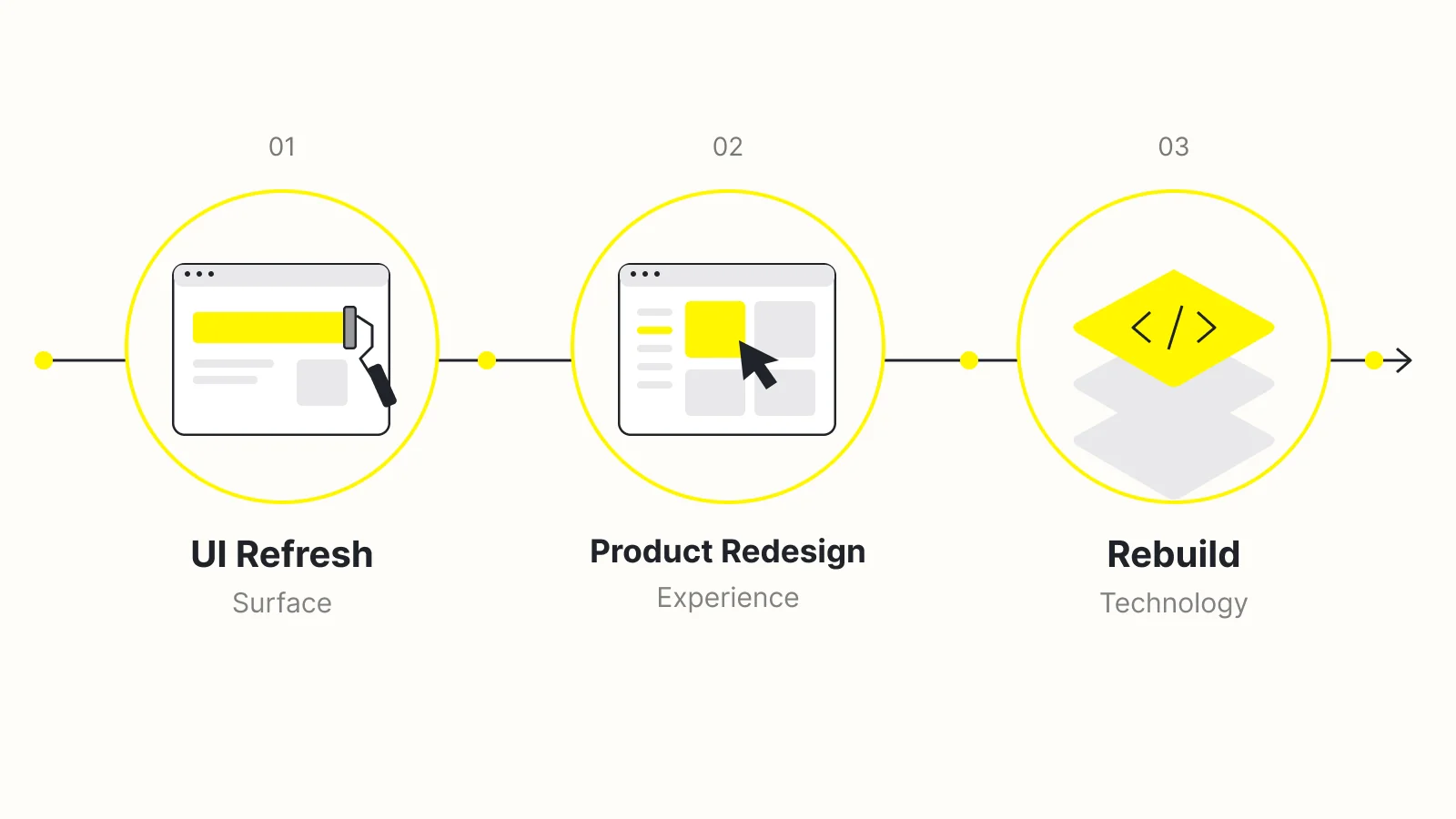
It's also worth distinguishing a SaaS website redesign from a product redesign, because teams frequently conflate them. They are two different surfaces with different jobs:
You can absolutely do both in one initiative, and a rebrand often forces the question. But they demand different metrics, different skills, and often different teams. Confusing the two is one of the fastest ways to spend a large budget and move the wrong number.
"Redesign" is a scope decision before it's a design decision. Naming which of these three you're actually signing up for is the single most useful conversation you can have at the start.
Bring us your product, friction points, and goals. Wolfpixel will help you identify what needs fixing, define the right scope, and build a redesign plan that protects your users.


The honest answer to when to redesign your SaaS product is: when design problems are demonstrably costing you money, and you can point to where.
"It feels old" is a reason to investigate, not a reason to fund a six-month project. What you're looking for is a cluster of signals that trace back to the experience itself. These are the ones that most reliably justify a redesign:
A useful gut check is to separate the two:
Redesign when you have the second. When you only have the first, run the research step of the redesign process first. You may find a genuine problem underneath, or you may find that a focused UI refresh is all you need.
The UI refresh vs. redesign question shapes your budget, timeline, and risk more than any other decision.
Choose too small and you repaint a house with a cracked foundation. Choose too big and you spend a year and a fortune solving problems your users never had. Here's how the three options compare.
| Dimension | UI Refresh | Product Redesign | Rebuild |
|---|---|---|---|
| What changes | Visual styling, components, brand | Navigation, IA, workflows, onboarding | Front end (or full stack) + design |
| Typical trigger | Dated look, rebrand, inconsistency | Broken flows, poor activation, IA that no longer fits | Legacy tech blocking the experience |
| User disruption | Low | Medium to high | High |
| Relative effort | Low | Medium to high | High |
| Primary risk | Looks better, works the same | Breaking muscle memory | Scope creep and long time-to-value |
| Best when | The structure works; the surface doesn't | Structure is the problem | Structure and code are the problem |
Many teams frame the work as a refresh to protect the budget and timeline, then discover mid-project that the real problem is structural. That's why research matters so much: it's cheaper to learn the true scope from research than from a stalled build.
A well-run redesign often starts as a refresh on the surface and a redesign underneath. You introduce a modern design system (the refresh) and use it as the vehicle to fix the highest-impact flows (the redesign), sequenced so each release stands on its own.
Once you know the scope, the next decision is how you ship it. Incremental vs. big bang is really a question of how much risk you're willing to concentrate into a single moment.
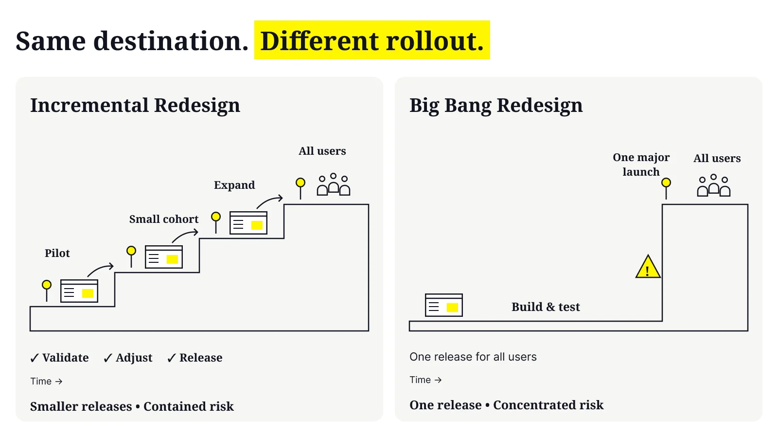
A big-bang redesign replaces the old experience with the new one all at once. Everyone wakes up to a different product on the same day.
It's faster to a "finished" feeling, gives marketing a clean relaunch moment, and avoids the awkward period where old and new coexist. But it concentrates all the risk (design, engineering, migration, and change management) into one release. If something is wrong, everyone hits it at the same time, and rolling back is painful.
An incremental redesign ships the new experience in stages: one surface, flow, or user segment at a time, often behind feature flags.
It's slower to feel "done," and you maintain two design languages during the transition. In exchange, you validate with real usage, catch problems while they're small, and give users time to adapt. For most established SaaS products with real revenue on the line, incremental is the default recommendation: the downside of a botched big bang is simply too expensive.
| Dimension | Incremental Redesign | Big-Bang Redesign |
|---|---|---|
| Risk | Distributed, contained | Concentrated in one release |
| Speed to "finished" | Slower | Faster |
| Learning loop | Continuous, based on real usage | Mostly pre-launch |
| User adaptation | Gradual, lower shock | Sudden, higher shock |
| Transition cost | Maintain two systems for a while | Clean cut, no overlap |
| Best fit | Established products, large user base | Early-stage products, small user base, or a full rebrand relaunch |
A big bang can be the right call when:
Even then, treat it as a big bang at the surface with as much validation underneath as you can manage: prototype tests, beta cohorts, and staged internal rollouts before the public flip.
A repeatable product redesign process is what separates a redesign that moves metrics from one that just moves pixels.
The exact steps flex with scope, but the sequence below reflects how effective SaaS redesigns actually unfold. Notice how much of it happens before anyone opens a design tool.
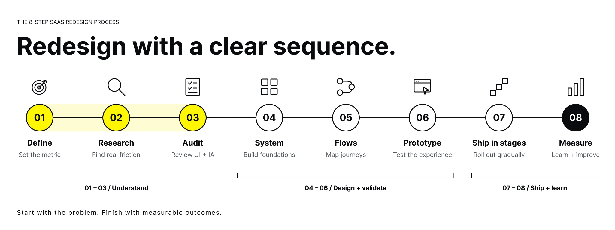
Write down the specific problem you're solving and the number you expect to move: activation rate, time-to-value, task completion, feature adoption, expansion, or trial-to-paid.
If you can't name the metric, you're not ready to start. This is the sentence every later decision gets checked against.
Before proposing solutions, understand the current experience. Combine two kinds of evidence:
The goal is to locate friction precisely rather than guess. This is also where you separate design problems from pricing, positioning, or performance problems that a redesign won't fix.
Inventory your screens, components, and flows. Where is the product inconsistent? Where has the information architecture stopped matching the feature set?
An interface inventory almost always reveals redundant patterns and orphaned screens you'll want to consolidate.
Establish the visual and interaction foundations: a design system or component library, typography, color, spacing, states, and accessibility standards.
A system isn't bureaucracy. It's what keeps a redesign consistent as it scales and gives your engineers something reliable to build against.
Start with the user's journey and the information architecture, not individual screens. Map the flow, then design the screens that serve it.
Designing screens before flows is how you end up with beautiful pages that don't add up to a usable product.
Put interactive prototypes in front of actual users, ideally a mix of new and existing ones, and watch them attempt real tasks. Testing before you build is the cheapest insurance you can buy.
Existing users will tell you which changes feel like improvements and which feel like betrayals of muscle memory.
Implement against the design system, ship behind flags to a limited cohort, and make sure you're measuring the metric from Step 1. Compare the new experience against the old with real data, not opinions.
Watch the metric. Where the new experience wins, expand the rollout; where it underperforms, diagnose and fix before going wider.
A redesign isn't "done" at launch. It's done when the number you set out to move has moved and held.
You'll evaluate design partners partly on their case studies, so it's worth knowing what a credible product redesign case study looks like. A strong one:
Be skeptical of case studies that are all before-and-after visuals with no problem definition, no research, and no honest discussion of what was hard. The prettiness of the final artboard tells you almost nothing about whether the redesign worked.
Bring us your product, friction points, and goals. Wolfpixel will help you identify what needs fixing, define the right scope, and build a redesign plan that protects your users.
This is the section most teams underweight and later regret skipping. Redesigning without losing users is a discipline, not a hope.
Your existing users didn't ask for change. They've built habits around your current product, and every unexpected difference is a small tax on their day. Here's how to keep them with you.
For a SaaS website redesign, add one more discipline: protect your search visibility.
A visually gorgeous site that quietly loses half its search visibility is not a successful redesign.
Your users' habits are an asset you built together. Treat changing them as something you earn permission for, not something you impose.
Most failed redesigns fail for a small set of predictable reasons. Knowing them in advance is the cheapest form of insurance.
Avoiding these isn't about being cautious for its own sake. It's about spending your redesign budget where it actually changes outcomes.
At some point you'll decide whether to run the redesign in-house, hire contractors, or bring in a specialized design partner. Each path is legitimate; the right one depends on your capacity, the scope, and how much design maturity already lives in the company.
Cost varies enormously with scope, so treat any single number with suspicion. These are the factors that actually move the price:
The most useful question isn't "what does a redesign cost?" but "what is the problem worth solving?"
If a redesign plausibly lifts activation or trial-to-paid conversion, the return is measured against your customer lifetime value, not the invoice. That framing keeps the conversation on value instead of price.
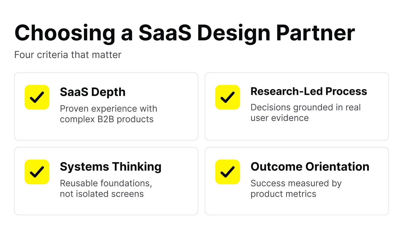
Use these criteria to separate a partner who will move your metrics from one who will hand you a pretty deck:
| Criterion | What to Look For | Red Flag |
|---|---|---|
| SaaS depth | A track record with products like yours (B2B, complex workflows) | Only consumer or marketing-site work |
| Process | A clear, research-led method they can articulate | "We'll just make it look amazing" |
| Case studies | Problem, research, trade-offs, and outcomes | Only glossy before-and-afters |
| Systems thinking | They build design systems, not one-off screens | Beautiful mockups with no reusable foundation |
| Collaboration | They plug into your team and work closely with engineers | A black box that reappears at the reveal |
| Handoff & implementation | Clear specs, tokens, and developer support | Files thrown over the wall |
| Outcome orientation | They ask about your metrics first | They ask about your color preferences first |
If you're weighing outside help, the most productive first step is a scoping conversation grounded in your actual metrics and constraints, not a pitch.
A good partner will happily pressure-test whether you even need a full redesign, or whether a targeted refresh gets you most of the way there. That kind of honesty at the start is itself a signal worth trusting.
If a redesign is on your roadmap, get a clear-eyed scope and a plan to protect your users before you commit budget. That single conversation tends to pay for itself many times over.
It depends almost entirely on scope. A focused UI refresh can move quickly; a full product redesign with research, a new design system, staged rollout, and engineering implementation is a multi-month effort.
The research and validation phases protect the timeline rather than pad it. Cutting them tends to add time later, when problems surface post-launch. Build in an iteration phase after launch rather than treating the reveal as the end.
Sometimes a rebrand is exactly what forces the redesign, and doing them together avoids two disruptive changes. But they're separable, and combining them concentrates more change, risk, and communication overhead into one moment.
If your product's structure works and only the brand has shifted, a UI refresh aligned to the new brand may be all you need. If the structure is also broken, sequence the work so the design-system foundation carries both.
Define the target metric before you start (activation, time-to-value, task completion, feature adoption, trial-to-paid, or retention) and instrument it so you can compare the new experience against the old with real usage data.
Pair that with qualitative feedback from support volume and user sentiment. If you can't point to a metric that moved and held, you've done a refresh, not a redesign, regardless of how it looks.
For a product redesign behind a login, SEO is largely unaffected. For a SaaS website redesign, it very much can if you're careless: changing URLs without redirects, dropping metadata, or breaking internal links can erase hard-won rankings.
Preserve URL structures where possible, implement 301 redirects, keep metadata and internal linking intact, and monitor organic traffic closely through the transition.
Lead with the business problem and the metric, not the aesthetics. Show the friction with evidence (funnel drop-off, support-ticket themes, session recordings, sales feedback) and frame the redesign as the way to move a number leadership already cares about.
Proposing a staged, incremental rollout also lowers the perceived risk, which makes approval easier.




.svg)



.svg)

.svg)

.svg)

.svg)

.svg)
.svg)
