


12 Oct 2026
UI/UX Design
Human Interface Guidelines: How to Use Them Across Your Mobile App Design Process


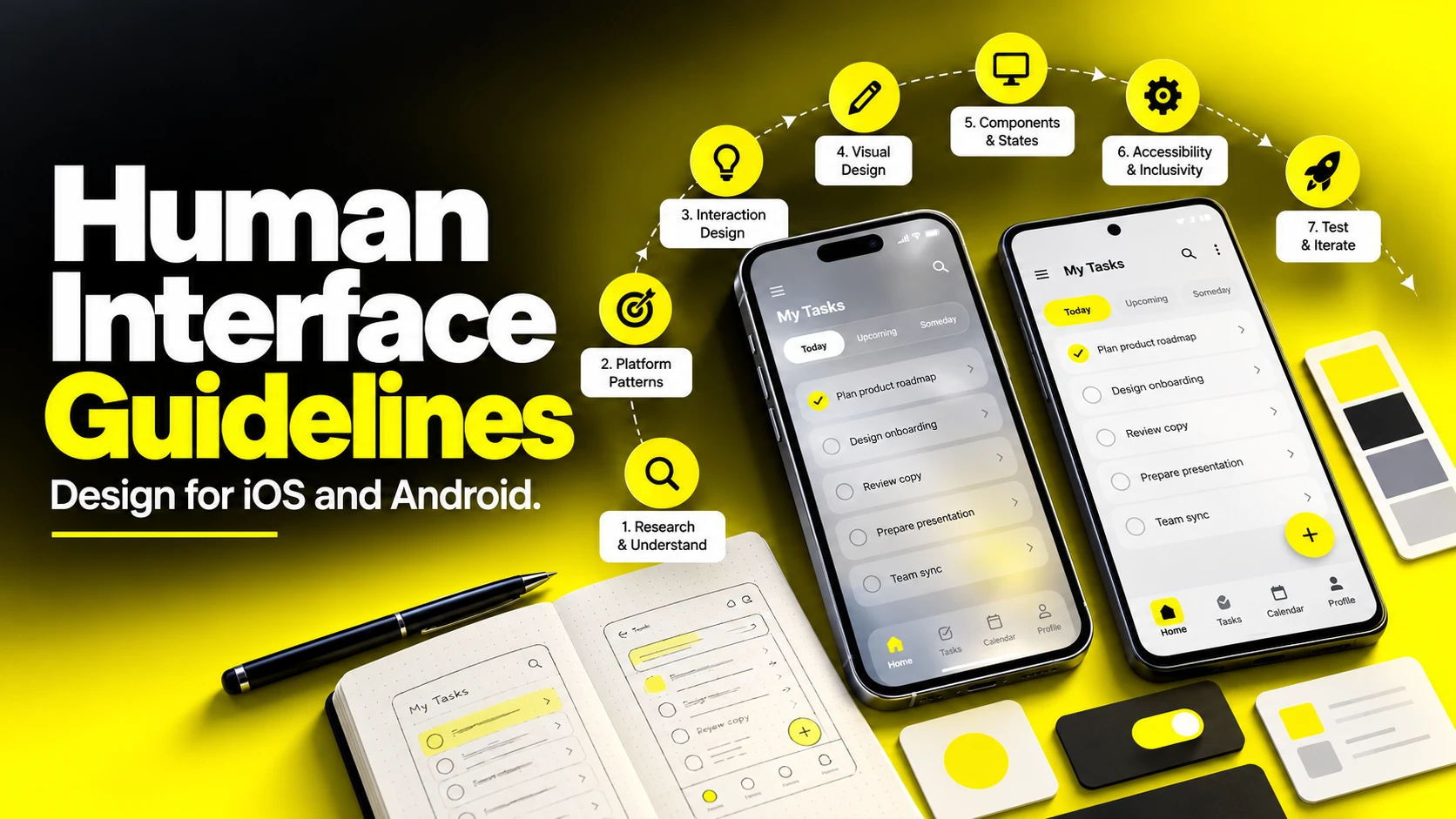
Human interface guidelines define how apps should look, behave, and interact with users across platforms. Apple’s Human Interface Guidelines, Google’s Material Design, and Microsoft’s Fluent cover layout, typography, accessibility, and interaction patterns.
Platform guidance helps teams build familiar, accessible experiences. Store review requirements are separate: an app can face review issues for substandard UI or insufficient functionality, but a visual deviation from the HIG does not automatically mean rejection. Use both design guidance and the applicable review requirements throughout the workflow.
This guide explains why these guidelines matter, how to apply them throughout the design process, and what founders and product leaders should expect from app design timelines, deliverables, and design partners.
Human interface guidelines describe platform-specific recommendations for how software presents content and behaves. Apple also uses Human Interface Guidelines as the proper name of its design documentation. Other ecosystems publish their own guidance or broader design systems.
The major published resources include the following. Their scope differs: some are guidelines, while others also provide component libraries, tools and design systems.
Start with Apple’s Human Interface Guidelines, Google’s Material Design and Microsoft’s Fluent 2.
| Guideline system | Publisher | Primary platforms | Distinguishing emphasis |
|---|---|---|---|
| Human Interface Guidelines (HIG) | Apple | iOS, iPadOS, macOS, watchOS, tvOS, visionOS | Platform patterns, system components, accessibility and device integration |
| Material Design | Android, web, cross-platform | Design tokens, dynamic color, adaptive layouts, systematic theming | |
| Fluent | Microsoft | Web, iOS, Android, Windows; Microsoft product experiences | Platform adaptation, focused experiences and inclusive design |
| GNOME / KDE HIG | Open-source desktop communities | Linux desktop environments | Consistency across a distributed contributor base |
Desktop-specific references include the GNOME HIG and KDE HIG.
Apple’s HIG organizes its guidance into these broad categories:
Three clarifications save a lot of wasted argument in design reviews.
Platform guidance and your product design system are related, but not identical. Apple’s HIG provides recommendations; Material Design and Fluent also include system-level components and resources. Your product system adds brand tokens, reusable components, behavior documentation and implementation decisions for your own app.
Usability principles are broader reasoning tools. Platform guidance adds specific conventions and implementation expectations. Use both: reason about why an interaction is difficult, then consider the patterns available on the platform you support.
They are not permanent. Apple introduced a substantially new visual language across its platforms at WWDC 2025, and Google has refreshed Material more than once. Any team treating the guidelines as a document they read once has already drifted. Always design against the current published documentation for the OS version you are targeting, not against a screenshot from two years ago.
For the 2025 example, see Apple’s introduction to Liquid Glass at WWDC25. Consult the current HIG for your supported versions.
Thinking in layers prevents the most common strategic mistake treating brand and platform as competitors.
Keep your brand expressive while respecting the behaviors users rely on. Document and test deliberate exceptions.
Platform guidance, product systems and brand expression work together.
Share your flow diagram, prototype or existing app. We can discuss platform patterns, design scope and the implementation checks your team needs.


Guidelines affect learnability, implementation choices, accessibility and release readiness. Treat these as practical product considerations rather than promises of a particular commercial return.
Store review is a separate gate. Apple’s App Review Guidelines include a design section and minimum functionality requirements, and its review guidance flags substandard user interfaces. Check those requirements before submission; HIG alignment alone does not guarantee approval.
Review Apple’s App Review Guidelines and its common review issues.
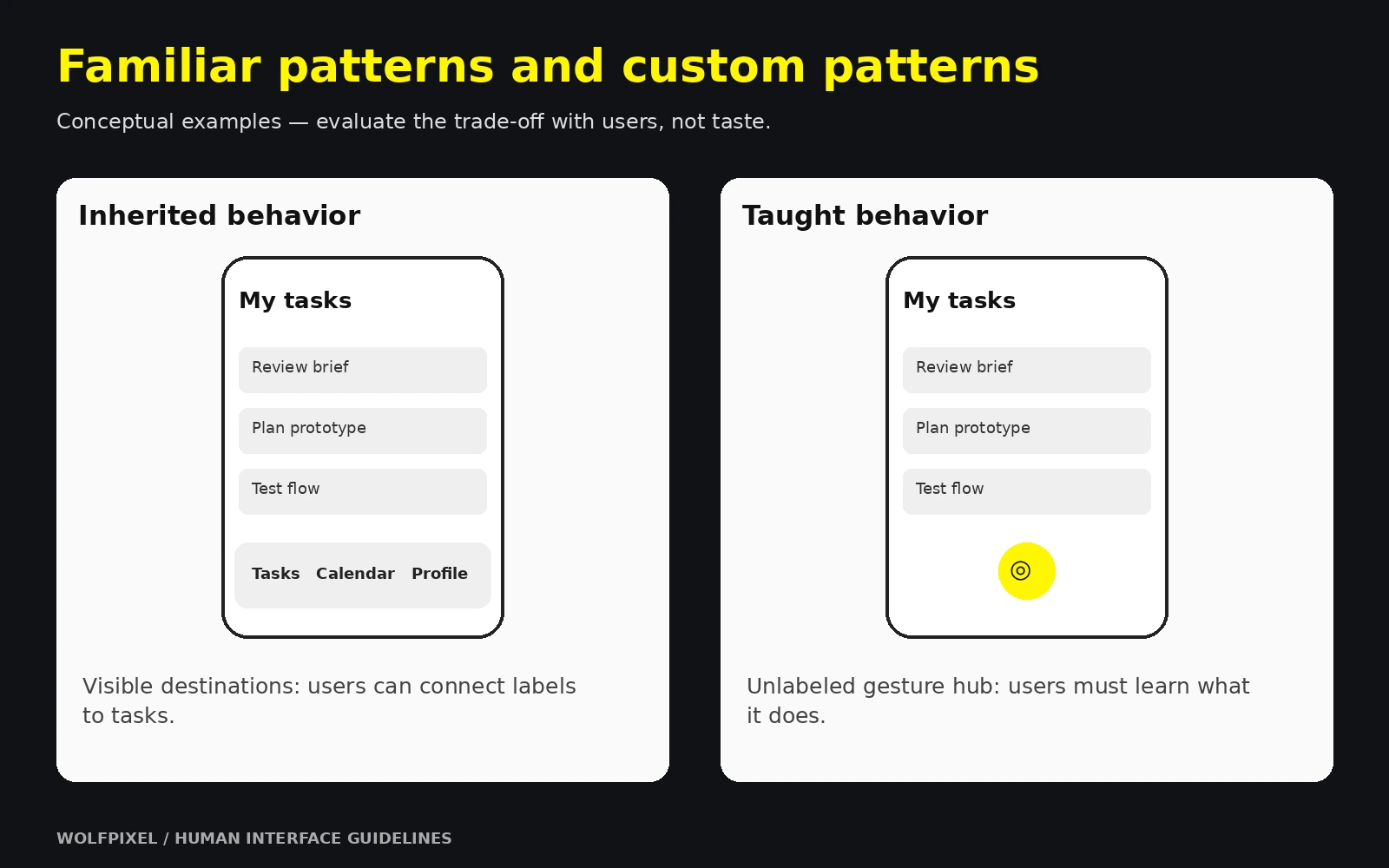
Familiar patterns can reduce the amount users need to learn. Standard navigation and dismissal behavior provide a starting point, while unfamiliar custom patterns may need more explanation and testing. Exact behavior depends on the component, platform and context.
Accessibility expands who can use your app. Review contrast, text scaling, meaningful labels, focus order and motion settings from the beginning. Test the implementation with assistive technologies and larger text; checking the visual design alone is not enough.
Use Apple’s accessibility design guidance and Android’s app accessibility guidance for the platform you are building on.
System components can reduce custom implementation and provide useful accessibility and localization behavior. They still require correct configuration and testing in your app. Replacing them creates additional code and behavior your team must maintain.
Trust is formed before evaluation. Users make fast judgments about whether an app feels legitimate. Mismatched iconography, inconsistent spacing, and controls that behave unexpectedly read as carelessness, and users generalize carelessness in the interface to carelessness with their money or data.
Design guidance and store approval requirements are related, but separate.
Here is the app design workflow we would recommend to any team building a serious product, with the guideline checkpoint that belongs at each stage. The value is not in the stage names most teams already know them but in the checkpoints, which are what actually prevent late-stage rework.
Step 1 — Discovery and definition. Clarify the job the product does, who does it, and what success looks like. Audit competitors on the platform, not in a spreadsheet install them, use them, note which platform conventions they follow and where they break. Guideline checkpoint: decide your target OS versions and device range now. This determines which components and APIs are available to you and constrains everything downstream.
Step 2 — Information architecture and user flows. Map the content model and the primary journeys before drawing a single screen. Decide your top-level navigation structure tabs versus a hierarchy versus a single focused surface. Guideline checkpoint: choose a navigation model the platform supports natively. This is the single most consequential decision in the entire process, and the most expensive to reverse.
Step 3 — Wireframes. Low-fidelity structure: what is on each screen, in what priority, and what happens when you tap it. Resist styling. Wireframes exist to argue about hierarchy and flow while arguing is still cheap. Guideline checkpoint: wireframe on real device dimensions with safe areas marked, and include the empty, loading, and error state of every screen, not just the happy path.
Step 4 — Visual design and UI. Apply the brand layer. Build a type scale, color system, spacing scale, iconography, and elevation model, then compose real screens from them. Guideline checkpoint: validate contrast ratios, minimum tap targets, and dynamic type behavior as you design rather than after. Confirm your color system survives both light and dark appearance.
Step 5 — Prototyping and validation. Turn static screens into something a real person can attempt to use. Test with users who match your audience. Guideline checkpoint: test on the device, in the hand, not in a browser window on a laptop.
Step 6 — Handoff and design system documentation. Deliver specifications, components, tokens, and behavior notes that an engineer can build from without guessing. Guideline checkpoint: document which elements are native components and which are custom, and justify every custom one.
Step 7 — Build support, design QA, and launch. Design does not end at handoff. Review builds on real hardware, catch drift, and refine. Guideline checkpoint: run a pre-submission review against store design requirements, accessibility settings, and every device size you claim to support.
| Stage | Core question | Primary output | Guideline focus |
|---|---|---|---|
| Discovery | What are we building and for whom? | Requirements, platform decision | Target OS and device range |
| IA & flows | How is it organized? | Sitemap, flow diagrams | Native navigation model |
| Wireframes | What goes where? | Low-fidelity screens, all states | Safe areas, layout structure |
| Visual design | What does it feel like? | High-fidelity UI, style foundations | Contrast, type scale, tap targets |
| Prototyping | Does it work for real people? | Interactive prototype, test findings | On-device gestures and motion |
| Handoff | Can engineering build it exactly? | Specs, components, tokens | Native vs. custom component map |
| QA & launch | Did it survive implementation? | Reviewed builds, release assets | Store design requirements, accessibility |
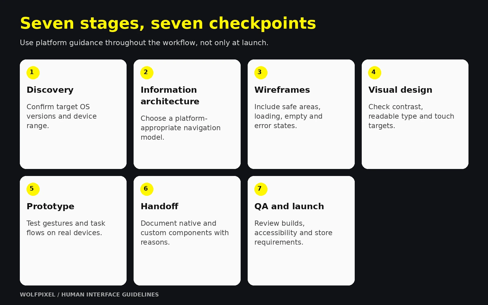
Put a platform checkpoint inside every stage of the workflow.
For the broader workflow, see our step-by-step mobile app design guide.
Timelines are where expectations break. The ranges below are planning heuristics for the design track specifically not engineering, and not research-backed benchmarks. Treat them as a way to structure a conversation with a design partner, then let scope adjust them.
| Product scope | Rough design duration | Typical unique screens | Notes |
|---|---|---|---|
| Focused MVP, one platform | 4–8 weeks | 10–20 | Single core flow, minimal settings, native components throughout |
| Full consumer product, one platform | 8–16 weeks | 25–60 | Onboarding, account, payments, notifications, empty and error states |
| Two platforms with shared system | 12–20 weeks | 30–70 shared | Shared foundations plus platform-specific adaptations; effort depends on architecture and scope. |
| Complex or regulated product | 16 weeks and up | 60+ | Compliance flows, permissions, audit trails, heavier research load |
Estimate states as well as screens. Loading, empty, error, offline, permission-denied and success conditions add design and implementation work. Scope, research, review cadence and engineering constraints also affect duration.
Other genuine drivers:
Here is an illustrative 12-week phasing model for a scoped design engagement. It is not a launch guarantee, and engineering can extend beyond it:
Resolve navigation decisions early enough to test them before engineering commits to the structure. Revisit them when user evidence shows the model is not working.
Estimate screens, states, research and review time together.
A prototype is not a deliverable you make because it looks impressive on a board deck. It is an instrument for reducing the cost of being wrong. The mobile app prototyping process works best when fidelity is matched deliberately to the question being asked.
| Fidelity | Best question it answers | Time cost | When to use |
|---|---|---|---|
| Paper or greyscale clickthrough | Is the structure comprehensible? | Hours | Immediately after wireframes |
| Linked static screens | Can users complete the core task? | 1–3 days | Before visual design is finished |
| Interactive high-fidelity | Does it feel right in the hand? | 1–2 weeks | Before handoff |
| Coded prototype | Is the interaction technically achievable? | Variable | For novel gestures, animation, or hardware features |
Match prototype fidelity to the question. Structure and comprehension can often be tested with a simple prototype, while gestures, visual feedback and technical behavior may require a more realistic or coded version.
Vague testing produces vague findings. Give each session concrete tasks and watch behavior, not opinions.
Prototypes reviewed on a desktop monitor systematically flatter themselves. Thumb reach, one-handed use, glare, notification interruptions, and the actual physical size of a tap target only reveal themselves on hardware. Every prototype that will ship to phones should be tested on phones — including at least one small screen and one large one.
Use iterative qualitative rounds where practical: test important tasks, analyze observations, revise the prototype and test again. Choose recruitment and sample size for the question and relevant user groups. A small round is a way to learn, not a guarantee of complete issue coverage.
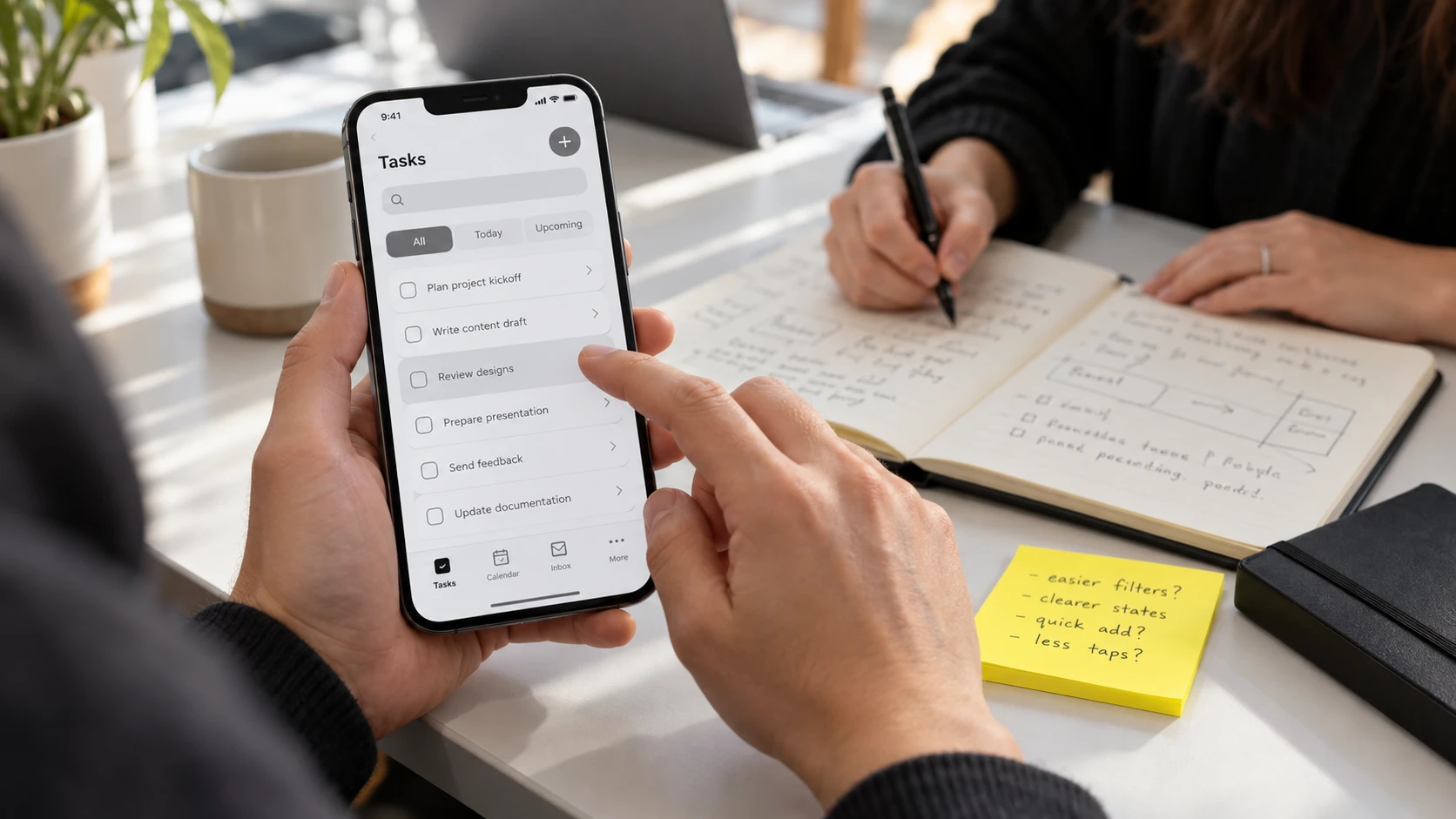
Match prototype fidelity to the question you need to answer.
If you are commissioning design work, this section is your checklist. The single most common cause of disappointment is not poor design ability it is an undefined deliverable list, where both sides assumed different things were included.
| Phase | Deliverable | What "good" looks like |
|---|---|---|
| Discovery | Requirements summary, platform decision | Explicit target OS versions and device range, written down |
| IA | Sitemap and user flow diagrams | Every entry point and dead end accounted for, including deep links |
| Wireframes | Low-fidelity screens, all states | Loading, empty, error, offline and success states present |
| Visual | Style foundations | Type scale, color system with contrast values, spacing scale, icon set, elevation |
| Visual | High-fidelity screens | Light and dark appearance, at least two device widths |
| Prototype | Interactive prototype | Real transitions, gestures, and at least one failure path |
| Research | Test findings | Observed behavior with recommendations, not just a highlight reel |
| Handoff | Component library | Named, reusable components with variants and states |
| Handoff | Specifications | Spacing, sizing, behavior notes, animation timing, asset exports |
| Handoff | Accessibility notes | Screen reader labels, focus order, dynamic type behavior |
| Launch | Store assets | App icon at all sizes, screenshots, preview graphics |
| Launch | Design QA report | Implementation review against specification |
You do not need craft expertise to assess quality. You need the right questions.
Ask to see the states. Request the error state, the empty state, and the loading state of the main screen. A portfolio of perfect happy-path screens with full data is a portfolio of screenshots, not a product design. This one question separates decorative work from production work faster than any other.
Ask why each custom component exists. Every deviation from a native component should have a stated reason. "It looked better" is not a reason. "The native picker cannot support our two-axis selection, so we built a custom control that preserves the same gestures and accessibility labels" is.
Ask what happens at the largest text size. If the answer involves hesitation, accessibility was not designed in.
Ask to see it on a device. Not a mockup image on a laptop. The actual prototype, on actual hardware, in your hand.
Ask how the design will be maintained. A design that cannot be extended by your team after the engagement ends is a liability with a nice cover.
Look at process artifacts, not just outcomes. Ask to see wireframes, iteration history, and test findings from a past project. Teams with genuine depth have messy middles they are proud of. Teams selling visuals have only finals.
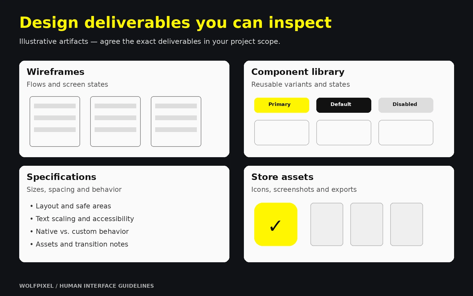
Review states and implementation artifacts alongside finished screens.
Review Wolfpixel’s product design portfolio and ask about the research, states and implementation decisions behind each project.
At some point every team decides whether to build design capability internally, hire an agency or studio, or run a hybrid. There is no universally correct answer, but there are predictable trade-offs.
| Model | Best suited to | Strengths | Watch for |
|---|---|---|---|
| In-house designer | Products in continuous iteration | Deep context, always available, compounding knowledge | Slow to hire, single point of failure, limited range |
| Design studio or agency | Zero-to-one builds, rebrands, major redesigns | Breadth of pattern experience, established process, senior input | Context transfer at the end, availability windows |
| Freelance specialist | Defined, scoped pieces of work | Cost-efficient, fast to start | Variable process rigor, limited capacity for scale |
| Hybrid | Teams scaling from one product to several | External system-building, internal iteration | Requires clear ownership boundaries |
Rather than fixating on a headline figure, understand the levers, because these are what you can negotiate.
Avoid the temptation to justify design spend with borrowed statistics. The defensible argument is more concrete and easier to hold up in a board meeting:
A maintained design system makes it easier to reuse decisions across features. Its value depends on adoption, coverage and ongoing maintenance rather than a guaranteed delivery-speed increase.
Bring design into the navigation and information-architecture discussion before implementation hardens the structure. Later design work can still improve a product, but structural changes may become more costly.
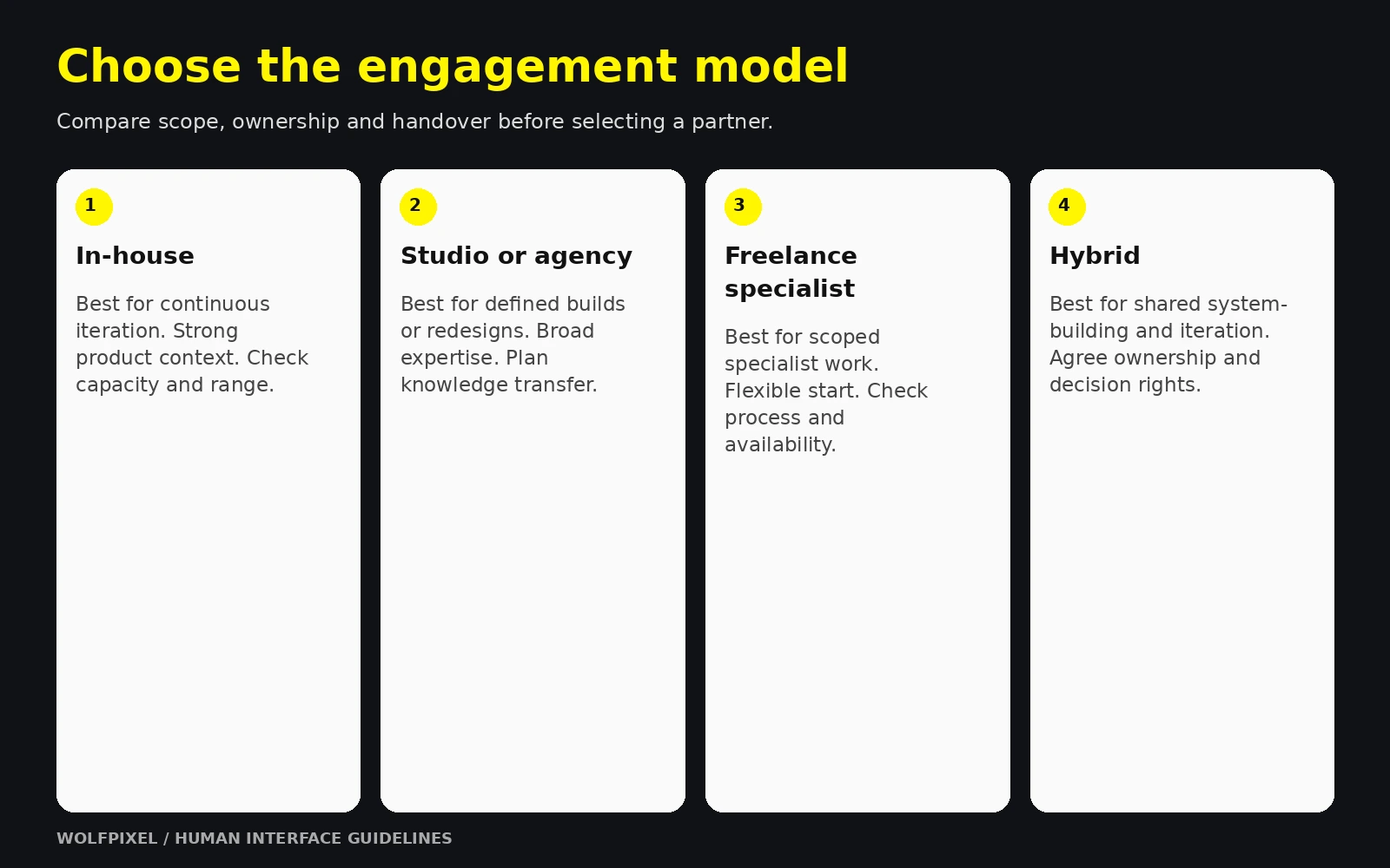
Agree scope, handover and build support before choosing an engagement.
Explore our mobile app design services, read our UI/UX design cost guide, or discuss your app design scope.
These are the failure patterns that recur most often. Most are cheap to avoid at the start and expensive to correct later.
A single visual design pushed unchanged to iOS and Android breaks conventions on at least one of them. Back behavior, navigation placement, system typography, share sheets, date pickers, and permission dialogs all differ. Share your brand, your content model, and your flows across platforms. Adapt the platform layer.
The instruction "make it look nothing like a standard app" almost always produces a product that is harder to use and no more memorable. Distinctiveness lives in color, typography, illustration, copy voice, and motion personality — all of which are fully available to you inside platform alignment. Distinctiveness does not live in relocating the back button.
The most common gap in design handoffs. Real users have no network, empty accounts, expired sessions, denied permissions, and failed payments. If those states are not designed, engineering will invent them under deadline pressure, and they will be the states your least happy users see most often.
Guidelines explain why a pattern exists. Teams that copy a competitor's screens inherit the appearance without the logic, and then cannot reason about edge cases the screenshot never showed. Read the foundations sections. They are shorter than they look and they pay for themselves.
Accessibility decisions belong in the workflow. Contrast, text scaling, focus order, target areas and screen reader labels can require structural changes, so review them before and during implementation.
Designs drift during implementation — not from carelessness, but from a thousand small judgment calls no specification anticipated. Without a designer reviewing real builds on real devices, the shipped product is a rough approximation of the approved design, and nobody notices until a user does.
Guidelines change with OS releases. Design against the current published documentation for the version you are targeting, and schedule a guideline review after each major platform announcement.
A custom control adds implementation, maintenance and accessibility work. System controls can evolve with platform updates, but their behavior in your app still needs review. Keep a record of each custom control and its reason, and reconsider it when a suitable platform option becomes available.
Nearly all of these share one root cause: platform alignment treated as a review event rather than a process property. Something checked once, late, by one person. The fix is structural — checkpoints inside each stage of the app design workflow, as set out in Section 3, so that no single review carries the weight of the whole product.
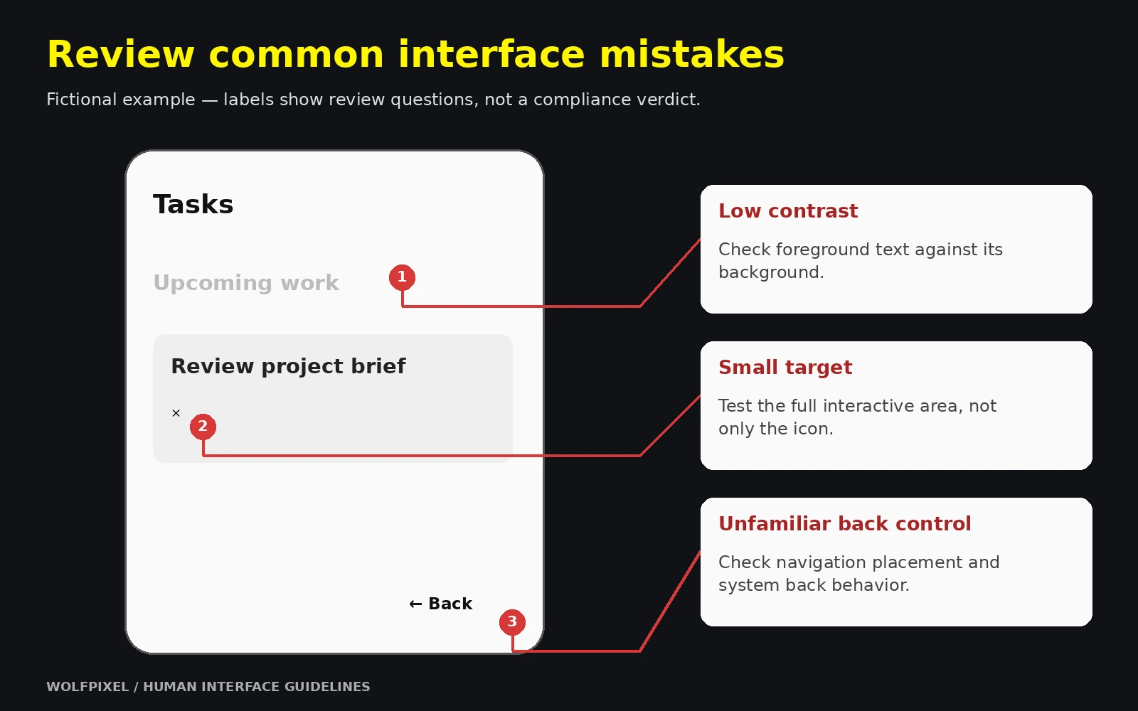
Check the real implementation on devices and with accessibility settings.
Apple’s HIG is design guidance, while its App Review Guidelines set approval requirements. HIG alignment does not guarantee approval, and a deliberate design variation does not automatically mean rejection. Review the applicable requirements and test whether your choices work for users.
Partially. Platform guidelines govern native surfaces, but the underlying reasoning — hierarchy, feedback, touch target sizing, accessibility, predictable navigation — transfers directly. If your PWA is installed to a home screen and behaves like an app, users will judge it by app conventions regardless of how it is built.
Platform guidance provides conventions and recommendations; your product system defines reusable implementation and brand decisions. Material Design and Fluent also supply broader design-system resources that can support your own system.
Start with well-supported platform controls, a consistent brand layer and focused user flows. Reserve custom work for cases that need it, and test accessibility, states and navigation in the actual app.
At minimum, after each major OS announcement, and again before any significant redesign. A short annual review of your custom component list against current native equivalents is also worth scheduling — platforms frequently ship native versions of controls teams previously had to build themselves.
The navigation model is often a high-leverage early decision because many flows depend on it. The most important decision for your app can also depend on its users, accessibility needs and core task.
Only if they are part of your launch commitment. If they are not, still design with adaptive layout in mind flexible grids and content-driven breakpoints so that supporting them later is an extension of the system rather than a redesign of it.




.svg)



.svg)

.svg)

.svg)

.svg)

.svg)
.svg)
