


12 Oct 2026
UI/UX Design
Human Interface Guidelines: How to Use Them Across Your Mobile App Design Process


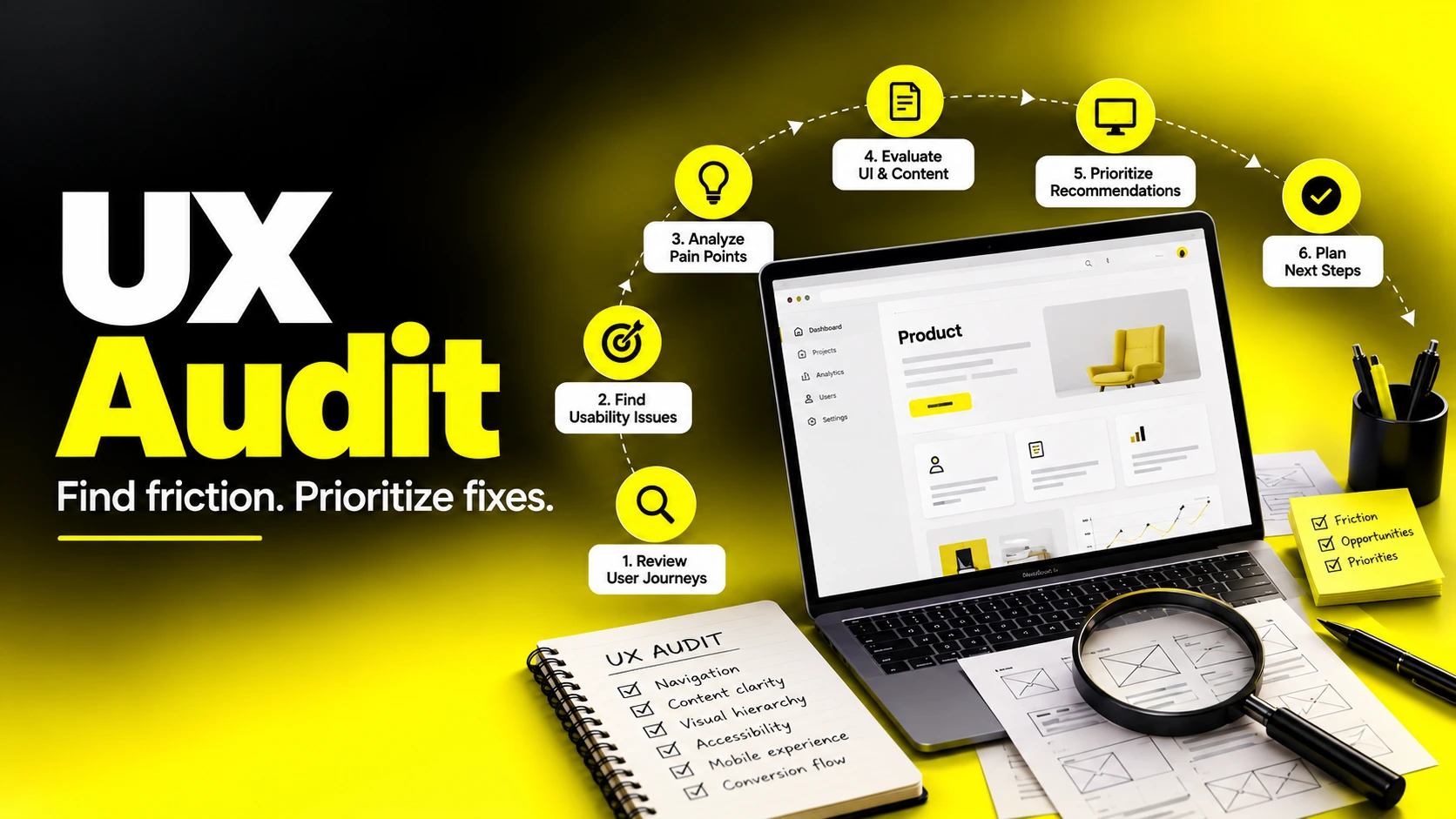
A UX audit is a structured review of a digital product that finds usability problems, explains why they hurt users and the business, and ranks fixes by impact. It combines expert review methods such as heuristic evaluation with real evidence from analytics, session recordings, and user feedback. A good UX audit ends with a prioritized report your team can act on, not just a list of opinions. As an indicative planning range, a focused audit may take one to three weeks; scope, recruitment and access to data can change the schedule.
Most teams don't ask for a UX audit when things are going well. They ask when signups plateau, when support tickets keep repeating the same confusion, or when a redesign is on the table and nobody can agree on what's actually broken.
A structured audit replaces guesswork with evidence. When teams know something is wrong but cannot locate it, reviewing real journeys and existing data helps turn uncertainty into a prioritized plan.
This guide is written for founders, product leaders, heads of growth, and teams investing in design. You'll learn exactly what a UX audit covers, how to conduct a UX audit step by step, what belongs in a UX audit checklist, how heuristic evaluation fits in, what a useful UX audit report looks like, and how to decide between doing it in-house or bringing in professional help.
A UX audit is a systematic evaluation of a website, app, or digital product to identify where the experience makes it harder for users to reach their goals — and, as a result, harder for the business to reach its own. You'll also hear it called a usability audit, UX review, or experience audit. The labels overlap; what matters is the method.
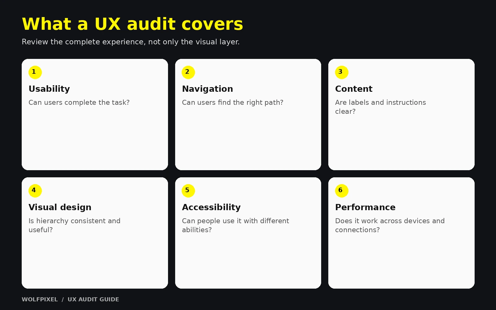
A strong UX audit answers three questions:
| A UX audit is… | A UX audit is not… |
|---|---|
| Evidence-based analysis of user problems | A list of personal design preferences |
| Focused on goals, tasks, and outcomes | A visual "refresh" or restyle |
| Prioritized by impact and effort | An unranked dump of every small issue |
| A diagnostic that informs decisions | A replacement for ongoing user research |
| Usually a defined, time-boxed project | A full redesign |
Connect each finding to a usability principle, observed behavior or a data point.
Share the journeys you want to improve. We can discuss the scope, evidence and design work needed to prioritize the next steps.


For founders and growth leaders, the value of a UX audit isn't "better design" in the abstract. It's clarity about where to spend limited time and budget.
Small changes to labels, forms and pricing clarity can be worth testing before a redesign.
| Role | What they get from a UX audit |
|---|---|
| Founders | A clear view of what's blocking growth and where to invest |
| Product leaders | A prioritized, evidence-backed backlog |
| Heads of growth | Friction points in funnels and ideas for experiments |
| Design teams | An outside-in perspective and shared language for issues |
| Engineering | Well-scoped, justified tickets instead of vague requests |
You don't need a UX audit every month, but there are moments when one pays off clearly.
| Stage | Recommended focus |
|---|---|
| Pre-launch / MVP | Core task flows, onboarding clarity, obvious usability blockers |
| Early traction | Activation funnel, pricing and signup pages, mobile experience |
| Scaling | Consistency, information architecture, design system gaps, accessibility |
| Pre-redesign | Full website UX audit to decide what to keep, fix, or rebuild |
| Mature product | Periodic targeted audits of high-value flows |
Audit before a redesign to identify underlying issues before changing the visual layer.
Here's the process I follow and recommend. It works for a SaaS product, an ecommerce store, a marketing website, or a mobile app — you simply adjust the scope.
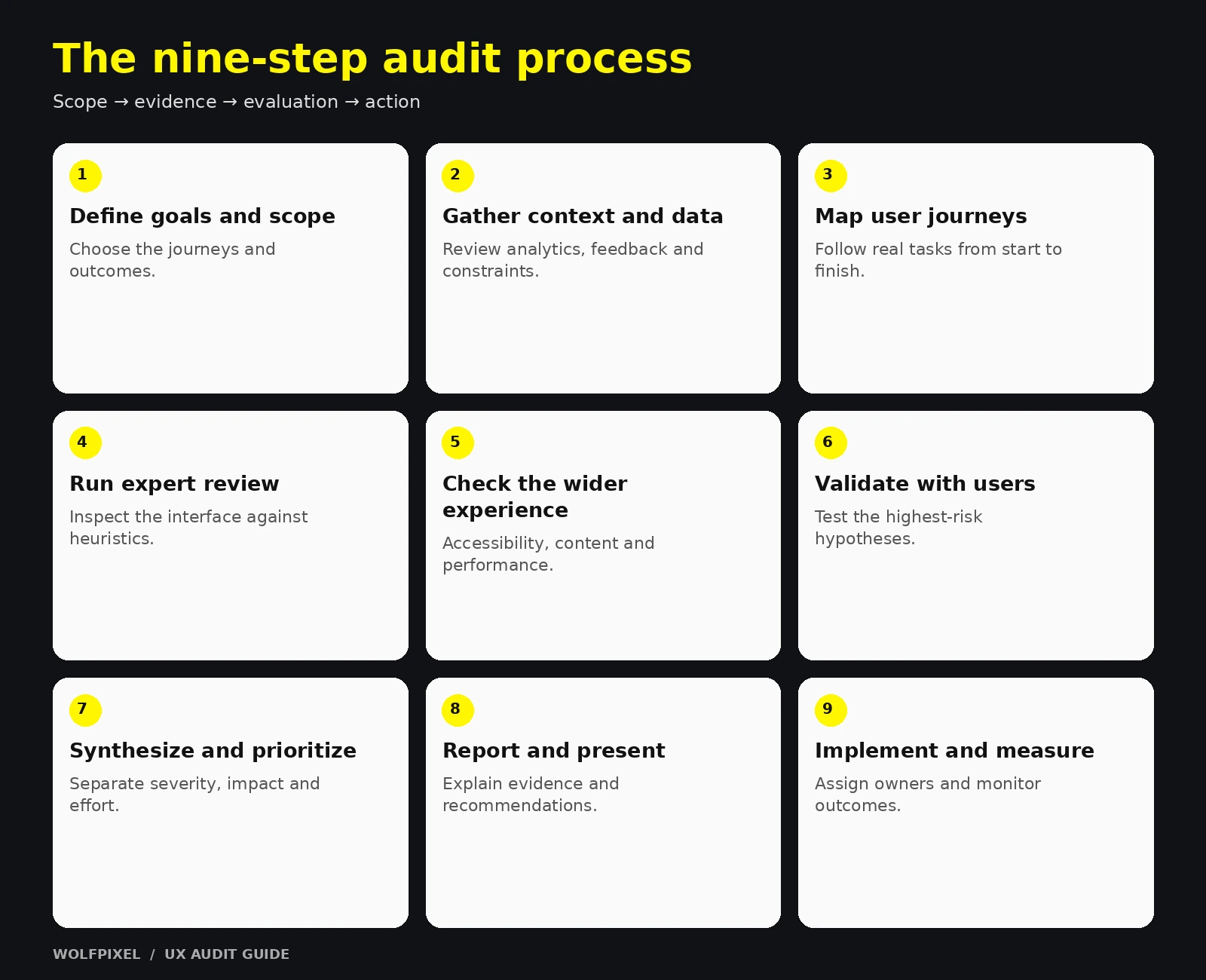
Start with the business, not the interface.
Output: A one-page audit brief with goals, scope, key user tasks, and success metrics.
Before reviewing a single screen, collect what the team already knows.
Output: A list of known problems, suspected problems, and open questions.
Identify the three to five tasks that matter most — for example, "sign up and create the first project" or "find a product and check out." Walk through each one as a user would, step by step, on each in-scope device.
Output: Journey maps or flow diagrams showing every step, decision point, and potential friction.
Evaluate each screen and flow against established usability principles — most commonly Jakob Nielsen's 10 usability heuristics (covered in detail below). Document every issue with a screenshot, the principle it violates, and where it occurs.
Tip: Have at least two evaluators review independently, then combine findings. Different reviewers catch different issues.
Automated tools cannot determine accessibility on their own. Follow W3C’s guidance on accessibility evaluation tools and include human evaluation.
Expert review finds likely problems; usability testing helps assess them with the people who use your product. Start with a focused qualitative round on important tasks and iterate. Recruit separately for materially different user groups, and choose sample size for the research question; a small round does not guarantee every issue will be found.
Group related issues into themes, then rate each one.
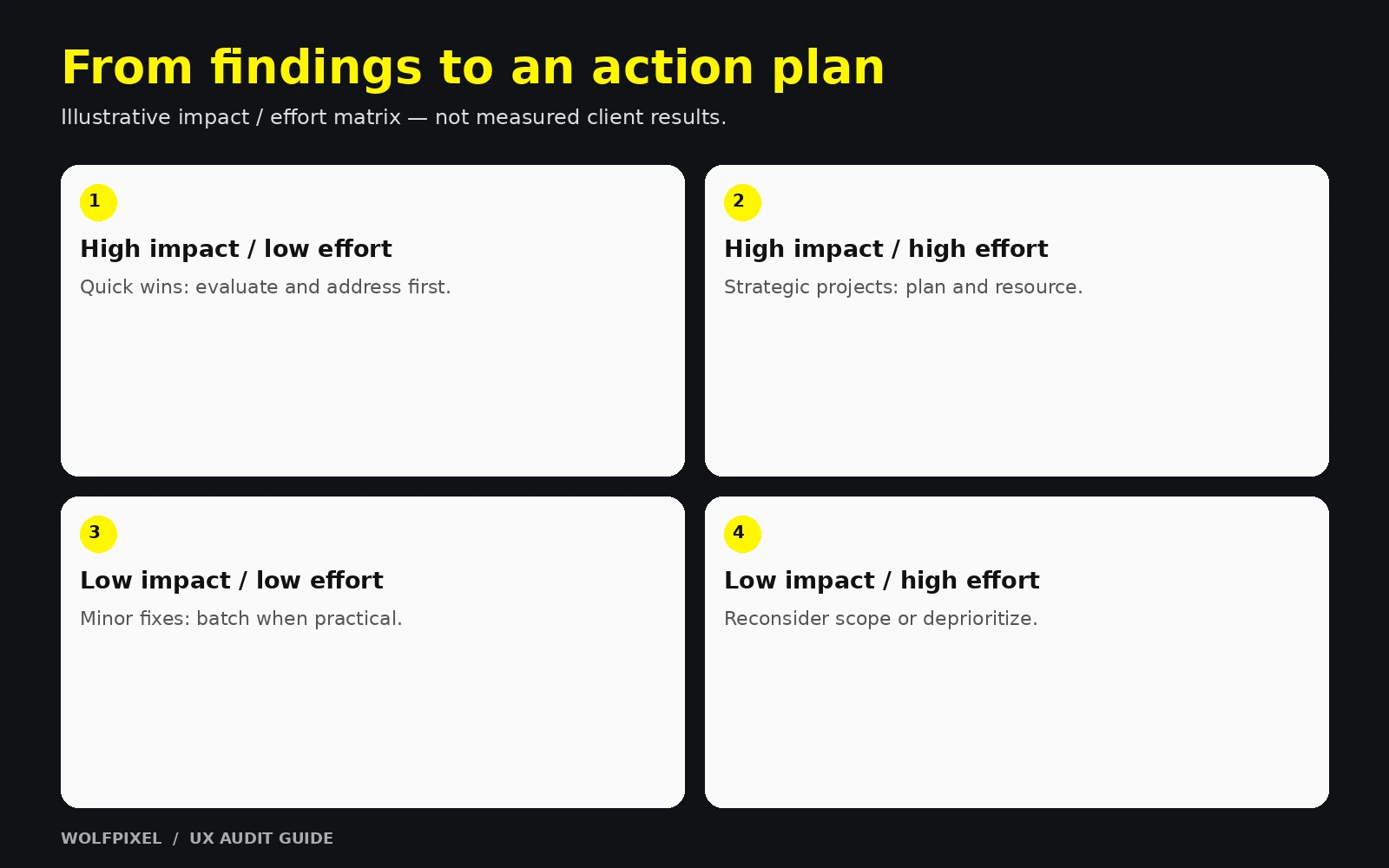
Plot issues on an impact-vs-effort matrix to separate quick wins from strategic projects.
Turn findings into a clear UX audit report (see the template section below) and walk stakeholders through it live. A presentation with discussion leads to far more action than a document sent by email.
Convert recommendations into backlog items, assign owners, and define how you'll measure success. Revisit key metrics after fixing the ship.
A specific audit goal gives every finding a clear purpose.
Use this UX audit checklist as a starting point. Adapt it to your product type and goals — not every item applies to every product.
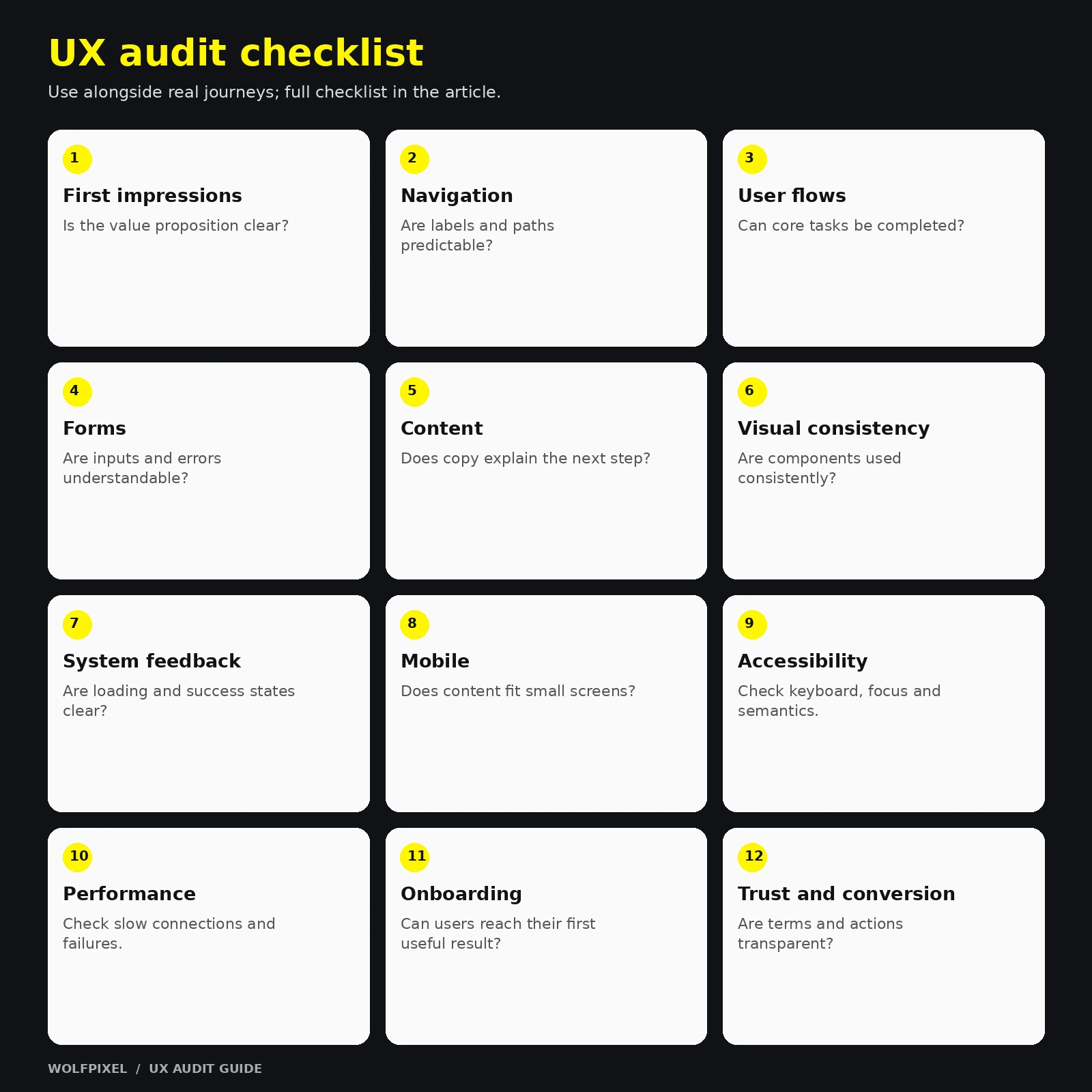
Use the checklist as a safety net; walk through real user journeys first.
For device-specific review, use our mobile app design guide alongside the audit checklist.
Heuristic evaluation is an expert review in which evaluators inspect an interface against recognized usability principles. It does not require recruiting users, but its findings remain hypotheses until supported by other evidence.
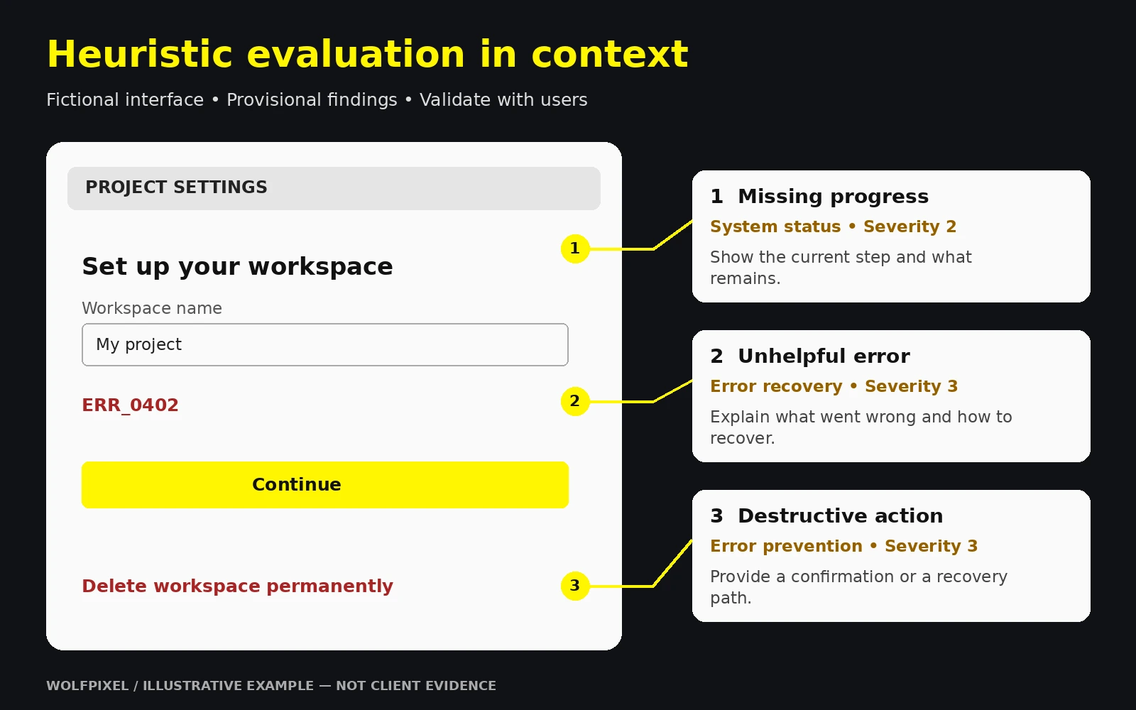
Jakob Nielsen’s ten usability heuristics provide a widely used framework for this review:
Source: Jakob Nielsen’s ten usability heuristics.
| # | Heuristic | What to look for |
|---|---|---|
| 1 | Visibility of system status | Loading states, progress, confirmation messages |
| 2 | Match between system and the real world | Familiar language and concepts, no internal jargon |
| 3 | User control and freedom | Undo, cancel, back, easy exits |
| 4 | Consistency and standards | Consistent patterns within the product and with platform conventions |
| 5 | Error prevention | Constraints, confirmations, smart defaults |
| 6 | Recognition rather than recall | Visible options, helpful suggestions, no memorization |
| 7 | Flexibility and efficiency of use | Shortcuts and accelerators for experienced users |
| 8 | Aesthetic and minimalist design | Only relevant information competing for attention |
| 9 | Help users recognize, diagnose, and recover from errors | Plain-language error messages with a solution |
| 10 | Help and documentation | Findable, task-focused help when needed |
See Nielsen Norman Group’s severity-rating guidance.
| Method | Best for | Limitation |
|---|---|---|
| Analytics review | Finding where users drop off | Doesn't explain why |
| Session recordings and heatmaps | Seeing actual behavior on pages | Time-consuming to review; privacy settings needed |
| Usability testing | Confirming real user struggles | Requires recruiting and planning |
| Cognitive walkthrough | Evaluating learnability for new users | Narrow focus on specific tasks |
| Accessibility testing | WCAG conformance and inclusive design | Automated tools miss many issues |
| Competitive review | Understanding user expectations in your category | Competitors aren't always right |
| Surveys and feedback analysis | Capturing stated frustrations at scale | What people say can differ from what they do |
Nielsen's heuristics are broad by design. For specialized products — especially ecommerce — many teams also use more detailed, research-based guideline sets for areas like product pages, checkout, and search. Broad heuristics tell you what kind of problem exists; specialized guidelines help you pinpoint specific patterns. Using both gives the most complete picture.
Treat expert findings as hypotheses and validate their impact with user evidence.
A UX audit is only as useful as its report. If stakeholders can't understand it in a few minutes, and engineers can't act on it, the work gets shelved.
The following is a hypothetical example to show how a well-written finding should read:
Notice the structure: the issue is specific, the evidence is stated, the principle is named, and the recommendation is actionable. That's what makes a report credible.
| Impact | Low effort | High effort |
|---|---|---|
| High impact | Quick wins — do first | Strategic projects — plan next |
| Low impact | Minor fixes — batch later | Deprioritize or skip |
Lead the executive summary with a short, evidence-backed priority list.
| Factor | In-house audit | Professional UX audit |
|---|---|---|
| Cost | Lower direct cost; uses internal time | Direct investment in external expertise |
| Objectivity | Risk of bias and familiarity blindness | Fresh, outside-in perspective |
| Product knowledge | Deep | Needs onboarding time |
| Methodology | Depends on team experience | Usually structured and repeatable |
| Speed | Competes with other priorities | Dedicated, time-boxed focus |
| Best for | Mature design teams, small targeted reviews | Growth-critical flows, pre-redesign, teams without senior UX capacity |
Many teams get the best results from a hybrid: an experienced external lead runs the audit while internal designers and PMs contribute product context and take ownership of implementation.
Pricing for a professional UX audit varies widely, so it's more useful to understand what drives the cost than to rely on a single number:
How to think about ROI: Compare the audit's cost with the value of the flow being reviewed. If a checkout, signup, or demo-request flow drives meaningful revenue, even modest improvements can justify the investment. Ask the provider how they'll help you measure results after fixes ship.
Assign owners and next steps so the report becomes implementation work.
Explore our UI/UX design services, review Wolfpixel’s product design case studies, or discuss your UX audit scope.
When estimating follow-up implementation, see our UI/UX design cost guide and confirm the actual scope with the team.
Timing depends on scope, access to data and recruitment. For planning, allow roughly a week for a tightly focused review and several weeks for a broader audit with user testing; confirm the schedule against actual deliverables.
Review important flows after major releases, redesigns or meaningful changes in user behavior. Set a recurring review cadence that fits how quickly your product changes.
Yes. An expert review combined with analytics and customer feedback can uncover many important issues. However, adding even a small round of usability testing increases confidence that you're fixing the problems that matter most to users.
Teams typically use a mix of analytics platforms, session recording and heatmap tools, accessibility checkers, usability testing platforms, and a design or whiteboard tool such as Figma for annotating screens and mapping journeys. The right mix depends on your product and existing stack.
Often, yes — as long as it's tightly scoped. Early-stage teams benefit most from a lightweight audit of onboarding and activation, where small fixes can meaningfully influence whether new users stick around.
A UI audit focuses mainly on visual consistency, components, and design system quality. A UX audit is broader, covering usability, flows, content, accessibility, and how the experience supports user and business goals.




.svg)



.svg)

.svg)

.svg)

.svg)

.svg)
.svg)
