


15 Oct 2026
UI/UX Design
Design Agency vs Freelancer: Which Is Right for Your Product?


The UI UX design process is a structured workflow for turning a business problem into a usable, tested product interface. It usually runs through seven steps: discovery, user research, problem definition, information architecture and user flows, wireframing and prototyping, UI design, and usability testing with developer handoff. Most teams organize these steps with a framework such as the Double Diamond or a Design Sprint. Depending on scope, the process takes anywhere from one week for a sprint to several months for a full SaaS product.
Most articles about the UX design process are written for people learning to become designers. This one is for the people who pay for design and live with the results: founders, product leaders, heads of growth, and teams deciding how much to invest in it.
I'm Maniruzzaman Jubayer, Design Lead at Wolfpixel. For the past six-plus years I've designed SaaS platforms, fintech dashboards, AI products, and marketing websites for startups and growing companies. In that time I've found that the teams that get the most from design aren't the ones with the biggest budgets. They understand the process well enough to ask the right questions, give useful feedback, and know what "done" should look like at each stage.
This guide walks through the full UI UX design process as it works on real product teams. It covers what happens at each step, which frameworks are worth using, which UX deliverables you should expect, how long design realistically takes, what it costs, and how to avoid the mistakes that quietly drain budgets.
The UI UX design process is the sequence of research, planning, design, and validation activities that a team uses to build a digital product people can understand, use, and come back to. It connects business goals (conversion, activation, retention, revenue) with user needs (clarity, speed, trust).
It helps to separate the two halves:
In practice they aren't separate projects. UX decisions set the skeleton and UI gives it a body. A beautiful interface on top of a confusing flow still fails, and a well-structured flow with a weak interface still loses trust.
You'll see "UX design process" and "product design process" used interchangeably. The difference is mostly scope. A product design process is wider. It includes business strategy, feature prioritization, and collaboration with engineering and product management over the whole life of the product. The UX and UI steps sit inside it. For founders and product leaders, product design is usually the more useful frame, because design decisions change roadmap and engineering cost, not only screens.
A defined process gives you three things ad-hoc design doesn't:
From my own work, the teams that skip the process rarely save time. They usually spend it later, redesigning screens that were built on assumptions nobody tested.
Explore our UI/UX design services to see how research, flows and interface design connect in an engagement.
Use evidence to connect business goals with user needs.
Book a free 30-minute call to discuss your product goals, design process, scope and practical next step.


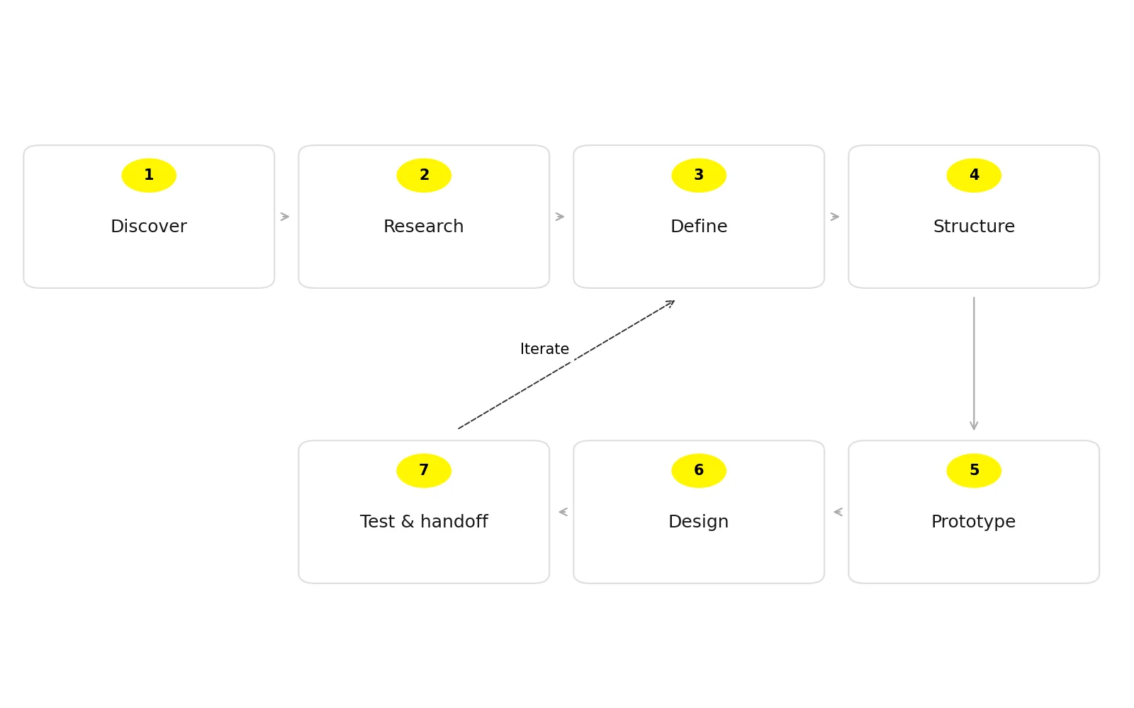
Every agency and in-house team labels these steps a little differently, but the underlying ux design workflow is consistent. Here's the version my team uses on SaaS, fintech, and AI products, and what each step should produce.
Goal: Agree on the problem, the users, the business goal, and what success looks like before any design starts.
What happens:
My take: This is the step clients most often want to skip, and it's the one I push back on most. A 60-minute kickoff that leaves everyone agreeing on one primary metric does more for a project than an extra week of polishing screens.
Goal: Replace assumptions with evidence about real users' behavior, needs, and language.
Common methods:
Research doesn't have to be a big, slow phase. For an early-stage startup, a handful of well-run interviews and an honest look at the analytics is often enough to change the direction of a design.
Goal: Turn research into clear, prioritized problems the design must solve.
Outputs usually include:
This is where a design partner earns their fee. Anyone can gather research. The skill is deciding what not to design.
Goal: Decide how content and features are organized and how users move through them.
What happens:
For data-heavy products, this step decides most of the outcome. In dashboard projects, the hardest decisions often concern structure and priority rather than appearance. They were about which information a user needs first, and which can wait one click deeper.
Goal: Test structure and flow cheaply before investing in visual design.
A good rule is to keep fidelity as low as possible for as long as possible. Once screens look finished, feedback shifts from "does this flow make sense?" to "can we change the blue?", and you lose the chance to fix bigger problems.
Goal: Turn validated wireframes into a polished, on-brand, buildable interface.
What happens:
The design system is what keeps your product consistent after the first release. Without one, every new feature slowly drifts in style and developers rebuild the same components again and again.
Goal: Confirm the design works for real users, then ship it cleanly to development.
The UX design process isn't a straight line. Testing often sends you back to Step 3 or Step 5, and that is the process working as intended.
| Step | Core question | Key output |
|---|---|---|
| 1. Discovery | What are we solving, and how will we measure success? | Project brief, success metrics |
| 2. User research | Who are the users and what do they actually need? | Interview notes, research findings |
| 3. Define | Which problems matter most? | Problem statements, personas/JTBD, journey map |
| 4. IA & user flows | How is it organized and how do users move through it? | Sitemap, user flows |
| 5. Wireframes & prototypes | Does the structure work? | Wireframes, clickable prototype |
| 6. UI design | Is it clear, on-brand, and buildable? | High-fidelity screens, design system |
| 7. Test & handoff | Can real users succeed, and can developers build it? | Usability report, dev-ready files, QA notes |
See NN/G’s guidance on iterative usability tests. Our SaaS product design work applies these activities to real product flows.
Keep testing and iteration inside the process.
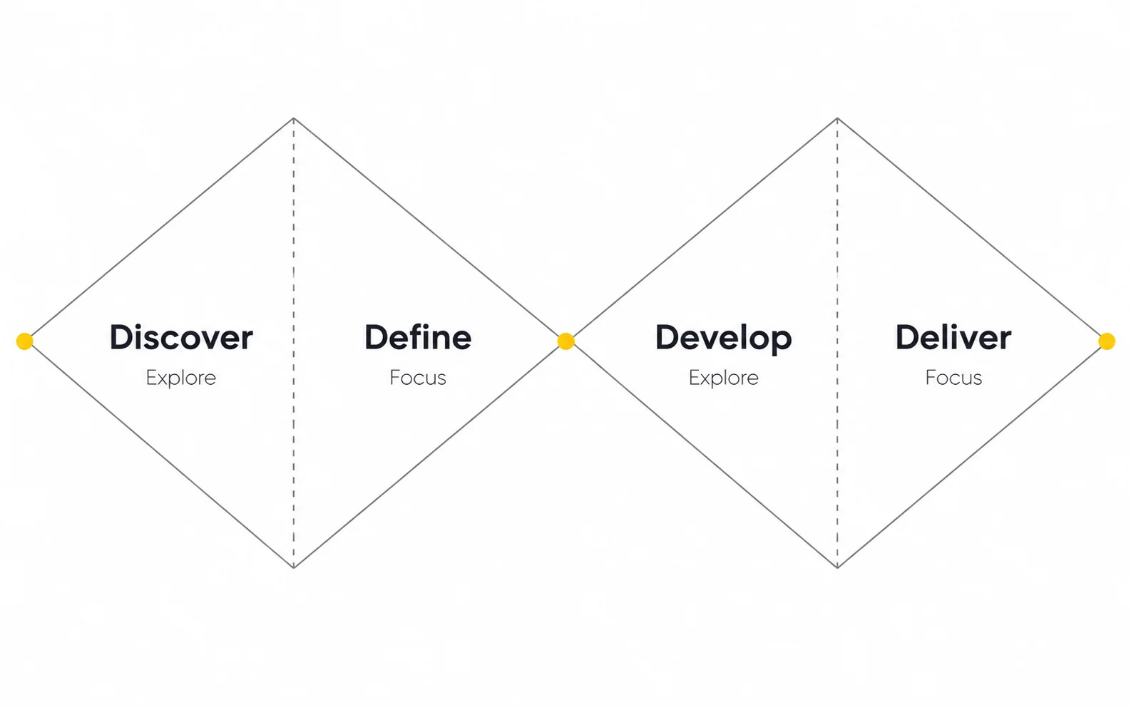
The seven steps describe what happens. A framework describes how you pace and organize it. Here are the frameworks you're most likely to hear about, and when each one makes sense.
Developed by the UK Design Council, the Double Diamond splits design into two rounds of diverging (exploring widely) and converging (narrowing down):
Best for: new products, major redesigns, or any project where you aren't yet sure you're solving the right problem. Its biggest value is that it forces a team to design the right thing before designing the thing right.
The Design Sprint, created by Jake Knapp at Google and developed further with his colleagues and described in the book Sprint, compresses a big decision into five days:
| Day | Activity |
|---|---|
| Monday | Map the problem and pick a target |
| Tuesday | Sketch competing solutions |
| Wednesday | Decide on the strongest ideas |
| Thursday | Prototype a realistic facade |
| Friday | Test with real users |
Best for: high-stakes questions with a clear decision-maker, such as a new onboarding concept, a pricing-page direction, or validating an MVP idea before committing engineering time. It isn't a replacement for a full product design process. It's a fast way to lower the risk of one decision.
Lean UX treats design as a series of small hypotheses ("We believe that X will result in Y"), tested with the smallest possible experiment and improved in short cycles alongside development.
Best for: live products with active users, where the team ships weekly and can learn from real behavior.
| Framework | Typical duration | Best for | Watch out for |
|---|---|---|---|
| Double Diamond | Weeks to months | New products, major redesigns | Can feel slow if research isn't time-boxed |
| Design Sprint | 5 days (4-day variants exist) | One high-risk decision | Needs the decision-maker in the room all week |
| Lean UX | Ongoing, 1–2 week cycles | Live products, growth teams | Can drift into local tweaks without a bigger strategy |
| Design Thinking | Flexible | Innovation workshops, early exploration | Often stops at ideas without a delivery plan |
What I recommend in practice: most of our client work is a hybrid. We use the Double Diamond to structure a new product or redesign, run a sprint-style week when there's one big unknown (like onboarding for an AI feature), and switch to lean, continuous cycles once the product is live.
Review the Design Council’s Double Diamond and the Design Sprint authors’ overview.
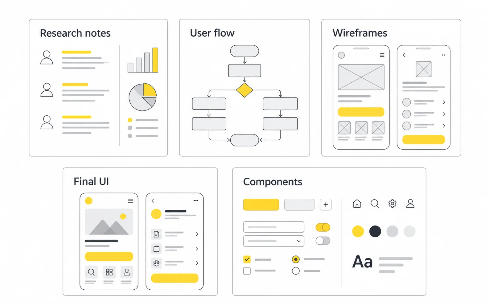
"UX deliverables" is where many buyers get confused, and where some vendors hide thin work behind nice-looking files. Here's what a professional engagement should produce, and why each item matters to you.
| Stage | Deliverable | Why it matters to the business |
|---|---|---|
| Discovery | Project brief, success metrics, scope doc | Stops scope creep and aligns stakeholders |
| Research | Research summary, interview insights, competitor audit | Turns opinions into evidence |
| Define | Personas / JTBD, journey maps, problem statements | Focuses budget on problems that matter |
| Structure | Sitemap, user flows | Prevents navigation and logic problems before they're built |
| Wireframing | Low/mid-fidelity wireframes, clickable prototype | Lets you test ideas cheaply |
| UI design | High-fidelity screens, all states, responsive layouts | What users actually see and developers build |
| System | Design system / component library, style guide | Keeps future features consistent and faster to design |
| Validation | Usability test report with prioritized fixes | Shows the design works, not just that it looks good |
| Handoff | Dev-ready Figma files, specs, annotations, design QA | Cuts build errors and back-and-forth |
Not every project needs every artifact. A seed-stage startup rarely needs polished persona posters or a 60-page research report. Ask your design partner which deliverables will actually change decisions and which are just there for show. Good partners size their documentation to the stage of your company.
Ask for the artifacts that change decisions and support delivery.
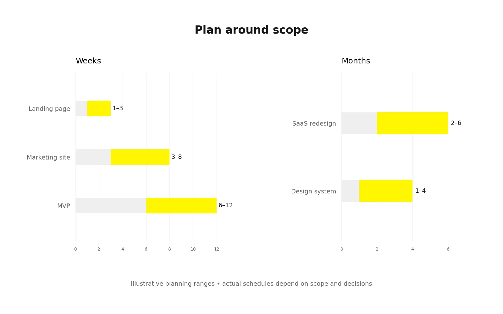
This is one of the most common questions founders ask me, and the honest answer is that it depends on scope, how complex the product is, and, more than people expect, how quickly decisions get made on the client side.
The ranges below are broad planning estimates for the scopes described, not measured industry averages or Wolfpixel package commitments. Your actual schedule depends on scope and decision speed.
| Project type | Typical design timeline | What drives the range |
|---|---|---|
| Design sprint (one key decision) | 1 week | Availability of the decision-maker |
| Landing page | 1–3 weeks | Copy readiness, number of variants |
| Marketing website (5–15 pages) | 3–8 weeks | Page count, content, brand readiness |
| MVP web or mobile app | 6–12 weeks | Number of core flows, research depth |
| Complex SaaS or fintech platform | 3–6+ months | Roles, permissions, data density, integrations |
| Design system | 1–4 months | Number of components, existing product debt |
| Redesign of an existing product | 2–6 months | Legacy constraints, migration planning |
Wolfpixel publishes package-specific turnaround times. Agree the scope and delivery cadence at kickoff rather than applying one turnaround promise to every type of design work.
Scope and decision speed matter as much as screen count.
Cost ranges vary widely by region, seniority, and scope, so be wary of anyone quoting a single "average price" for UI UX design. It's more useful to understand the pricing models and the factors that drive cost.
| Model | How it works | Best for | Trade-off |
|---|---|---|---|
| Hourly | Pay for time spent | Small, unclear, or advisory work | Hard to predict total cost |
| Fixed-price project | Set scope, set fee | Well-defined projects (website, MVP) | Changes mean change requests |
| Monthly retainer / subscription | Ongoing capacity for a monthly fee | Startups and growth teams shipping continuously | Needs a steady backlog to get full value |
| In-house hire | Salary plus benefits and tools | Mature products with constant design needs | Slow to hire; one person rarely covers every skill |
For transparency: Wolfpixel’s published Bench Light package is $3,900/month at the time of this update. Package coverage and custom project quotes depend on scope; review the current design subscription plans and pricing before comparing proposals.
Design pays off when it's tied to a metric that matters to the business. Before you approve a budget, write down the one or two numbers the design should move: signup conversion, onboarding completion, demo bookings, support tickets per user, or churn. Then check whether the proposal includes the research and testing needed to actually move them. A cheaper proposal that skips validation isn't cheaper if the result has to be redesigned in six months.
If you're weighing whether conversion is the real problem, our guide on why SaaS products don’t convert is a useful companion to this section.
Our guide to how UX design drives higher conversions connects design decisions with measurable outcomes.
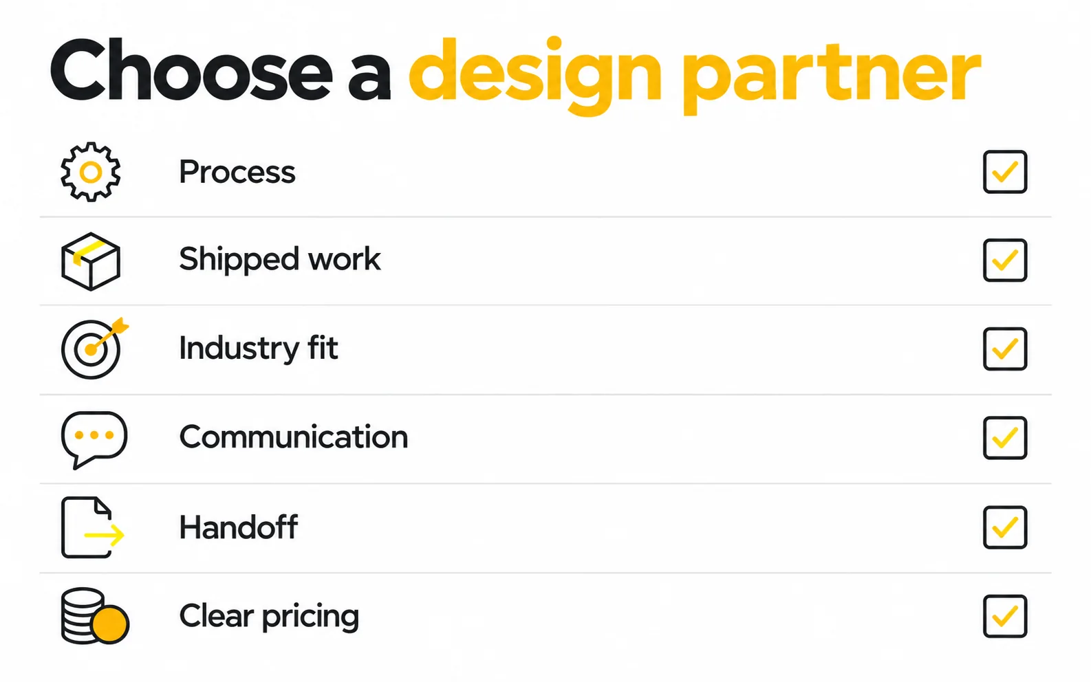
Knowing the process is half the job. The other half is choosing who runs it. Whether you're hiring a freelancer, an agency, or building an in-house team, these are the criteria I'd use if I were on the client side.
If you're comparing options, our roundup of top UI/UX agencies for SaaS growth is written to be honest about where different studios fit best.
Evaluate the process behind the portfolio.
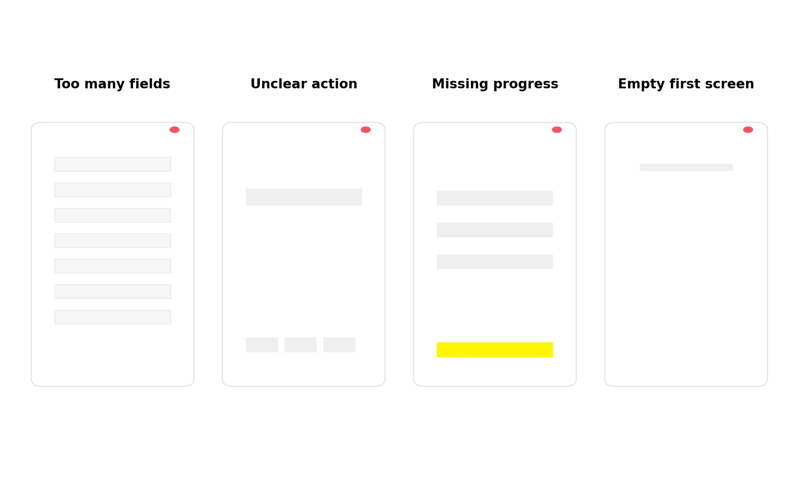
These are the patterns I see most often when a project comes to us after a previous design effort stalled. None of them come from a lack of talent. They come from gaps in the process.
What happens: Stakeholders fall in love with polished screens before the flow has been validated. Fix: Get sign-off on user flows and wireframes before visual design starts.
What happens: The product reflects internal assumptions and vocabulary. Fix: Even five user interviews will surface the language and priorities your real customers use.
What happens: Problems appear during development or after launch, when they cost the most to fix. Fix: Time-box research instead of cutting it. A focused week is better than none.
What happens: Conflicting opinions stall progress and dilute the design. Fix: Name one decision-maker and judge feedback against the agreed success metrics, not personal taste.
What happens: Empty, error, and loading states get improvised by developers, and the product feels unfinished. Fix: Make "all states designed" part of your definition of done.
What happens: Designs turn out to be expensive or impossible to build as drawn. Fix: Bring an engineer into wireframe reviews to check feasibility early.
What happens: Every new feature looks slightly different, and design and development slow down over time. Fix: Build a lightweight component library from the first release, and grow it as the product grows.
What happens: The team moves on and never learns whether the design worked. Fix: Plan a post-launch review against your success metrics, and budget for at least one round of iteration.
What happens: The marketing site promises one experience and the product delivers another. Fix: Keep brand identity and product UI in one visual system so users feel continuity from first click to daily use.
Planning a product, redesign or MVP? Book a free 30-minute call to discuss your goals, scope and next step.
Plan for edge cases, engineering reviews and post-launch learning.
A UX designer focuses on research, structure, and flows: whether the product solves the right problem in a logical way. A UI designer focuses on the visual layer: layout, typography, color, components, and interaction details. On smaller teams and at many agencies, one product designer covers both, which is why the combined term "UI UX designer" is common.
You can reduce it, but skipping it entirely usually moves the cost somewhere else, typically into development rework or a redesign after launch. A lean alternative is a few targeted user interviews, a review of your existing analytics, and a quick usability test on a prototype before development starts.
Figma is the standard tool for wireframing, UI design, prototyping, and design systems. Teams often add FigJam or Miro for workshops and journey mapping, Maze or Lyssna for remote usability testing, and analytics tools such as Hotjar or Mixpanel to study real user behavior after launch.
A freelancer suits small, well-defined tasks. An agency or design subscription suits startups and growth-stage teams that need senior, multi-skill design without long hiring cycles. An in-house team makes sense when design needs are constant and large enough to justify full-time salaries, and many companies combine an in-house lead with an external partner.
Most involved at the start and at key decision points: discovery, direction sign-off, and usability test reviews. A realistic commitment is a kickoff session, a short weekly review, and quick async feedback on work in progress. Slow or unclear decisions are one of the most common reasons design timelines slip.
Yes. On many product teams, design works one or two sprints ahead of development. Designers validate and finalize the next set of flows while engineers build the current one. This works best once the core structure and design system are in place.





.svg)



.svg)

.svg)

.svg)

.svg)

.svg)
.svg)
