


15 Oct 2026
UI/UX Design
Design Agency vs Freelancer: Which Is Right for Your Product?



A landing page is a standalone web page built for one specific goal, such as capturing a lead, selling a product, or getting sign-ups. Visitors usually arrive from an ad, email, social post, or search result. A homepage serves many audiences and goals. A landing page removes distractions and guides one audience toward one action.
Ask ten marketers to define a landing page and you'll get several answers. Some say it's any page a visitor lands on first. Others say it's a page with a form. Others say it's whatever the ad links to. All three are partly right, and that confusion causes real problems. Teams send expensive paid traffic to a homepage, build a microsite when a single page would do, or pay for a "landing page" that is really a smaller copy of their website.
I'm Maniruzzaman Jubayer, a Design Lead with 6–7 years in UX/UI design. Much of my work has been helping product and growth teams decide what kind of page they actually need before anyone opens a design tool. This guide gives you the definition, the main types of landing pages, clear comparisons (landing page vs homepage, vs website, vs sales page, vs microsite), and a practical framework for deciding when to use a landing page. It also covers how to judge professional design support if you're thinking of investing in it.
There are two definitions in common use, and it helps to separate them.
The technical definition: A landing page is any page where a visitor first enters your site. In analytics tools, this is the "entry page" or "landing page" for a session. By this definition, your homepage, a blog post, or a pricing page can all be landing pages.
The marketing definition (the one that matters for growth): A landing page is a dedicated page built around a single campaign goal. It is designed to turn a specific visitor into a lead, sign-up, or customer. You may also hear it called a lead capture page, a destination page, or a "lander."
Most confusion comes from mixing these two up. When a founder asks, "Do we need a landing page?", they almost always mean the marketing kind. They want a focused page that turns attention into action.
In my design reviews, I use a simple test. For a campaign page, I check for three useful characteristics:
If a page is trying to serve several audiences or several goals, it's working more like a homepage. That isn't bad. It just needs different design decisions.
Every unrelated link can create another exit. A homepage has to offer navigation, product menus, company information, and support links because it serves everyone. A landing page trades that breadth for focus. It is the design equivalent of a conversation with one person about one thing.
From my experience: The most useful question I ask at the start of any landing page project is, "Where is the visitor coming from, and what did we promise them there?" Once a team can answer that clearly, most layout decisions become much easier to make.
The GA4 landing page report uses the first pageview in a session. For the campaign-focused usage, see Unbounce’s landing page explanation.
One audience, one goal and one consistent promise.
Share your audience, offer and campaign goal. We can review your existing page or help shape a focused page with one clear next action.


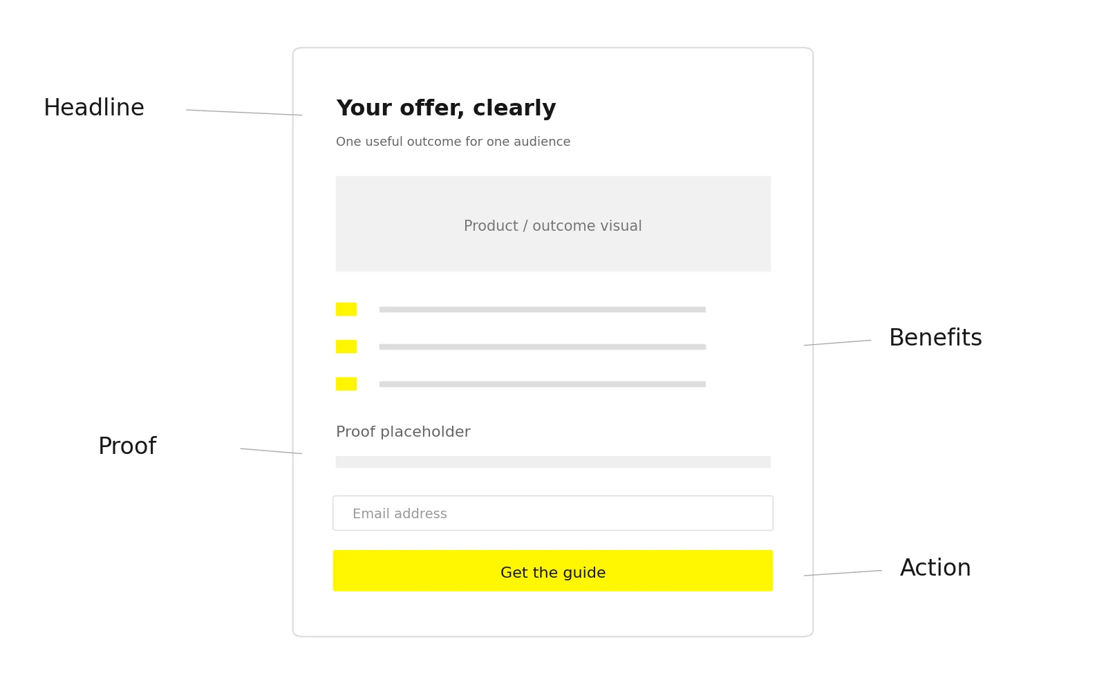
Landing pages differ in length and style, but effective ones tend to share the same building blocks. Think of these as layers of persuasion, not a fixed template.
| Element | What It Does | Design Guidance |
|---|---|---|
| Headline | Confirms the visitor is in the right place | Match the wording and promise of the ad or link that brought them |
| Subheadline | Clarifies who it's for and what they get | One or two lines; specific over clever |
| Hero visual | Shows the product, outcome, or context | Real product UI or a relevant image beats generic stock photos |
| Value proposition | Explains why this offer matters | Focus on outcomes, not feature lists |
| Benefits section | Breaks the value into scannable points | Three to five benefits, each tied to a real user pain |
| Social proof | Reduces perceived risk | Use only genuine testimonials, logos, or reviews you have permission to show |
| Primary CTA | The single action you want | High contrast, action-oriented label ("Get the guide," not "Submit") |
| Form (if used) | Captures lead information | Ask only for what you'll actually use |
| Objection handling | Answers the "but what about…" questions | FAQs, guarantees, pricing clarity, security notes |
| Minimal navigation | Keeps focus on the goal | Often removed or reduced to the logo and essential legal links |
Message match means the landing page clearly continues what the visitor clicked on. If an ad says "Free SaaS onboarding checklist," the page headline should say the same thing, not "Welcome to Acme Software." When the promise and the page don't match, visitors feel unsure within seconds, even if the design looks polished.
A landing page is read in a pattern, not line by line. Most visitors scan the headline, glance at the visual, skim a few benefit lines, and look for the button. Good landing page design controls that path with size, contrast, spacing, and placement. A beautiful page with a weak hierarchy usually underperforms a plain page with a clear one.
Continue the promise visitors clicked on.
Different goals call for different page structures. The table includes campaign landing pages plus related pages such as thank-you and splash pages, whose jobs differ from the primary campaign conversion page.
| Type | Primary Goal | Best For |
|---|---|---|
| Lead generation page | Capture contact details | B2B, services, gated content |
| Click-through page | Warm up visitors before a checkout or sign-up | E-commerce offers, SaaS trials |
| Sales page | Sell a product directly | Courses, info products, high-consideration offers |
| Squeeze page | Collect an email address quickly | Newsletters, simple lead magnets |
| Webinar/event page | Drive registrations | Webinars, launches, conferences |
| Waitlist/pre-launch page | Validate demand, build a list | New products, beta programs |
| Product/feature page for campaigns | Promote one product or feature to one segment | Paid campaigns, product-led growth |
| Thank-you page | Confirm the conversion and guide the next step | After any form submission |
| Splash page | Show a brief message before entry | Age gates, announcements, language selection |

These pages exchange something valuable, such as an e-book, audit, demo, or quote, for contact information. The main design challenge is balancing form length against lead quality. Shorter forms usually get more submissions. Longer forms can filter for more serious prospects. Which is right depends on what your sales team needs.
A click-through page doesn't ask for information. It builds enough understanding and trust that the visitor clicks through to a checkout, pricing page, or app sign-up. These pages are useful when jumping straight to a cart would feel too abrupt.
Sales pages are usually the longest type. They need to carry the full buying decision on their own, including the problem, solution, proof, offer details, pricing, guarantees, and objections. More on how they differ from standard landing pages in Section 4.
For founders, a waitlist page is often the first landing page they build. It tests positioning before the product exists. From a design point of view, the priority is clarity: can a stranger explain what you're building after five seconds on the page?
This is the most underused type. Most teams treat it as a dead end ("Thanks, we'll be in touch"). A good thank-you page sets expectations, confirms the next step, and can offer a secondary action, such as booking a call right away or following a helpful resource.
For a software launch, our SaaS product design approach connects the pre-launch promise with the product experience.
These terms are often used interchangeably, but they solve different problems. Here is a single comparison, followed by a closer look at each.
| Types | Landing Page | Website | Sales Page |
|---|---|---|---|
| Purpose | One campaign goal | Full online presence | Close a sale |
| Audience | One segment | Everyone | Buyers of one offer |
| Number of pages | One | Many | One |
| Navigation | Minimal or none | Full | Minimal or none |
| Main traffic | Ads, email, social, campaigns | All channels | Warm traffic, email, ads |
| Lifespan | Often campaign-bound | Ongoing | Tied to the offer |
| Success metric | Conversion rate on one action | Overall business goals | Sales |
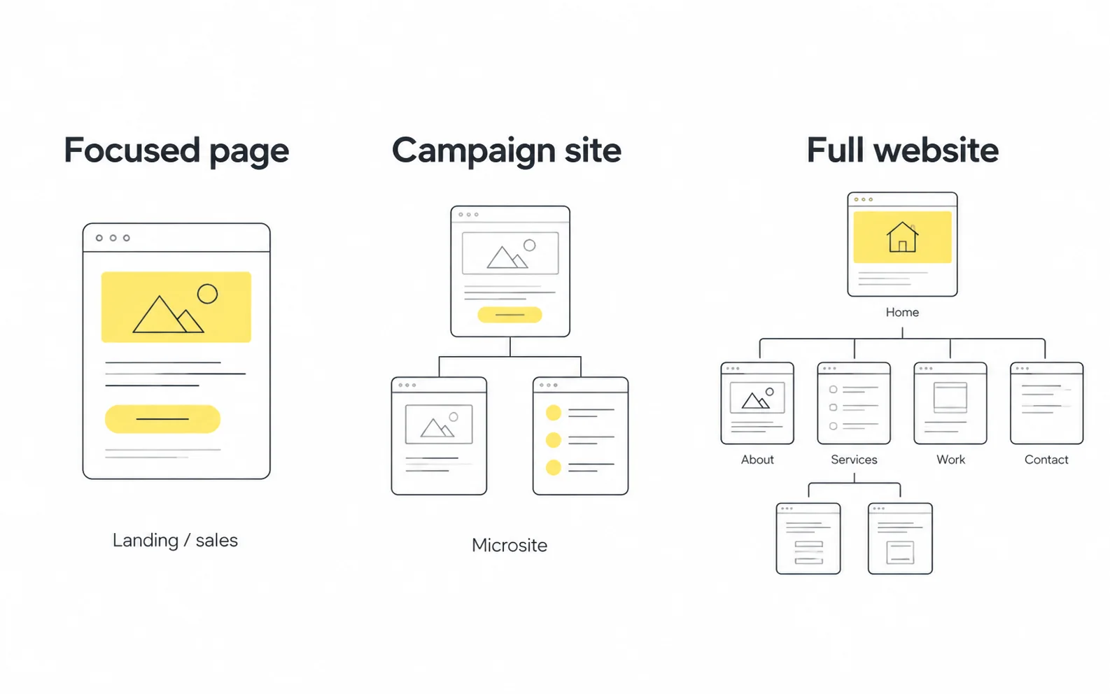
The homepage is your front door. It has to welcome investors, candidates, customers, partners, and press, and send each of them somewhere useful. A landing page is a private meeting room for one visitor with one purpose.
The practical rule: send campaign traffic to a landing page, and send brand traffic to your homepage. When someone clicks an ad about a specific feature and lands on a general homepage, they have to find the relevant information themselves. Many won't.
A website is a collection of pages that together represent your business: product pages, pricing, blog, about, careers, support. A landing page can live on your website (for example, yourdomain.com/demo) or on a separate tool or subdomain. The difference isn't where it's hosted. It's what it's built to do. A website supports many journeys. A landing page supports one.
This also answers a question founders often ask: "Can a landing page replace a website?" In the very early stage, sometimes yes. A single pre-launch or waitlist page can be enough. As soon as you need to support multiple audiences, build search visibility across many topics, or signal credibility to partners and investors, you'll need a full website.
A campaign sales page is a sales-focused landing page; terminology varies, and not every landing page asks for payment. The key differences:
A useful principle: page length should match the size of the ask. A free checklist doesn't need 3,000 words. A premium course might.
A microsite is a small, separate website, usually with a few pages and its own navigation, built for a specific campaign, product line, or event. It often has its own domain or subdomain and sometimes its own visual identity.
Choose a landing page when you have one offer and one action. Choose a microsite when the campaign needs several pages of content, such as an event with a schedule, speakers, venue details, and registration, or a product launch with interactive storytelling.
From my experience: Microsites are often chosen because they feel more impressive, not because the content needs them. Before approving one, I ask the team to list every page the microsite would need and what each page does. If most pages end up as "about the campaign" filler, a well-designed long landing page usually does the job with less build and maintenance effort.
For a broader site build, explore our website design implementation in Webflow.
Choose page scope around the job it needs to do.
You probably need a landing page if any of the following is true:
Ask these four questions in order:
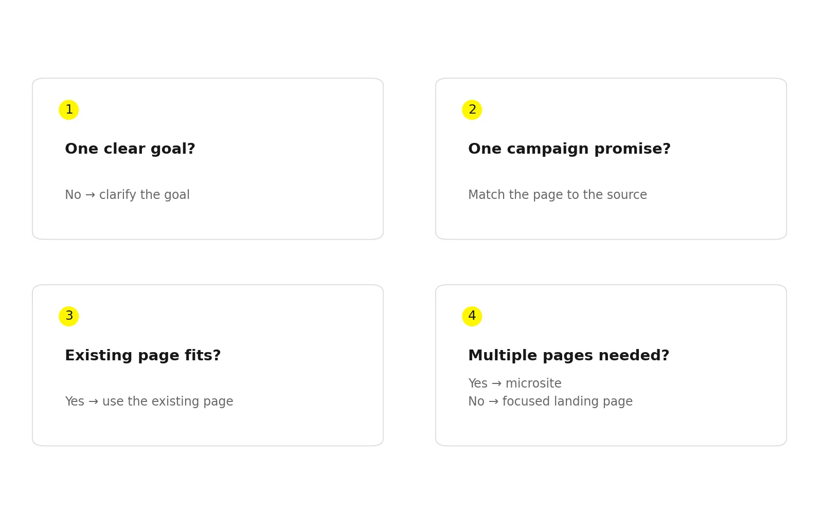
Check whether a useful existing page already fits the offer.
Design quality matters, but most landing page problems start before design. This is the planning sequence I recommend to product and growth teams.
Step 1: Define one conversion goal. Write it as a single sentence: "A visitor from [source] will [action] because [reason]." If you can't write that sentence, the page isn't ready to design.
Step 2: Define the audience precisely. "Small businesses" is too broad. "Founders of seed-stage B2B SaaS companies without a design team" gives you language, examples, and objections to work with.
Step 3: Map the traffic source and its promise. Collect the exact ad copy, email subject line, or social post that will drive traffic. Your headline should continue that promise.
Step 4: List objections before writing copy. What would make this visitor hesitate? Price, time, trust, switching effort, data privacy? Each major objection should be answered somewhere on the page.
Step 5: Write the content before designing the layout. Design built around placeholder text tends to fall apart when real copy arrives. Draft the headline, benefits, proof, and CTA first, then design the structure around them.
Step 6: Wireframe the hierarchy. Decide what the visitor sees first, second, and third. Check mobile layout early. For many campaigns, especially social ones, most visitors will be on a phone.
Step 7: Design, build, and connect tracking. Set up analytics events, form tracking, and source attribution (such as UTM parameters) before launch, not after.
Step 8: Launch, measure, and iterate. Watch conversion rate, form drop-off, scroll depth, and lead quality. Test one meaningful change at a time. A headline or offer test usually teaches you more than a button color test.
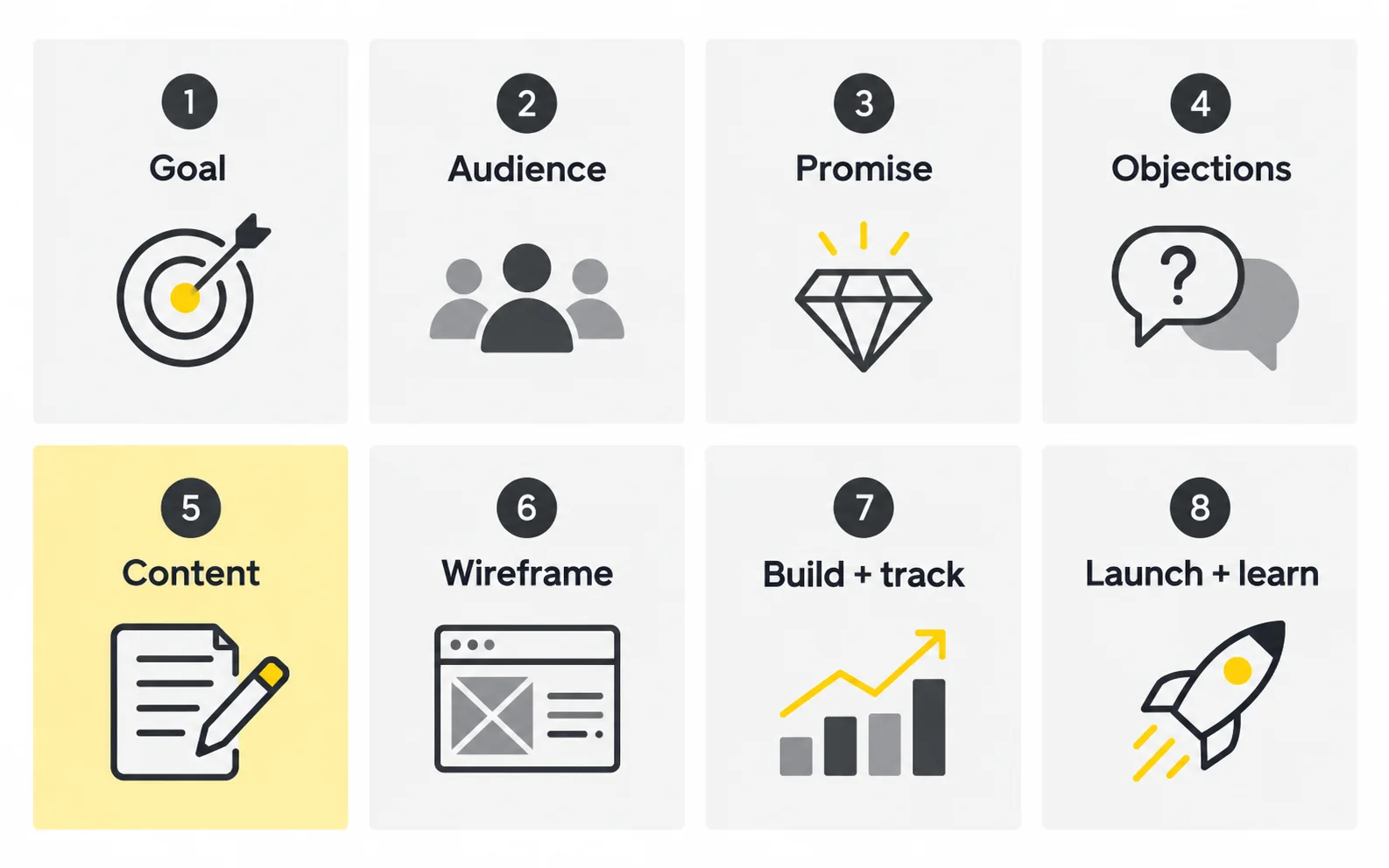
From my experience: Step 5 is the one teams most want to skip, and skipping it is the most common reason I see redesigns happen shortly after launch. When copy and design are developed together, the layout supports the message instead of forcing the message into a pre-made shape.
Use our UI/UX design process to connect the brief, wireframes and validation. Our guide to conversion rate optimization through UX explains how to evaluate meaningful changes.
Write the message before polishing the layout.
Page builders and templates have made landing pages easy to launch. That's a good thing. But launching a page and building one that consistently converts the right people are different jobs.
| Approach | Strengths | Limitations |
|---|---|---|
| DIY with a template | Fast, low cost, full control | Generic look, weaker message fit, hierarchy issues |
| Freelance designer | Custom design, flexible | Quality varies widely; strategy may be limited |
| Design agency or studio | Strategy, copy, design, and build together | Higher investment, longer timelines |
| In-house design team | Deep product and brand knowledge | Capacity is often limited |
Costs vary a lot depending on scope, region, and who you hire, so be wary of any single "standard price." Instead, compare proposals on what's included:
It also helps to think about value relative to traffic. If you're spending meaningfully on paid acquisition, even a modest improvement in conversion can matter more than the cost of the design work. If you have almost no traffic yet, a simple template may be the smarter first step.
Explore our landing page design services and review the thinking behind relevant case studies.

| Mistake | Why It Hurts | Fix |
|---|---|---|
| Sending ad traffic to the homepage | Visitors have to search for what the ad promised | Build a dedicated page that continues the ad's message |
| Multiple competing CTAs | Choice creates hesitation | Pick one primary action; make any secondary actions visually quieter |
| Vague, clever headlines | Visitors can't tell what you offer | Say what it is, who it's for, and the outcome |
| Asking for too much, too soon | Long forms add friction to small offers | Match form length to the value of the offer |
| Feature lists instead of benefits | Visitors care about outcomes | Translate each feature into what it lets the user do |
| Designing desktop-first only | Mobile visitors get a weaker experience | Design and test mobile layouts on purpose |
| Generic stock imagery | Adds nothing and can reduce credibility | Use real product UI, real people, or clear illustrations |
| Fake or unverifiable social proof | Damages trust if noticed | Use only real, permitted testimonials and logos |
| Slow load times | Visitors may leave before the page appears | Compress images, limit scripts and heavy animations |
| Launching without tracking | You can't learn or improve | Set up analytics and conversion events before launch |
| Never iterating | The first version is rarely the best one | Review data regularly and test one meaningful change at a time |
Most of the issues above trace back to one root cause: treating the landing page as a design deliverable instead of a conversation. When teams ask, "What does this visitor need to hear, in what order, to feel confident taking this step?", the right headline, layout, and CTA tend to follow. When they start with "Make it look modern," they usually end up with a nice-looking page that doesn't do its job.
From my experience: The strongest landing pages I've worked on were rarely the most visually ambitious. They were the ones where everyone on the team, from product to growth to design, agreed on a single sentence describing the visitor and the promise before any pixels were placed.
Review our mobile-first landing page best practices, or book a consultation to discuss your audience, offer and next step.
Judge the page by clarity and useful outcomes.
It can be, but most campaign landing pages aren't built for organic search. They're often short, highly focused, and sometimes set to noindex to avoid duplicate content across ad variations. If you want a page to rank, give it substantial, useful content aimed at a clear search query, and keep it indexable.
Usually minimal. Many teams remove the main menu to reduce exits and keep only the logo, essential legal links, and the primary CTA. Some brand-sensitive audiences expect a way to learn more, so a light footer with key links can be a reasonable compromise.
As long as it needs to be to answer the visitor's questions for the size of the request. A newsletter sign-up can be very short. A high-priced product or complex B2B offer usually needs more space for proof, detail, and objection handling.
There's no fixed number. A common approach is one page per distinct offer, audience, or campaign. If your ads target different segments with different messages, each segment usually benefits from its own page.
You can if the campaigns share the same audience and the same promise. If the messaging differs between campaigns, separate pages, or at least separate headline variations, help keep message matches strong.
Start with conversion rate for the primary action, then look at form abandonment, scroll depth, bounce rate, and time on page. For lead generation, also track lead quality downstream. A high conversion rate with unqualified leads is not a win.
Choose indexing based on the page’s search purpose; ad variations do not automatically need noindex. If you intentionally exclude a page, follow Google’s noindex guidance.




.svg)



.svg)

.svg)

.svg)

.svg)

.svg)
.svg)
