


12 Oct 2026
Brand Identity
Brand Guidelines: What to Include, Real Examples, and How to Build Yours


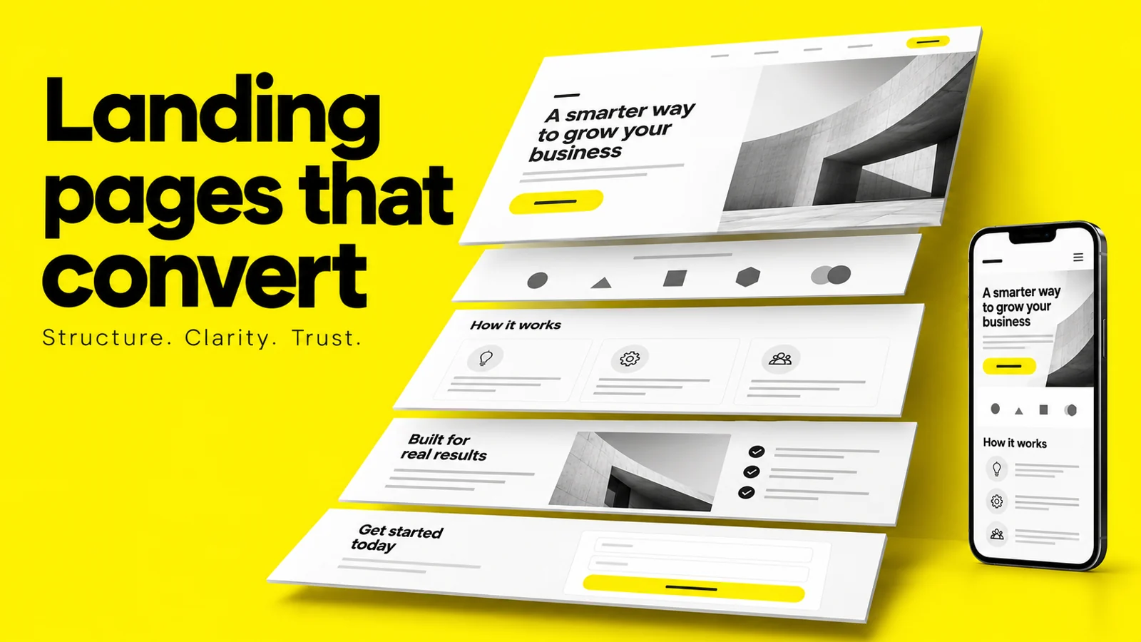
The landing page best practices that matter most are structural, not cosmetic: one page, one audience, one action; message match between the ad and the headline; a first viewport that answers what it is, who it's for, and what happens next; copy written for scanning rather than reading; a form that asks only what it can justify; and proof placed next to the claim it supports. Everything else — colours, animations, section counts — is downstream of those decisions. Treat best practices as a well-reasoned starting point, then let your own testing overrule them.
Search "landing page best practices" and you'll get roughly the same eleven tips from every result: match your message, remove the navigation, add social proof, test everything. The advice isn't wrong. It's just not actionable, because it tells you what to include without telling you what order to put it in, how much weight each element deserves, or how to tell whether your version of "add social proof" is doing any work at all.
This guide assumes you already know a landing page should have one call to action. What it gives you instead is the reasoning underneath each practice — the structural logic that determines page order, the craft-level details in forms and typography that quietly cost conversions, and the honest limits of best practice as a discipline.
It's organised the way we'd actually build a page: structure first, then the first viewport, copy, UX, visual design, and a checklist you can ship against. The last section covers what most guides skip, because most are published by page-builder companies: when it's worth paying for professional design help, and what goes wrong when you get it wrong.
A best practice is a prior, not a law — the option most likely to work before you have evidence about your specific audience. That makes it extremely valuable for a first build and progressively less valuable as you accumulate data.
The distinction matters because best practices get applied as rules by teams who've never tested them, then defended as principles when the data disagrees. The useful posture: adopt the default, instrument it, let your own results override it.
Set the baseline before testing: our landing page conversion rate benchmarks explain how to compare pages by industry, traffic source, and conversion goal.
These hold up almost everywhere, because they follow from how attention works rather than from any particular audience:
Most of the rest depend on your offer, price point, and traffic temperature:
Get a landing page review from Wolfpixel and uncover the structural, UX, messaging, and design issues holding your conversions back.


Most guides give you a list of landing page elements. Lists don't tell you what to build, because the same elements in a different order produce a completely different page.
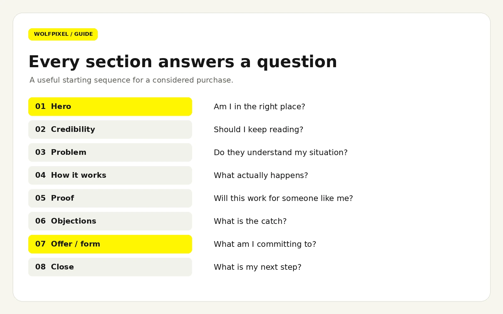
A landing page is a structured argument, and arguments have sequence. The visitor arrives with a question ("am I in the right place?"), acquires new questions as they scroll ("does this actually work?", "will it work for someone like me?", "what does it cost me to find out?"), and converts when the last objection is cleared. Your page structure should answer those questions in the order they occur.
This sequence works for the majority of B2B, SaaS, and considered-purchase pages. Treat it as a starting skeleton, not a template to fill mechanically.
The page should survive being read out of order. Nobody reads top to bottom. They scan headings, stop at whatever catches them, and scroll back up if interested. So every section heading should be a complete, meaningful statement on its own. "Built for revenue teams that outgrew spreadsheets" works as a standalone. "Features" does not.
For calibration, Unbounce's SaaS analysis found pages in the 250–725 word range performed best in their dataset — lower than most teams expect. If your page runs to 1,800 words, the question isn't "is this too long?" but "which of these paragraphs answers a question a real prospect actually asked?"
For an example of product storytelling in a complete marketing site, explore our Zyntra SaaS website case study. The project connects product explanations, pricing, and conversion touchpoints within one coherent experience.
"Above the fold" gets treated as a place to cram things. It's better understood as a set of four jobs, and if any one fails, the rest of the page doesn't get read.
Job 1 — Confirm the click was correct. Open your ad copy in one window and the page in another. Does the headline carry the same core promise in recognisably similar language? If the ad says "cut close time in half" and the page says "the modern revenue platform," you've failed job one and no amount of design will recover it.
Job 2 — State what it is, in plain terms. Category first, differentiation second. A visitor who can't tell whether you're software, a service, or a marketplace has no framework for evaluating anything that follows.
Job 3 — Signal who it's for. Specificity is a qualifier, not a narrowing. "Built for B2B finance teams closing in under five days" tells the right person they've arrived and the wrong person to leave — a favour to both.
Job 4 — Make the next step obvious and low-anxiety. One primary button labelled with the outcome rather than the mechanism, plus a line telling the visitor what happens after they click.
This is the fastest quality check in the discipline. Show the first viewport to someone unfamiliar with the product for five seconds, take it away, and ask: What is it? Who is it for? What happens if I click the button?
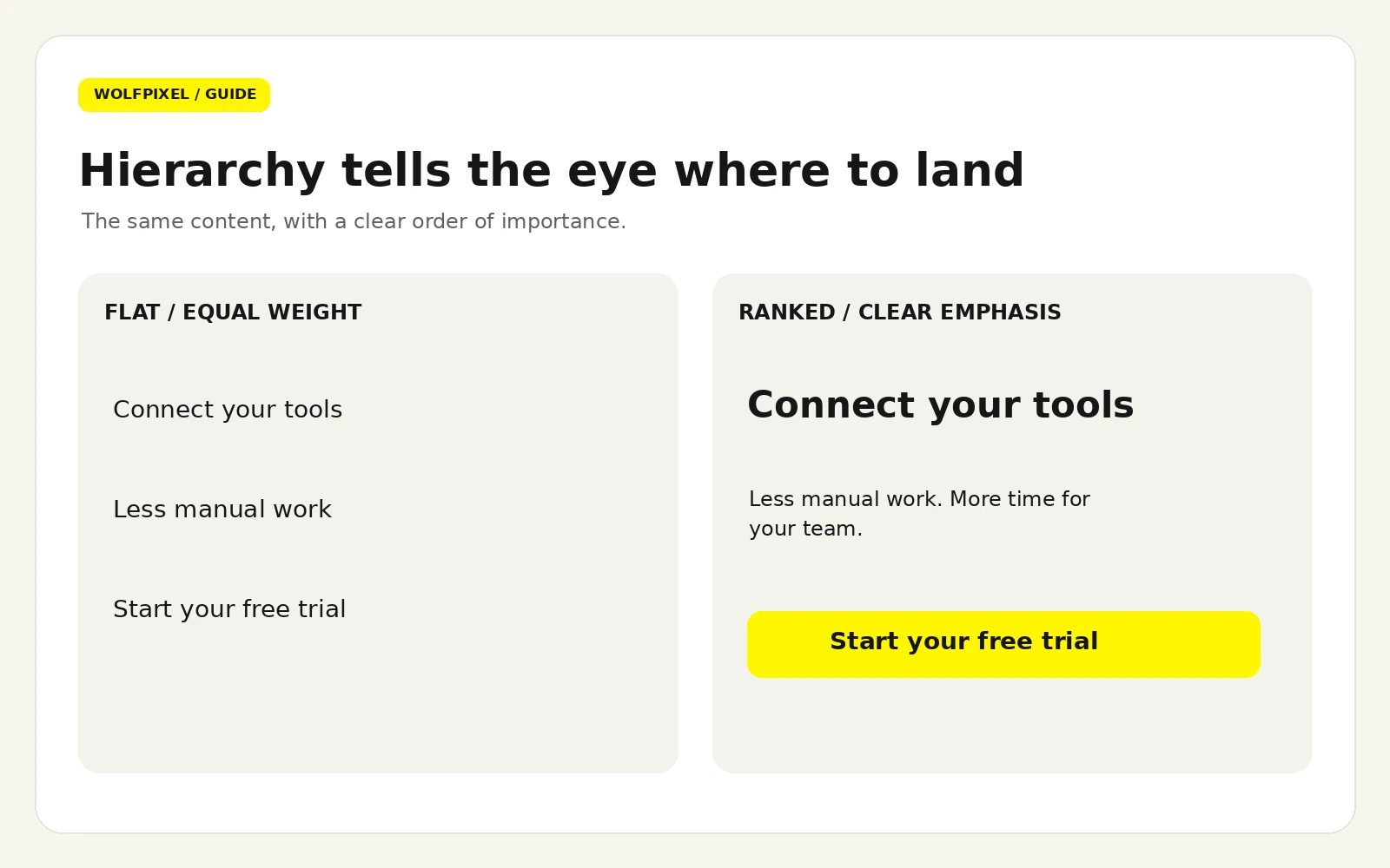
If they can't answer all three, the problem is almost always that the hero is carrying too many messages at equal visual weight — a headline, a subhead, a badge row, a logo strip, and a secondary CTA, none of them clearly dominant. The eye has nowhere to land. The fix is subtraction: one dominant headline, one supporting line, one primary action, one visual that shows the product doing something real.
Unbounce's 2024 Conversion Benchmark Report found that 83% of landing page visits happen on mobile devices. On a phone, after browser chrome, you have roughly the height of a business card to work with — not the generous 16:9 canvas your desktop mockup implies.
Practical consequences:
Copy and layout are the same problem. A designer who treats copy as content to be poured in later will produce a page that looks resolved and converts badly.
Unbounce's SaaS analysis found pages written at a fifth-to-seventh-grade reading level converted at around 12.9%, while pages written at a professional reading level converted at roughly 2.1%. That gap is larger than almost any design change will produce.
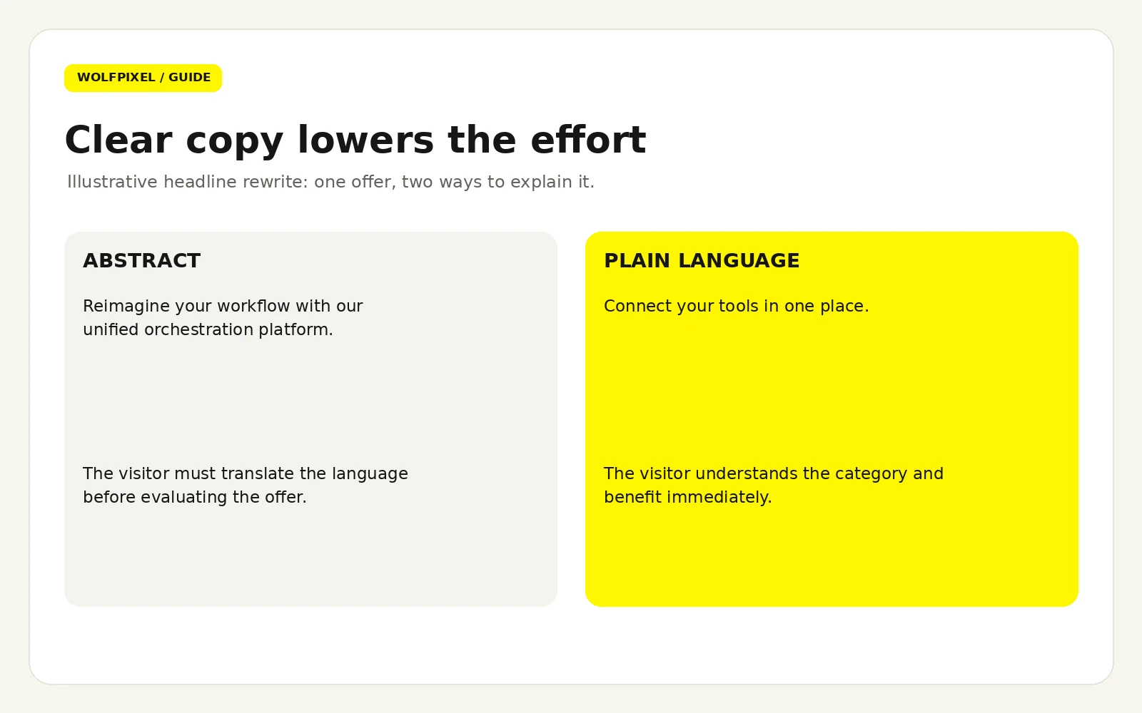
This is not about dumbing down. It's about processing cost. A senior buyer scanning on a phone between meetings has limited attention to spend, and every clause they have to re-read spends some of it. "Leverage our unified orchestration layer" isn't more credible than "connect your tools in one place" — it's just more expensive to parse.
The test: read the page aloud. Every sentence you stumble over is costing you conversions.
Avoid formula-chasing, but these structures reliably clear the "what is it / who's it for" bar:
What fails: abstractions ("Reimagine your workflow"), unqualified superlatives, and headlines describing the company rather than the visitor's situation.
Label the button with what the visitor gets, not what the system does. "Submit" describes your database. "Get my free audit" describes their outcome. Add a micro-line beneath the button removing the last uncertainty: No credit card. Takes two minutes. That single line is one of the cheapest conversion improvements available.
This is where craft separates a page that follows best practices from one that actually works. Most of what follows is invisible when done right and quietly expensive when done wrong. Our guide to conversion rate optimization through UX design covers the broader process of identifying friction and prioritising improvements.
Every field is a small negotiation. The productive question isn't "how few fields can we have?" but "does this field earn its place in qualification or routing?"
Structural decisions:
Technical details that reduce friction on mobile:
Accessible pages convert better for everyone, not just for users with disabilities — the requirements happen to encode good usability. Three requirements worth designing to explicitly:
Three more that routinely get missed:
Light grey body text on white is the most common contrast failure we see, and it's usually a deliberate aesthetic choice. It reads as refined on a designer's calibrated monitor and as illegible on a phone in daylight.
Friction isn't only effort — it's uncertainty. Anxiety-reducing elements belong immediately adjacent to the ask:
The thank-you page is the most under-designed asset in most funnels, despite reaching an audience that has already said yes. Confirm what happened, set expectations for what's next, and offer exactly one sensible follow-on action — a calendar link, a getting-started guide, an upgrade. Not four.
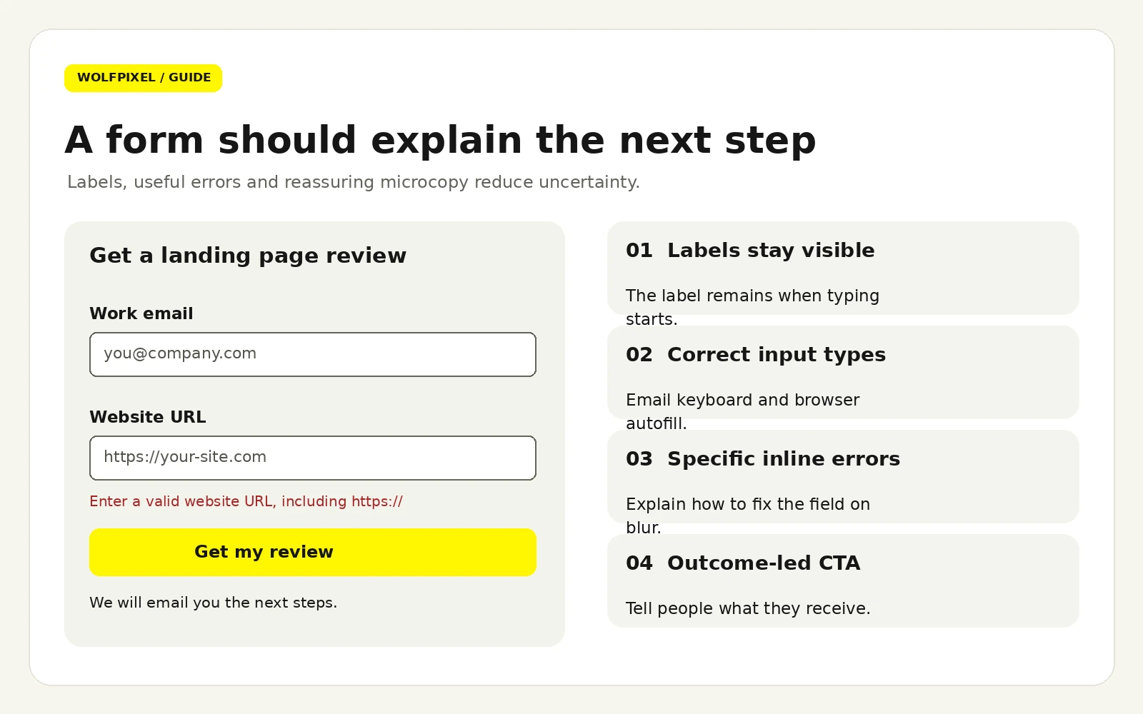
Reference: WCAG 2.2 accessibility requirements, including the target-size exceptions and contrast criteria.
For implementation details, read the W3C explanations of minimum touch target size and spacing exceptions and non-text contrast for interface controls.
If three elements in a section share the same visual weight, you haven't designed a hierarchy; you've designed a tie. Establish visual hierarchy through contrast in size, weight, colour, and space — using the fewest levers needed. A headline that's larger, bolder, darker, and more generously spaced than everything else is over-specified; size and space alone usually suffice.
The most common failure: every section a full-width band with a centred heading and identical padding. It looks tidy and reads as undifferentiated, because nothing signals which section matters more.
Space groups and separates. Elements that belong together should sit closer to each other than to anything else — a heading tight to its paragraph, a button tight to the line it belongs to. Most "cluttered" pages don't have too much content; they have uniform spacing, so the eye can't tell what's grouped with what.
Every image should have a job. Generic office photography occupies the most valuable space on the page while saying nothing. Ranked by how well they usually perform for B2B and SaaS:
If you're cropping a screenshot so tightly the UI is unreadable, it has become decoration. Show it legibly or replace it.
Not all proof is equal. Roughly in order of persuasive power:
For B2B, always name the person, the role, and the outcome. "Great product, highly recommend — J.S." is worse than no testimonial.
When the ad, the landing page, and the product each look like different companies, the visitor pays a small trust tax at every step. Consistent type, colour, tone, and photographic style aren't vanity — they're continuity signals that tell someone they haven't been handed off to a stranger.
This is the strongest practical argument for building a small reusable UI design system for your landing pages rather than treating each as a bespoke artefact: consistency becomes the default rather than something you enforce page by page.
This continuity starts with a clear brand identity that gives your website, campaigns, and product the same visual and verbal foundations.
Design choices are usually the reason pages are slow. The heaviest offenders are almost always unoptimised hero imagery, custom font loading, and third-party scripts.
For examples of how to organize the promise, product proof, and next step, explore our landing page inspiration guide. Study the structure before choosing the visual treatment.
Run this before every launch. It's ordered by how much damage each failure does, so if you only get through the first two groups, you've caught most of what matters.
Checklists catch omissions, not misjudgements. These are the failures we see on pages that tick every box:
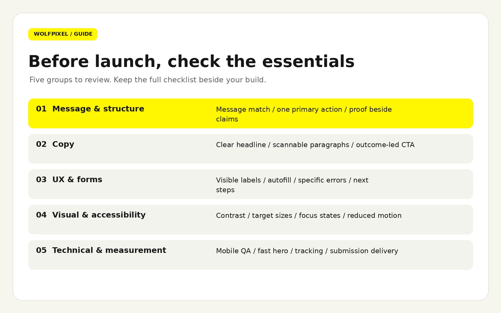
At some point the question stops being "what should we change?" and becomes "who should do this?" Here's a straight assessment, including when the answer is nobody.
If inconsistent brand expression is the underlying issue, review our step-by-step brand identity design process before treating the landing page as a standalone redesign.
Quotes vary enormously, and the variation is usually scope rather than quality:
For a scope-based breakdown of research, interface complexity, and handoff, our UI/UX design cost guide explains how those decisions shape the budget.
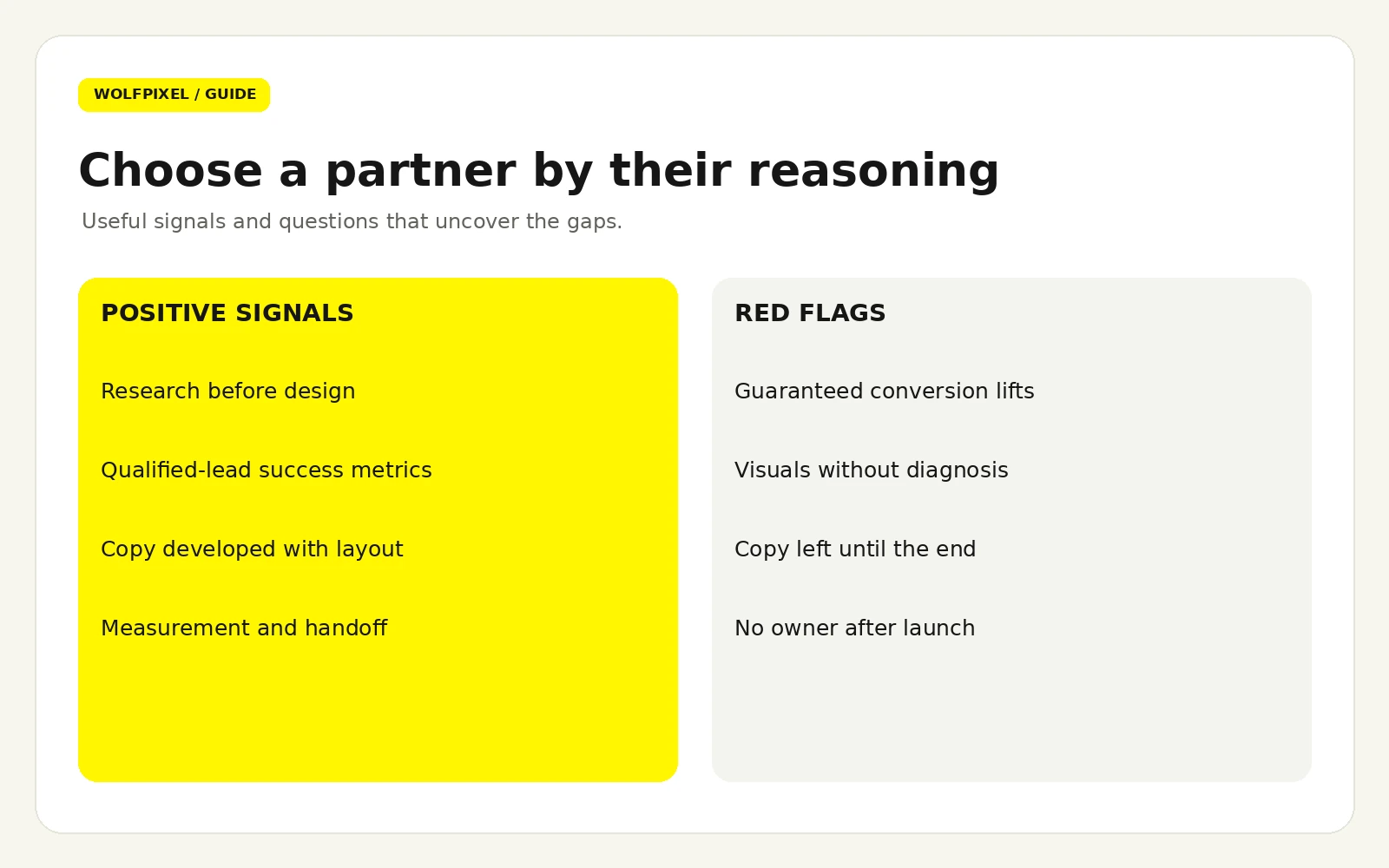
Ask these five things. The answers are diagnostic:
Red flags: guaranteed percentage lifts (nobody can promise this honestly), striking portfolios with no stated outcomes, a process that starts in Figma rather than in research, and reluctance to be measured on business metrics.
Design investment has real downside when handled poorly. A rebrand that discards recognisable equity can depress conversion for months. A visually ambitious page can cost more in load time than it gains in appeal. A system your team can't maintain decays as untrained hands modify it. And a full-page redesign means that if the number moves, you won't know which of thirty changes caused it.
Mitigate all four by insisting on measurement from the start, staging significant changes where traffic allows, and treating documentation and handoff as deliverables rather than afterthoughts.
Explore our landing page design services and landing page design pricing to scope a page or a reusable campaign system.
As many as you have distinct campaigns, audiences, or offers — and no more than you can maintain. Segmented pages outperform one general-purpose page because message match improves, but three well-maintained pages beat twelve neglected ones. This is precisely where a reusable design system pays for itself.
Builders are the right call when speed and marketing-team independence matter more than precision — campaign pages, tests, short-lived offers. Custom builds make sense when the page needs to share components with your product, when performance requirements are strict, or when the design is a differentiator in itself. Many teams sensibly run both. Our Webflow development services cover CMS-driven sites that marketing teams can maintain.
Usually not well. Paid traffic arrives from a specific promise and converts best on a short, focused page. Organic traffic arrives mid-research and needs more context, which tends to lower the rate while raising total volume. If you must share a page, prioritise the more valuable channel and accept the compromise consciously.
It depends on whether the product needs demonstrating. Video earns its place when watching is genuinely faster than reading. It hurts when it delays the page, autoplays with sound, or replaces scannable text for visitors who won't press play. Keep it short, make it optional, and ensure the page works fully without it.
Conversion-focused pages and ranking pages have partly opposing requirements: search often rewards depth, while conversion usually rewards focus. The practical resolution is to let content pages do the ranking and link to a dedicated conversion page, rather than trying to make one page do both jobs.
Quarterly at minimum. Traffic mix drifts, competitors reposition, claims go stale, and tracking breaks silently. A page that beat its benchmark last year may be quietly sliding without anyone noticing.





.svg)



.svg)

.svg)

.svg)

.svg)

.svg)
.svg)
