


15 Oct 2026
UI/UX Design
Design Agency vs Freelancer: Which Is Right for Your Product?


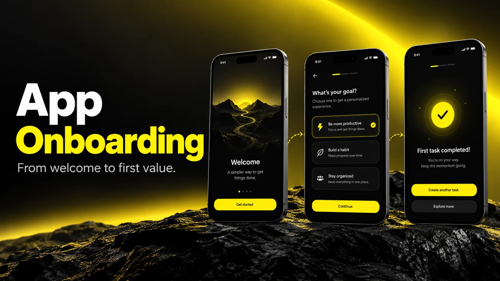
The best app onboarding examples, such as Duolingo, Headspace, Spotify, and Notion, get users to a meaningful first result quickly, ask only for what's needed at that moment, and personalize the experience based on a few simple questions. Great mobile app onboarding is not a set of welcome slides; it's a short, purposeful path to value. To design your own, pick one "aha" moment, remove every step that doesn't lead to it, request permissions in context, and measure drop-off at each screen.
If you've searched for app onboarding examples, you've probably already scrolled through Dribbble shots, Mobbin libraries, and Reddit threads full of "this app's onboarding is so cool." Those resources are useful. But a gallery of screens doesn't tell you why a flow works, whether it will work for your product, or what to do when 40 screens of inspiration still leave your own first-run experience leaking users.
I'm Maniruzzaman Jubayer, a Design Lead with six to seven years of hands-on UX/UI work. Onboarding is one of the areas I've spent the most time redesigning, testing, and arguing about with product and growth teams. The pattern I see again and again is this: teams copy the look of great onboarding and miss the decisions behind it.
This guide is written for founders, product leaders, and heads of growth who want more than inspiration. You'll get real examples with the lesson behind each one, a framework for choosing the right onboarding pattern, practical onboarding screens design guidance, permission request UX that doesn't tank opt-in, a step-by-step process to reduce app onboarding drop-off, and an honest look at when professional design support is worth the investment.
App onboarding is everything a new user experiences between opening your app for the first time and reaching the moment where your product proves its value. That includes welcome screens, sign-up, personalization questions, permission requests, empty states, tooltips, and the first task a user completes.
A useful way to define its job: onboarding exists to shorten the distance between install and "aha." Everything else, including branding, tutorials, and data collection, is secondary to that goal.
Good onboarding does three things well:
These terms are often used interchangeably, but there's a practical difference. The app first run experience is the literal first session: what someone sees in the first few minutes. Onboarding can extend well beyond that, across days or weeks, as users discover features progressively. Treating onboarding as a single session is one of the reasons many teams overload their first screens.
From my experience: When I audit an onboarding flow, the first question I ask the team isn't "what does it look like?" It's "what is the one action that tells you a new user is likely to stay?" Surprisingly often, different people in the room give different answers. Until that's agreed, no screen design will fix the problem.
For software teams, our SaaS user onboarding guide connects first-run decisions with product activation.
Pick one meaningful first outcome before designing the welcome screens.
Share your onboarding flow. We can review the activation moment, identify friction, and plan practical design and testing improvements.


These ten apps illustrate useful setup and early-use patterns. The table links to official product documentation; it is not a claim that every current install follows the same screen sequence. Onboarding can vary by platform, region, account and experiment. Review the current flow before adapting it.
| App | Pattern to study | Principle to borrow |
|---|---|---|
| Duolingo | Offers language and goal questions, a beginner or placement-test path, and a profile to save progress. | Guide users into a meaningful first learning action. |
| Headspace | Provides exercises and recommendations around mental-health goals and how a person feels. | Make personalization useful, not decorative. |
| Calm | Offers guided breathing and beginner meditation content as tangible starting activities. | Demonstrate value through a small useful activity. |
| Spotify | Uses following, saved favorites and listening activity to improve recommendations. | Let preferences shape the experience. |
| Includes topic selection during account setup. | Use relevant interests to seed a useful first feed. | |
| Notion | Supports individual and collaborative workspaces. | Match the starting environment to the user’s needs. |
| Canva | Offers templates that users can browse, preview and customize. | Provide an actionable starting point instead of an empty canvas. |
| Airbnb | Lets visitors search and review listings before a booking decision. | Allow exploration before a higher-commitment action. |
| MyFitnessPal | Uses profile information, activity and goals to calculate initial nutrition targets. | Ask for information when it serves the core outcome. |
| Slack | Its workspace-creator guide covers channels, customization and inviting teammates. | Guide setup toward real collaboration. |
Look past the visuals, and the same decisions repeat:
Dribbble, Mobbin, and Page Flows each serve a different purpose:
From my experience: I ask designers on my team to annotate every reference they collect with one line: "This works because ___." If they can't finish the sentence, the reference goes back in the library. It keeps us from importing patterns that solved someone else's problem.
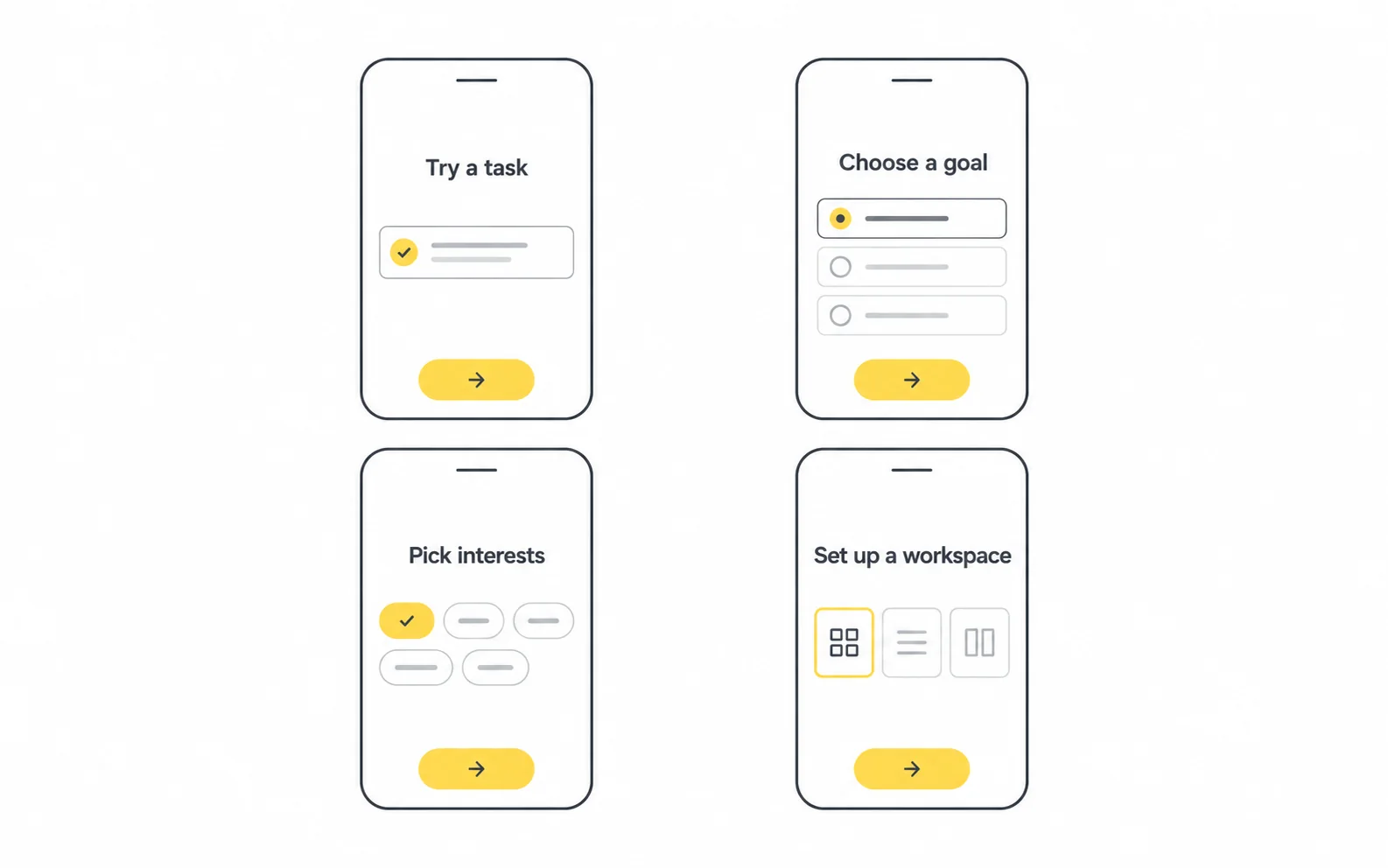
There's no single best onboarding pattern. The right choice depends on product complexity, how much personalization matters, and how quickly users can reach value on their own.
| Pattern | How it works | Best for | Watch out for |
|---|---|---|---|
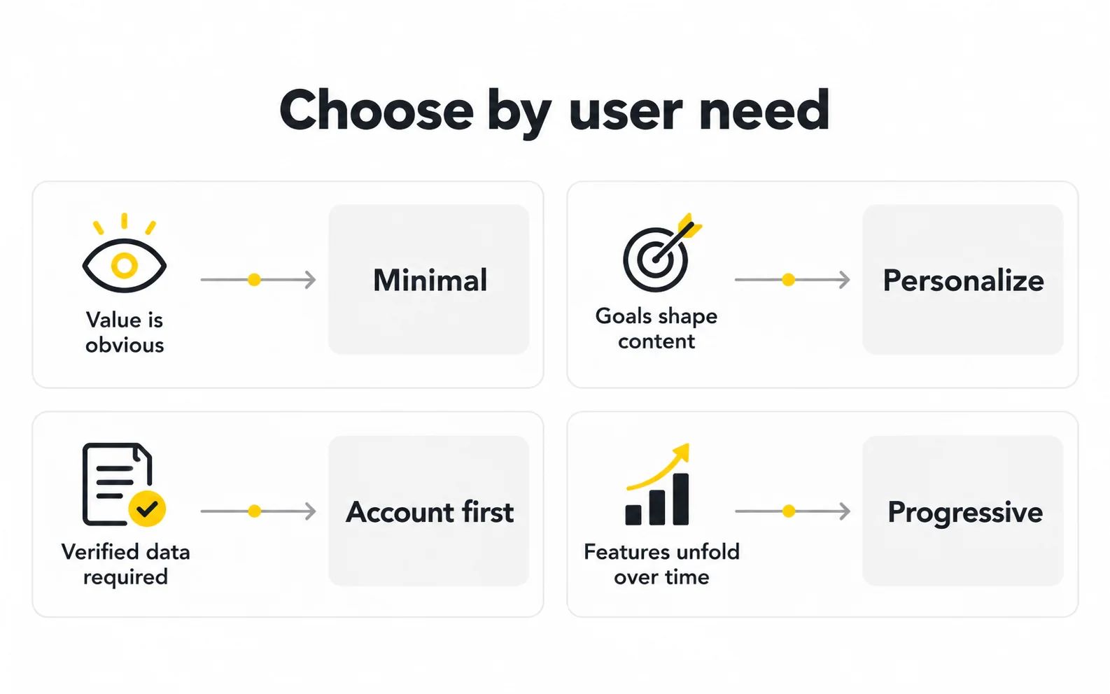
| Benefit-oriented intro | 2–3 screens explaining the value proposition | Simple apps with a clear promise | Users skip it; keep it very short |
| Function-oriented walkthrough | Screens or overlays explaining key features | Apps with non-obvious interactions | Explaining UI people could discover alone |
| Account-first setup | Sign-up and profile before entering the app | Apps where data is required to function (banking, healthcare) | High early drop-off if value isn't clear |
| Personalization quiz | Short questions that tailor content | Content, wellness, learning, fitness apps | Asking questions that don't change anything |
| Interactive / learn-by-doing | The user completes a real task as the tutorial | Creative, productivity, learning apps | Tasks that are too hard for a first session |
| Progressive onboarding | Guidance appears in context as features are used | Feature-rich or complex products | Tooltip overload, poorly timed prompts |
Progressive onboarding on mobile means teaching features at the moment they become relevant instead of all at once. A user sees a hint about filters when they first open search results, not on a welcome slide three sessions earlier.
It works well because context makes guidance memorable. It fails when every screen gets a tooltip. A simple rule I use: one contextual prompt per session, tied to a single behavior you want to encourage.
Most successful products blend two or three of these patterns rather than choosing just one.
Plan onboarding around the broader journey using our mobile app design process.
Choose the pattern that fits your user’s needs.
These app onboarding design best practices come from patterns that consistently hold up in usability testing and redesign work.
| Check | Question to ask |
|---|---|
| Purpose | Does this screen move the user closer to first value? |
| Clarity | Can someone understand it in a few seconds? |
| Action | Is there exactly one obvious next step? |
| Control | Can the user skip or go back? |
| Relevance | Does any question here change what the user sees next? |
| Accessibility | Does it work with large text and screen readers? |
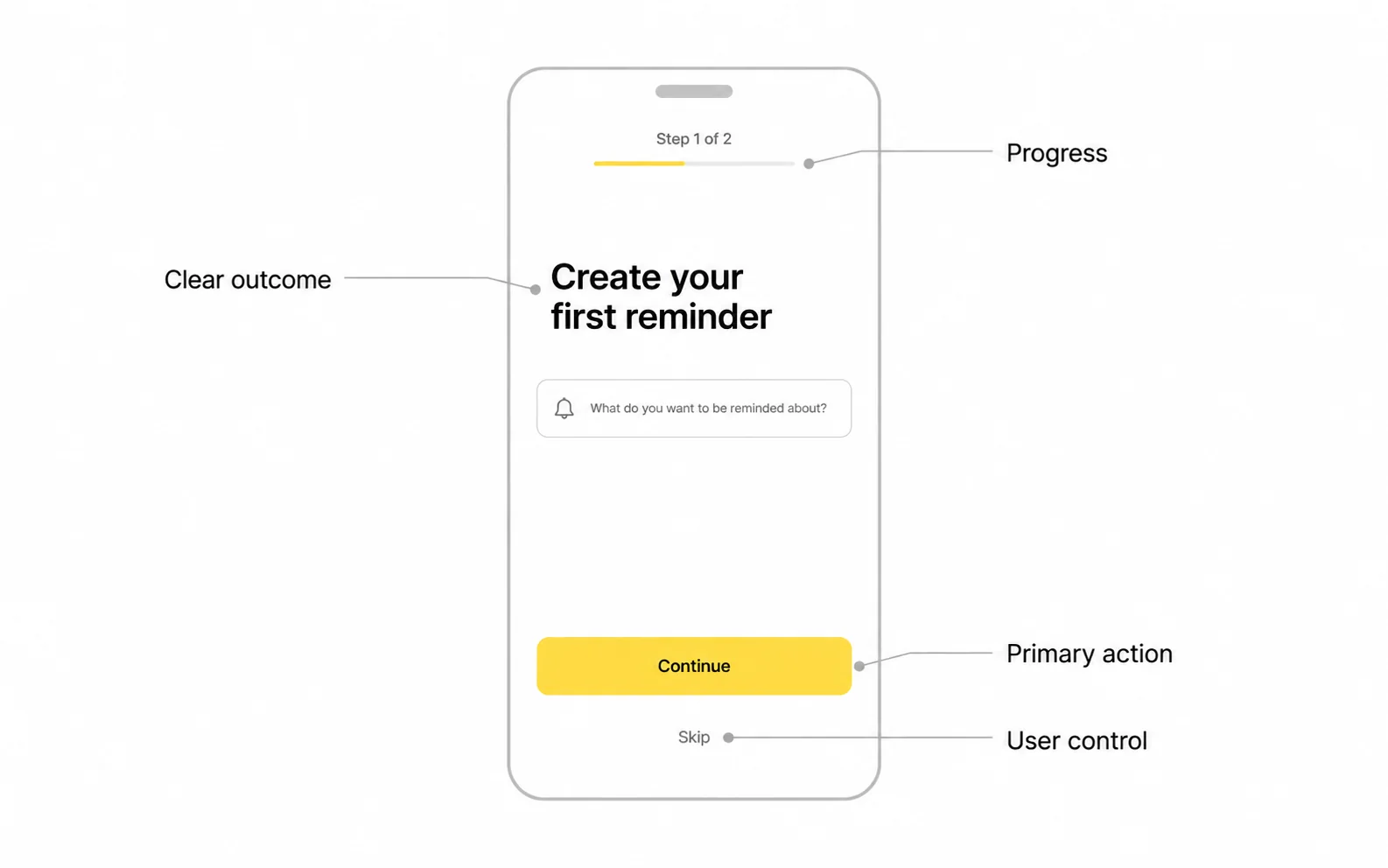
From my experience: The fastest improvement I've seen teams make isn't a visual redesign. It's deleting screens. When we map each onboarding screen against "what happens if we remove this?", the answer for several of them is usually "nothing bad." Those screens were added over time by different stakeholders, and nobody owned the overall flow.
For platform conventions, see our mobile human interface guidelines guide.
One screen, one idea, one clear next action.
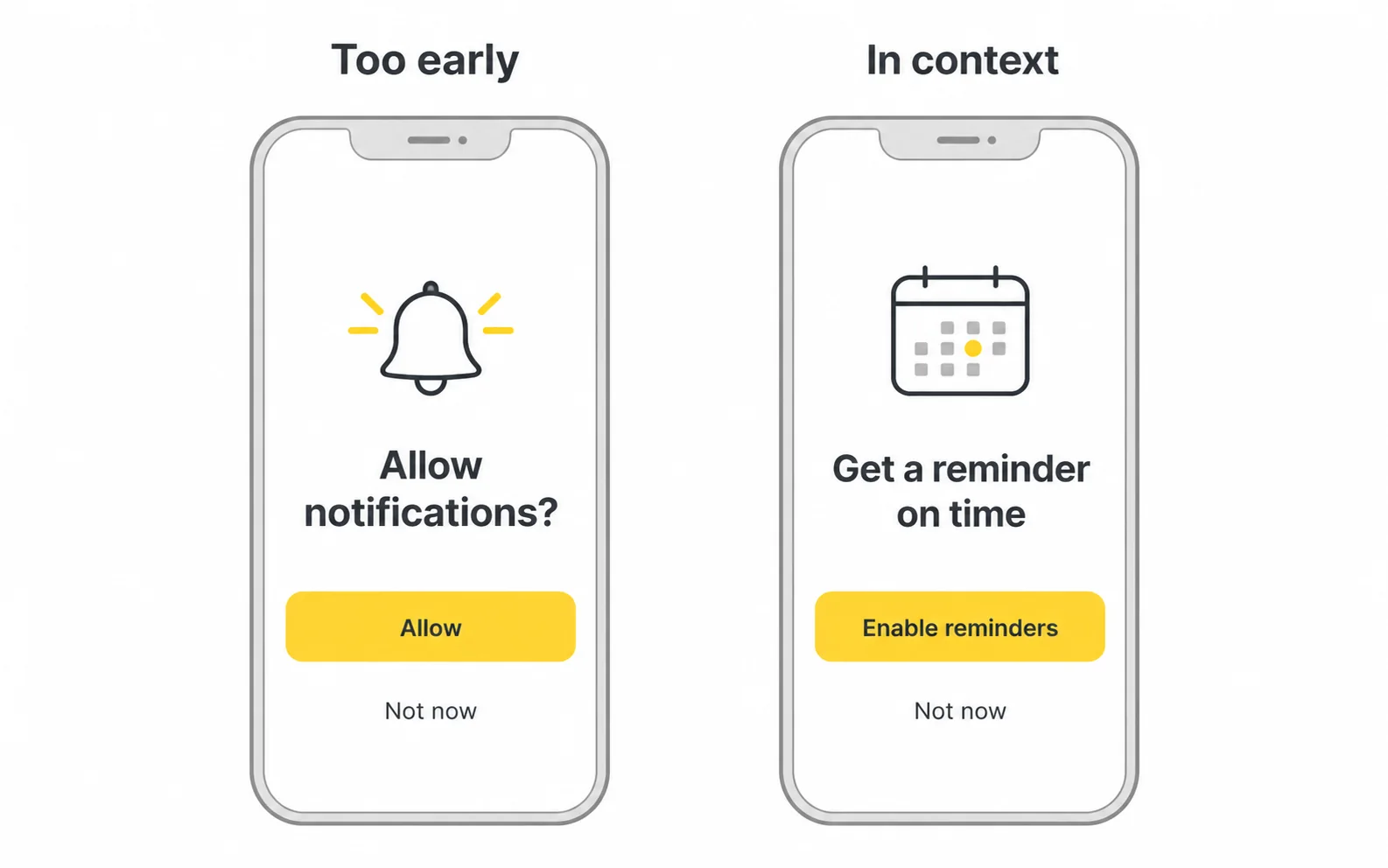
Permission requests for notifications, location, camera, contacts, and tracking are some of the most consequential moments in mobile app onboarding. Recovery depends on the platform, permission and denial history. Android can show a rationale and request again in some cases; after certain denials, settings may be needed. On iOS, review the rules for the specific permission. Ask at the point of need and provide a usable fallback.
| Permission | Poor timing | Better timing |
|---|---|---|
| Notifications | On first launch, before any value | After the user sets a goal, reminder, or saves something |
| Location | During sign-up | When the user searches nearby or opens a map feature |
| Camera | On the welcome screen | When the user taps a scan, photo, or video action |
| Contacts | During account creation | When the user chooses to invite or find friends |
| Tracking (iOS ATT) | Immediately at launch without context | After a brief, honest explanation, in line with Apple's rules |
From my experience: Notification permissions are where I've seen the biggest gap between what teams want and what users accept. Moving the request from launch to right after a user creates their first reminder or goal is usually one of the first experiments I recommend, because the benefit is suddenly obvious to the user.
Use the current Apple privacy and pre-alert guidance, App Store Review Guidelines, and Android runtime-permission documentation.
Ask in context and follow the rules for the specific platform.
You can't fix what you don't measure. Here's the process I use to reduce app onboarding drop-off in a structured, repeatable way.
Agree on a single, measurable activation event that correlates with retention in your product, such as completing a first lesson, creating a first project, or making a first transaction. Use your own retention data to validate it rather than guessing.
Track each onboarding screen and action as an event in your analytics tool (Amplitude, Mixpanel, Firebase, or similar). You need to see exactly where users stop, not just overall completion.
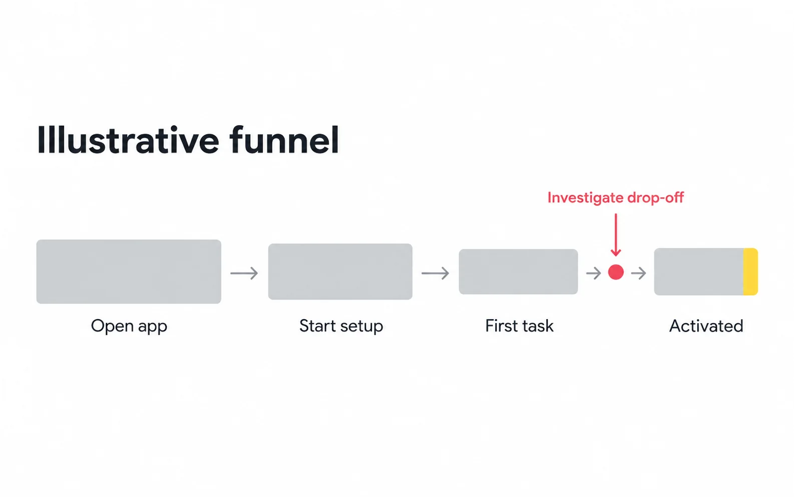
Map the funnel from install to activation. Focus first on the single step with the largest drop, not on polishing every screen at once.
Numbers show where; research shows why. Combine:
Write it plainly: "If we move account creation after the first lesson, more users will reach activation because they'll have experienced value first." Then run an A/B test or a staged rollout.
| Metric | What it tells you |
|---|---|
| Onboarding completion rate | Whether users finish the flow |
| Step-level drop-off | Which specific screen is causing loss |
| Time to value | How quickly users reach the "aha" moment |
| Activation rate | Whether onboarding leads to meaningful use |
| Permission opt-in rate | Whether requests are well timed and explained |
| Early retention (e.g., Day 1, Day 7) | Whether onboarding creates lasting users |
A caution: higher completion isn't automatically better. Removing a personalization step might increase completion but lower retention if the resulting experience feels generic. Always pair completion metrics with activation and retention.
Keep a simple log of experiments, results, and decisions. Onboarding is never "done"; it changes as your product, audience, and platform rules change.
A focused UX audit can connect funnel evidence with user research and usability testing within UI/UX design.
Pair completion with activation and retention.
Most onboarding problems are not caused by bad visuals. They're caused by unclear goals and too many competing requests.
| Mistake | Why it happens | Risk | Fix |
|---|---|---|---|
| Forcing sign-up before value | Growth or data goals prioritized | Users leave before understanding the product | Delay account creation where possible |
| Long feature tours | Teams want to show everything they built | Users skip and remember nothing | Teach in context with progressive onboarding |
| Asking all permissions at launch | Convenience for engineering | Denials that are hard to reverse | Ask in context, with explanation |
| Personalization questions that change nothing | Collecting data "just in case" | Wasted effort, lost trust | Only ask what visibly shapes the experience |
| Empty first screen | No default content planned | New users see nothing useful | Seed content or guide a first action |
| No skip or back option | Desire to "control" the flow | Frustration and abandonment | Respect user control |
| Copying another app's flow | Inspiration taken literally | A pattern that doesn't fit your users | Adapt principles, not screens |
| Not testing on real devices and text sizes | Designs reviewed only on desktop | Broken layouts, accessibility failures | Test across devices and settings |
| Ignoring returning users | Flow designed only for first installs | Existing users re-onboarded on new devices | Offer an early login path |
| Dark patterns | Pressure to hit short-term metrics | Distrust, poor reviews, possible platform rejection | Be transparent and honest |
From my experience: The riskiest mistake isn't a single bad screen; it's having no owner for the full flow. Marketing adds a value screen, legal adds a consent step, growth adds a referral prompt, and suddenly the first-run experience is a committee document. Naming one person accountable for onboarding end to end prevents most of the problems in this table.
Give one person ownership of the entire first-run experience.
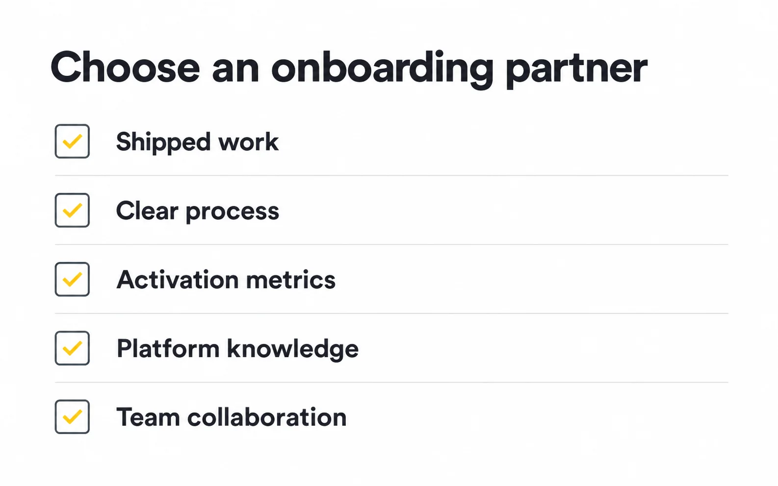
Many teams can improve onboarding in-house. But when onboarding is directly tied to acquisition costs and revenue, bringing in experienced design or branding support can speed up results and reduce costly guesswork.
There's no universal price for onboarding design. Cost depends on:
| Factor | How it affects scope |
|---|---|
| Engagement type | A focused audit is lighter than a full redesign or ongoing retainer |
| Research depth | User interviews and usability testing add time but reduce risk |
| Platform coverage | iOS, Android, and web each need consideration |
| Brand work | Illustration, motion, and visual identity add scope |
| Experimentation support | Designing and analyzing A/B test variants adds ongoing effort |
| Handoff needs | Design systems and developer documentation take additional time |
A practical way to frame the investment: estimate what a meaningful improvement in activation would be worth given your current acquisition spend and user value, and compare that with the cost of the engagement. Keep the estimate conservative.
Explore our mobile app UX design services. Keep brand identity design aligned with reusable components, using a design system your team can maintain.
Review our product design case studies or request an onboarding review.
There's no ideal number. The right length is the shortest path that gets users to first value while collecting only what's needed. Simple apps may need little or none; apps that personalize heavily can justify more, as long as each step visibly pays off.
In most cases, yes. A skip option respects users who prefer to explore. The exception is when information is truly required for the app to work, such as identity verification in regulated industries, and in that case you should clearly explain why.
It can be, if it's short, optional, and demonstrates the product's value. Long, unskippable videos tend to delay value. Always respect reduced-motion settings and make sure the flow works without sound.
Review it whenever your product adds major features, your target audience shifts, or platform guidelines change, and keep monitoring step-level metrics continuously so problems surface early.
Yes. B2C onboarding usually focuses on quick personal value. B2B onboarding often involves multiple roles, such as an admin setting up a workspace and teammates joining later, so each role needs its own path toward activation.
Onboarding focuses on getting new users to their first meaningful outcome. User education is ongoing and helps people discover advanced features over time, often through progressive onboarding, help content, and in-app messaging.





.svg)



.svg)

.svg)

.svg)

.svg)

.svg)
.svg)
