



15 Oct 2026
UI/UX Design
Design Agency vs Freelancer: Which Is Right for Your Product?


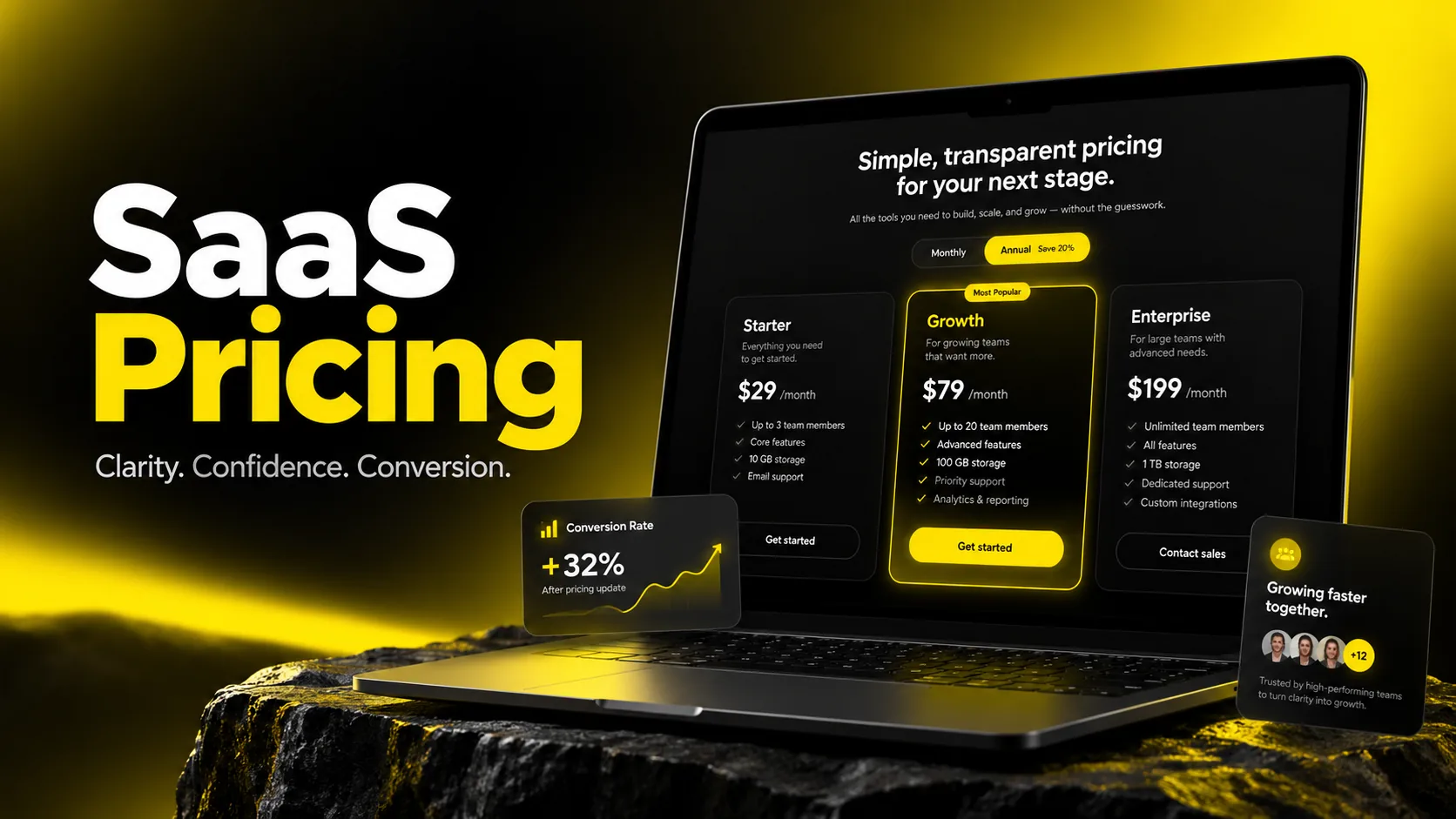
Good SaaS pricing page design helps buyers pick the right plan quickly and confidently. The core ingredients are a small number of clearly differentiated tiers (usually three), a recommended plan, plain-language feature comparisons, visible trust signals, and one obvious call to action per plan. The best pricing pages reduce uncertainty rather than add persuasion. Test changes against your own baseline, because no universal "good" pricing page conversion rate applies to every product.
Your pricing page is often the most important page on your site that nobody on the team owns.
Marketing writes the copy. Product decides the packaging. Finance sets the numbers. Engineering builds the table. Design is asked to "make it look clean." The result is a page that reflects internal politics more than how buyers actually make decisions.
I'm Maniruzzaman Jubayer, a Design Lead with 6–7 years of UX/UI experience. Pricing pages are some of the most revealing projects I work on. They expose everything a company hasn't decided yet: who the product is for, what separates one plan from another, and what the team is willing to be transparent about. When I audit a pricing page, the visual design is rarely the real problem. The real problem is usually a confusing offer that design is being asked to hide.
This guide covers what I've learned about SaaS pricing page design: the psychology behind plan selection, a step-by-step design process, pricing table and tier layouts, practical best practices, patterns from well-known SaaS pricing page examples, the mistakes I see most often, and how to evaluate professional design support if you decide to bring in help.
For the wider website journey, explore our SaaS website design services.
SaaS pricing page design is the practice of structuring, writing, and presenting your plans so a visitor can understand what each plan includes, see which one fits them, and take the next step: start a trial, buy, or talk to sales.
It sits at the point where pricing strategy meets interface design. The strategy decides what you sell and for how much. Design decides whether people can understand it in the few moments they give you.
The people on your pricing page are not all at the same stage, and good design serves each of them:
In my experience, most teams design only for the first group. The comparers and champions are often closer to buying, and they're the ones who get frustrated by vague feature lists.
| Element | What it does | What good looks like |
|---|---|---|
| Headline | Frames the value, not just "Pricing" | Short, outcome-focused, speaks to the audience |
| Billing toggle | Switches monthly/annual views | Clear labeling of the annual saving, no hidden defaults that mislead |
| Plan cards | Summarize each tier | Plan name, who it's for, price, key limits, one CTA |
| Recommended plan | Guides undecided buyers | Visually distinct, labeled honestly |
| Feature comparison table | Supports detailed evaluation | Grouped, scannable, with tooltips for jargon |
| Trust signals | Reduce perceived risk | Customer logos, reviews, security or compliance notes you can verify |
| FAQ | Answers billing and policy objections | Refunds, cancellations, seat changes, taxes |
| Enterprise / sales path | Handles complex buyers | Clear "talk to sales" route with what to expect |
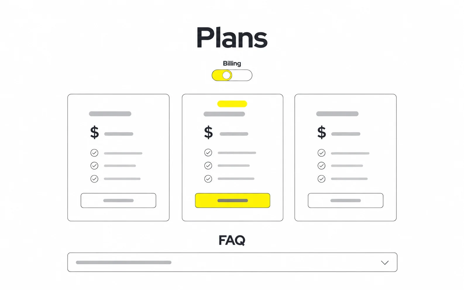
Plan selection also shapes SaaS onboarding UX: keep promises consistent from pricing through activation.
Share your pricing page. We can help clarify your plans, improve the buyer experience, and build a practical testing roadmap.


Pricing page psychology is useful, but only when it helps people decide rather than tricks them. Buyers who feel manipulated on a pricing page tend to carry that distrust into the rest of the relationship. Here are the principles I rely on most, and how I apply them responsibly.
People judge a price relative to the numbers they see around it. Placing a higher-priced plan in view makes the mid-tier feel more reasonable by comparison. In practice, this is why many SaaS pages show an Enterprise or Pro plan next to the core plan.
Use it well: The anchor plan must be a real, sensible offer for some customers. A fake "anchor" that nobody buys is noticeable and erodes trust.
When presented with a low, middle, and high option, many buyers gravitate toward the middle because it feels like a safe choice. This is one reason three-tier layouts are so common.
Use it well: Make sure the middle plan is genuinely the best fit for your core customer. If it isn't, you're steering people into the wrong plan and setting up churn.
More options can make decisions harder. Too many plans, add-ons, and toggles push people to delay the decision. When I review pricing pages, reducing choices is usually the first recommendation, before any visual change.
Whatever is preselected carries weight. Many products default the toggle to annual billing. That can be reasonable, but the monthly price and the actual amount charged upfront should never be obscured.
People tend to react more strongly to losing something than to gaining something equivalent. Framing annual billing as "save X%" or showing what a lower plan doesn't include uses this principle.
Use it well: Show real savings calculated accurately. Avoid inflated "was" prices that were never charged.
Buyers look for evidence that people like them have made this choice safely. Relevant logos, reviews, and statements like "cancel anytime" (only if true) lower the perceived risk of committing.
My rule of thumb: If a psychological technique would feel embarrassing to explain to a customer out loud, don't use it. Clarity builds more long-term revenue than cleverness.
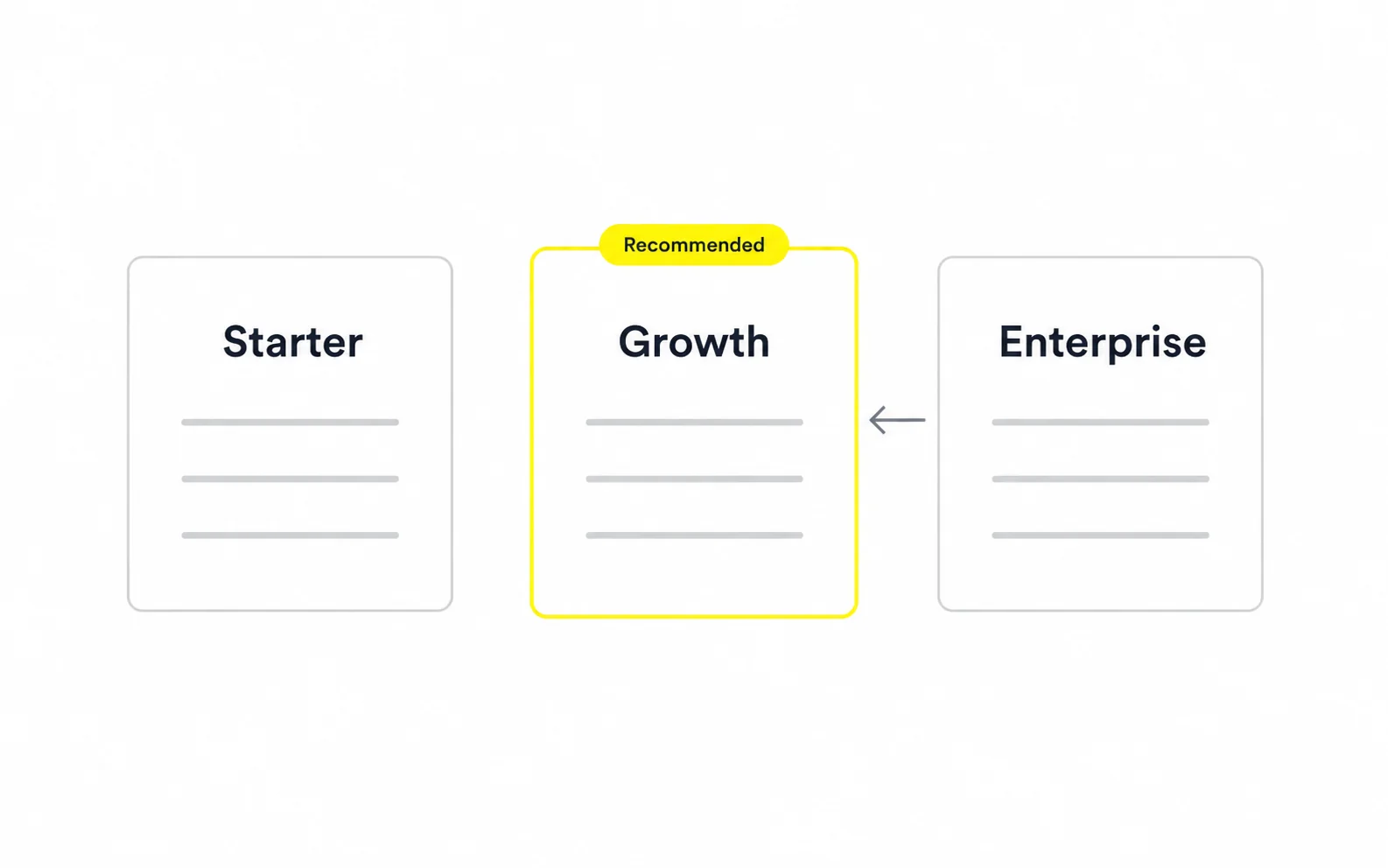
Help buyers choose honestly. A recommendation should reflect customer fit.
This is the process I follow when leading pricing page work. The design phase is actually the fourth step. Skipping the first three is the most common reason redesigns underperform.
Confirm with product, finance, and leadership:
If these answers change mid-project, the design will be rebuilt. Lock them first.
Write one sentence per plan: "This plan is for [who] who need [what]." If two plans produce the same sentence, you likely have one plan too many.
Pull questions from sales calls, support tickets, chat logs, and onboarding feedback. These questions become your comparison table groupings, tooltip copy, and FAQ. In my projects, this step consistently surfaces objections the team didn't know existed.
Start in grayscale. Decide the order in which a visitor should process information:
Visual polish comes later. If the grayscale wireframe doesn't make the choice obvious, color won't fix it.
Plan names, descriptions, and feature labels are design decisions. Replace internal jargon ("Advanced workflow orchestration") with language buyers use ("Automate approvals across teams").
Group features by job-to-be-done, keep the plan header sticky on long tables, and add short tooltips for anything technical.
Side-by-side cards rarely survive a narrow screen. Common approaches include stacked cards with the recommended plan first, swipeable cards, or a plan selector that changes the visible comparison column.
Place reassurance near the decision point, not only at the bottom of the page.
Run quick usability sessions. Ask participants to find the right plan for a given scenario and explain what they'd pay. Misunderstandings here are much cheaper to fix than after launch.
Instrument the page (details in the best practices section below) and plan a series of controlled tests rather than one big reveal.
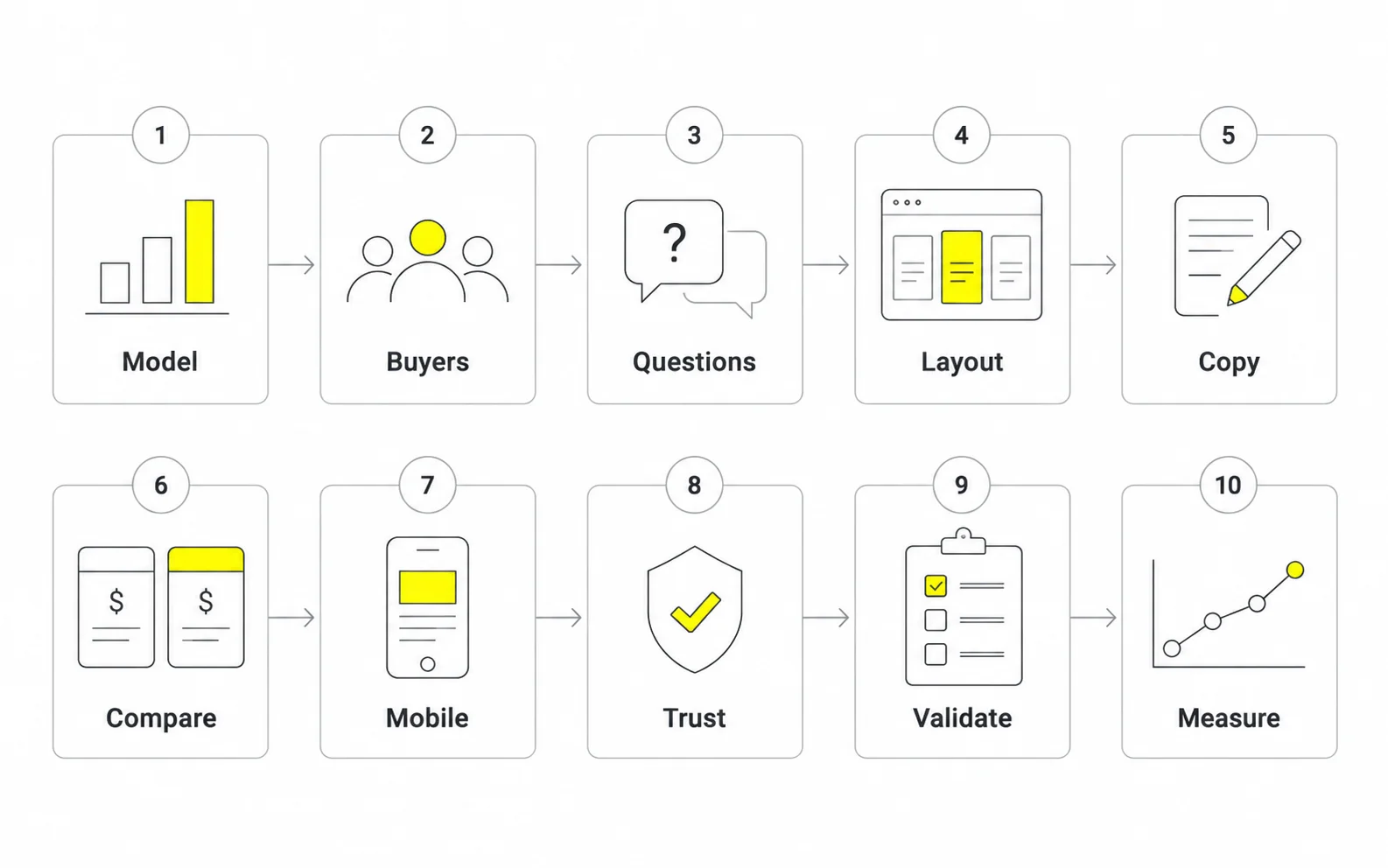
Start with a UX audit of the current buyer journey, and use SaaS landing page design best practices to connect acquisition messaging with the offer.
Align packaging and buyer needs before polishing the layout.
Pricing table design and tier structure are where most of the decision-making happens. Get these right and the rest of the page has an easier job.
Three tiers is a common and sensible starting point because it supports anchoring and the compromise effect without overwhelming buyers. A fourth tier, often "Enterprise" with custom pricing, works when you have a real sales-led segment. Beyond that, clarity usually suffers.
| Tier structure | Best for | Watch out for |
|---|---|---|
| Single plan | Simple products with one clear audience | No room to grow revenue with larger customers |
| Two tiers | Clear self-serve vs. team/business split | Buyers may lack a "safe middle" |
| Three tiers | Most self-serve B2B SaaS | The middle plan must be genuinely strongest for your core customer |
| Three tiers + Enterprise | Products with both self-serve and sales-led buyers | Enterprise card needs clear next steps, not just "Contact us" |
| Usage-based or calculator | Infrastructure, API, and messaging products | Buyers need help estimating cost; add examples |
Strong tiers differ in ways buyers care about: team size, usage limits, level of control, security, or support. Weak tiers differ by long lists of minor features nobody can evaluate.
A pattern I use with product teams: identify the one "upgrade trigger" per tier, the moment a customer outgrows their plan. That trigger becomes the headline differentiator on the card.
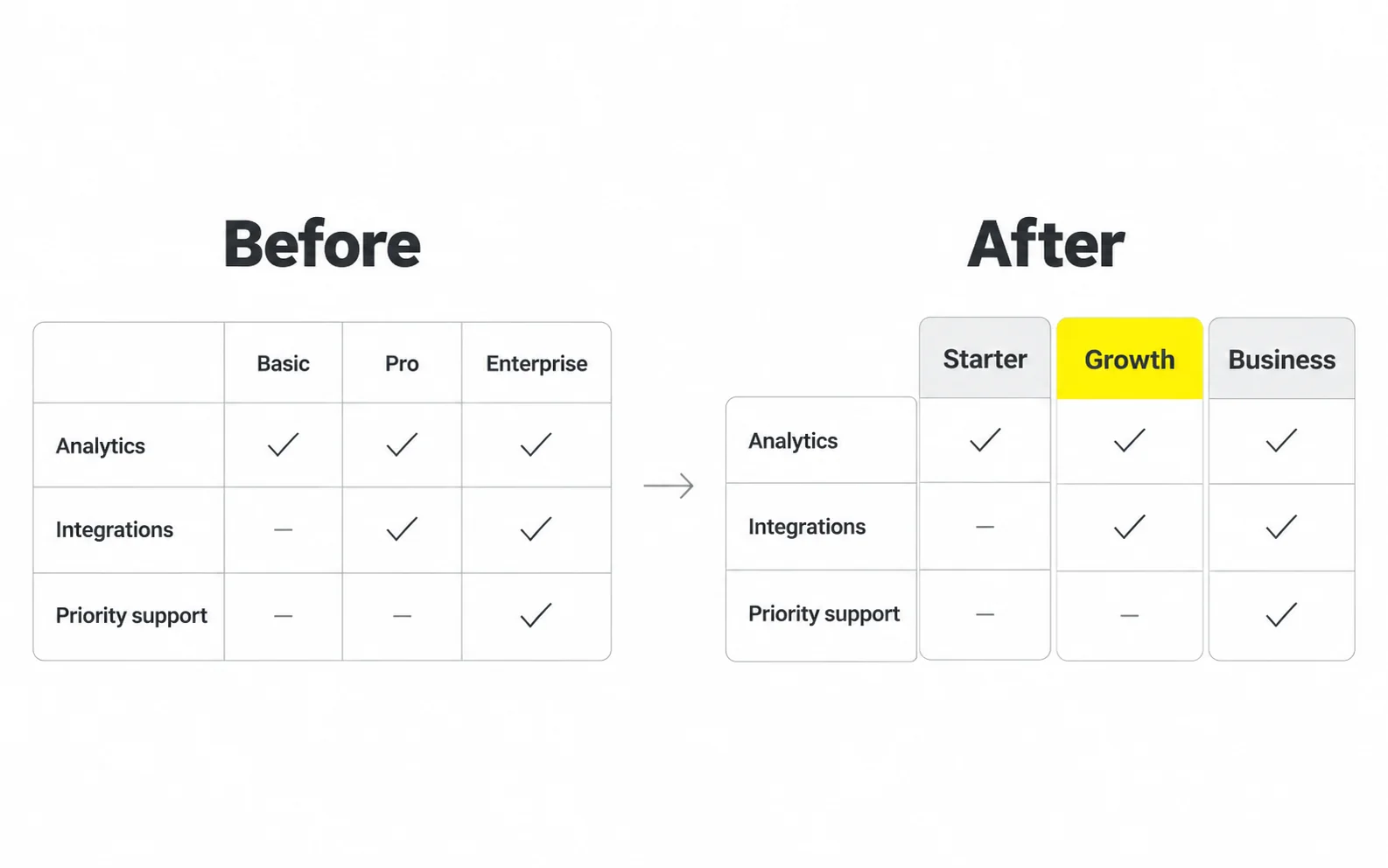
A shared design system for reusable product components helps pricing cards, tables and interaction states stay consistent.
These pricing page best practices are the ones I return to on nearly every project. None of them guarantees a specific lift, but together they remove the most common sources of friction.
There's no single benchmark that fits every SaaS product, because conversion depends on traffic source, price point, sales motion, and whether you offer a free plan. What matters is your own baseline and the direction of change. Useful metrics include:
| Metric | What it tells you |
|---|---|
| Pricing page to signup/trial rate | How well the page moves visitors to action |
| Plan mix | Whether buyers choose the plan you designed for them |
| Clicks on "Contact sales" | Interest from larger or complex buyers |
| Toggle usage (monthly vs. annual) | Sensitivity to commitment and billing |
| Scroll depth and table interaction | Whether visitors need deeper comparison |
| Trial-to-paid conversion by plan | Whether the page is setting accurate expectations |
| Early churn or downgrades | Whether people were steered into the wrong plan |
My advice: Always pair a top-of-funnel metric (clicks, signups) with a downstream one (paid conversion, retention). A change that increases signups but attracts poorly-fitted customers isn't a win.
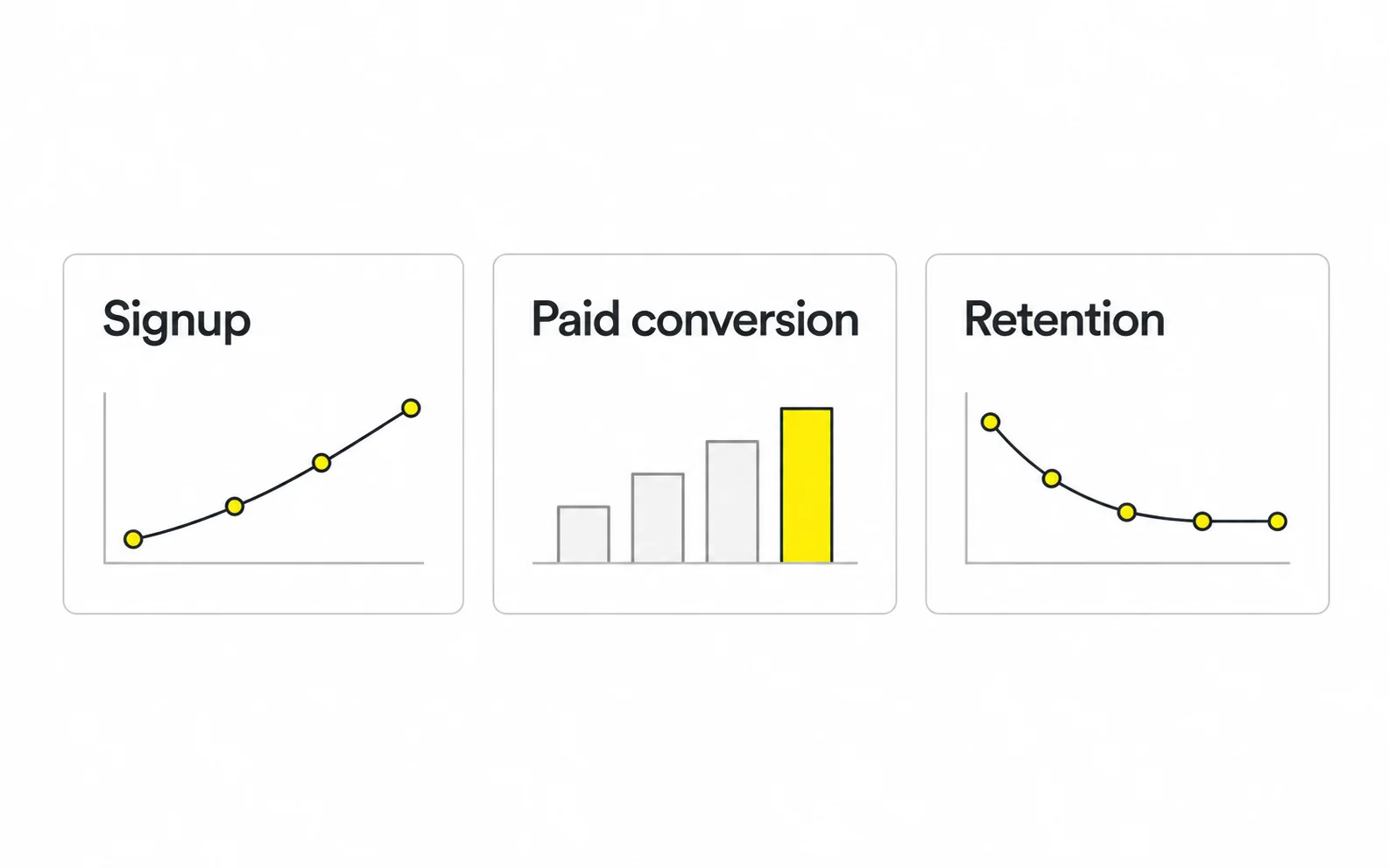
Our guide to conversion rate optimization through UX explains how to connect usability work with measurable outcomes.
Measure downstream conversion and retention alongside clicks and signups.
Galleries of SaaS pricing page examples are useful for inspiration, but copying a layout rarely works because the layout serves that company's specific pricing model. The better approach is to study the pattern and ask whether it fits your model.
Pricing pages change frequently, so review the live versions before drawing conclusions. These are patterns that well-known SaaS companies have used and that I find worth studying.
Seen at: Slack, which has long promoted a "fair billing policy" that can credit eligible self-serve accounts for inactive members. Check the current policy and purchase-method requirements.
Why it's worth studying: Per-seat pricing creates a fear of paying for unused seats. Addressing that fear directly on the pricing page turns a common objection into a reason to trust the company.
Apply it: Identify your biggest billing anxiety and answer it where buyers make the decision.
Seen at: Stripe, known for its usage-based model with a route to custom pricing for larger businesses.
Why it's worth studying: It keeps the entry point simple for small customers while acknowledging that large-volume customers need a different conversation.
Apply it: If your pricing is usage-based, keep the default rate easy to find and make the custom option visible without hiding standard pricing.
Seen at: Products such as Notion and Figma, which have offered free plans alongside paid tiers for teams and organizations.
Why it's worth studying: The free plan lowers the barrier to adoption, while the paid tiers are organized around team growth and administrative control.
Apply it: Tie each tier to a stage of growth (individual, team, organization), not to an arbitrary feature bundle.
Seen at: Email and marketing platforms such as Mailchimp, where pricing depends on audience size.
Why it's worth studying: When price depends on volume, a static table can't answer "What will I pay?" An interactive control can.
Apply it: If your price scales with a metric, let buyers enter their number and see the result.
Seen at: Platforms such as HubSpot that sell several product lines.
Why it's worth studying: Buyers first choose which product they need, then which tier. Presenting everything at once would overwhelm them.
Apply it: If you have multiple products, add a product selector before plan selection.
When I study a pricing page, I ask:
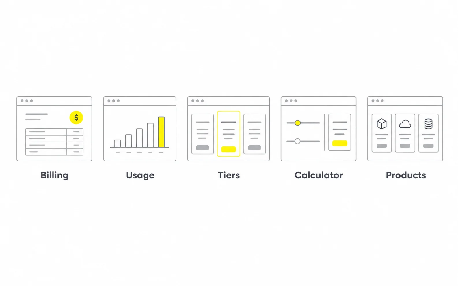
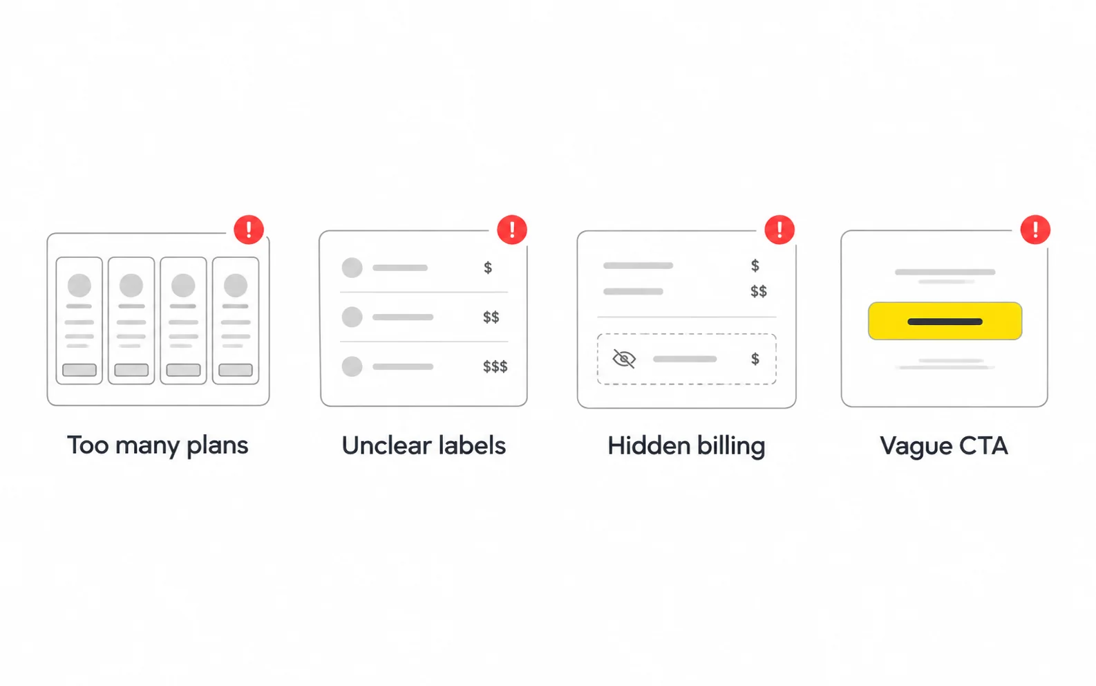
These are the issues I see most often when auditing pricing pages. Most are fixable without changing your prices.
| Mistake | Why it hurts | How to fix it |
|---|---|---|
| Too many plans | Creates choice overload and delays decisions | Consolidate to three core tiers plus an optional Enterprise path |
| Feature-dump cards | Buyers can't tell what matters | Show 3–6 key differentiators; move the rest to the comparison table |
| Internal jargon | Visitors don't understand what they're buying | Rewrite using words from sales calls and support tickets |
| Unclear pricing metric | Buyers fear surprise bills | Define the metric and show an example calculation |
| Hidden annual billing | Feels deceptive when the charge arrives | Show the upfront amount clearly next to the monthly equivalent |
| "Contact us" with no context | Buyers skip it or leave | Explain who the plan is for and what happens next |
| Recommending the wrong plan | Leads to poor fit, downgrades, or churn | Recommend the plan that best fits your core customer |
| Neglecting mobile | Tables break and comparisons become impossible | Design a mobile-specific comparison pattern |
| Fake urgency or inflated discounts | Erodes trust and may create compliance risk | Use honest, verifiable offers only |
| No FAQ | Billing questions go unanswered | Add a focused FAQ on refunds, cancellations, and plan changes |
| Redesigning without measurement | You can't tell what worked | Record a baseline and test changes in stages |
The most common root cause I've encountered is treating the pricing page as a visual problem when it's actually a packaging problem. If the team can't explain in one sentence why a customer should choose Plan B over Plan A, no layout will make that choice obvious. When a pricing page redesign stalls, I usually pause the visuals and facilitate a packaging conversation first.
For narrow-screen behavior, see our mobile UX design guide.
A clearer layout cannot fix an unclear offer.
Many teams can improve their pricing page internally. But when the page is tied to significant revenue, or the team is too close to the product to see it clearly, professional design support can help.
Costs vary widely, so it's more useful to understand what drives them than to rely on a generic figure:
| Engagement type | Typically includes | Best for |
|---|---|---|
| Audit and recommendations | Heuristic review, prioritized fixes | Teams with in-house designers who need direction |
| Redesign project | Research, wireframes, UI, handoff | Teams launching new packaging or a rebrand |
| Design + development | Design plus build and QA | Teams without front-end capacity |
| Ongoing optimization | Testing roadmap, iterations, reporting | Teams with meaningful pricing page traffic |
Consider outside support if several of these are true:
Keep brand identity for SaaS consistent with the offer. Review our product design case studies or request a pricing page review.
For self-serve products, public pricing usually helps buyers qualify themselves and reduces sales friction. Sales-led or highly customized products may reasonably use "Contact sales" for some tiers, but it helps to share a starting price or explain what influences cost.
It depends on your product. Free plans suit products that spread through usage and collaboration. Free trials suit products whose value is clear within a short period. Some companies offer both. Your pricing page should make the difference clear either way.
Review it whenever packaging, prices, or major features change, and check it periodically against real buyer questions from sales and support. Treat optimization as ongoing, not a one-time project.
Most SaaS sites place "Pricing" in the main navigation because buyers actively look for it. Hiding it can frustrate visitors who are ready to evaluate.
If you have meaningful traffic from multiple regions, showing local currency and clarifying taxes can reduce confusion. Localization adds design and operational complexity, so plan for it deliberately.
Low traffic makes statistically reliable A/B tests difficult. In that case, qualitative methods such as usability testing, customer interviews, and session recordings often provide more useful guidance.





.svg)



.svg)

.svg)

.svg)

.svg)

.svg)
.svg)
