



15 Oct 2026
UI/UX Design
Design Agency vs Freelancer: Which Is Right for Your Product?


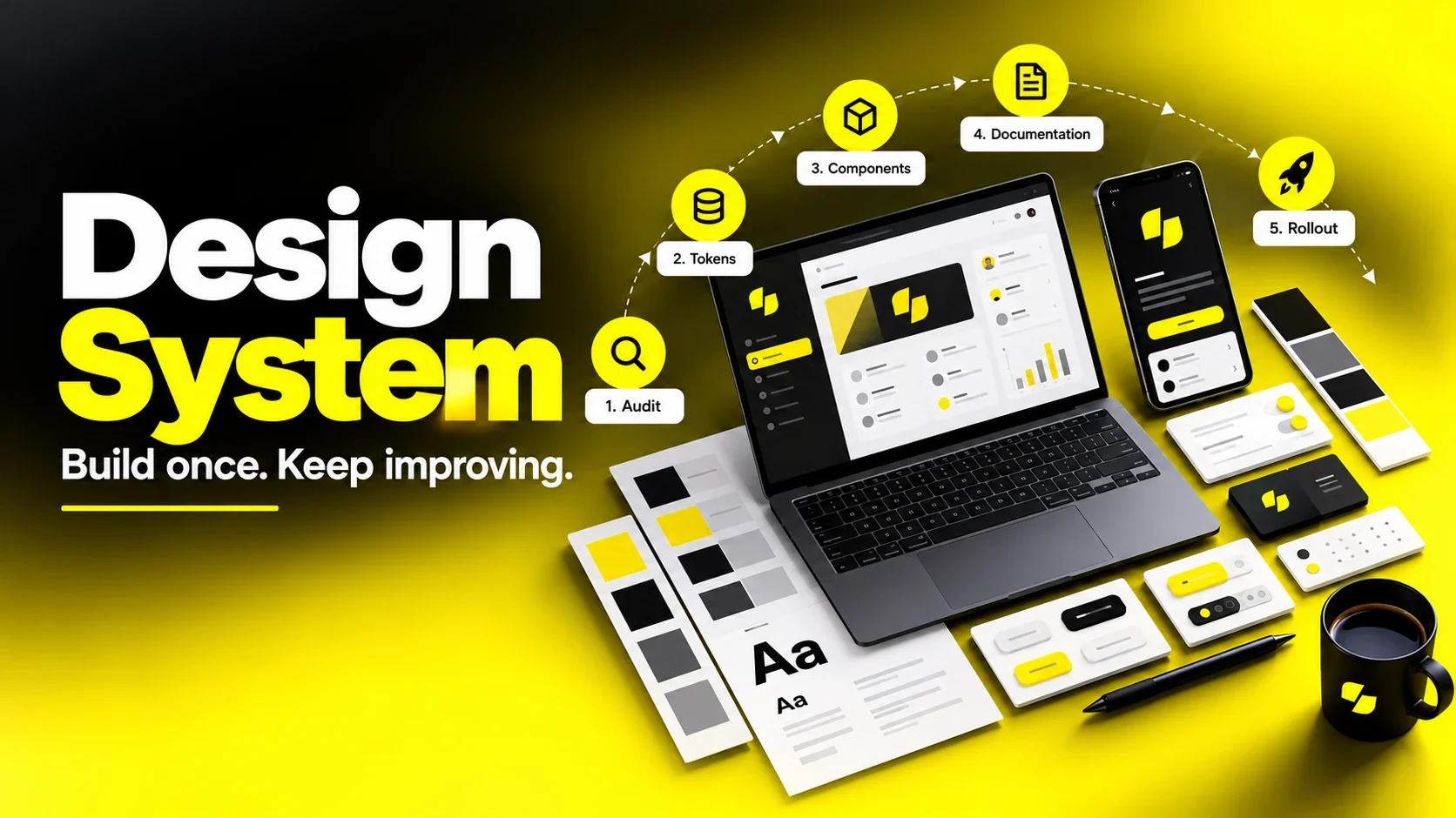
To build a design system, start by auditing your existing UI and code, then define design tokens (color, typography, spacing), build a small set of high-use components in Figma and code, document how and when to use them, and set up a governance process so the system keeps evolving. Start small with the components your team uses most, align designers and developers on shared naming from day one, and treat the system as a product with owners and users, not a one-time project.
Most teams don't decide to build a design system on a quiet afternoon. They get pushed into it. There are fourteen slightly different blue buttons in production. Engineers rebuild the same modal for the third time. A rebrand turns into months of manual cleanup. New designers take weeks to learn "how we do things here."
I'm Maniruzzaman Jubayer, COO & Co-founder of Wolfpixel. I've built design systems from scratch, inherited half-finished ones and helped teams rescue systems that nobody was using. The lesson that keeps repeating: unclear goals, weak adoption and missing ownership can undermine even carefully designed components.
This guide is written for founders, product leaders, heads of growth, and design teams deciding whether and how to invest. You'll learn what a design system actually is (and how it differs from a style guide), when your company needs one, how to build the business case, a step-by-step process for building one, how design tokens and a Figma design system work together, how to document and govern it, and the mistakes that quietly kill most systems.
A design system is a shared set of design decisions, reusable components, and usage guidelines that helps a team build consistent products faster. It combines three things:
A design system connects decisions in design and production. Shared naming, token pipelines, reusable components and release processes help a primary-action decision flow consistently to its consumers; updates still need implementation and adoption.
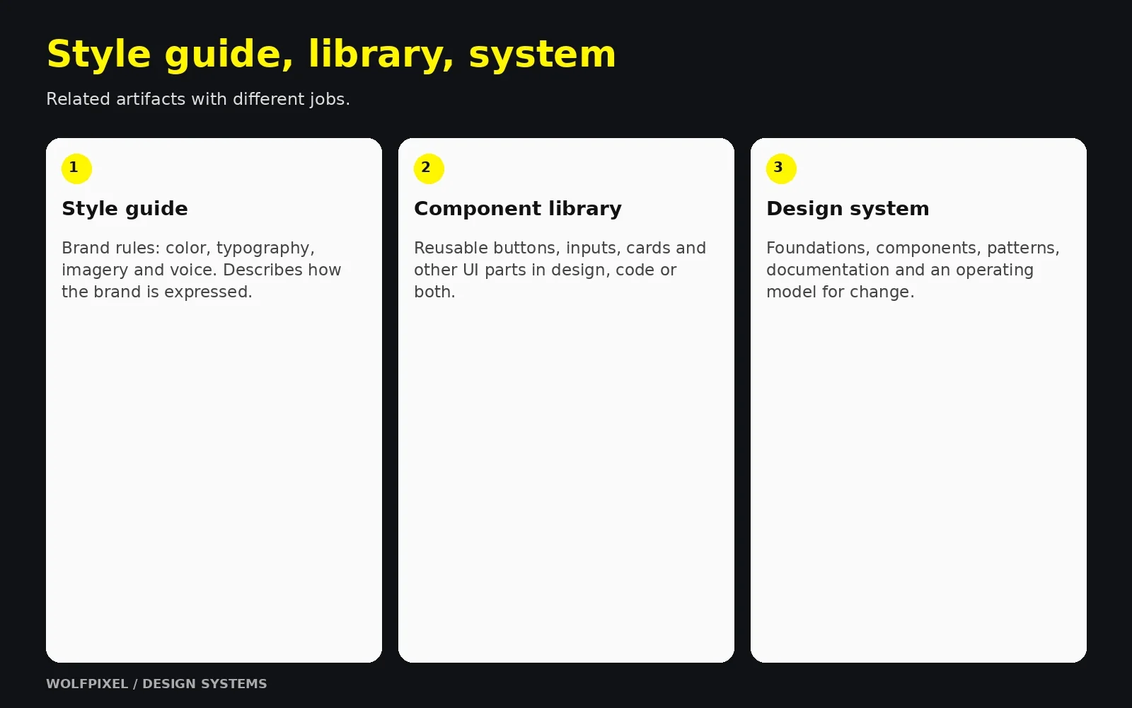
This is one of the most common points of confusion. A style guide is one part of a design system, not a substitute for it.
| Aspect | Style guide | Component library | Design system |
|---|---|---|---|
| What it is | Visual and brand rules (logo, colors, fonts, tone) | Reusable UI elements in design and/or code | Tokens + components + patterns + documentation + governance |
| Format | Usually a PDF or static page | Figma library, code package, or both | Living product with owners, versions, and a roadmap |
| Answers | "What does our brand look like?" | "What pieces can I reuse?" | "How do we build, decide, and change things consistently?" |
| Connected to code? | Rarely | Sometimes | By design |
| Maintained by | Brand or marketing team | Designers or engineers | Cross-functional owners |
A simple way to explain it to stakeholders: a style guide describes the brand, a component library provides the parts, and a design system is the operating model that keeps both in sync with the product.
A design system should express your brand identity, not replace it. In my experience, the strongest systems start from clear brand foundations, including personality, voice, and visual principles, and translate them into product-ready decisions. If your brand itself is still undefined, fix that first. Systematizing an unclear brand only produces consistent confusion.
A system connects reusable parts with the decisions and process behind them.
For the brand foundation, see our brand identity design guide.
Share your product and current library. We can discuss a practical first step: an audit, token foundation, component library or a plan for stronger adoption.


Not every company needs a full design system on day one. Building too much too early is a real risk, as is waiting until inconsistency becomes expensive.
| Company stage | Typical situation | What to build |
|---|---|---|
| Early stage (1–2 designers) | Speed matters most; product still changing | A lightweight token foundation plus a small set of high-use components selected from the audit. |
| Growth stage (multiple squads) | Inconsistency spreading; handoff friction rising | A shared Figma library connected to a coded component library, with basic documentation |
| Scale stage (multiple products or brands) | Duplicate work across teams; theming needs | A full system with token pipeline, theming, contribution model, versioning, and dedicated ownership |
From what I've seen, the most successful early-stage teams build a minimum viable design system: just enough foundations and components to remove the most painful inconsistencies, with room to grow. You don't need a documentation website with 60 components to get value. You need the ten components your team rebuilds every week, done properly.
Start with the repeated problems your team needs to solve.
Design systems need ongoing investment, so leadership will reasonably ask what the return is. The strongest business cases avoid vague promises and instead connect the system to problems the company already feels.
Measure your own baseline before you start, then track the same metrics after launch:
| Metric | How to measure |
|---|---|
| Design and build time | Time to design and ship a typical screen or feature, before vs after |
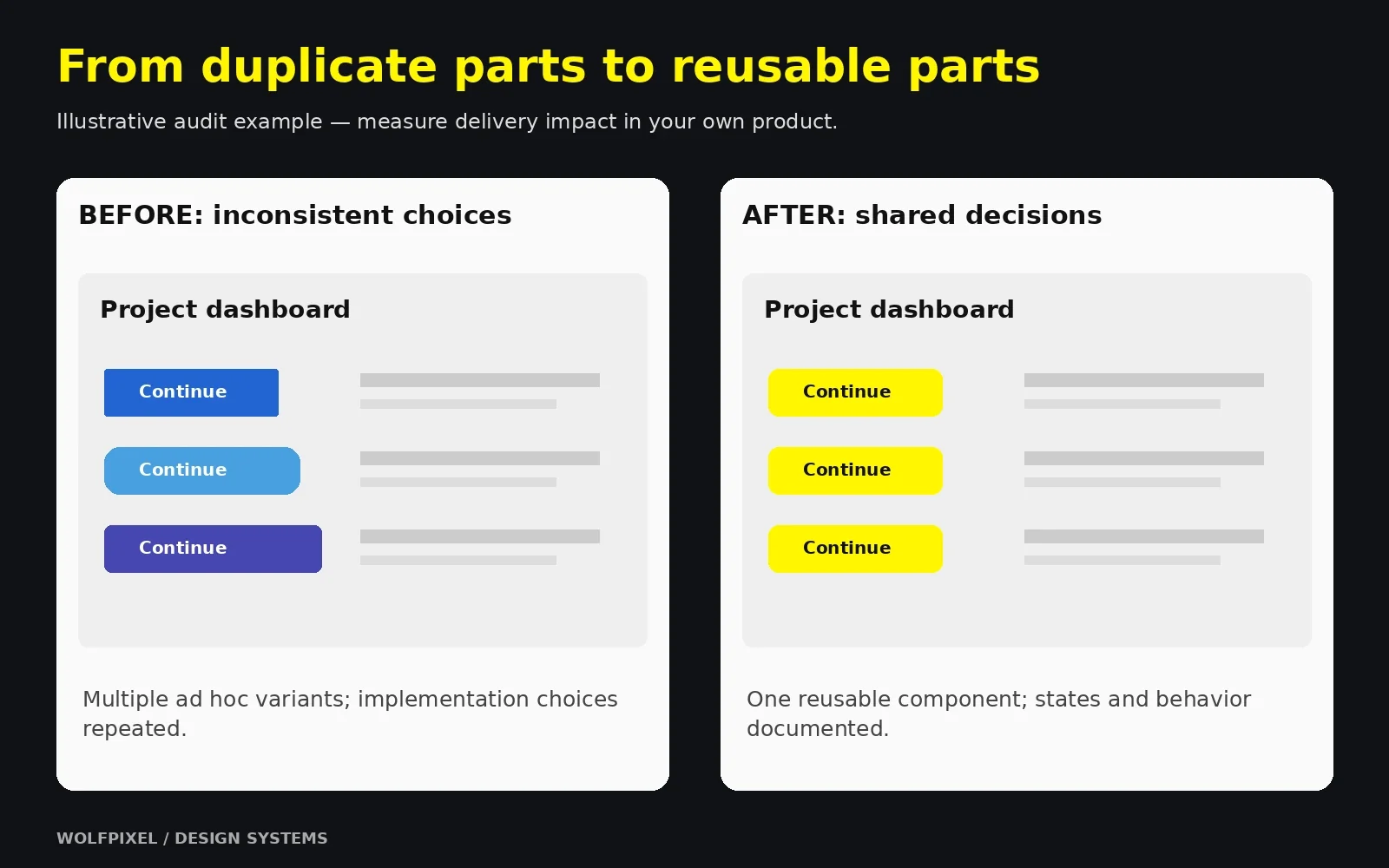
| UI inconsistency | Count variants of core elements (buttons, inputs, colors) in the audit |
| Design QA defects | Number of UI-related bugs or review comments per release |
| Adoption | Percentage of screens or code using system components |
| Onboarding time | Time for a new designer or engineer to ship their first feature |
| Change cost | Effort needed for a global change (e.g., updating a primary color) |
Use a transparent formula leadership can check:
Estimated annual capacity value ≈ hours saved per person per week × people affected × loaded hourly cost × working weeks. Estimated first-year net value = capacity value + separately evidenced avoided rework − initial build cost − annual maintenance and tooling cost.
Illustrative example only: eight people saving two hours each per week represents sixteen hours of released capacity per week. Capacity is not automatically a cash saving. Replace assumptions with your own observations and avoid counting the same saved effort again as avoided rework.
One insight from my own work: the business case lands best when you show the audit itself. Put every button variant from production on one slide. That single visual usually does more persuading than any spreadsheet.
Measure your own baseline and distinguish released capacity from cash savings.
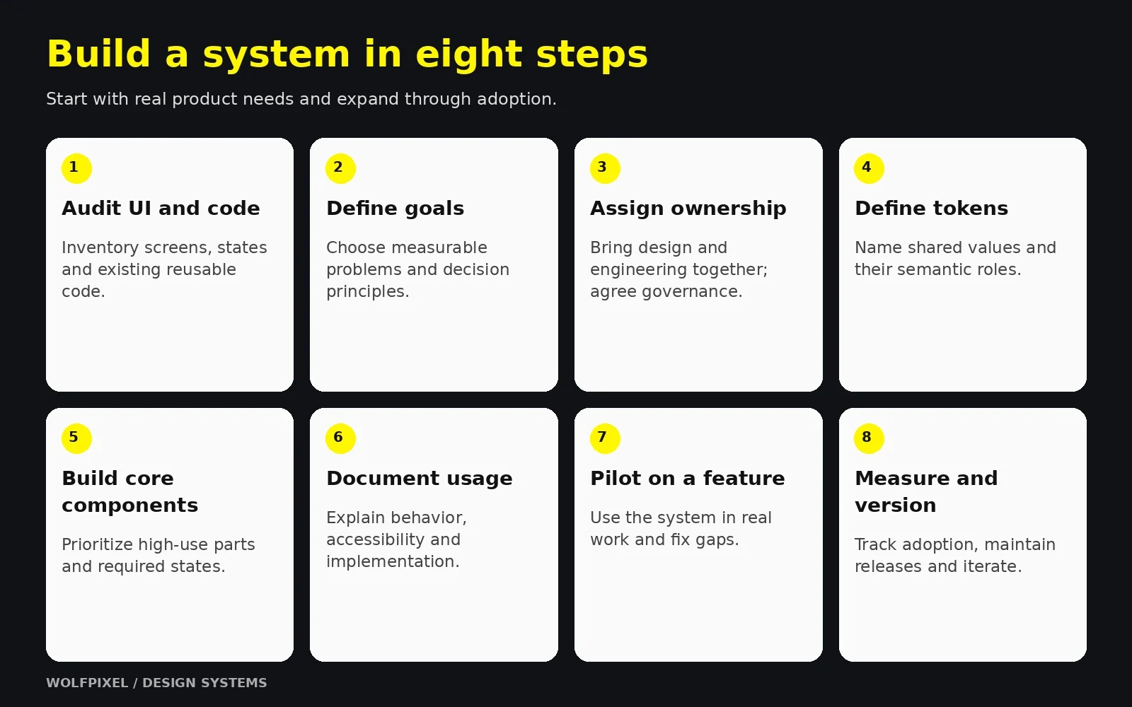
This is the process I recommend for most product teams. Sections 5–7 go deeper into the most technical steps.
Screenshot every screen and state in your product and marketing site, then group similar elements: buttons, inputs, colors, type styles, icons, and modals. Audit the codebase too. Engineers have often already built reusable components or CSS variables that aren't reflected in design files. Build on what exists rather than creating a parallel system.
Write down why you're building the system and how you'll know it's working. Examples: "reduce UI inconsistency in checkout," "support dark mode," or "cut handoff friction between design and engineering." Then define three to five design principles that guide decisions, such as "clarity over decoration" or "accessible by default."
Include at least one designer and one front-end engineer from the start. A design system owned only by designers becomes a Figma library nobody implements. Decide how the system will be run. Common models include a single dedicated team (centralized), contributors spread across product teams (federated), or one person maintaining it (solitary), which is common in early-stage startups.
Consolidate your audit into a controlled set of colors, a type scale, a spacing scale, radii, shadows, and motion values. Store them as design tokens so design and code share one source of truth. (See Section 5.)
Prioritize components that are used most often and are most inconsistent today. For most products, that means buttons, inputs, selects, checkboxes, cards, modals, navigation, alerts, and tables. Build each one in Figma and in code, with all states and variants. (See Section 6.)
Every component needs guidance on when to use it, when not to, its states, accessibility requirements, and code references. (See Section 7.)
Before rolling out company-wide, use the system on one live feature or page. Real work exposes gaps faster than any review meeting. Collect feedback, fix what breaks, and use the pilot's results as proof for broader adoption.
Track the metrics from Section 3, release updates with version numbers and changelogs, and review the roadmap regularly. A design system is never finished. It evolves with your product.
You don't always have to start from zero. Adapting an established open-source foundation can speed things up, while a fully custom system gives you more control over brand expression.
| Approach | Best for | Trade-off |
|---|---|---|
| Build custom | Distinctive brands, complex products, long-term scale | More time and investment up front |
| Adapt an open-source system or UI framework | Early-stage teams, internal tools, speed | Risk of generic look; customization debt later |
| Hybrid | Teams combining established foundations with product-specific patterns | Requires clear rules about what's customized |
Pilot the system on a real feature before expanding it.
For product rollout, review our SaaS redesign process.
Use our structured UX audit process.
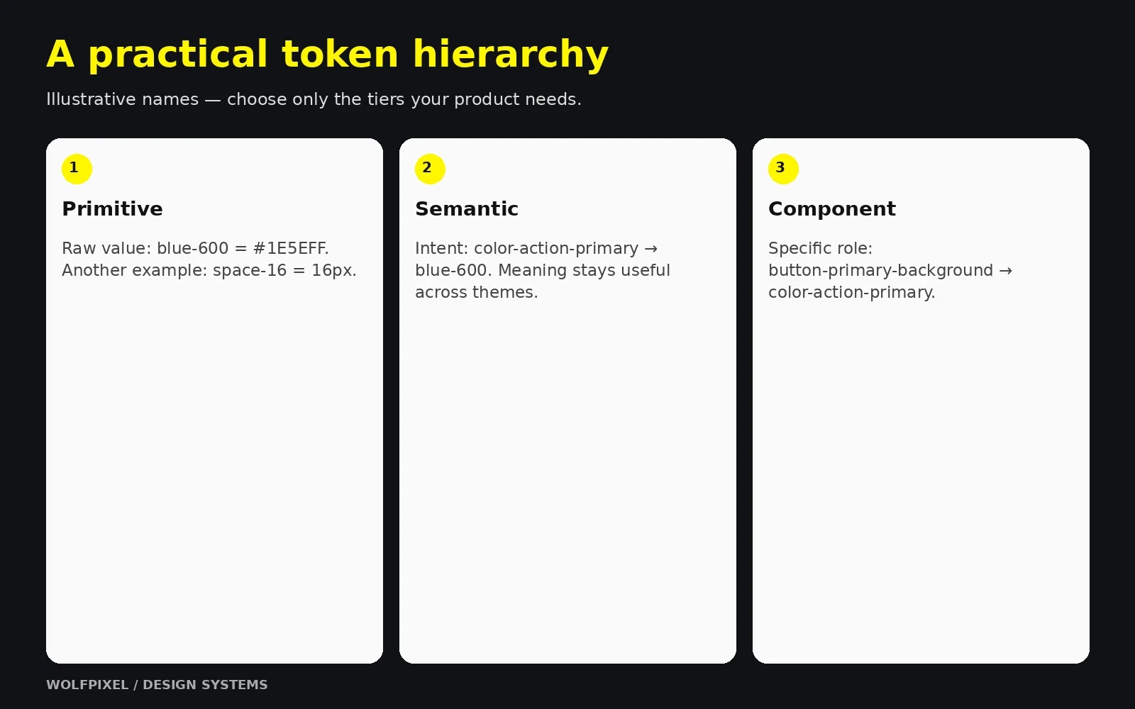
Design tokens name design decisions such as colors, dimensions, spacing and motion values. Instead of repeating a hex value, use a meaningful token. Changes can propagate through token references and generated outputs after the pipeline is run and consumers adopt the release.
Tokens are what turn a style guide into a system. They give designers and developers the same language.
| Tier | Purpose | Example |
|---|---|---|
| Primitive (global) | Raw values in your palette and scales | blue-600, space-16, font-size-300 |
| Semantic (alias) | Meaning and intent; what the value is for | color-action-primary, color-text-danger, space-inset-md |
| Component | Values scoped to a specific component | button-primary-background, card-padding |
For theme-sensitive component values, referencing semantic roles rather than raw palette values can make changes easier to manage. Use component-specific tokens where they provide useful control; you do not need three tiers for every value.
Good token names describe purpose, not appearance. color-text-danger stays correct even if the brand changes the danger color from red to crimson. red-text doesn't. A practical naming structure is:
category – property – concept/variant – state Example: color-background-button-primary-hover
Agree on naming conventions with engineering early, including casing (kebab-case for CSS variables, camelCase for JavaScript), so tokens translate cleanly into code.
With semantic tokens, a theme is simply a different mapping. color-background-surface might point to white in light mode and gray-950 in dark mode. The same approach supports multiple brands, high-contrast accessibility modes, and white-label products.
The Design Tokens Community Group published the stable 2025.10 specification in October 2025. Its modules define an interoperable token format, color representation and resolution. It is a Community Group specification, not a W3C Standard. Evaluate the format against the tools and transformation pipeline you actually use.
See the DTCG 2025.10 technical reports and specification status and FAQ.
In Figma, variables can hold reusable values and modes for different contexts such as themes. Styles can group properties such as typography and effects. On the code side, a tool such as Style Dictionary can transform token sources for different platforms. Define how imports, exports and releases are reviewed instead of assuming tools stay synchronized automatically.
Use Figma’s variable modes documentation and Style Dictionary’s token transformation documentation when defining your pipeline.
Use meaningful token roles and a reviewed release pipeline.
For platform conventions, review our human interface guidelines for mobile apps.
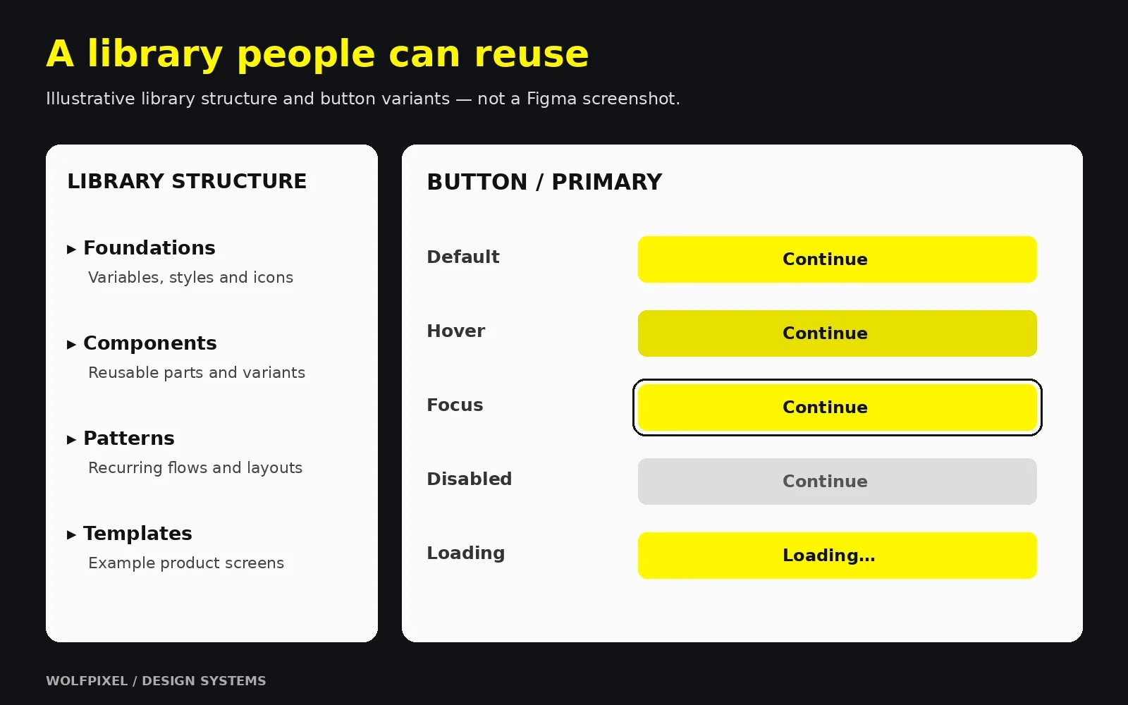
A Figma design system is where most teams make their system visible first. The goal is not a beautiful sticker sheet. It's a library that designers use by default because it's faster than drawing from scratch.
A structure that scales well for most teams:
Larger organizations often split libraries further, for example by platform (web, iOS, Android) or by product area, so teams only enable what they need.
Good component library design follows a few consistent rules:
Many teams organize components using atomic design thinking, a methodology popularized by Brad Frost, which moves from small elements (atoms) to combinations (molecules and organisms) to full layouts. You don't need to follow it rigidly, but the idea of building upward from small, reliable parts is sound.
Read Brad Frost’s explanation of atomic design for the underlying method.
Use a simple matrix: how often is it used vs how inconsistent is it today. High usage plus high inconsistency means build first. In most products I've worked on, buttons, form inputs, and modals land in that top-right corner almost immediately.
Map your Figma components to implemented components and keep their APIs aligned. Figma Code Connect can show mapped code snippets in Dev Mode; it does not replace implementation, release management or drift checks. Storybook provides a way to develop and document component variations in isolation.
See Figma Code Connect and Storybook’s component workflow.
Before a component is published, check that it has:
Keep design variants and implemented behavior aligned.
For platform-specific components, use our mobile app design guide.
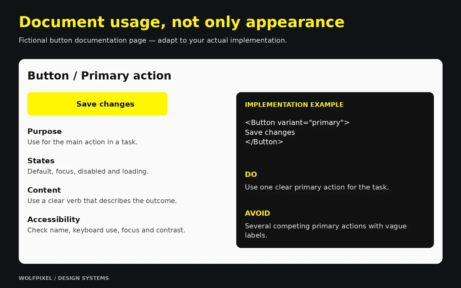
A design system that isn't documented or adopted is just a nicely organized file. This is where most systems succeed or fail.
| Documentation element | Why it matters |
|---|---|
| Purpose and when to use | Prevents misuse (e.g., using a modal where inline feedback works better) |
| When not to use | Points people to the right alternative component |
| Anatomy and variants | Explains each part and option |
| States and behavior | Defines interaction, loading, and error handling |
| Accessibility guidance | Keyboard support, ARIA requirements, contrast rules |
| Content guidelines | Label length, tone, capitalization |
| Do's and don'ts | Visual examples that make rules concrete |
| Code reference | Props, import paths, and live examples |
| Changelog | Shows what changed and when |
Keep documentation where people already work. Some teams document directly inside Figma; others use a dedicated documentation platform such as Zeroheight or Supernova, or a Storybook-based site. The best tool is the one your team actually opens.
Governance answers practical questions: Who approves a new component? How do product teams request changes? What happens when a team needs something the system doesn't have?
A lightweight contribution process works for most teams:
In my experience, adoption is a product problem, not a policy problem. Mandates alone don't work. What works:
Public design system examples are the best free education available. Study them for structure and documentation, not to copy their look.
| Design system | Organization | What to learn from it |
|---|---|---|
| Material Design | Token-based theming and comprehensive foundations | |
| Carbon | IBM | Thorough documentation and open-source code |
| Polaris | Shopify | Current merchant-facing components and usage guidance |
| Atlassian Design System | Atlassian | Well-organized foundations and content guidelines |
| Fluent | Microsoft | Cross-platform consistency and iconography |
| GOV.UK Design System | UK Government | Research-backed patterns and accessibility-first thinking |
| Lightning Design System | Salesforce | Semantic token roles and enterprise component guidance |
A useful exercise: pick one component, such as a text input, and compare how three of these systems document it. You'll quickly see what good documentation looks like and what your own system is missing.
Documentation and ownership are part of the product.
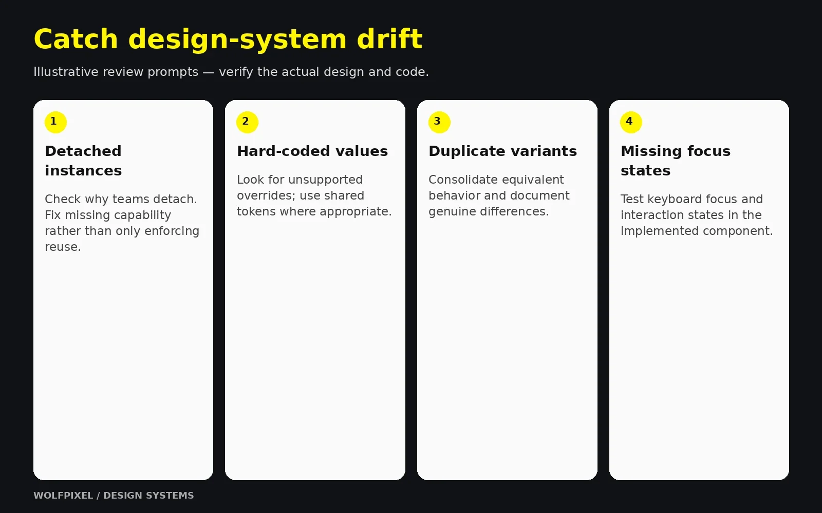
| Risk | What it looks like | Mitigation |
|---|---|---|
| Low adoption | Teams detach components or build their own | Involve product teams early; make the system the easiest path |
| Design–code drift | Figma and production components diverge | Shared naming, Code Connect or similar, joint reviews |
| Maintenance burden | Backlog of requests nobody handles | Clear ownership and a contribution model |
| Over-engineering | Complex token structures nobody understands | Start simple; add tiers only when needed |
| Losing leadership support | Budget cut after launch | Track and share ROI metrics regularly |
Plan for three kinds of cost:
Budget for maintenance as well as launch. Without owners and ongoing capacity, requests and changes can accumulate while consumers drift.
Many companies have talented designers but no one with the time or experience to set up a system from scratch. Experienced external support can help you:
Fund maintenance and adoption alongside the initial build.
Explore our UI/UX design and system capabilities, review Wolfpixel’s product design case studies, or discuss your design-system scope.
When the system supports a brand transition, see our rebranding strategy and rollout guide.
For a growing software product, our SaaS product design services connect reusable foundations with the real workflows your customers use.
Timing depends on scope, team availability, code readiness and documentation. Plan a focused initial release and a real pilot, then expand in phases. A mature multi-platform system remains an ongoing product rather than a project with a permanent finish date.
Yes. Many systems start with a single designer working closely with one engineer. Focus on foundations and the most-used components, document as you go, and expand as the team grows.
Start with the components causing the most repeated work and inconsistency. Buttons, inputs, selects, cards, dialogs, alerts and navigation are common candidates. Set the initial component count from your audit and capacity; quality and adoption matter more than a universal target.
A good one does the opposite. By standardizing repetitive decisions like button styles and spacing, it frees designers to focus on user problems, flows, and moments that genuinely need custom treatment.
AI can assist with documentation drafts, code exploration and consistency checks when it has clear tokens, component APIs and usage guidance. Review generated work for correctness, accessibility and alignment with the implemented system; clear documentation is useful context, not a guarantee of correct output.





.svg)



.svg)

.svg)

.svg)

.svg)

.svg)
.svg)
