


12 Oct 2026
Brand Identity
Brand Guidelines: What to Include, Real Examples, and How to Build Yours


Landing page inspiration is most useful when you study structure, not just styling. High-performing pages often share key elements: a clear promise, product visuals, problem framing, social proof, objection handling, and repeated calls to action.
Galleries like Land-book, Lapa Ninja, Dribbble, and Behance offer useful references, but the real value lies in understanding why each layout works.
This guide breaks down real SaaS landing page examples, explores the difference between B2B landing pages and SaaS homepages, and shows how to turn inspiration into a live page through a practical design process. The focus is on structure and conversion goals, not simply copying visual trends.
There is a specific failure mode that shows up when teams collect references without a system. It looks like this: the hero comes from one page, the feature grid from another, the pricing table from a third, and the finished page has no argument running through it. Every section is defensible on its own and the page as a whole persuades nobody.
Inspiration is useful for three things, and it is actively harmful for a fourth.
Use references to learn structure. When you look at a page you admire, the useful question is what order the argument is in. Does it lead with the outcome or with the mechanism? Does the product appear before or after the problem is named? How many times does the CTA repeat before the fold ends? Structure transfers across industries. Styling usually does not.
Use references to calibrate density. Landing pages for technical buyers carry far more information per screen than pages for consumer-adjacent products. Looking at ten pages aimed at your buyer tells you quickly whether your draft is too sparse or too heavy.
Use references to pressure-test your own copy. Put your headline next to five headlines from pages aimed at the same buyer. If yours is the only one that could be swapped onto a competitor's page without anyone noticing, the copy is the problem, not the layout.
Do not use references as a visual target. Dribbble shots in particular are optimized for the feed, not for the funnel. A shot has no analytics attached, no real copy length, no legal disclaimer, no empty states, and no mobile constraint. That does not make it useless, and we publish plenty of shots ourselves, but a shot is a direction, not a specification. Treat it the same way an architect treats a sketch.
The one-line version is worth keeping: collect for patterns, not for pixels.
Collect for patterns, not for pixels.
See how we design landing pages to understand how we turn a page goal, buyer objections, and reference patterns into a design and build brief.
Send us the page you want to improve and the references you have collected. We can discuss which structural changes to evaluate first and what the design and build should include.


Strong SaaS pages often use a recurring set of blocks. Which blocks you need, their order, and their emphasis depend on your buyer, source traffic, and offer. Here is a working anatomy to evaluate.
| Block | Job it does | Common failure |
|---|---|---|
| Above the fold | State who it is for, what it does, and what changes. One primary CTA. | Clever headline that names no outcome |
| Product proof | Show the interface or the artifact so the claim is visible | Abstract 3D shapes instead of the real product |
| Social proof strip | Borrow credibility before asking for attention | Logos the buyer does not recognize, placed too low |
| Problem framing | Name the status quo the buyer is living in | Describing the problem the founder has, not the buyer's |
| Mechanism | Explain how the product actually produces the outcome | Feature list with no causal link to the promise |
| Depth section | Give the evaluator enough to build an internal case | Everything gated behind a demo request |
| Objection handling | Address price, switching cost, security, integration | Silence on the thing everyone asks about |
| Proof in depth | Testimonials, case studies, numbers, certifications | Generic praise with no specificity |
| Closing CTA | Restate the promise, remove the last friction | New, unrelated offer introduced at the end |
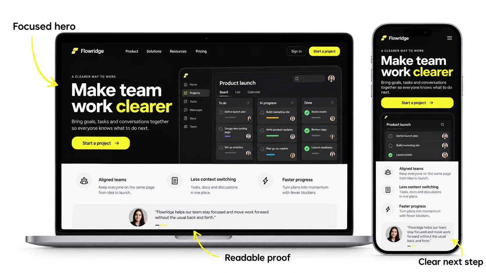
The fold still matters, not because people refuse to scroll, but because it is where the decision to keep reading gets made. A working hero answers three questions fast:
A quick diagnostic we use constantly: cover everything except the hero, hand it to someone outside the company, and ask them to describe the product in one sentence. If they cannot, no amount of design further down the page will rescue it.
NN/g’s Scrolling and Attention research found that attention remains concentrated near the top even when visitors scroll. Make the audience, promise, and reason to continue clear in the hero.
Proof goes early when the claim is large. The bigger the promise, the sooner the evidence has to appear. A page claiming a dramatic time saving needs the interface or a customer name within the first scroll.
Mechanism goes early for technical buyers. Engineers and technical evaluators want to know how it works before they care what it saves. For them, the "how" section is the trust builder.
Depth goes early in a considered purchase. If the buyer will need to convince three other people, give them the material to do it rather than forcing a call first.
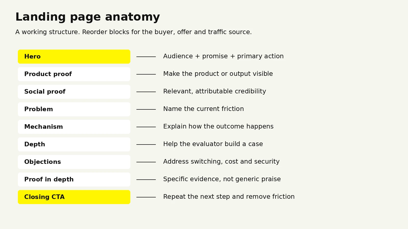
A useful hero makes the audience, product, and outcome clear.
The examples below include published website case studies, a creative-agency template, and Dribbble product concepts. They are references for design patterns, not a ranked list or evidence of measured conversion lift. The commentary describes what to study and test in your own context.
Explore Landify — landing page structure as a reference for hierarchy and content grouping across responsive web layouts and product screens. Landify is a real-estate management-platform case study; it does not report landing-page conversion lift.
An AI landing page concept published on Dribbble. Study how the product or output is presented, rather than treating the shot as a tested funnel.
The pattern: designing for a category the buyer cannot picture yet. AI products have a specific problem. The category is crowded, the claims are interchangeable, and the buyer has usually been disappointed by something similar. Pages in this category live or die on how quickly they make the abstract concrete.
What to take from it: when your product does something the buyer cannot visualize, the hero has to carry a visual of the output, not a visual of the concept. Show the thing the product produces. A page for an intelligence layer should show the intelligence appearing somewhere a person would actually see it.
A full SaaS website case study for an AI customer service platform, built to communicate complex automation with clarity and trust.
The pattern: sequencing complexity. Automation products fail on landing pages when they try to explain the whole system at once. The fix is a staged reveal: outcome first, then a simplified mechanism, then the depth for people who want it.
What to take from it: decide explicitly which section is allowed to be complicated. Usually exactly one. Every other section gets simplified to protect it. Pages that let complexity leak into every block read as heavy and lose people before the mechanism section earns its keep.
A sales management SaaS site designed and built in Webflow, covering UI/UX, product storytelling, and conversion-focused pages. See the UnifyIQ case study.
The pattern: pages designed against a sales motion. Sales tooling is bought by a manager and used by a team, which means the page has two readers with different questions. The manager wants pipeline visibility and reporting. The rep wants to know it will not add admin work.
What to take from it: when a product has a buyer and a separate user, give each one a dedicated section rather than blending their concerns into one generic feature grid. Blended messaging tends to convince neither.
A human-first HR platform covering brand identity, dashboards, and the web experience. Published on Behance and as a case study.
The pattern: brand and landing page designed as one system. The most common reason a landing page feels generic is that it was designed after the brand, from the brand, without either informing the other. When the identity and the page are built together, the page inherits distinctive type, color, and tone instead of reaching for whatever is current.
What to take from it: if your landing page could carry a competitor's logo without anything looking wrong, the problem is upstream of the page. That is a brand system issue, and redesigning the hero will not fix it.
An AI property advisor that recommends homes based on lifestyle and behavior rather than filters. On Behance and in our case studies.
The pattern: leading with the frustration, not the feature. When a product replaces a painful existing behavior, the fastest route to attention is naming that behavior precisely. Endless filtering and manual searching is a concrete, recognizable experience. "AI-powered recommendations" is not.
What to take from it: write the problem section before the solution section. If the problem statement is specific enough that your buyer winces, the rest of the page has far less work to do.
A dark-UI fintech landing page exploration with analytics visuals, on Dribbble.
The pattern: visual continuity between marketing and product. A dark marketing page can fit a dark product experience, but theme alone does not establish trust. Choose a palette that supports the brand, the content, and accessible contrast.
What to take from it: match the page to the product and audience, rather than choosing a theme because it is fashionable. Check text and UI contrast in both dark and light palettes.
A creative-agency Webflow template with oversized editorial typography, deep purple surfaces, and vivid yellow-green accents. This is an agency reference rather than a SaaS product page.
The pattern: typography as the differentiator. When a page has little product UI to show, type does the work that a screenshot would otherwise do. Editorial type systems with real scale contrast are the cheapest way to make a page feel considered.
What to take from it: if your product is hard to screenshot, invest the design budget in type and layout rhythm rather than in decorative illustration. Illustration dates quickly. A strong type system does not.
Earnify, OpsLoop, and SaleX are product interface explorations rather than marketing pages.
The pattern: product UI can provide concrete evidence of what the product does. Compare a tightly cropped, annotated screen with illustration in context; no visual format guarantees better conversion.
What to take from it: crop hard. A full dashboard screenshot at hero size is unreadable. One panel, one number highlighted, one interaction shown, is legible at a glance and carries the claim.
Compare these concepts with Zapmail’s SaaS product surface. Consistent product interface design helps connect the marketing promise with the experience visitors will actually use.
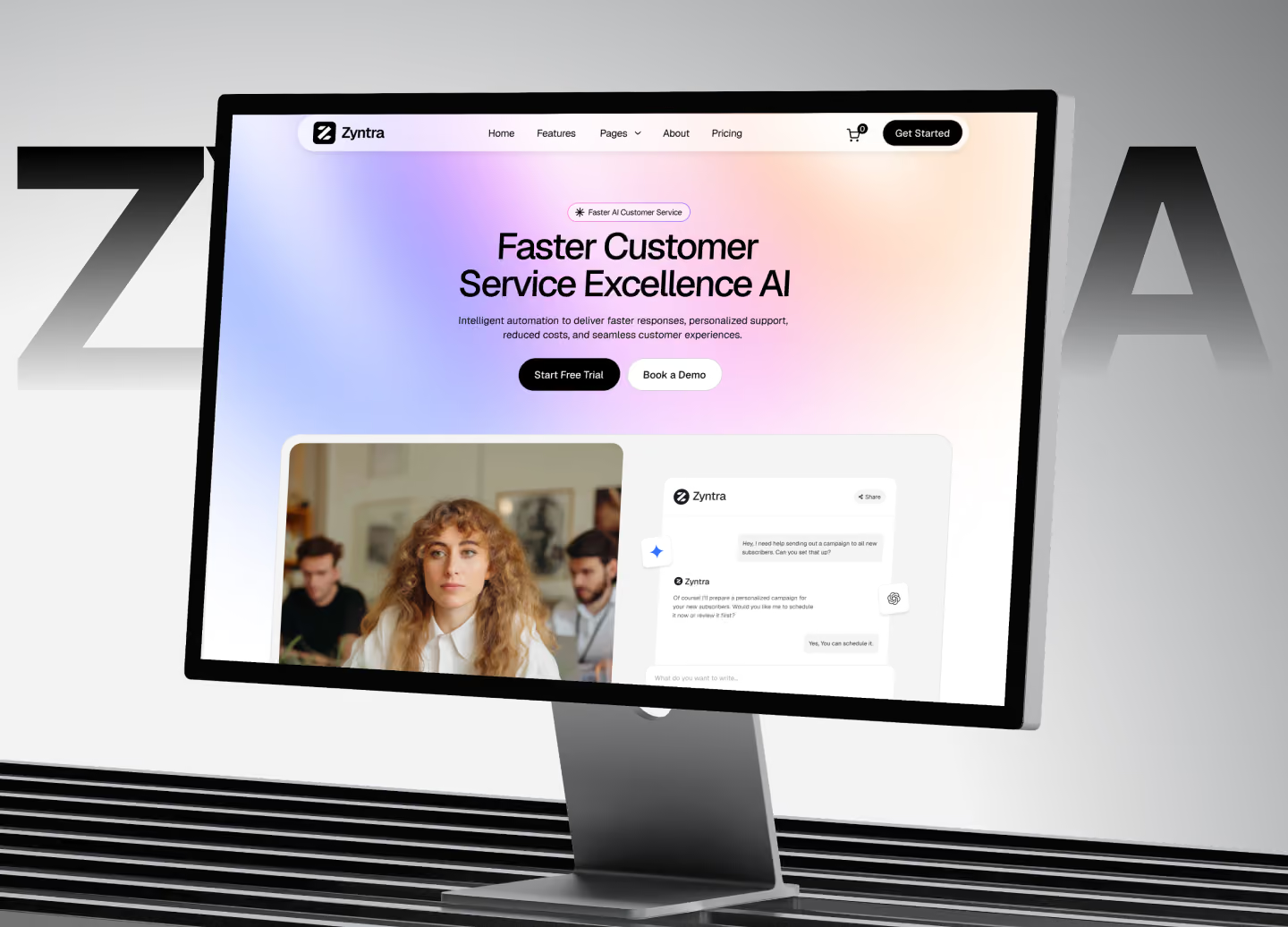
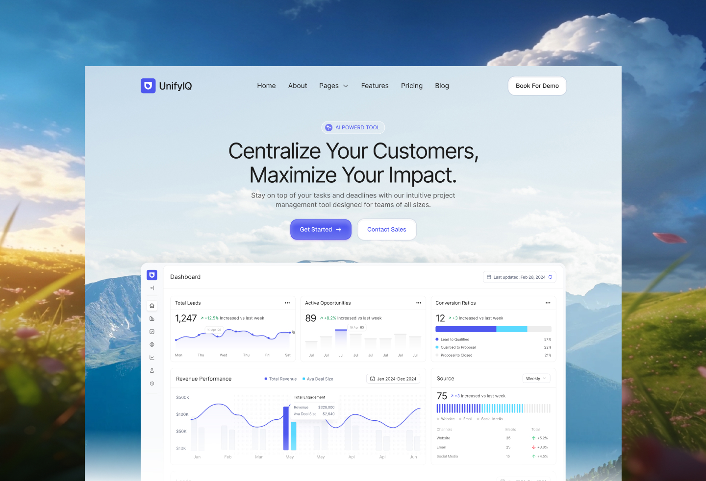
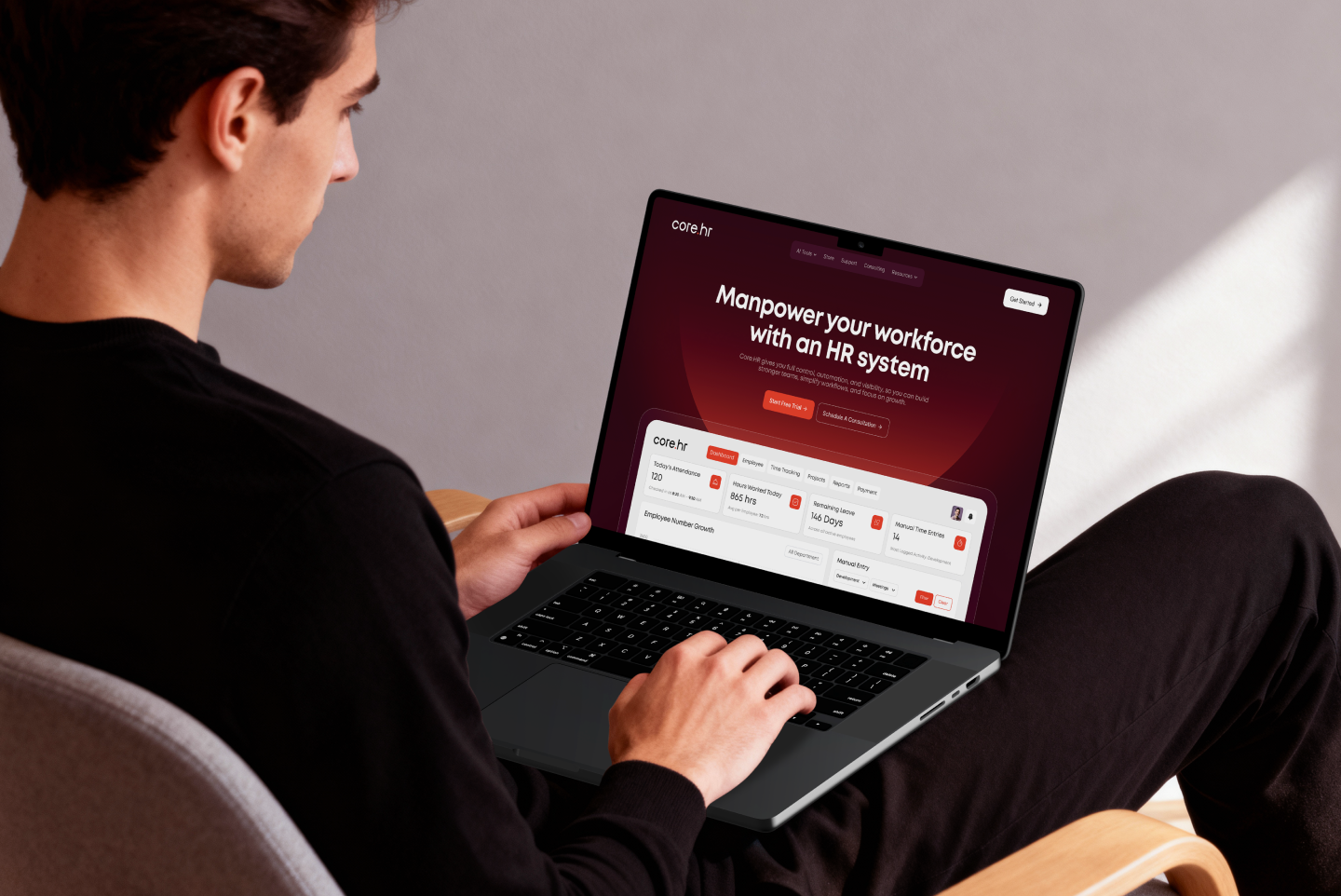

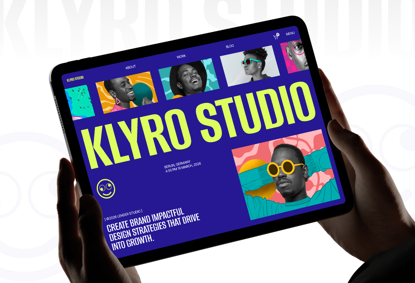
These five images are reused from the published case studies. They demonstrate visual approaches; they do not establish conversion outcomes.
Explore the original Nero AI landing page concept and fintech SaaS landing page exploration. Product references include Earnify’s merchant interface concept, OpsLoop’s micro-task interface concept, and SaleX’s order page concept.
These get conflated constantly, and the conflation produces pages that do neither job. A homepage serves many audiences and many intents. A landing page serves one audience arriving with one intent from one source.
| Criterion | SaaS homepage | Campaign landing page |
|---|---|---|
| Traffic | Mixed: brand search, direct, organic, existing users | Single source: ads, outbound, a specific campaign |
| Audience awareness | Ranges from unaware to existing customer | Narrow and known |
| Navigation | Full nav, footer, multiple paths | Reduced or removed |
| CTA count | Several, tiered by readiness | One, repeated |
| Message | Positioning for the whole product | One use case or one segment |
| Success metric | Engagement, routing, assisted conversion | Conversion rate on the single action |
B2B landing page examples that work tend to differ from product-led pages in four ways.
Longer pages, not shorter. Considered purchases need more evidence, not less. The instinct to cut length usually removes the material an evaluator needed to make the internal case.
Two CTAs at different commitment levels. A high-intent action such as booking a call, and a low-commitment one such as a detailed overview. Forcing a single high-friction action loses everyone not yet ready.
Explicit objection handling. Security posture, integration coverage, implementation time, and contract terms. In B2B these are not footnotes. They are the reason deals stall.
Named, specific proof. A logo wall is weak proof in B2B. A named customer in the same industry with a specific situation is strong. Where NDAs prevent naming, describing the company by shape ("a 200-seat logistics operator") still beats anonymity.
Self-serve products invert several of these. The page is shorter, the signup path is the only real CTA, free tier terms get stated plainly near the fold, and the product visual does most of the persuading. Where a B2B page builds a case, a product-led page removes friction from an action the visitor is already halfway toward taking.
For the wider evaluation journey, read our B2B SaaS UX guide and explore SaaS product design services.
Our guide to B2B website design covers the wider evaluation journey. If visits fail to become activated customers, investigate why a SaaS product isn’t converting across the page, signup, and product.
Different sources answer different questions. Using the right one for the right question saves hours.
| Source | Best for | Limitation |
|---|---|---|
| Land-book, Lapa Ninja, One Page Love | Broad visual range, fast scanning across categories | Visual references; a screenshot does not establish conversion performance |
| SaaS-specific galleries | Category-matched structure, section-level browsing | Coverage and update frequency vary by source |
| Dribbble and Behance | Directional concepts, type and color exploration, unreleased thinking | Includes concepts and shipped work; confirm the context |
| Mobbin and similar flow libraries | Real shipped UI including onboarding and signup | Product-focused, less marketing page coverage |
| Awwwards, Siteinspire | Ambitious motion and interaction work | Evaluate motion, accessibility and performance against your own needs |
| Competitor pages directly | The exact objections your buyer carries | Copying a competitor's mistakes is easy |
| Your own product UI | The most credible visual asset you own | Requires cropping and art direction to read well |
Scrolling without a capture system produces nothing. This is the loop we use.
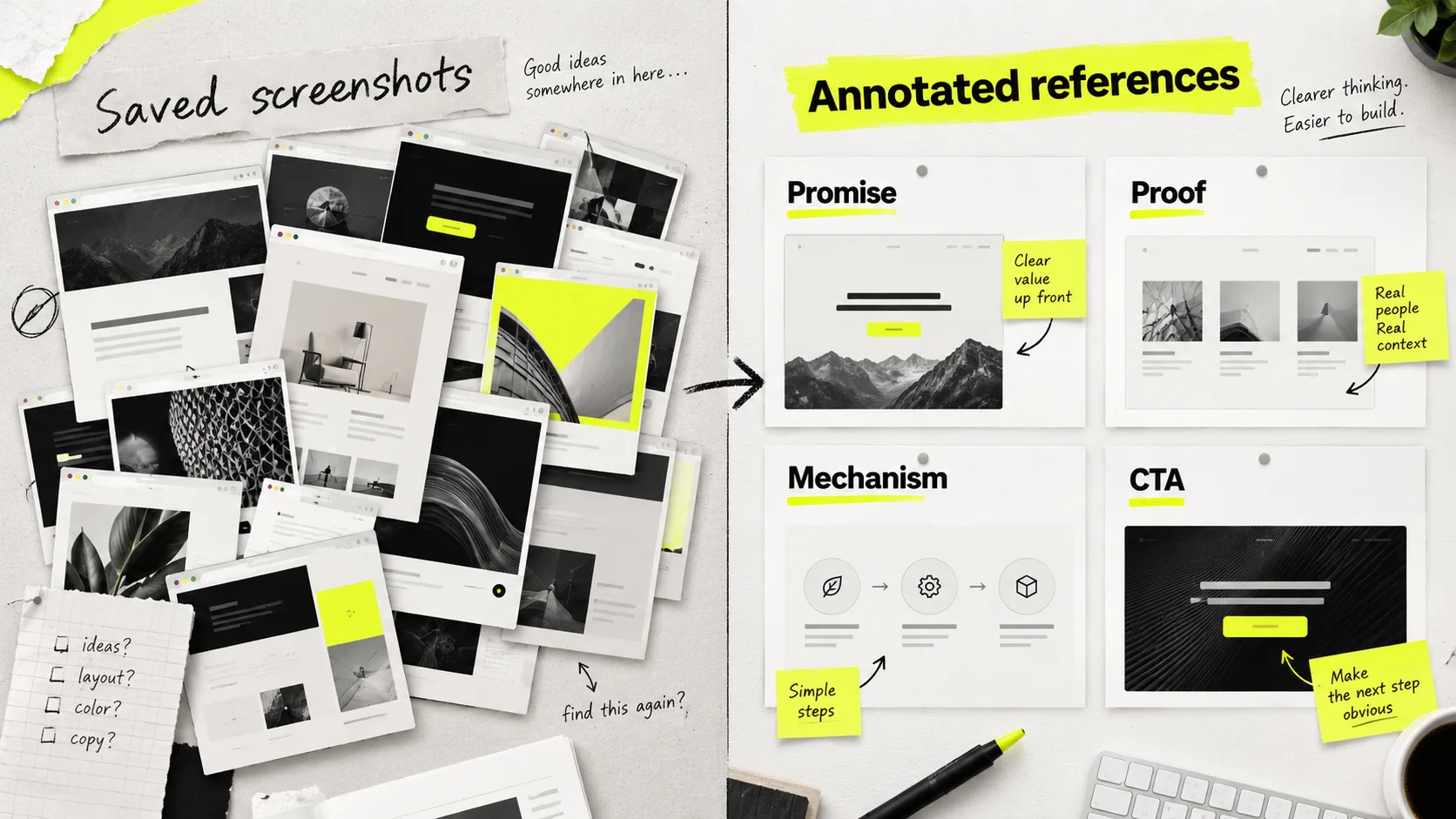
Browse Landbook’s website gallery, Lapa Ninja’s landing page references, One Page Love’s single-page examples, and Mobbin’s product flows. A gallery entry is inspiration, not evidence of business results.
This is the sequence we run, compressed. It works whether you are building in-house or briefing a partner.
One audience, one source of traffic, one action. If the sentence needs an "and," you are describing two pages. Ambiguity here produces every downstream problem.
The strongest headlines are usually lifted from how customers describe the problem, lightly tightened. Sales call notes, support tickets, onboarding surveys, and review sites are all faster than a brainstorm and produce better copy.
Using your inventory from the inspiration phase, decide the sequence and write one line stating what each block must accomplish. This document is the brief. A page designed without it will be reorganized three times.
This is the step most teams skip and it is the most expensive one to skip. Real copy determines how much space every block needs. Designing first produces layouts that break the moment real sentences arrive, and headline decisions get made to fit a box rather than to persuade.
No color, no imagery, no brand. Grayscale forces hierarchy to be created by size, weight, and spacing, which is where hierarchy should come from. If the page does not work in grayscale, color will only disguise the problem.
Check text/background pairs against WCAG 2.2’s minimum contrast guidance: at least 4.5:1 for normal text and 3:1 for large text, with defined exceptions. Recheck after applying the brand palette.
A SaaS landing page template is a reasonable choice in specific circumstances and a poor one in others.
| Use a template when | Build custom when |
|---|---|
| Validating a message before committing budget | The brand is a genuine differentiator |
| Running many campaign variants quickly | The product needs an unusual explanation |
| Timeline is measured in days and stakes are low | The page is the primary revenue surface |
| No designer available and speed beats polish | You are competing against well-designed incumbents |
If you go the template route, change the type system and the imagery direction at minimum. Those two changes remove most of the recognizable template signature. Leaving both stock is why templated pages read as templated.
Choose custom landing page design when the offer, brand, or product explanation needs a structure a template cannot support.
Mobile needs deliberate prioritization. Adjust headline length, product crops, spacing, and section density for narrow screens. Use accordions only where they preserve access to useful detail; avoid hiding essential proof. Check touch targets, keyboard access, and the full mobile reading path.
Our guide to designing for mobile first offers useful principles for narrow-screen hierarchy and interaction. Adapt app patterns to the page’s reading path.
Slow loading can lose visitors before they evaluate the design. Set a weight budget before build, compress and modern-format every image, lazy-load anything below the fold, and keep third-party scripts to what you will actually look at.
Use web.dev’s Core Web Vitals guidance to measure loading, responsiveness, and visual stability with LCP, INP, and CLS. Check real-user data alongside lab results.
The 2020 Milliseconds Make Millions report hosted by Think with Google observed relationships between faster mobile experiences, conversion, and order value in retail and travel. It supports measuring speed; it does not guarantee the same revenue change for a SaaS page.
Scroll depth, section-level engagement, CTA clicks by position, and form drop-off. Without these, the next iteration is guesswork. And changing the hero, the proof section, and the CTA copy simultaneously means you learn nothing from the result.
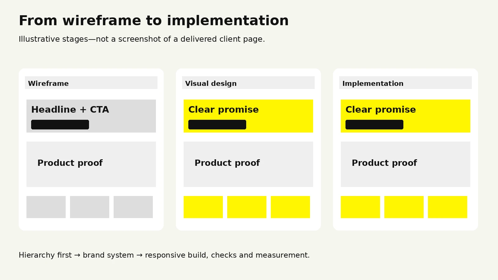
Choose the argument and write the copy before polishing the layout.
These are the recurring ones. Most are invisible to the team that built the page, because they know what the product does.
The hero that says nothing. Unclear messaging is one reason why most startup websites fail. Abstract headlines like "Work, reimagined" or "The future of operations" feel premium and communicate nothing. If the headline would fit on a competitor's page unchanged, rewrite it.
Hiding the product. Pages that show only illustration, gradient shapes, or lifestyle photography ask the visitor to trust a claim with no evidence. Show the interface.
Feature lists with no causal chain. A grid of features answers "what is in it" and leaves "why does that produce the outcome you promised" unanswered. Each feature should visibly connect to the promise made in the hero.
Competing CTAs. Strong visual hierarchy in design makes the primary action recognizable. Several equally prominent actions can make the next step unclear. Choose a primary action and present supporting paths with a deliberate hierarchy; validate the result with your visitors.
Proof placed too late. Social proof at the very bottom arrives after the skeptical visitor has already left. At least one credibility signal belongs within the first scroll.
Unannotated screenshots. A raw product screenshot is not self-explanatory. Crop to the relevant panel and label what the visitor is looking at.
Ignoring the post-click experience. SaaS user onboarding needs to deliver on the page’s promise. Ad copy promising one thing and a page delivering another creates a mismatch that no design fixes. The message match between source and page is part of page design.
Motion that delays reading. Scroll-triggered animation that holds content back until an element enters view adds friction on every scroll. Motion should reward attention, not gate it.
Forms asking for more than the offer is worth. Make conversion-focused UX decisions about which information is needed now. Eleven fields for a whitepaper is a bad trade. Ask for what the next step genuinely requires.
Designing for the demo instead of the buyer. Pages sometimes get optimized for how they look in a pitch deck or on Dribbble. Those are different audiences with different goals.
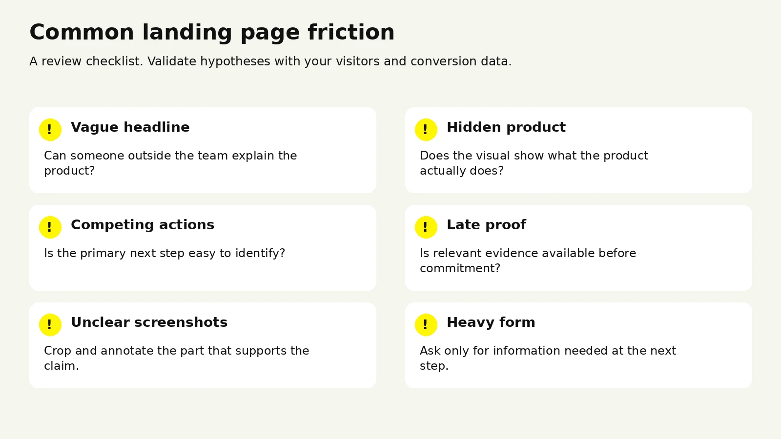
Use our landing page best practices checklist and landing page conversion-rate guide when planning the next iteration.
Baymard’s research on checkout form fields finds that unnecessary fields increase checkout effort. The study concerns ecommerce checkout; use it as a principle to test in your lead forms, not a SaaS conversion benchmark.
At some point the question stops being which reference to use and becomes whether to build in-house or bring in help.
Bringing in a partner tends to pay off when the page is a primary revenue surface, when your internal design capacity is fully committed to product work, when you need several campaign variants faster than a single designer can produce them, or when you are entering a category where the incumbents are visibly well designed and a mediocre page will read as a weaker product.
Keeping it in-house makes sense when you have a designer with conversion experience and available time, when the page is genuinely experimental and will be rewritten in a month, or when a template plus strong copy is sufficient for the stage you are at.
Price varies by market and scope, so the variables matter more than any single figure.
| Factor | Lower | Higher |
|---|---|---|
| Deliverable | Design only, handed to your developer | Design plus build, deployed live |
| Page count | One page | Page plus variants and sub-pages |
| Content | Copy supplied by you | Messaging and copywriting included |
| Product visuals | Existing screenshots reused | Custom UI illustration or 3D |
| Motion | Static | Scroll interaction and micro-animation |
| Brand | Established system to work within | Identity work required first |
| Research | None | Customer interviews, competitive audit |
Wolfpixel’s pricing page lists a $1,950 Landing Page Launch Sprint including strategy, design, build, and a live page, with a 48-hour turnaround. It also lists three-day delivery for standard landing pages. Confirm your brief, readiness, and final scope with the team; compare proposals by deliverables rather than price alone.
Compare website design packages by scope and ownership. A monthly design subscription can fit recurring campaign work; redesigning an existing site needs a brief covering existing content, URLs, and performance.
Read how to evaluate UX agencies for shortlist questions, and review our team and track record alongside shipped work and the proposed handoff.
Speed can come at the cost of research, so ask explicitly what a fast turnaround skips. Highly art-directed pages can be difficult for a marketing team to update without the original designer, so ask how much of the page you will be able to edit yourself. And a page designed without measurement instrumented is a page you cannot improve, regardless of how good the first version is.
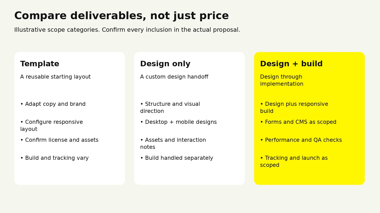
Review current landing page pricing and scope, or send us your landing page and reference shortlist.
Length should follow how much evidence the buyer needs. A self-serve product with a free tier can convert on a short page, because the visitor is committing to a trial rather than a purchase. An enterprise product with a long sales cycle usually needs a substantially longer page, because the visitor has to assemble an internal case. The better question than length is whether every section is doing work. Cut sections that do not advance the argument, and do not cut sections that answer real objections.
For a campaign page tied to paid traffic, usually not. Removing nav keeps attention on the single action. For a homepage or an organic landing page where visitors may arrive at different stages, keep navigation, since forcing someone researching a product into a single funnel action tends to lose them. A middle option that works well: a reduced header with just the logo and the primary CTA.
Full redesigns are usually the wrong unit of change. Continuous section-level iteration can be easier to evaluate than periodic overhauls, because you learn which change caused which result. Trigger a full redesign when the positioning changes, when the brand changes, or when the page no longer matches the product it is selling. Otherwise, improve blocks individually. Our guide to redesigning an existing site explains how to scope a broader change.
Yes, with two conditions. The Klyro Studio template build shows an agency template’s visual system; adapt it to your offer. Change the type system and the imagery direction, since those two elements carry most of a template's recognizable signature. And write original copy, because identical structure with distinctive language reads as considered, while distinctive structure with generic language reads as empty.
If the sources bring meaningfully different audiences or promises, yes. Matching the page to a specific ad’s promise can reduce confusion. Validate its effect with your own audience and conversion data. Build the core page first, then split when a source has enough volume to justify maintaining a variant.
Start with conversion rate on the primary action, scroll depth, and CTA clicks broken down by position on the page. Those three together tell you whether people are arriving, staying, and acting. Section-level engagement comes next, since it shows which block is losing people. Avoid running multiple changes at once, and give any test enough volume to mean something before acting on it.





.svg)



.svg)

.svg)

.svg)

.svg)

.svg)
.svg)
