October 26, 2026
Web Design
Landing Page vs Homepage: Key Differences and When to Use in 2027


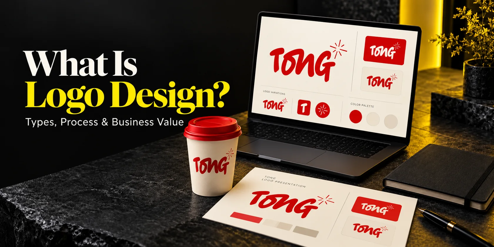
Logo design is the process of creating a distinctive visual identifier for a business, product or organization. It can use a name, initials, a symbol or a combination of these, shaped through research, concept development, drawing, typography and testing. The finished logo should help people identify your business and remain usable wherever they encounter it.
For a small business founder, the useful question is what makes that identifier worth investing in. Your logo needs to work in a website header, on a proposal, inside a profile circle or on a product label. A beautiful presentation is a starting point; the ordinary places your customers see it are the real test.
I’m Masuder Rahaman, Brand Design Director and Founder of Wolfpixel, with eight years of branding experience. I lead logo, identity and guideline work. This guide explains the decisions behind a usable logo, with published Wolfpixel projects and clearly labeled illustrative mockups. Wolfpixel offers the design services discussed here; the examples show design work, not measured revenue or recognition gains.
A logo is one part of a wider identity. If you are deciding between those purchases, our branding, brand identity and logo design comparison explains the boundaries. Here, the focus stays on the logo: its types, construction, process, practical value and handoff.
The seven commonly taught types of logo design are wordmarks, lettermarks, pictorial marks, abstract marks, mascots, combination marks and emblems. This is a useful classification, not a universal standard. Some guides separate single-letter forms or group symbols differently. A business can also use related versions across more than one category.
| Type | What it uses | Example to recognize the form | Decision for a small business |
|---|---|---|---|
| Wordmark | The full business name in distinctive lettering | Coca-Cola’s script name | Useful when learning the name matters; check its length and readability |
| Lettermark / monogram | Initials rather than the full name | IBM’s initials | Compact, but new customers may still need the full name nearby |
| Pictorial mark | A recognizable object or image | Apple’s apple symbol | The picture can aid recognition; do not assume unfamiliar customers know the company |
| Abstract mark | A nonliteral shape or arrangement | Nike’s swoosh | Can become a distinctive cue; it does not explain the offer by itself |
| Mascot | A character used as the identifying face | KFC’s Colonel character | Can support an expressive voice; detail needs careful handling at small sizes |
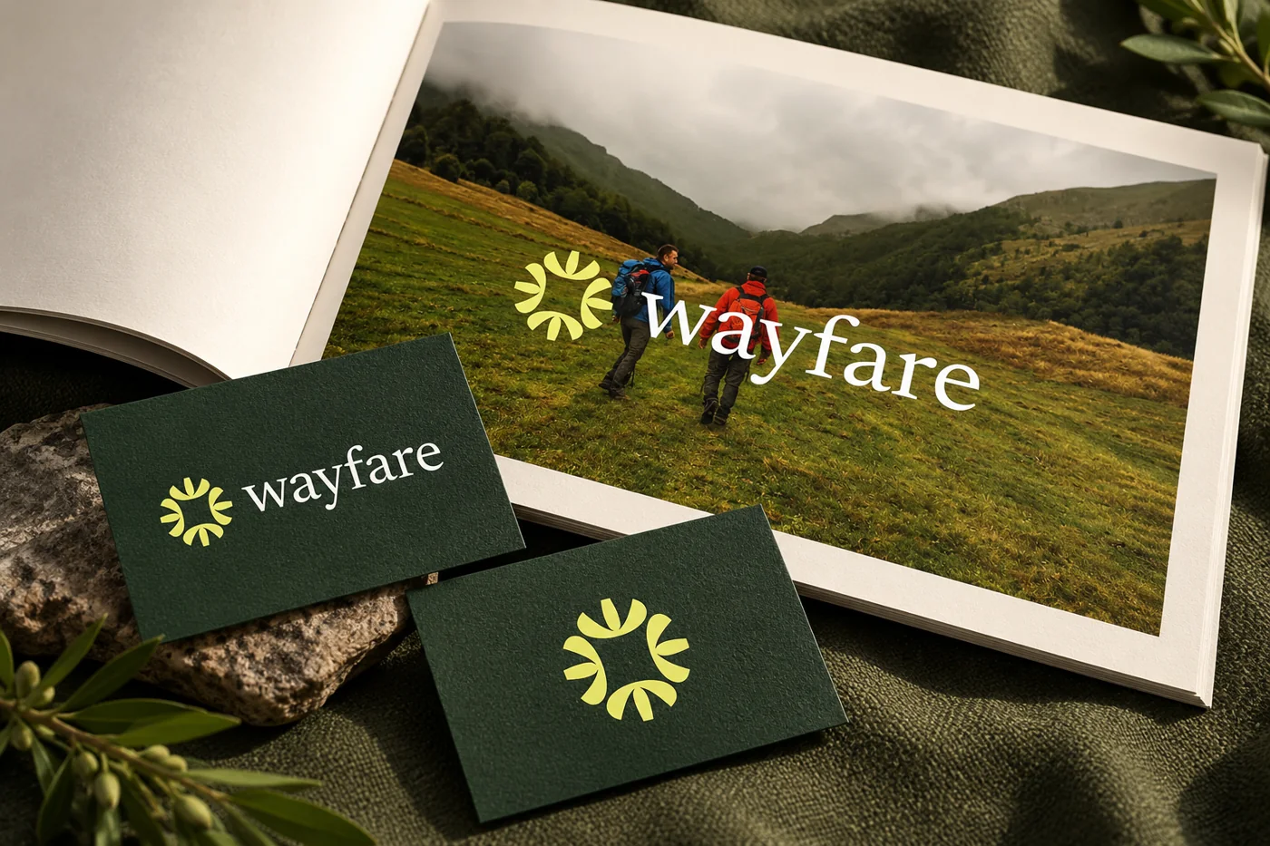
| Combination mark | A name paired with a symbol or character | Wolfpixel’s Wayfare wordmark and compass symbol | Provides a name and a visual cue; agree how the parts may be used separately |
| Emblem | Text integrated into a badge, seal or enclosing form | Harley-Davidson’s bar-and-shield emblem | Useful for a unified badge; check small text and production limitations |
A new consultancy may get more immediate use from a readable wordmark than from a symbol nobody associates with the business yet. A longer company name may need a compact version, but an acronym can create another name for customers to remember. Ask what information the mark will carry in its most common setting.
A combination mark can give you a name-led starting point and a compact symbol for constrained spaces. That flexibility depends on deliberate design and usage rules. Removing the name from any logo does not automatically create an effective app icon.
A responsive logo changes its arrangement or detail for different spaces; an animated version adds movement. Those treatments can apply to several logo types. Decide on the recognizable static mark and essential small-use version first. Add motion when you have a real use for it, with a still alternative where needed.
For another primary teaching reference, Adobe’s logo-format guide explains typography-based, pictorial and combination approaches. Different category counts are a reminder to assess the work rather than the label.
Share your business, current mark and first three applications. Define the logo versions, approval checks and handoff your team needs.


A logo can contain a name, letterforms, a symbol, color, spacing and a defined arrangement. It does not need every ingredient. A strong wordmark may rely entirely on lettering, while a symbol-led system may pair its icon with a separate name treatment.
The way a name is drawn affects what people can read and how the mark feels. Look at individual letters, their spacing and the complete word. A typeface that looks good in a heading may need adjustment to work as a compact identifying mark. Decorative strokes should not make the name ambiguous in the applications you need.
A symbol provides a visual cue; negative space shapes the empty areas within and around it. A hidden idea can be rewarding, but it is optional. The primary form still needs to read clearly when someone does not discover the explanation. Do not add a leaf, globe or roof solely because it appears in your industry.
Choose colors in relation to the audience, category, surrounding materials and production needs. A color does not guarantee one universal emotion. Review the mark on the actual light and dark backgrounds you expect to use, and agree on one-color alternatives. A gradient may be useful on screen while a stamp needs a simpler treatment.
A lockup is an agreed arrangement of the logo’s parts. The symbol and name may need different proportions in a horizontal website header and a stacked sign. Define those versions instead of letting everyone improvise them. Clear space protects the mark from nearby text and graphics.

A tagline can sit alongside a logo when it remains readable, but it need not be built into every version. A small-business name that is clear without a slogan is often easier to place. Supporting type, photos and templates belong to the wider brand identity system, which can carry information the logo does not need to contain.
Five useful logo design principles are simplicity, relevance, distinctiveness, versatility and lasting suitability. These are review criteria, not a scoring formula. Memorability and readability matter across them, and a deliberate design can balance them in different ways.
“It doesn’t feel premium” can mean several things. “The thin strokes disappear on the product label” identifies a visible problem. “The initials resemble a competitor’s mark” opens a different question. Connect your feedback to the audience, readability, distinctiveness or application, so the designer knows what needs investigation.
Keep category familiarity and distinction in balance. A mark can be appropriate without copying the colors and shapes used by every other business in the space. Likewise, being unfamiliar is not automatically an advantage if people misread the name.
A practical logo design process has seven connected steps: brief, research, concepts, digital development, typography and color, testing and refinement, then handoff. Teams may combine or revisit stages. The important part is the decision each stage resolves and the evidence you see before moving on.
Describe the business, the people you serve, the name to use and the three places the logo must work first. Record what should remain from an existing mark and any production constraints. “Friendly accountant for independent shops” gives a more useful starting point than “make it modern.”
Review relevant competitors, customer language and the materials people encounter while buying. Look for confusing similarities and useful category cues. This helps identify a design problem; it does not authorize copying another mark or establish trademark availability.
A logo design concept is the organizing idea behind a direction: why that form, lettering or relationship fits the brief. Rough sketches can explore several ideas without polishing every one. Ask for meaningful alternatives, with a short rationale and a realistic application, rather than many near-identical color options.
Convert promising ideas into controlled digital artwork. Refine curves, spacing, alignment and the balance between name and symbol. Review the mark without a dramatic mockup as well as in context. Real construction work should remain visible when lighting and material effects are removed.
Check the name, palette, light/dark treatments and any small-use variant together. Confirm the spelling and any local-language version with someone qualified to review it. If two writing systems are needed, scope the paired lockup deliberately; a mechanical font substitution may not preserve the intended relationship.
Use the agreed real applications and ask people in the target audience what they can read and distinguish. Separate a usability issue from personal preference. Choose one decision-maker to consolidate feedback, and agree when a revision changes the original scope.
Deliver the approved masters, exports, required versions and practical rules. Open the files in the software and vendor workflows you expect to use. Confirm how questions found during the first implementation will be handled. Approval should mean the kit is usable, not just that a presentation was accepted.
This is the process for the identifying mark. If your audience, positioning, voice and wider visual system also need development, see our complete brand identity process and define that larger scope separately.
Before you approve a logo, make a small proof sheet from your own use cases. A founder who mostly works through proposals and a website needs different evidence from a shop ordering embroidered uniforms and exterior signage. Ask the designer to show the mark at its intended size, with ordinary content around it.
| Test | What to show | What a problem looks like |
|---|---|---|
| Name readability | Website header, invoice and profile context at actual size | Letters merge, the name is misread or the tagline becomes noise |
| Small-use clarity | Your smallest icon, label or avatar placement | Important gaps close or the main shape becomes indistinct |
| One-color reproduction | Solid black and reversed white versions | The idea disappears when a gradient or extra colors are removed |
| Background fit | The light, dark and photographic settings you plan to use | Edges disappear or an unplanned box is needed around the logo |
| Physical production | A sample or vendor proof for the intended material | Thin lines fill in, small text fails or stitching changes the form |
| Independent understanding | Relevant people who have not seen the presentation | They repeatedly misread the name or confuse it with another business |
Ask “What name can you read?”, “What would you look for to find this business again?” and “Does it remind you of another company?” The answers can reveal a problem worth investigating. A handful of friendly opinions does not prove that a logo will improve recognition across your market.
There is no single minimum size that works for every mark and medium. Define it from tests of the actual artwork. A wide wordmark may need a compact companion in a profile circle; an intricate emblem may need a simplified small-use version. Record the threshold rather than trusting a zoomed-in screen view.
A large embossed sign can show a direction beautifully, but your email signature may be where customers see it most. Approve the everyday applications alongside the showcase. If you already have a functioning logo, identify a specific failure before replacing it. Our rebranding strategy guide covers the wider decision when a business or audience has changed.
A finished logo design package should give you artwork you can use and clear instructions for using it. Ask for an organized handoff with the approved versions, appropriate exports and an editable master. The exact file list depends on your website, software and production vendors.
| Deliverable | Typical purpose | Acceptance check |
|---|---|---|
| Editable master | Future authorized changes and clean artwork production | Your designer identifies the source app, required fonts and any linked assets |
| SVG | Scalable artwork for suitable digital applications | The intended artwork is vector-based and renders correctly in your website workflow |
| Transparent PNG | Everyday screen placements that need a bitmap | Edges, dimensions and light/dark versions suit the intended background |
| Production PDF or EPS, where required | Supplying a printer or another production vendor | The vendor confirms usable artwork, color treatment and any special requirements |
| Logo usage sheet | Consistent application by you and collaborators | Approved versions, clear space, minimum sizes, colors and examples are understandable |
A PDF presentation can explain the concept and show applications. A production PDF can carry print artwork. Those are different deliverables. A PDF may contain vector shapes, raster images or a mixture; the extension alone does not guarantee scalable artwork. Ask the recipient or printer to check the supplied file for the intended job.
W3C’s SVG specification describes a format that supports vector and mixed vector/raster graphics. Simply placing a small JPEG inside an SVG does not turn that photograph into clean vector logo artwork. This is why inspecting the actual file matters.
Document what you own or are licensed to use, who may edit the artwork and what third-party assets require separate access. Keep font and illustration license records with the kit. Delivery of a logo file does not itself establish that a name or design is clear for use in every market.
The USPTO’s guidance on strong trademarks is a useful U.S. starting reference on distinctiveness. For clearance and registration decisions, use the relevant jurisdiction’s official guidance and qualified advice for your situation. Set that responsibility before a large production order.
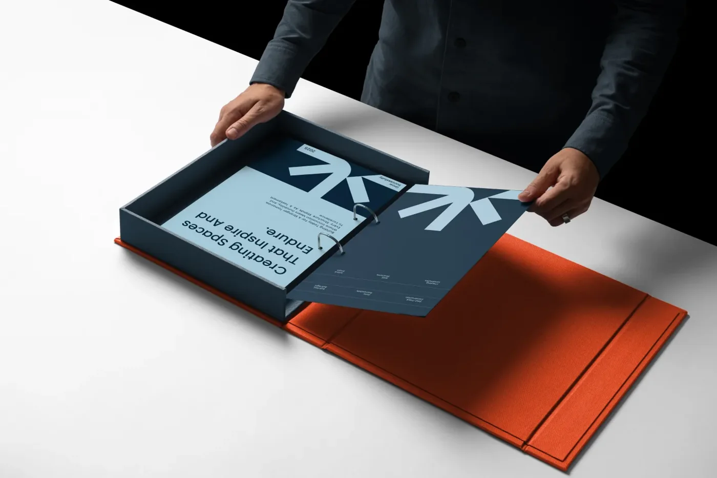
For a larger system, our brand guidelines guide covers the additional rules for typography, imagery, voice and applications. A logo-only usage sheet can be shorter if it answers the decisions your team actually needs to make.
A usable logo can help your business become easier to identify across repeated customer encounters. It can also reduce the everyday work of deciding which mark to place on a document or sending a vendor a replacement file. These are practical contributions, not a promise that a new symbol will cause more sales.
Someone may see your profile, visit your website and later receive a proposal. A consistent identifying mark helps connect those encounters. The name, message and customer experience still need to agree. An unfamiliar symbol on an otherwise unclear website cannot supply the missing explanation of what you sell.
Clear, well-reproduced artwork can make materials feel cared for. Trust also depends on the offer, evidence, communication and the experience of working with you. Treat the logo as one signal within that experience. Replacing the mark will not fix inaccurate claims, unreliable delivery or an unsuitable product.
For a solopreneur, a practical win may be knowing which file to use and having a name that reads clearly on every proposal. A product business may prioritize reliable labeling. Write down the expected improvement before the project, then use a comparable check after rollout.
If your wider materials remain inconsistent, the next useful purchase may be a compact identity system rather than another logo. Our small-business brand identity buying guide explains how to compare that broader scope.
A logo maker can help you explore arrangements or prepare a simple starting point. A designer can investigate the brief, develop original directions and resolve the practical details across your applications. The appropriate route depends on the importance of distinctiveness, your production needs and the support you can provide yourself.
Before using a tool, check its current export options, asset terms, editing access and the work you must do to test the result. Do not assume a generated or template-based mark is exclusive or cleared for your market. Before hiring a designer, ask to see the reasoning, ordinary applications and handoff behind a relevant portfolio project.
Price depends on the research, complexity, revisions, versions and implementation support included. A low number or a large concept count does not tell you whether the final kit will work. Compare a written scope, with clear client inputs and approval boundaries, rather than a promise of “unlimited” design without a defined task.
Business: We help [audience] with [offer].
Name: Use [exact spelling and writing system].
Current issue: Our mark needs to solve [specific problem].
First applications: [Three places, including the smallest or hardest one].
Keep / change: Retain [recognized elements]; investigate [constraints].
Evidence: Review [actual-size tests, one-color proof and relevant feedback].
Handoff: Supply [masters, exports, versions and usage rules] for [software/vendors].
Responsibilities: Name the approver and clarify artwork rights, asset licenses, clearance and production checks.
Explore the logo and visual-system deliverables in Wolfpixel’s brand identity design service if you want a partner to apply this brief. Specify whether you need the identifying mark alone or the wider kit, so the proposal matches the work you actually need.
You can review original work on Wolfpixel’s branding portfolio and ask how a relevant direction was developed and prepared for use. A useful conversation ends with a clearer scope and review criteria.
A common seven-part classification includes wordmarks, lettermarks, pictorial marks, abstract marks, mascots, combination marks and emblems. Other guides group them differently or add letterforms and dynamic variants. Use the categories to compare construction and practical fit, rather than treating seven as a universal standard.
A logo may contain a business name, initials, symbol, color and a defined arrangement with controlled spacing. It does not need all of them. A wordmark can work through lettering alone, while a combination mark pairs a name with a visual cue. A tagline is optional.
A practical sequence is: write the brief; research the audience and category; develop concepts; draw digital directions; resolve typography, color and versions; test and refine; then hand over the artwork and usage rules. Stages may overlap or repeat as the team learns.
Five useful review principles are simplicity, relevance, distinctiveness, versatility and lasting suitability. They are practical criteria rather than a formal standard. Test whether the mark is readable, distinguishable and usable in your real applications instead of judging it only on a large presentation slide.
Logo design is the graphic design discipline focused on creating an identifying mark. Graphic design also includes layouts, publications, packaging and many other forms of visual communication. A logo is one reusable identifier within that wider work.
Wayfare’s name paired with its compass-like symbol is a combination-mark example from Wolfpixel’s portfolio. TONG’s expressive lettering shows how a wordmark can lead an identity. Examples help you recognize a construction approach; they are references to learn from, not artwork to copy.
It is the central idea behind a proposed direction and its connection to the brief. A useful concept explains why the form or lettering suits the business and shows it in relevant applications. Changing only a color does not necessarily create a different concept.
A PDF can present concepts, document usage rules or supply production artwork. Ask which purpose the file serves and whether any required vector artwork is actually present. A presentation PDF should not be your only deliverable if you also need editable masters and everyday exports.
You can consider one for exploration or a simple starting point, provided its current terms and outputs suit your use. Check export quality, asset licensing, editability and the tests you must do yourself. Do not assume the result is exclusive or ready for every production method.
Not always. A readable wordmark may be enough when learning your name is the immediate priority. A symbol can be useful for compact placements or recognition, but it needs an intentional relationship with the name and appropriate usage rules.
Poster design arranges a message for a particular display, event or campaign. Logo design creates an identifier that can be reused across many materials, including posters. A poster can change its headline and layout while keeping the same logo. Our graphic design guide explains the wider discipline.
It can support recognition and a more consistent presentation, but sales also depend on the offer, audience, distribution and customer experience. Measure the specific issue the design addressed. Avoid attributing a revenue change to the logo alone without evidence.
Agree on an editable master, appropriate digital and production exports, necessary light/dark or one-color versions, and basic usage rules. Also clarify asset licenses, artwork ownership or permitted use, and who checks the first implementation. The exact package should follow your applications.