

 24 min read
 Published
A private school website has one job that a public school website does not: it has to win a family that is comparing several schools, often on a phone. The best private school websites make that family feel the school in the first screen and then make the next step, inquire, visit or apply, impossible to miss.
I’m Maniruzzaman Jubayer, Co-founder & COO and Product Design Specialist at Wolfpixel, with 7 years of experience. This guide is for heads of school, admissions directors and marketing and communications teams at private and independent schools who are planning a new website in 2027 and want examples worth copying, with the reasons.
The short answer: the 17 best private school websites for 2027 are Phillips Exeter Academy, Lakeside School, Harvard-Westlake, Groton School, Sidwell Friends, Worcester Academy, The Walker School, Greenhill School, Colorado Academy, Brentwood Academy, Montgomery Bell Academy, Porter-Gaud, The Paideia School, Aidan Montessori, The Bryn Mawr School, Garrison Forest School and Girls Preparatory School. They cover boarding and day schools, girls’ and boys’ schools, faith-based schools, a Montessori school and schools from preschool to grade 12.
Key takeaways:
- Every one of the 17 links tuition or financial aid from its homepage. If yours does not, that is the first fix.
- 12 of the 17 show an admissions action (Inquire, Visit, Apply or Admission) on the first desktop screen. Only 5 do on the first phone screen, without opening the menu.
- 11 of the 17 homepages use the word “Home” as their main heading (H1), and 2 have none. A heading that says who the school is and where, as Worcester Academy’s does, helps families and search engines.
- In a Lighthouse mobile test, accessibility was solid (median score 92) but speed was not: the median Largest Contentful Paint was 22.6 seconds, and none of the 17 homepages met Google’s 2.5-second “good” threshold in that lab test.
- The strongest sites carry one idea everywhere: Groton’s circle, Garrison Forest’s forest, Paideia’s curiosity. One idea, used consistently, beats a new effect on every page.
How we chose and tested these sites: in November 2026 we read the pages Google ranks for private school website examples, including Ubiq Education, Finalsite, SchoolStatus, School Webmasters and Morweb, and the AI Overview for the query. Most are written by website vendors about their own clients. We then reviewed more than 20 US private school websites and kept 17 that each do something worth copying. On November 22, 2026 we captured every homepage at 1440 pixels wide and on a 390-pixel phone screen, recorded what a family sees first, checked the links on the homepage, and ran a Lighthouse mobile test. Wolfpixel did not design any of these websites, and none of these schools is our client.
What makes a great private school website
A great private school website does five things well. These are the checks we used for every site in this guide.
- Says who the school is for in the first screen. Grades, day or boarding, the place, and real students, not only a slogan.
- Makes the next step obvious. Inquire, visit and apply are in the header or one tap away, on desktop and on a phone.
- Explains cost. Tuition and financial aid are linked from the homepage and written in plain words.
- Serves current families too. Calendar, portals, news and forms have their own route, so parents do not dig through admissions pages.
- Works for everyone. Readable text, alt text for images, keyboard access, a reasonable load on mobile data and, where families need it, translation.
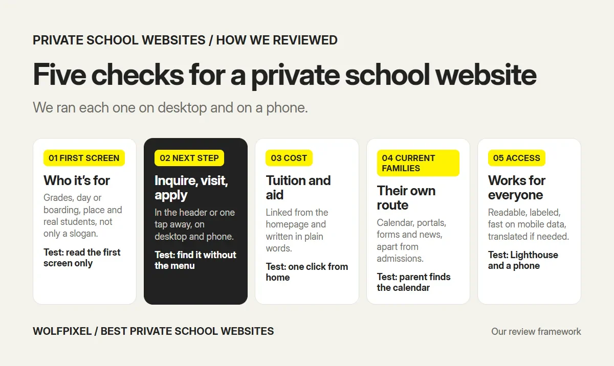
Design style matters, and several of these sites are beautiful. But a family that cannot find tuition or the tour dates will not stay for the typography. These five checks are also where we start every school website design project.
The 17 best private school websites at a glance
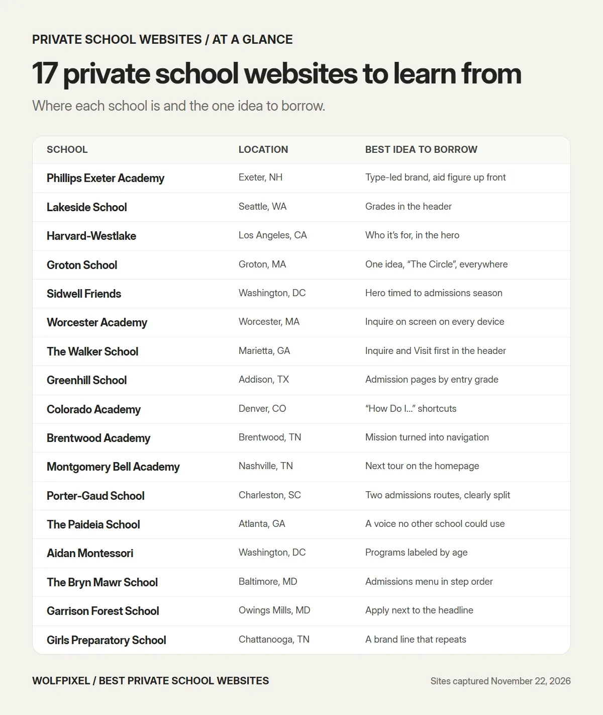
| School | Location | Type | Best idea to borrow |
|---|---|---|---|
| Phillips Exeter Academy | Exeter, NH | Boarding and day, 9–12 | Type-led brand and a headline aid figure |
| Lakeside School | Seattle, WA | Day, 5–12 | Grades in the header, “Admissions & Aid” |
| Harvard-Westlake | Los Angeles, CA | Day, 7–12 | Who the school is for, in the hero |
| Groton School | Groton, MA | Boarding and day, 8–12 | One idea, “The Circle”, everywhere |
| Sidwell Friends | Washington, DC | Quaker day, PK–12 | A hero message timed to admissions season |
| Worcester Academy | Worcester, MA | Day and boarding, 6–12 | Inquire on screen on every device |
| The Walker School | Marietta, GA | Day, PK3–12 | Inquire and Visit first in the header |
| Greenhill School | Addison, TX | Day, PK–12 | Admission pages by entry grade |
| Colorado Academy | Denver, CO | Day, PreK–12 | “How Do I…” shortcuts for families |
| Brentwood Academy | Brentwood, TN | Christian day | Mission turned into navigation |
| Montgomery Bell Academy | Nashville, TN | Boys’ day | Tours promoted on the homepage |
| Porter-Gaud | Charleston, SC | Episcopal day, 1–12 | Two admissions routes, clearly split |
| The Paideia School | Atlanta, GA | Day, age 3–12 | A voice no other school could use |
| Aidan Montessori | Washington, DC | Montessori, toddler–6 | Programs labeled by age |
| The Bryn Mawr School | Baltimore, MD | Girls’ school | Admissions menu in step order |
| Garrison Forest School | Owings Mills, MD | Girls’ school | Apply next to the headline |
| Girls Preparatory School | Chattanooga, TN | Girls’ school | A brand line that repeats |
1. Phillips Exeter Academy
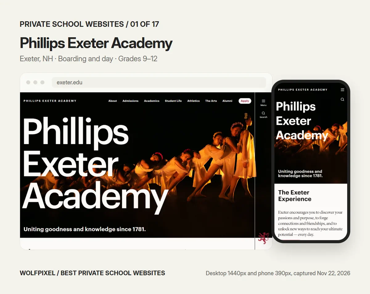
Visit: exeter.edu
Exeter’s homepage is almost all typography: the school’s name set huge over a dark performance photo, with one line underneath, “Uniting goodness and knowledge since 1781.” The header is short (About, Admissions, Academics, Student Life, Athletics, The Arts, Alumni) and ends in an Apply button. Further down, financial aid is not buried in a menu; it is a homepage link that leads with a number, “We give $30M in financial aid.”
- Borrow: one confident type treatment instead of a slideshow, and a concrete aid figure where families can see it.
- Check: on a phone the Apply button moves into the menu, so the first screen shows no next step. The homepage H1 is “Home.”
- Our checks: Admissions action in the first desktop screen, yes; in the first phone screen, no; tuition or aid linked from the homepage, yes; Lighthouse mobile accessibility 91, performance 37, LCP 12.5 s.
2. Lakeside School
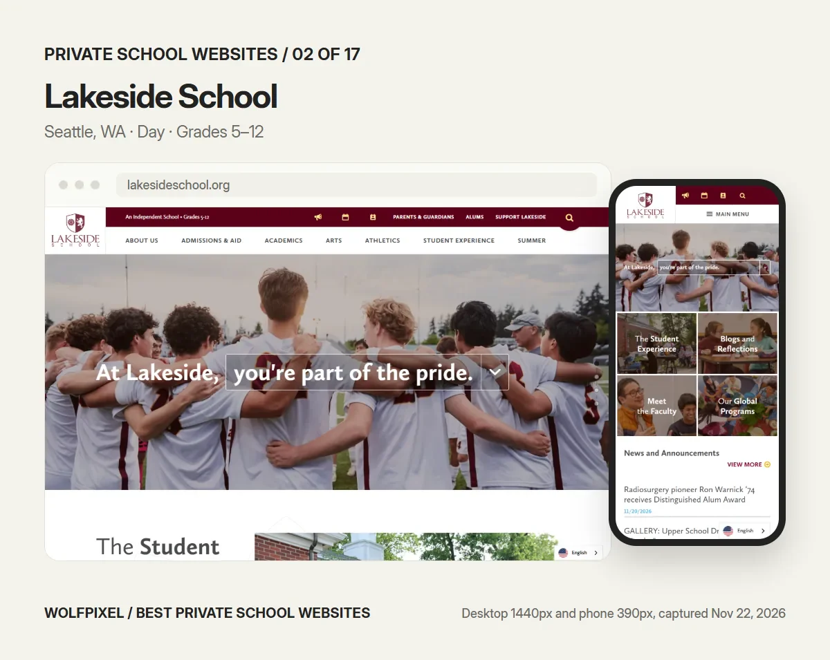
Visit: lakesideschool.org
Lakeside answers the first question a family has before they ask it. The top bar reads “An Independent School • Grades 5–12,” and the main navigation says “Admissions & Aid” instead of “Admissions,” so cost sits next to the application from the first click. Utility links speak to each audience by name: Parents & Guardians, Alums, Support Lakeside. On a phone the homepage turns into a grid of photo tiles, Student Experience, Meet the Faculty, Global Programs, followed by news.
- Borrow: put your grades and school type in the header, and pair admissions with aid in the label.
- Check: the phone view has no admissions link in the first screen, only icons and the menu.
- Our checks: Admissions action in the first desktop screen, yes; in the first phone screen, no; tuition or aid linked from the homepage, yes; Lighthouse mobile accessibility 94, performance 26, LCP 20.8 s.
3. Harvard-Westlake School
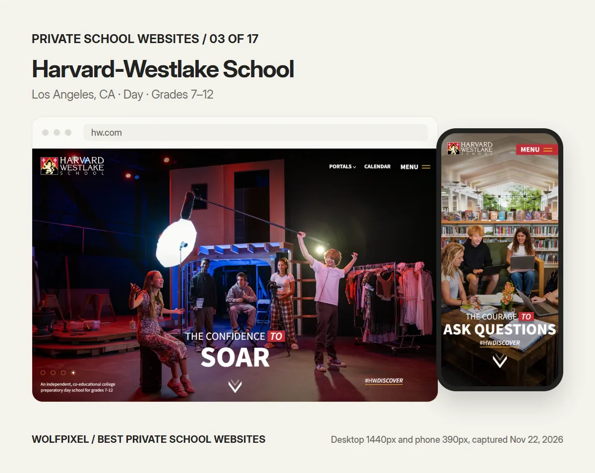
Visit: hw.com
Harvard-Westlake rotates bold headlines over student photography, “The confidence to soar,” “The courage to ask questions,” with a campaign hashtag, #HWDISCOVER. The detail worth copying is small: a line in the corner of the hero says exactly what the school is, “An independent, co-educational college preparatory day school for grades 7–12.” The header puts current families first, with Portals and Calendar next to the menu.
- Borrow: a one-sentence description of the school in the hero, even if the headline is a slogan.
- Check: admissions lives inside the menu, so a prospective family has to look for it on both desktop and phone.
- Our checks: Admissions action in the first desktop screen, no; in the first phone screen, no; tuition or aid linked from the homepage, yes; Lighthouse mobile accessibility 94, performance 30, LCP 22.6 s.
4. Groton School
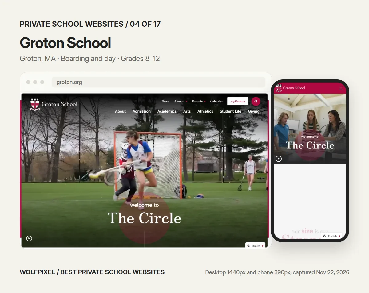
Visit: groton.org
“Welcome to The Circle” refers to the shape of Groton’s campus, and the site turns it into the whole brand: a circle frames the hero video, and the idea returns as the school’s sense of community. Below the hero, a run of large numbers gives families quick facts, and a homepage section is titled simply “Affordability.” Even the page title is useful: “Boarding and Day School in Groton, Massachusetts, Grades 8–12.”
- Borrow: one visual idea drawn from your own campus or history, and a page title that says type, place and grades.
- Check: the video-led homepage had the lowest Lighthouse mobile performance score in our test, 6 out of 100, and the phone view shows no admissions action until the menu opens.
- Our checks: Admissions action in the first desktop screen, yes; in the first phone screen, no; tuition or aid linked from the homepage, yes; Lighthouse mobile accessibility 95, performance 6, LCP 20.0 s.
5. Sidwell Friends School
Visit: sidwell.edu
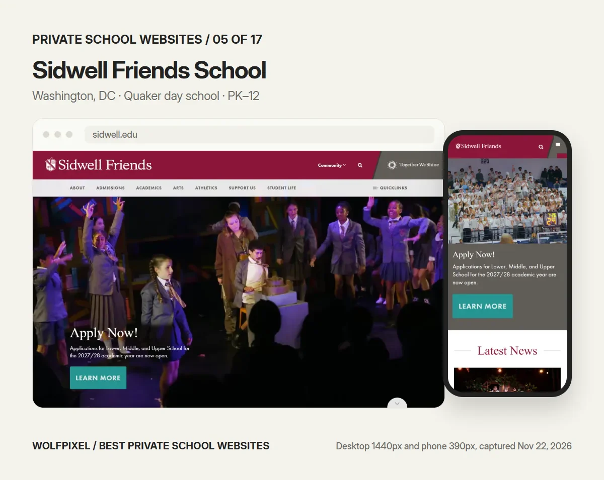
Sidwell’s hero changes with the admissions calendar. In November it read “Apply Now! Applications for Lower, Middle, and Upper School for the 2027/28 academic year are now open,” with one button. On a phone the same message is the first thing a family sees. The rest of the homepage is built on the school’s Quaker identity, with sections for Quaker Values, Queries and Community Voices, and the aid page is named “Affording SFS.”
- Borrow: a seasonal hero that says what a family should do this month, and a warm name for the tuition page.
- Check: the homepage has no H1 at all, and Lighthouse flagged images without alt text, low-contrast text and links without a readable name.
- Our checks: Admissions action in the first desktop screen, yes; in the first phone screen, yes; tuition or aid linked from the homepage, yes; Lighthouse mobile accessibility 85, performance 27, LCP 40.6 s.
6. Worcester Academy
Visit: worcesteracademy.org
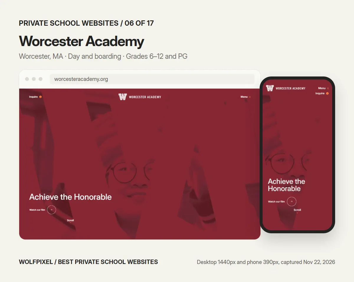
Worcester Academy keeps an “Inquire” link with a small orange dot in the header at every screen size. It is the only site in this guide where the inquiry link is visible in the first phone screen without a banner or a button inside the hero. The H1 is a plain description, “Co-ed Day And Boarding School For Grades 6 To 12 And Postgraduates,” and the homepage sections pair each area with a short promise, such as “40+ Teams. 15 Sports. One Legacy.” and “Our City, Our Classroom.”
- Borrow: a persistent inquiry link, and an H1 that describes the school.
- Check: the red duotone over the hero video means the first screen shows little of the campus or the students in natural color.
- Our checks: Admissions action in the first desktop screen, yes; in the first phone screen, yes; tuition or aid linked from the homepage, yes; Lighthouse mobile accessibility 86, performance 26, LCP 24.6 s.
7. The Walker School
Visit: thewalkerschool.org
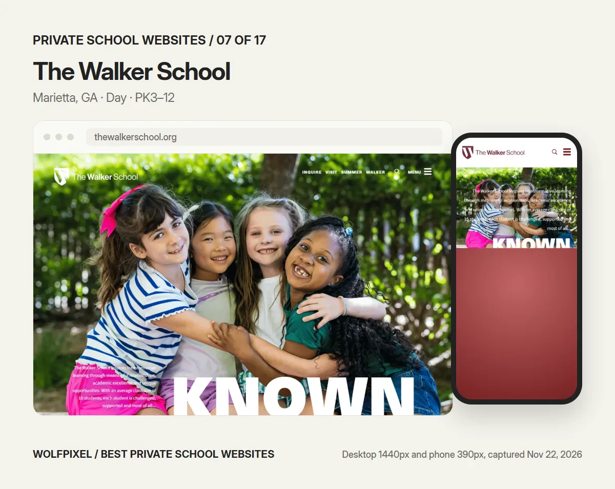
The first two words in Walker’s header are “Inquire” and “Visit,” before Summer, the parent portal and the menu. The hero is one huge word, “KNOWN,” over a photo of four laughing students, with a short paragraph that includes a fact families want: an average class size of 15. Admission content is split into the questions families actually ask, including Plan Your Visit, Tuition and Financial Assistance, International Students and Transportation.
- Borrow: order the header by what prospective families need, and name a concrete number in the hero.
- Check: on a phone, the hero paragraph sits in small white text over a busy photo and is hard to read. Lighthouse also flagged images without alt text.
- Our checks: Admissions action in the first desktop screen, yes; in the first phone screen, no; tuition or aid linked from the homepage, yes; Lighthouse mobile accessibility 85, performance 27, LCP 49.6 s.
8. Greenhill School
Visit: greenhill.org
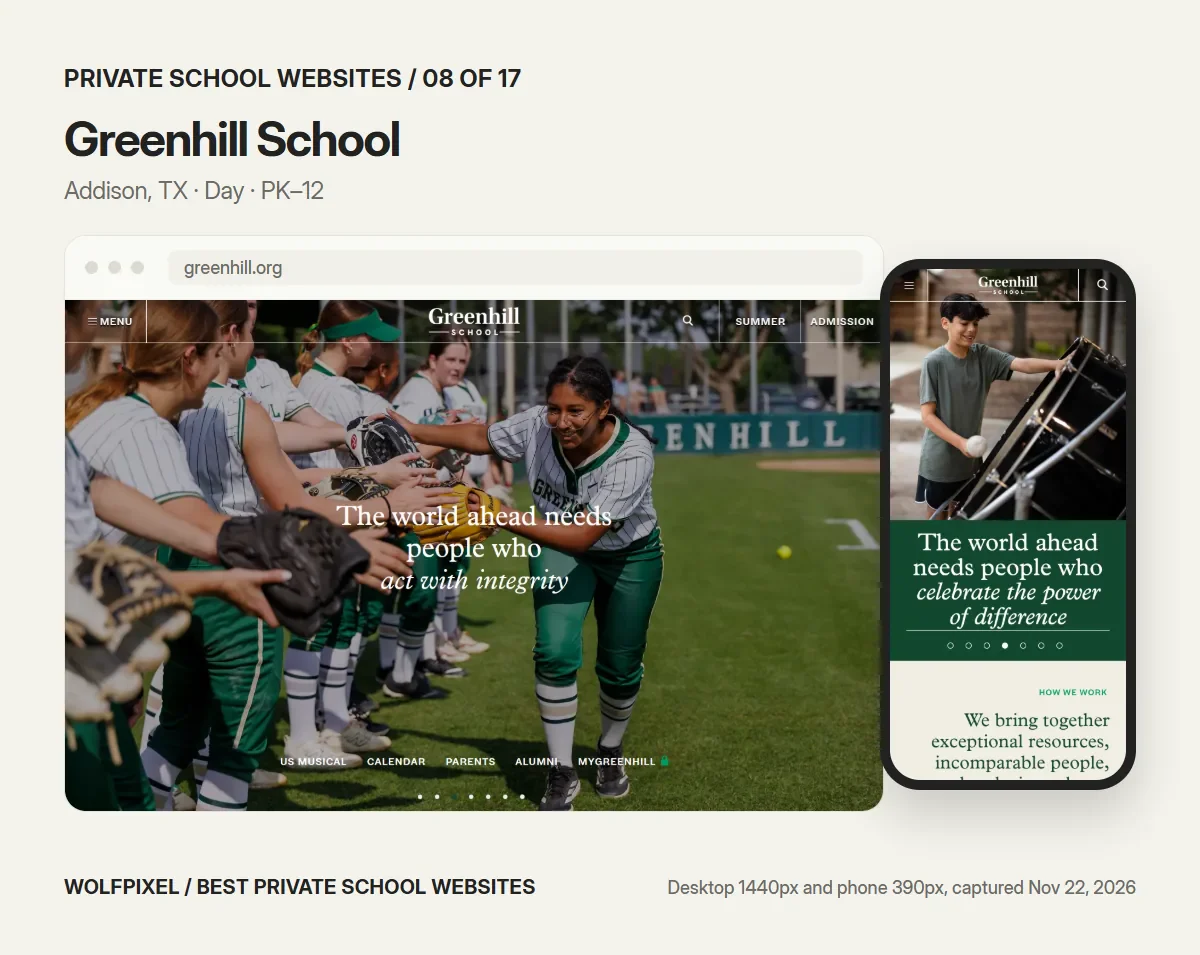
Greenhill’s admission menu is organized by entry point: Pre-K and K, Grade 1, Grades 2–4, Grades 5–8 and Grades 9–11, followed by “Understanding Tuition and Fees” and Financial Aid. A family applying for kindergarten never has to read the high school process. On the homepage, quick links along the bottom of the hero serve the people already in the community: Calendar, Parents, Alumni and the myGreenhill portal.
- Borrow: admission pages by entry grade, and a tuition page that explains rather than only lists.
- Check: the hero is a carousel with a different headline on each slide, so a visitor may never see the message the school cares about most.
- Our checks: Admissions action in the first desktop screen, yes; in the first phone screen, no; tuition or aid linked from the homepage, yes; Lighthouse mobile accessibility 77, performance 22, LCP 14.8 s.
9. Colorado Academy
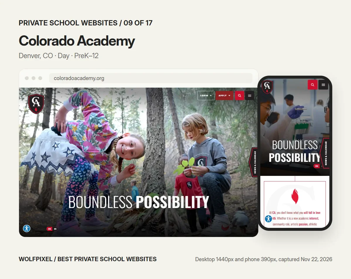
Visit: coloradoacademy.org
“Boundless Possibility” sits over photos of students outdoors, with Login and Apply menus in the header and an English and Spanish toggle on screen. The homepage is full of practical help: a “Find it Fast” block, a “How Do I…” section and a News & Calendar tab fixed to the side of the screen. Fast facts with numbers cover academics, athletics, arts and experiential learning.
- Borrow: a “How Do I…” shortcut list for the ten questions your front office answers every week.
- Check: when we visited, an event pop-up opened on arrival and covered most of the homepage on desktop and phone. We hid it for the screenshot. Pop-ups on first load cost more attention than they win.
- Our checks: Admissions action in the first desktop screen, yes; in the first phone screen, no; tuition or aid linked from the homepage, yes; Lighthouse mobile accessibility 100, performance 7, LCP 20.4 s.
10. Brentwood Academy
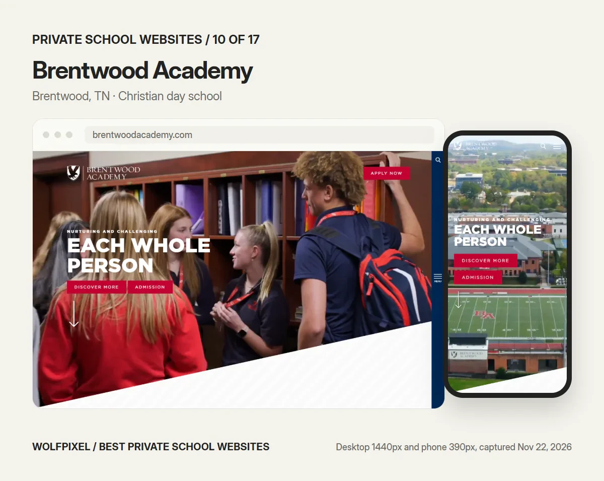
Visit: brentwoodacademy.com
Brentwood turns its mission into its navigation. The school’s promise, nurturing and challenging “each whole person,” becomes three menu groups, Body, Mind and Spirit, holding athletics, academics and Christian life. The hero has two buttons, Discover More and Admission, and an “Apply Now” button stays in the top corner. On a phone both hero buttons stay visible.
- Borrow: navigation that expresses what the school believes, as long as each label still makes sense on its own.
- Check: “Body, Mind, Spirit” is memorable but asks first-time visitors to guess where academics live.
- Our checks: Admissions action in the first desktop screen, yes; in the first phone screen, yes; tuition or aid linked from the homepage, yes; Lighthouse mobile accessibility 88, performance 26, LCP 11.9 s.
11. Montgomery Bell Academy
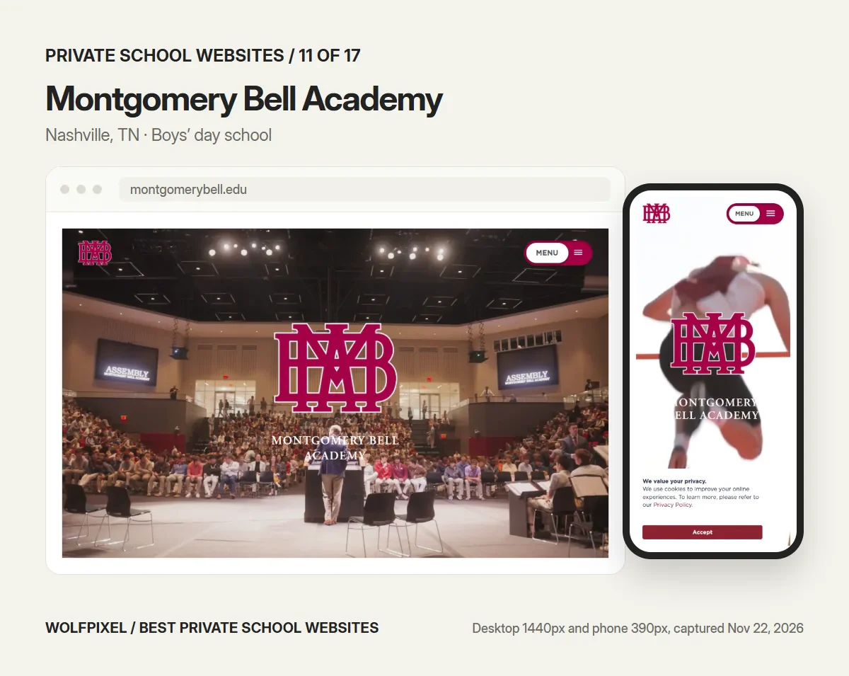
Visit: montgomerybell.edu
MBA’s homepage promotes the next admissions event directly: “Register today for Thursday’s Coffee & Tours.” The brand is built around what the school wants its boys to become, and the menu groups follow it: Gentleman, Scholar and Athlete. The large crest over a full assembly hall says tradition before a word is read.
- Borrow: put your next tour or open house on the homepage with a date and a registration link.
- Check: the first screen has no admissions action on desktop or phone, the homepage has no H1, and on a phone the cookie notice covers the lower third of the screen.
- Our checks: Admissions action in the first desktop screen, no; in the first phone screen, no; tuition or aid linked from the homepage, yes; Lighthouse mobile accessibility 85, performance 26, LCP 28.8 s.
12. Porter-Gaud School
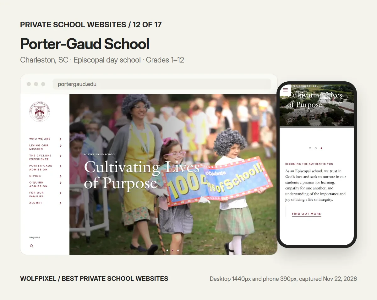
Visit: portergaud.edu
Porter-Gaud uses a vertical navigation rail on the left of the desktop screen, a rare choice for a school site. Because the school also runs the O’Quinn Schools, its preschools for ages 2 through kindergarten, the rail gives each its own admissions route, “Porter-Gaud Admission” and “O’Quinn Admission,” with Inquire at the bottom. The homepage gives space to an alumna video and a “Reviews & Testimonials” section, along with a virtual look around campus.
- Borrow: separate admissions routes when one website serves more than one program or school.
- Check: a side rail takes some learning, and on a phone the hero title and the crest overlap.
- Our checks: Admissions action in the first desktop screen, yes; in the first phone screen, no; tuition or aid linked from the homepage, yes; Lighthouse mobile accessibility 86, performance 25, LCP 24.1 s.
13. The Paideia School
Visit: paideiaschool.org
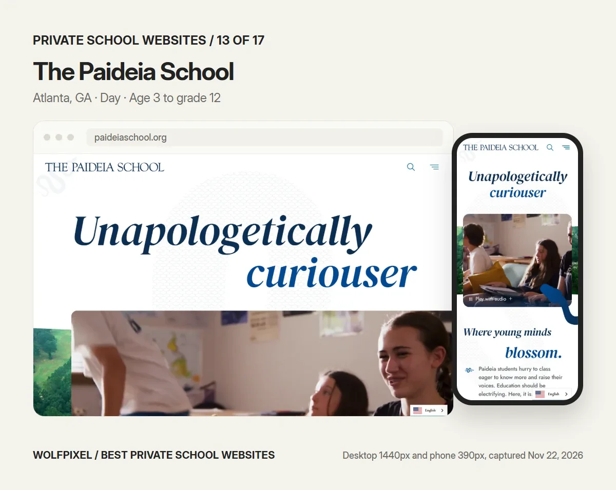
“Unapologetically curiouser” is a headline no other school could use, and Paideia commits to it: italic serif type, playful copy such as “Where young minds blossom,” and a hero video with a “Play with audio” option. Finalsite’s own review of the site describes an animated snake that winds between sections as the school’s visual thread. It reads like the school sounds.
- Borrow: write in your school’s real voice, and let one visual motif carry it.
- Check: the first screen gives no grades and no next step; the age range, 3 through grade 12, is in the page description but not on screen.
- Our checks: Admissions action in the first desktop screen, no; in the first phone screen, no; tuition or aid linked from the homepage, yes; Lighthouse mobile accessibility 100, performance 25, LCP 23.5 s.
14. Aidan Montessori School
Visit: aidanschool.org
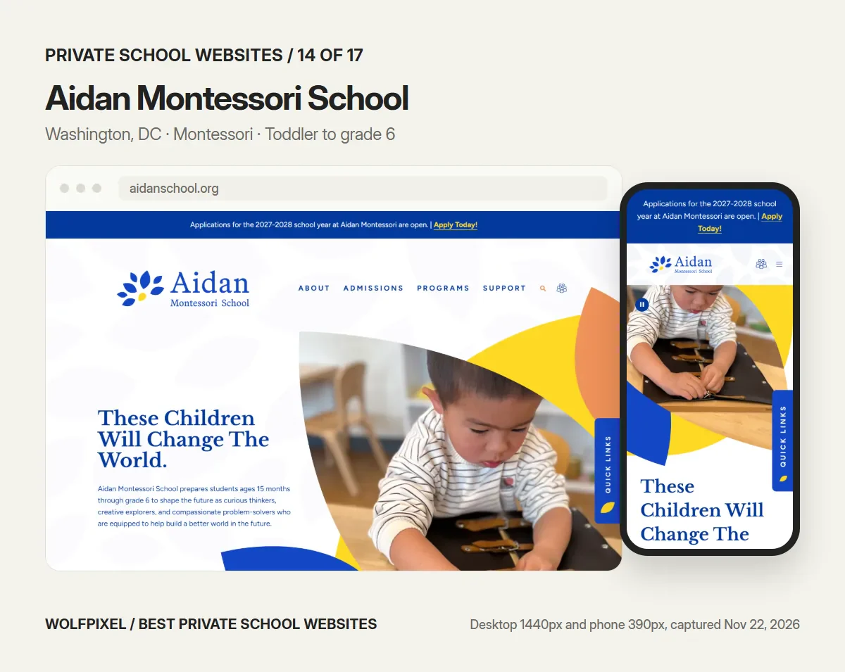
Aidan does the basics better than most large schools. A blue banner across the top says applications for 2027–2028 are open, with “Apply Today!” on every screen size. The hero says who the school serves in one sentence, and the program sections are labeled by age: Young Children’s Community for ages 15 months to 3 years, Primary for 3 to 6, and Elementary for grades 1 to 6. Montessori parents think in ages, and the site does too.
- Borrow: label programs the way parents think about their child, by age or grade, not by internal names.
- Check: the homepage says 15 months, while the page description in search results says 18 months. Small inconsistencies like this make families call the office.
- Our checks: Admissions action in the first desktop screen, yes; in the first phone screen, yes; tuition or aid linked from the homepage, yes; Lighthouse mobile accessibility 100, performance 29, LCP 19.0 s.
15. The Bryn Mawr School
Visit: brynmawrschool.org
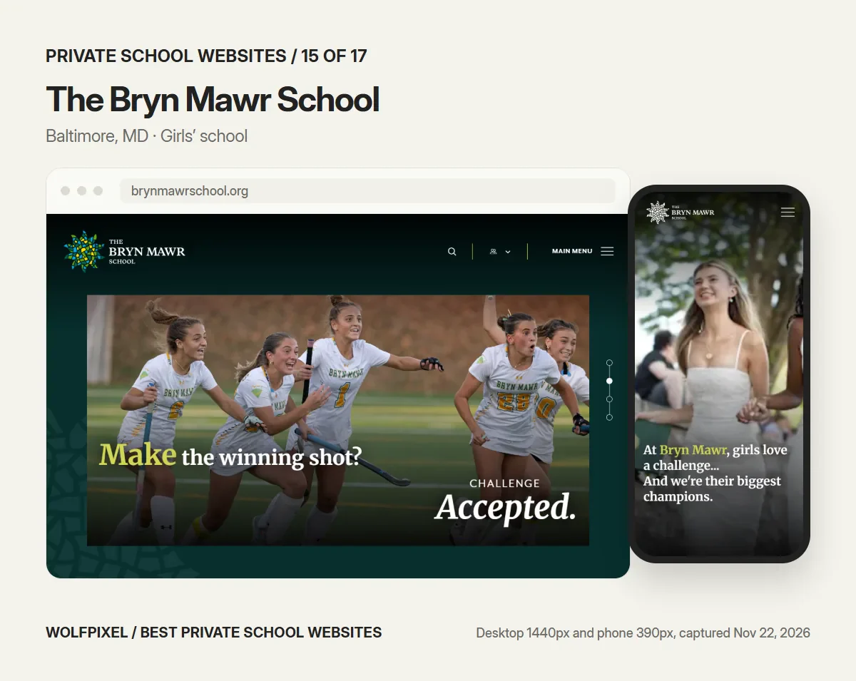
Bryn Mawr pairs action photography with a confident question-and-answer headline, “Make the winning shot? Challenge accepted.” On a phone the message becomes “At Bryn Mawr, girls love a challenge… And we’re their biggest champions.” The quicklinks are grouped by audience, Community, Parents, Alumnae, Faculty & Students, and the admissions menu reads like a checklist: Why Bryn Mawr?, Request Information, Visit, Application Process, Tuition & Affordability, Apply Now.
- Borrow: an admissions menu that follows the family’s steps in order.
- Check: the desktop header shows only search, a login menu and “Main Menu,” with no admissions link in sight.
- Our checks: Admissions action in the first desktop screen, no; in the first phone screen, no; tuition or aid linked from the homepage, yes; Lighthouse mobile accessibility 94, performance 28, LCP 28.0 s.
16. Garrison Forest School
Visit: gfs.org
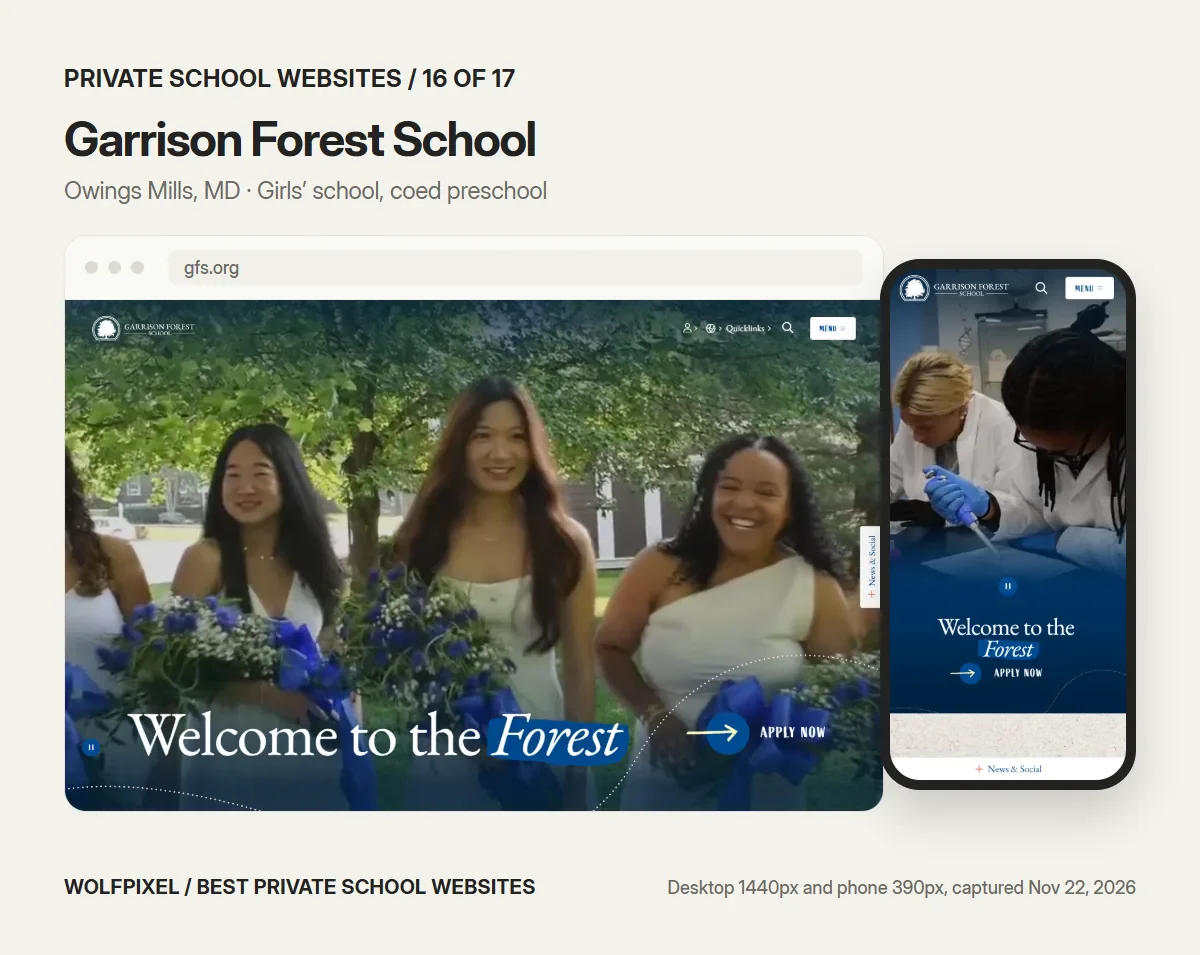
“Welcome to the Forest” sits next to an “Apply Now” arrow, on desktop and on a phone, which makes Garrison Forest one of only five sites here with an admissions action in the first phone screen. The divisions are explained with their grades and who they serve: Upper School, all-girls, grades 9–12; Middle School, grades 6–8; Lower School, kindergarten to grade 5; and a coed preschool for ages 2 to 5. The aid page is called “Affording GFS.”
- Borrow: Apply next to the headline, and division cards that state grades and who each division is for.
- Check: the homepage loads more than 200 images, and its Largest Contentful Paint was the slowest in our mobile test.
- Our checks: Admissions action in the first desktop screen, yes; in the first phone screen, yes; tuition or aid linked from the homepage, yes; Lighthouse mobile accessibility 92, performance 25, LCP 72.8 s.
17. Girls Preparatory School
Visit: gps.edu
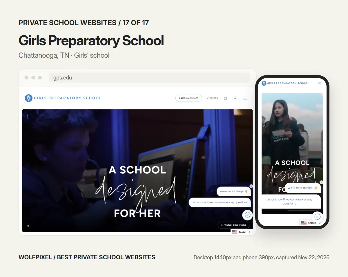
GPS builds its whole site on one line, “A school designed for her,” and a phrase that repeats with new endings: “Hers to explore,” “Hers to call.” The script type gives the brand warmth. The site also answers the cost question directly, with a tuition assistance page and a blog post on how to afford a private school, and a chat assistant offers help on arrival.
- Borrow: a brand line that can repeat with variations across the site.
- Check: the header shows Camps & Clinics and the MyGPS portal but no admissions link, and the chat prompt opens over the hero on a phone.
- Our checks: Admissions action in the first desktop screen, no; in the first phone screen, no; tuition or aid linked from the homepage, yes; Lighthouse mobile accessibility 100, performance 26, LCP 14.9 s.
What 17 private school websites told us
Across the 17 sites, the patterns are clear, and so are the gaps.
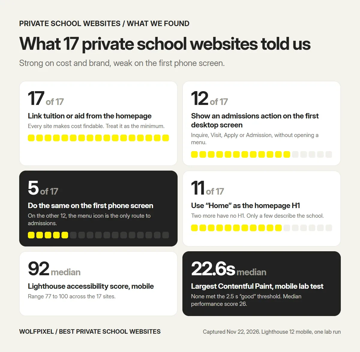
- Tuition is a given. All 17 link tuition or financial aid from the homepage, often under a warmer name: “Affording SFS,” “Affording GFS,” “Tuition & Affordability,” “Understanding Tuition and Fees.”
- Admissions disappears on phones. 12 of 17 show Inquire, Visit, Apply or Admission on the first desktop screen. On a phone, only 5 do: Sidwell Friends, Worcester Academy, Brentwood Academy, Aidan Montessori and Garrison Forest.
- The main heading is wasted. 11 homepages use “Home” as their H1 and 2 have none. Worcester Academy (“Co-ed Day And Boarding School For Grades 6 To 12 And Postgraduates”) shows the alternative.
- Accessibility scores are good, not perfect. The median Lighthouse accessibility score was 92, ranging from 77 to 100. The most common failures were zoom disabled (7 sites), links without a readable name (6 sites) and headings out of order (6 sites). An automated score catches only part of what a manual review with assistive technology would.
- Speed is the weak spot. The median mobile performance score was 26 and the median Largest Contentful Paint was 22.6 seconds in the lab test, and none of the 17 met Google’s 2.5-second “good” threshold. Lighthouse simulates a slow mobile connection, so real visitors on fast connections see better numbers, but full-screen video heroes and image-heavy homepages are the usual cause of the gap.
- Zoom is often switched off. 7 of the 17 homepages stop visitors from zooming on a phone, which Lighthouse flags because people with low vision rely on it.
- Translation is common. 9 of the 17 load a translation tool on the homepage.
- Pop-ups are rare. Only Colorado Academy opened an event pop-up on arrival when we visited.
The phone gap is the one to act on. Many families meet a school first on a phone, and on 12 of the 17 sites the only way to the admissions pages from the first phone screen is the menu icon.
What should be on a private school website?
Every private school website needs the same core pages, whatever its size. If a family cannot find one of these in two taps on a phone, it is the first thing to fix.
| Page | What a family needs from it | Common gap |
|---|---|---|
| Homepage | Who the school is for, grades, day or boarding, location, real photos, one next step | A slogan with no grades or place |
| Admissions | Steps, dates, deadlines, who to contact, the inquiry form | Steps hidden in a PDF |
| Tuition and financial aid | Tuition by grade, what it includes, how aid works, the aid deadline | No figures, or no link from the homepage |
| Visit | Tour times, open house dates, a booking form | “Contact us to arrange a visit” |
| Academics and programs | Each division or program, with outcomes in plain words | Long lists with no hierarchy |
| Student life | Arts, athletics, clubs, boarding, shown with photos | Stock images |
| About | Mission, head of school, history, leadership, accreditation | A mission statement and nothing else |
| Calendar and news | Term dates, events, closures | Out-of-date posts on the homepage |
| Parents and students | Portal login, forms, lunch, transport, handbook | Current families sent through the admissions menu |
| Giving and alumni | How to give, events, alumni stories | A donate button and no reason to give |
| Contact | Address, map, phone, office hours, staff directory | Phone number only in the footer |
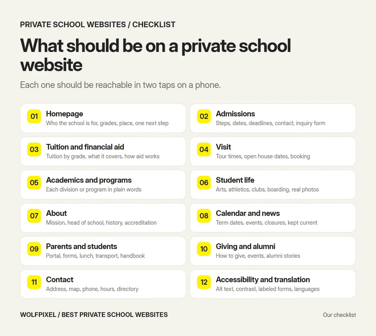
A private school website serves two audiences at once. Prospective families need a story and a clear path to inquire; current families and students need the calendar, the portal and the forms, fast. The best sites in this guide separate the two in the navigation instead of making current parents dig through admissions pages.
Private school vs public school website design
The pages overlap, but the job is different. A public school website is mainly a communication tool for families who are already enrolled. A private or independent school website is also the school’s main recruitment tool, so it has to persuade a family that is comparing several schools, often paying tuition for the first time.
That changes four things:
- Admissions comes first. Inquire, visit and apply sit in the header or one tap away, and the admissions section explains each step.
- Tuition has to be explained. Families compare cost and aid before they book a tour.
- Brand carries more weight. Typography, photography and writing have to show what makes the school different from the one ten minutes away.
- More audiences. Alumni, donors and, for boarding schools, international families each need their own route.
The legal picture differs too. The Department of Justice’s 2024 rule under Title II of the ADA requires state and local governments, including public schools, to meet WCAG 2.1 Level AA, with compliance dates of April 26, 2027 for larger public entities and April 26, 2028 for smaller ones. Private schools are not covered by that rule. The DOJ’s guidance says Title III of the ADA applies to what businesses open to the public offer on the web, and the ADA.gov Title III overview lists religious organizations among the entities Title III does not apply to. Whether your school is covered is a question for a lawyer. Designing to WCAG 2.2 AA is still the sensible target, because it is the most current version of the standard and it makes the site easier to use for every family.
Ideas to borrow for your own school website
These are the patterns that came up again and again in the 17 sites, and the example to study for each.
- Say who the school is for in the first screen. Grades, day or boarding, and place, in plain words next to the slogan.
- Put inquire, visit and apply in the header on every page, and keep at least one of them visible on a phone without opening the menu.
- Link tuition and financial aid from the homepage. Families look for it early, and hiding it does not make it cheaper.
- Split prospective and current families. A “Parents” or “Community” menu keeps portals and forms out of the admissions story.
- Use one idea across the whole site. A line, a shape or a mascot, used consistently, does more than a new animation on every page.
- Use real students and teachers, in real places. Visitors can tell stock photography from their own campus.
- Let students speak. Short video answers or quotes from students and alumni do more than a paragraph about community.
- Keep motion light. Animation should guide the eye, not delay the content. Our mobile tests show how heavy homepages slow the first screen.
- Offer translation if your families need it. 9 of the 17 sites load a translation tool on the homepage.
- Give staff a CMS they can actually use. A site that is beautiful at launch and out of date by spring does more harm than a plain one. If you build on Webflow, plan Webflow development with editing roles for each office.
Common private school website mistakes
- A slogan with no information. “Excellence. Character. Community.” could be any school.
- Admissions steps in PDFs. They are hard to read on a phone and hard for search engines to understand.
- Pop-ups on arrival. An event pop-up on first load hides the page a family came to see, especially on a phone.
- No tuition figures. Families who cannot find cost often leave to find it elsewhere, sometimes on a ranking site.
- Heavy video heroes. A large autoplay video can push the first meaningful content back by seconds on mobile data. A UX audit of your current site will show where families drop off before you redesign anything.
- Navigation organized by the org chart. Divisions, offices and committees instead of the questions families ask.
- Stale homepage news. A homepage that still shows last spring’s events tells families the site is not maintained.
- Pinch-to-zoom switched off. A viewport setting that blocks zoom makes small text unreadable for many visitors. Seven sites in this guide do it.
- Accessibility treated as a widget. An overlay toolbar does not fix missing alt text, poor contrast or unlabeled forms.
Website platforms private schools use
Going by their page source, at least 15 of the 17 sites in this guide run on a school website platform, mostly Finalsite or Ubiq. That is not a reason to choose one, but it explains why so many independent school websites share a structure.
| Platform type | Examples | Good fit when | Watch for |
|---|---|---|---|
| School website platform | Finalsite, Blackbaud, Digistorm (Veracross), Ubiq | You want the website, enrollment forms, calendars and portals from one vendor | Template look, annual licence, design limits |
| Open-source CMS | WordPress, Drupal | You want full ownership and many developers to choose from | Plugins, security updates and hosting are on you |
| Website builder | Webflow, Squarespace | A small school or a single campus with a modest site | Portals and SIS links usually need third-party tools |
We name platforms only where the page source showed them on the day we checked. A platform does not make a website good or bad; the content, structure and maintenance do.
How much does a private school website cost?
There is no public price list for most school platforms, so be careful with averages. Published figures we found:
- Design TLC, a school and nonprofit studio, says its website projects start at $8,000.
- Wolfpixel’s education web design projects for schools and colleges are usually $5,000 to $25,000, designed and built, with a fixed quote within 48 hours of a brief.
- School platforms such as Finalsite and Blackbaud price by quote and usually add an annual licence for hosting and the CMS.
Before you compare quotes, read what a website design package should include, so each proposal covers the same scope. What moves the price: the number of pages and templates, custom photography and video, migration of old content, integrations with enrollment, SIS or portal systems, translation, accessibility testing and ongoing support.
How long does a school website redesign take?
Plan for months, not weeks, and work back from the admissions calendar. Interactive Schools, an independent school web agency, advises starting six to twelve months before you want the new site live. Apptegy, which builds district websites, says its typical go-live timeline is around sixty to ninety days. A smaller custom site can move faster once content is ready; our own school projects take three to four weeks of design and build for a 20 to 30 page site, after the content is ready.
The practical rule: launch before your inquiry season opens, not in the middle of it, and leave time for staff training before the old site goes dark. Our guide to website redesign services covers content, migration and launch checks in more detail.
How Wolfpixel designs school websites
We are a senior design team, so the designer you meet on the first call is the one who does the work. We design and build websites for private and independent schools, colleges and education organizations: the admissions path first, tested on a phone, then the brand and the pages, on a CMS your staff can update. Before handover, a member of your team publishes a real change on the live site, so we know they can.
Our education work so far has been for education companies, such as the Inclass school management platform, whose website and product UI we designed. If you are building a learning product rather than a school website, our guide to EdTech UX design agencies covers that job. For a school site, our education web design agency page explains what we do, what it costs and how long it takes.
Sources and method
We captured and checked every website below on November 22, 2026. Websites change often, so the screenshots may not match what you see today.
- School websites, linked in each entry above. Desktop captures at 1440 × 900 pixels; phone captures at 390 × 844 pixels.
- Homepage checks: we recorded whether an admissions action (Inquire, Visit, Apply or Admission) was visible in the first screen without opening a menu, whether tuition or financial aid was linked from the homepage including its menus, the homepage H1 and the presence of a translation tool.
- Lighthouse 12, mobile, default simulated throttling, one run per homepage. Lab scores vary between runs and differ from real-user data, so treat them as a snapshot.
- Google Search Central: Core Web Vitals, for the 2.5-second LCP threshold.
- U.S. Department of Justice, ADA.gov: Fact sheet on the Title II web and mobile app rule.
- U.S. Department of Justice, ADA.gov: Guidance on web accessibility and the ADA and the ADA.gov Title III overview.
- W3C: Web Content Accessibility Guidelines (WCAG) 2.2.
- Finalsite: The Best Private & Independent School Websites of 2025, for its description of The Paideia School’s site.
- Ranking pages reviewed for coverage and gaps: Ubiq Education, Finalsite, SchoolStatus, School Webmasters, Morweb and Educational Networks.
The five checks, the ideas to borrow, the mistakes and the “Check” notes in each entry are our own judgement as designers. They are not a ranking of the schools themselves.
Private School Website FAQs
What are the best private school websites in 2027?
Our 17 picks are Phillips Exeter Academy, Lakeside School, Harvard-Westlake, Groton School, Sidwell Friends, Worcester Academy, The Walker School, Greenhill School, Colorado Academy, Brentwood Academy, Montgomery Bell Academy, Porter-Gaud, The Paideia School, Aidan Montessori, The Bryn Mawr School, Garrison Forest School and Girls Preparatory School. Each one does at least one thing other schools can copy, from Lakeside stating its grades in the header to Worcester Academy keeping an Inquire link on screen on every device.
What should be on a private school website?
At minimum: a homepage that says who the school is for, admissions steps and dates, tuition and financial aid, visit and open house booking, academics by division, student life, an about section with the head of school, a calendar and news, a hub for current parents and students, giving and alumni, and full contact details. Admissions, tuition and visit pages should be reachable in one or two taps on a phone.
What is the best design for a school website?
The best design gets each visitor to their next step fast. For a private school that means saying the grades, place and type of school in the first screen, keeping Inquire, Visit or Apply visible on every page, linking tuition from the homepage, separating current families from prospective ones in the navigation, and using real photography of the school. Visual style comes after those basics.
What is the best website builder for schools?
It depends on what you need. School platforms such as Finalsite and Blackbaud bundle the website with enrollment forms, calendars and parent portals. WordPress gives you ownership and a wide choice of developers. Webflow or Squarespace can suit a small school with a simple site. Choose on how easily your own staff can update it and on the integrations you need, not on templates.
How much does a private school website cost?
Most school platforms quote privately and add an annual licence. Published starting points include Design TLC, whose website projects start at $8,000, and Wolfpixel, whose school and college websites are usually $5,000 to $25,000, designed and built. Page count, photography and video, content migration, integrations, translation and accessibility testing move the price most.
How long does a school website redesign take?
Plan for several months. Interactive Schools advises starting six to twelve months before you want the new site live, and Apptegy quotes a typical go-live of about sixty to ninety days for district sites. A smaller custom site can take three to four weeks of design and build once the content is ready. Launch before your inquiry season opens.
Do private school websites need to be ADA compliant?
The 2024 ADA Title II web rule, which sets WCAG 2.1 AA as the standard, applies to public schools and other state and local government bodies, not private schools. The Department of Justice says Title III of the ADA covers what businesses open to the public offer on the web, and the ADA.gov Title III overview lists religious organizations as not covered. Ask a lawyer about your school, and design to WCAG 2.2 AA regardless.
How is a private school website different from a public school website?
A public school website mainly informs families who are already enrolled. A private school website also has to recruit, so it puts admissions, tuition and visits first, explains what makes the school different, and serves more audiences, including donors, alumni and, for boarding schools, international families.
How often should a private school redesign its website?
Most schools redesign every four to six years, but the content should change every week. Redesign sooner if the site is hard to use on a phone, staff cannot update it, the brand has changed, or families keep asking the admissions office for information that should be on the site.
Planning a new website for your school?
Send us your current site. A senior designer replies within 4 business hours with the three changes we would make first for families on a phone, and a fixed quote for the redesign.

Was this article helpful?

Written by
Maniruzzaman Jubayer
Co-founder & COO | Product Design Specialist at Wolfpixel
Maniruzzaman Jubayer is Wolfpixel’s Co-founder & COO and a product design specialist with 7 years of experience. He oversees website, app and digital product design at Wolfpixel, including the education web design work for schools and education companies. This guide reviews private school websites that Wolfpixel did not design; Wolfpixel offers the school website design and build services mentioned in it.
View all articles