






 19 min read
 Published

Most law firm website design starts from one template that is then filled with practice areas. That works fine until you notice who is actually arriving. A person hurt in a crash this morning, a parent planning to leave a marriage, a family whose son was arrested last night and a couple writing their first will don’t read a website the same way. They don’t trust the same things, and they don’t want the same next step.
I’m Maniruzzaman Jubayer, Co-founder & COO and Product Design Specialist at Wolfpixel, with 7 years of experience. I personally oversee website, app and digital product design. This guide looks at how law firm website design should change by practice area, using live firm websites as examples.
The firms below are credited third-party examples, not Wolfpixel clients. We picked each one because it makes at least one decision that fits its practice area well. If you are looking for a team to do this work for your firm, that’s our law firm website design services page. This article is the thinking behind it.
The short answer: law firm website design by practice area means giving each practice its own page, built around that client’s urgency, fears and next step. Injury and criminal defense pages lead with a phone call, family and divorce pages with calm and privacy, bankruptcy with plain fees and estate planning with clarity.
Key takeaways:
- Urgency decides the layout. Same-day practices need tap-to-call in the first screen; slow-decision practices need guides and online booking.
- Proof changes by practice: results with context for injury, trial record for criminal defense, credentials for bankruptcy, tools and guides for divorce.
- Every practice page needs the same eight blocks, in the order a worried visitor looks for them.
- Advertising rules shape the design. Results need context and disclaimers, and contact forms must not invite the full story.
- Each practice page also needs its own case-type pages to rank in local search.
How we chose these examples: we reviewed live law firm websites in each practice area in November 2026 and kept the ones that make at least one clear, practice-specific decision a visitor would notice in the first screen. No firm paid to be included, none is a Wolfpixel client and we have no affiliation with any of them. Each screenshot was taken from the firm’s live homepage in November 2026 and is credited in the image. Sites change, so details may differ when you visit.
Why one law firm website template fails most practice areas
A generic law firm site is designed for an imaginary visitor who is calm, has time and is comparing firms on prestige. Real visitors rarely look like that. Each practice area brings its own state of mind, and the design has to meet it.
| Practice area | The visitor’s state | Urgency | Proof that matters | Main watch-out |
|---|---|---|---|---|
| Personal injury | Hurt, stressed, on a phone | Same day | Results with context, reviews | Results without disclaimers |
| Family law | Anxious, protective | Days to weeks | Process clarity, calm tone | Safety and privacy |
| Divorce | Private, researching quietly | Weeks | Guides, tools, fit with their situation | Shared devices, discretion |
| Bankruptcy | Ashamed, under financial pressure | Days | Plain explanations, credentials | Fees and certification claims |
| Criminal defense | Panicked, often a relative calling | Hours | Trial experience, availability | Asking for too much detail |
| Estate planning | Calm, comparing carefully | Months | Clarity, guides, approachability | Jargon and pressure |
Read across a row and the brief for that practice page almost writes itself. Read down the “Urgency” column and you see why one homepage hero and one contact form can’t serve everyone. It’s the same reason landing pages and homepages do different jobs: a homepage introduces the firm, while a practice page has to win one specific client.
If you want to see broad visual references first, our roundup of 13 law firm website design examples covers layouts, typography and trust signals across firm types. This guide goes a level deeper: what each practice area needs from its pages.
Anatomy of a practice area page that gets the call
Before the practice-by-practice breakdown, here’s the page structure we start from. Every block earns its place by answering a question the visitor already has.
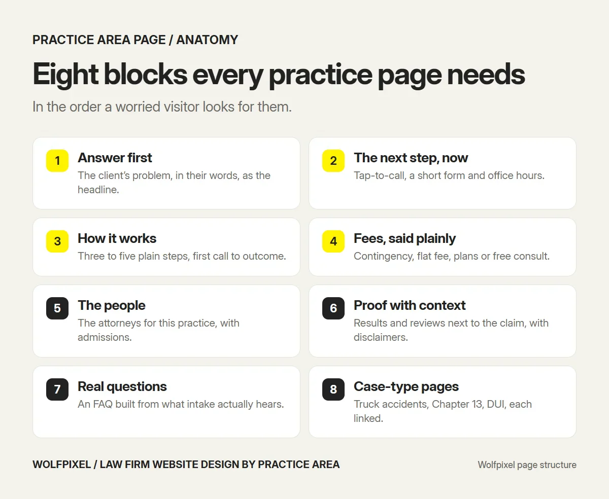
- Answer first. The headline says what you do for this client in their words: “Hurt in a truck accident in Austin?” beats “Personal Injury Practice.”
- The next step, immediately. A phone number people can tap, a short form and office hours. On mobile, the call button stays within thumb reach.
- How the process works. Three to five plain steps, from first call to outcome. Uncertainty is what stops people calling.
- Fees, said plainly. Contingency, flat fee, payment plans or a free consultation. If you don’t say it, visitors assume the worst.
- The people. The attorneys who handle this practice, with bar admissions and relevant experience, not the whole firm.
- Proof with context. Results, reviews or credentials placed next to the claim they support, with the disclaimers your state expects.
- Answers to real questions. An FAQ written from the questions your intake staff actually hears.
- Case-type sub-pages. Truck accidents, Chapter 13, DUI and so on, each linked from the main practice page.
That last point matters for search too. A firm with one “Practice Areas” page listing twenty services gives Google nothing specific to rank. A clear practice page with linked case-type pages gives it a structure to understand.
A practice page works a lot like a landing page: one audience, one problem, one next step. The same rules apply, and our guide to landing page best practices covers the layout details that lift calls and form fills. To know whether a practice page is actually working, track calls and form fills against the landing page conversion rate benchmarks.
Personal injury lawyer website design
Personal injury visitors are the most urgent of any practice area. Many search on a phone soon after an accident, sometimes from a hospital. They want to know three things fast: can you help with this, does it cost anything up front and can I talk to someone now.
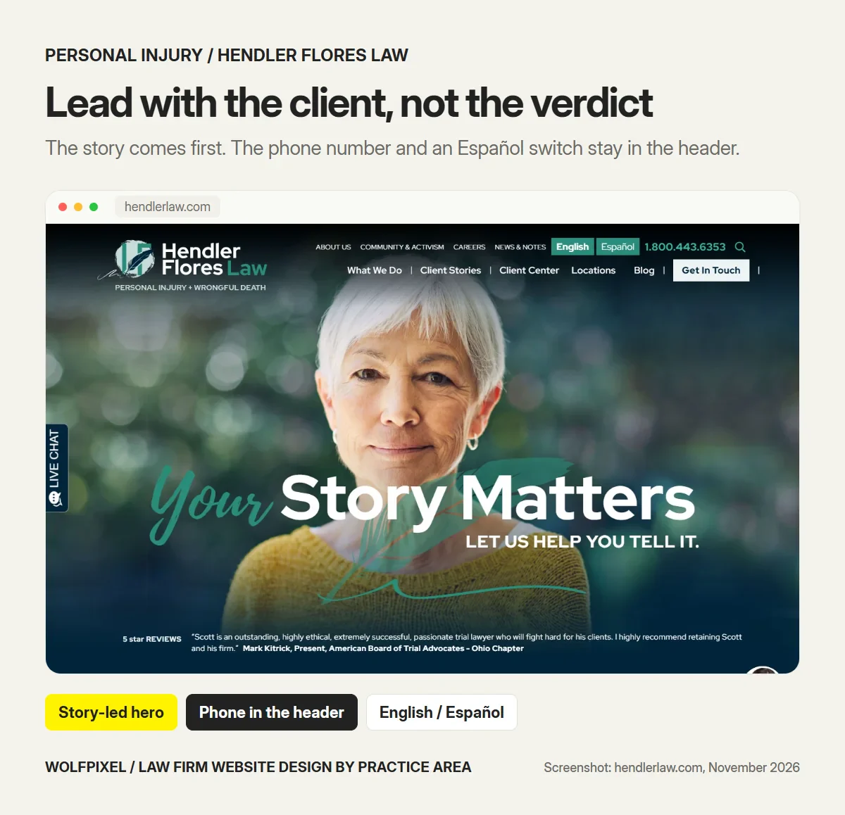
Hendler Flores Law in Texas leads with a story, not a settlement number. The homepage headline is “Your Story Matters”, with a client review directly under it and a row of case types along the bottom. The phone number sits in the header next to an English and Español switch, and “Client Stories” is a main navigation item.
When the site does mention big outcomes, it explains them. One page describes a $13.8 million verdict in the context of the client’s asbestos case, rather than dropping the figure into a banner on its own.
What to take from it: in personal injury, results persuade best when they come with the story behind them. Lead with the client, keep the phone one tap away and explain your fee model before anyone has to ask.
Design checklist for injury firms:
- Click-to-call in the header on every page, and a sticky call bar on mobile.
- “No fee unless we win” or your actual fee terms, stated in plain words near the top.
- Case-type pages for the accidents you want: car, truck, motorcycle, slip and fall, wrongful death.
- Results and verdicts with case context and the disclaimer your state requires.
- A Spanish path if your market needs one.
Family law website design
Family law clients are protective and often frightened. Custody, support and protective orders are on the line, and many have never hired a lawyer before. They read more before they call, and they want to feel that the firm will be calm and on their side.
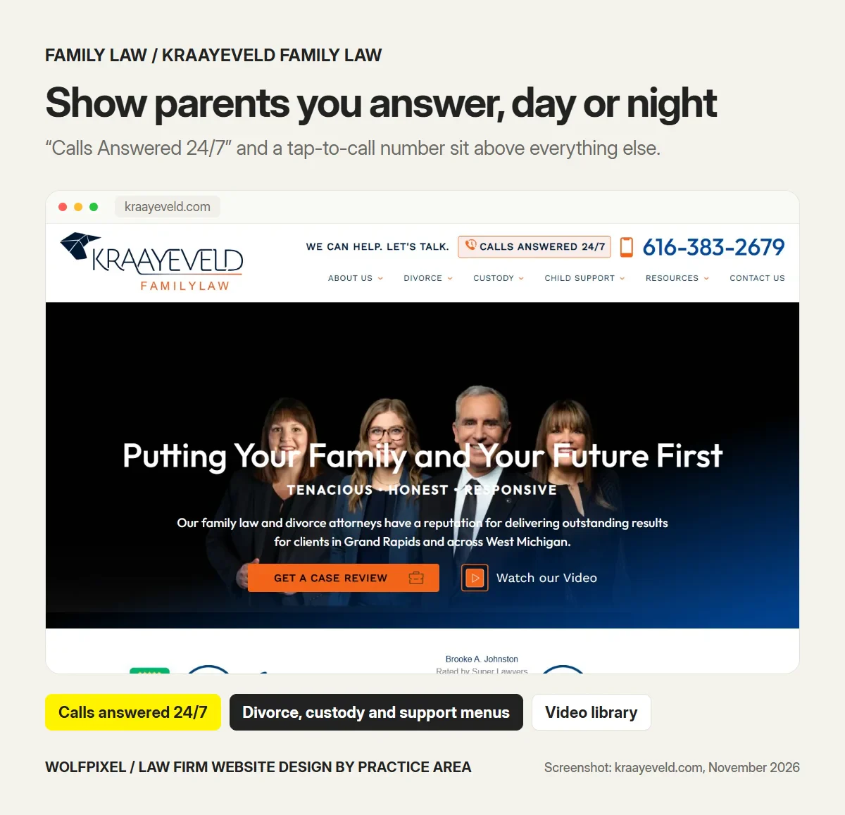
Kraayeveld Family Law in Grand Rapids puts “Calls Answered 24/7” and a tap-to-call number at the very top, so a parent in a crisis knows they can reach someone. The main navigation splits divorce, custody and child support into their own menus, and the site goes unusually deep on child support, including a page on child support for business owners. A video library lets people hear the attorneys before they call.
What to take from it: depth is reassurance in family law. A page that answers the exact question a parent is worrying about, such as support when one parent owns a business, tells them the firm has handled people like them.
One safety detail most family law sites miss: if you publish pages about domestic violence or protective orders, add a quick-exit button that instantly leaves the site. People reading those pages may be on a device someone else checks. It costs very little to build and it protects your most vulnerable visitors.
Design checklist for family law firms:
- Separate pages for divorce, custody, child support, adoption and protective orders.
- Process pages that explain what happens at each stage, in plain language.
- A calm visual design tone: warm photography of real people, generous spacing, no aggressive red banners.
- A short, private contact form that never asks for the full story up front.
- A quick-exit button on safety-related pages.
Divorce lawyer website design
Divorce clients often start researching long before they tell anyone, sometimes on a shared laptop or phone. They want to understand the process, the money and what it means for their children, and they want a firm that understands their particular situation.
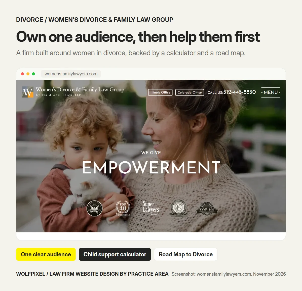
Women’s Divorce & Family Law Group, by Haid and Teich, positions the whole firm around one audience: women going through divorce. The site backs that positioning up with useful tools rather than slogans: a child support calculator, a “Road Map to Divorce” guide and a page on electronic snooping, a niche topic that speaks directly to people worried about privacy during a divorce.
What to take from it: in divorce, a clear audience and practical tools build trust faster than awards. When a visitor finds a calculator or a step-by-step guide built for someone in their position, the firm has already started helping them.
Design checklist for divorce firms:
- A clear statement of who you help best, if you have a focus.
- Guides and tools: process road maps, support or alimony explainers, checklists for the first consultation.
- Discreet contact options and no auto-playing video or sound.
- Pages for the hard questions: the house, retirement accounts, business ownership, relocation.
- Testimonials that describe the process, with any disclaimers your state requires.
Bankruptcy attorney website design
Bankruptcy visitors are under financial pressure and often embarrassed to be looking. They compare Chapter 7 and Chapter 13, wonder whether they qualify and worry about what a lawyer will cost when they are already short of money.
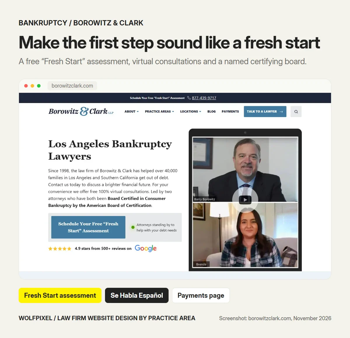
Borowitz & Clark in Los Angeles turns the first step into something that sounds hopeful: a free “Fresh Start” assessment, offered both in the top bar and as the main button. The homepage explains that consultations can be fully virtual, shows the firm’s Google rating and names the body behind its attorneys’ certification, the American Board of Certification. The site also explains the means test in plain language, says “Se Habla Español” and has a dedicated payments page in the main navigation.
What to take from it: in bankruptcy, the words you choose for the call to action do half the work. “Fresh Start” removes shame from the first step, and a visible payments page answers the money question before it becomes an objection. Small wording and placement choices like these are where conversion-focused UX design earns its keep. Naming the certifying body also matters: it’s exactly what attorney advertising rules ask for when a firm claims certification.
Design checklist for bankruptcy firms:
- Separate, plain-language pages for Chapter 7 and Chapter 13, and the means test.
- A non-judgmental call to action: an assessment, a review or a “fresh start”, not “File Now”.
- Fee and payment plan information that’s easy to find.
- Pages organised by the debt people have: credit cards, medical bills, wage garnishment, foreclosure.
- Spanish content or a Spanish-speaking contact if your market needs it.
Criminal defense attorney website design
Criminal defense calls are the most time-sensitive of all. An arrest happens at night or on a weekend, and the person searching is often a parent, partner or friend. They need to know you answer the phone, that you have trial experience and that you handle this exact charge.
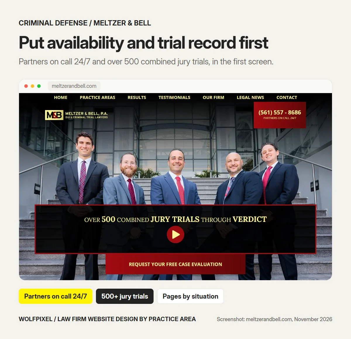
Meltzer & Bell in West Palm Beach shows the partners together on a flight of steps with one line of proof across the image: over 500 combined jury trials through verdict. The phone number in the header is labelled with partners on call 24/7, and a free case evaluation button sits right below the proof. The firm even has a page for airport arrests, a narrow situation that a worried relative can find and immediately recognise.
What to take from it: in criminal defense, availability and trial experience are the proof. Show both in the first screen, then build pages for the specific charges and situations people search for.
Design checklist for criminal defense firms:
- A 24/7 phone path, stated clearly and working on mobile.
- Pages by charge: DUI, drug offences, assault, white collar, juvenile, federal.
- Attorney profiles that show courtroom and trial experience, and former prosecutor roles if true.
- Forms that ask for a name, phone number and the charge, nothing about what happened.
- A clear statement that contacting the firm doesn’t create an attorney-client relationship.
Estate planning attorney website design
Estate planning visitors are the opposite of injury or criminal clients. They are usually calm, they take their time and they compare several firms. What stops them is jargon, pressure and the feeling that estate planning is only for the wealthy.
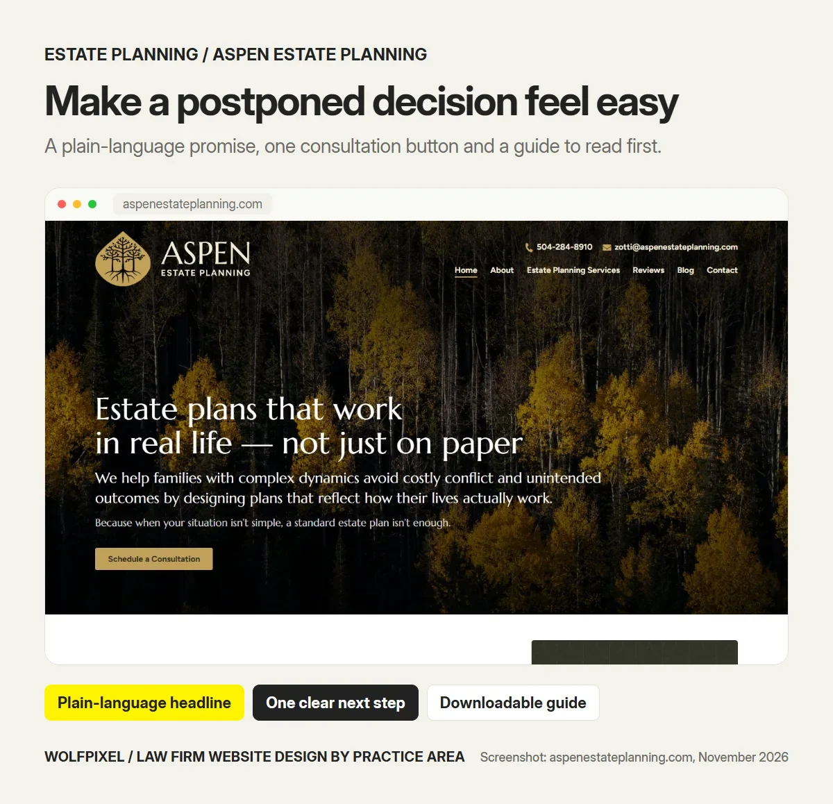
Aspen Estate Planning in Louisiana opens with a plain-language promise: estate plans that work in real life, not just on paper. The page speaks to families with complex dynamics instead of listing documents, offers a single “Schedule a Consultation” button and backs it up with a downloadable guide to estate planning for Louisiana families.
What to take from it: in estate planning, the site’s job is to make a postponed decision feel manageable. A human headline, one clear next step and a guide people can read at their own pace fit how these clients actually decide.
Design checklist for estate planning firms:
- Plain-language pages for wills, trusts, probate, powers of attorney and incapacity planning.
- A guide, checklist or workshop that people can use before they are ready to book.
- Online booking for a short first consultation.
- Flat-fee or package information if you offer it.
- Photography and tone that feel warm and unhurried.
What about immigration, employment and business law?
The same method works for practice areas we haven’t covered in depth. Start from the visitor’s state, then pick the proof and the next step that fit it.
| Practice area | The visitor’s state | What the page should lead with |
|---|---|---|
| Immigration | Worried about status, family and deadlines | Language options, case types by visa or process, clear fees |
| Employment (employee side) | Angry or afraid after a firing or dispute | Situations in plain words, filing deadlines, free review |
| Business law | Busy, comparing firms on fit and cost | Industries served, fixed-fee packages, a short call booking |
| Workers’ compensation | Injured and worried about income | How claims work, no up-front fees if true, tap-to-call |
How practice area pages help a law firm rank in local search
Most legal searches are local: “divorce lawyer near me”, “DUI attorney Austin”. Practice pages are how a firm shows up for each of them, so we plan search into the page structure from the start.
- One page per practice, one per case type. Give each practice its own URL, title and H1, and link case-type pages from it. That gives search engines one clear page to rank for each search. If you run Google Ads for a practice, send that traffic to a dedicated practice landing page, not the homepage.
- City and practice together. If you serve several cities, write a real page for each city where you have an office or meaningful work, with local details. Copy-paste city pages rarely rank and can look spammy.
- Structured data. Mark up the firm with LegalService schema, with name, address, phone and opening hours that match your site and your Google Business Profile, plus FAQ and breadcrumb markup on practice pages.
- Google Business Profile. Choose the primary category that matches your main practice, add the others as secondary categories and link each office’s profile to its location or practice page.
- Reviews on the page. Reviews that mention the practice area, shown next to it with any required disclaimers, help both the visitor and your local relevance.
- Speed on a phone. Most urgent legal searches happen on mobile. Keep practice pages light, with fast images and no heavy chat widgets that block the call button.
Attorney advertising rules every practice area page has to follow
Design decisions on a law firm website are also advertising decisions. The rules come from your state, which usually adopts its own version of the American Bar Association’s Model Rules. This isn’t legal advice, and your firm or ethics counsel should sign off on the final copy, but these are the points we design around on every legal site.
No false or misleading claims. ABA Model Rule 7.1 prohibits false or misleading communications about a lawyer’s services. Its comments explain that truthful past results can still mislead if they create unjustified expectations, and that a disclaimer may help. That’s why we place results next to their context and leave room for disclaimers in the design, instead of adding them as tiny footnotes later.
Name the responsible lawyer and how to reach them. The rules require the name and contact information of at least one responsible lawyer or firm in each communication. On a website, that usually means a clear firm name, phone number and office address on every page.
Be careful with “specialist” and “certified”. A firm can generally only call itself a certified specialist if an approved organisation certified it and that organisation is named. Borowitz & Clark above is a good example of doing this properly.
Treat contact forms as intake, not a chat box. ABA Formal Opinion 10-457 explains that a website inviting people to describe their legal problem can turn them into prospective clients, with confidentiality duties under Rule 1.18. Short forms that ask only for contact details and the type of matter, plus a clear “no attorney-client relationship yet” notice, protect both sides.
New York changed its rules in 2026. Under amendments effective June 1, 2026, New York no longer requires ads to be labelled “Attorney Advertising” and no longer requires the “Prior results do not guarantee a similar outcome” disclaimer, according to the New York State Bar Association’s summary. Many New York sites still show both, and some firms keep the results disclaimer on purpose. Other states have their own rules, so always check your state bar.
Accessibility is part of trust. Legal clients include older people, people with disabilities and people reading under stress. Designing to WCAG 2.2 AA, with readable contrast, keyboard access and labelled forms, makes every practice page usable for them.
We last checked the sources in this section in November 2026. Rules change, so confirm the current version with your state bar before you publish.
A practice area page checklist you can use today
Run each of your practice pages through this list. If a page fails more than two of these, it’s probably costing you calls.
- The headline names the client’s problem in their words.
- The phone number is tappable and visible without scrolling on mobile.
- Fees or the free consultation are explained above the fold or close to it.
- The process is explained in three to five plain steps.
- The attorneys who handle this practice are shown, with relevant experience.
- Results, reviews and credentials sit next to the claims they support, with the disclaimers your state expects.
- The FAQ answers questions your intake team actually hears.
- Case-type sub-pages exist for the matters you want more of.
- The form asks for contact details and matter type only, with a clear no-relationship notice.
- The page loads quickly on a phone and meets WCAG 2.2 AA basics.
Want a second opinion? Send us one practice page and a senior designer will reply within 4 business hours with what to fix first. Start from our law firm website design page.
If your current site fails most of this list, a redesign is usually faster than patching page by page. Our guide to choosing a website redesign agency covers how to scope that without losing the search rankings you already have. For a wider review of how people move through your site, a UX audit finds the problems a checklist can’t, and our guide to website design packages explains what a redesign usually costs.
How we approach practice area design at Wolfpixel
When we design a law firm website, we start from the practice areas, not the homepage. We map who each page is for, how urgent their situation is and what they need to see before they call. Then we design the website with a page for each practice area, a phone-first consultation path and the case-result and confidentiality details the advertising rules expect, and we build it on a CMS such as Webflow so your staff can update it.
You can see this thinking in the brand identity and website we designed for the law firm JurisLex, shown in our JurisLex case study. Legal clients judge a firm quickly, often at a difficult moment, so we gave JurisLex a classic serif logo and a deep burgundy palette for authority, then paired them with a clear, modern site structure. The brief that shaped the website was practical: make getting in touch easy on a laptop or a phone, without burying the contact route under long blocks of legal text. The same principle sits behind every practice page in this guide.
The pattern isn’t unique to law. Other trust-heavy industries face the same problem, and our guide to healthcare website design shows how clinics solve it with clear navigation and appointment paths. If your firm’s site still treats every client the same, our law firm website design and redesign page shows how we work, and a senior designer replies within 4 business hours.
Law Firm Website Design by Practice Area FAQs
Should a law firm have a separate page for each practice area?
Yes. Each practice area has a different client, urgency and set of questions, so one combined page serves none of them well. A separate page lets you answer that client’s first question, show the attorneys who handle it and give search engines a clear page to rank for that practice.
What should a personal injury lawyer website include?
A personal injury website needs click-to-call in the header, a clear free-consultation and contingency-fee explanation, case results with context and the disclaimers your state requires, attorney profiles and a short intake form. Most injury clients search on a phone, often soon after the accident, so the call path matters more than anything else.
How is a family law website different from a criminal defense website?
Family law clients usually research for days and want a calm, private first step, so the site needs plain explanations, process pages and a discreet contact route. Criminal defense calls are urgent and often come from relatives at night, so the site needs a 24/7 phone path, pages by charge and proof of courtroom experience.
Can a law firm website show case results and testimonials?
Usually yes, if they are truthful and not misleading. ABA Model Rule 7.1 treats results that create unjustified expectations as potentially misleading, and many states expect a disclaimer next to them. Rules differ by state, so check your state bar’s advertising rules before you publish results or reviews.
Does New York still require the Attorney Advertising label?
No. Amendments effective June 1, 2026 removed New York’s requirement to label ads “Attorney Advertising” and the mandatory “Prior results do not guarantee a similar outcome” disclaimer. Many New York firm sites still show both, and some firms keep the results disclaimer voluntarily.
Can a law firm website contact form create an attorney-client relationship?
A form that invites people to describe their matter can make them prospective clients, which brings confidentiality duties under Rule 1.18, according to ABA Formal Opinion 10-457. Ask only for what you need to call back and state clearly that submitting the form does not create an attorney-client relationship.
Should a bankruptcy or immigration firm offer a Spanish version of its site?
If a meaningful share of your clients prefers Spanish, yes. A Spanish path, or at least a visible “Se habla español” line with a Spanish-speaking contact, removes a real barrier for clients who already feel anxious about their situation.
How many practice area pages should a law firm website have?
One for every practice area you actively want clients for, plus sub-pages for the case types people actually search, such as truck accidents under personal injury or Chapter 13 under bankruptcy. Don’t publish pages for work you don’t want; they attract the wrong calls.
Do practice area pages help a law firm rank in local search?
Yes. A separate page for each practice and case type, with its own title, H1, FAQ and LegalService structured data that matches your Google Business Profile, gives search engines one clear page to rank for each local search, such as “DUI attorney Austin”.
Want each practice area to bring in its own calls?
Send us your current site. A senior designer replies within 4 business hours with what to fix first, and we’re happy to sign an NDA before you share anything.

Was this article helpful?

Written by
Maniruzzaman Jubayer
Co-founder & COO | Product Design Specialist at Wolfpixel
Maniruzzaman Jubayer is Wolfpixel’s Co-founder & COO and a product design specialist. This guide compares live law firm websites by practice area and explains the design, intake and advertising-rule decisions behind them. The firms shown are credited third-party examples, not Wolfpixel clients. Wolfpixel offers the law firm website design services discussed in the article.
View all articles