


16-09-2026
UI/UX
Build your best healthcare web design with these 11 examples.


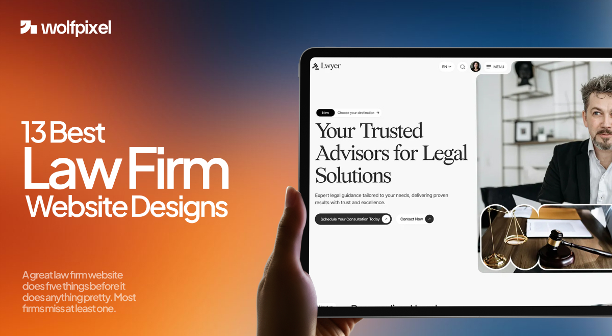
The best law firm website designs in 2026 all do the same job well: they earn trust in the first few seconds, load fast on a phone, and make the next step obvious. Everything else is style on top of that foundation.
If you are about to redesign your firm's site or you are just trying to figure out why your current one is not bringing in cases, this is the fastest way to learn. Below are 13 law firm websites that are working right now, with a short breakdown of what each one gets right and what you can borrow. We also cover what a project like this usually costs and how to choose the right partner near the end.
A great law firm website does five things before it does anything pretty. Most firms miss at least one.
Keep those five in mind as you go through the examples. You will see the same ideas show up again and again, just dressed differently. Healthcare practices face the same trust test, see our healthcare website design examples.
Turn more visitors into consultations.


A strong law firm website does more than look professional. It builds trust, communicates legal services clearly, and guides potential clients toward taking action. These 13 law firm website designs showcase effective branding, intuitive navigation, engaging layouts, and smart conversion elements. Use these examples as practical inspiration for your next law firm website redesign.

Pitta & Baione is a New York firm that represents accident victims and families across personal injury and estate planning. Its site opens with proof, not a pitch. It puts a live settlement ticker right in the hero, showing real dollar figures by case type, with a "Request a Consultation" button sitting directly under the numbers. A chat widget follows you down the page. The lesson here is simple. Lead with outcomes your client cares about, then make the next step impossible to miss.
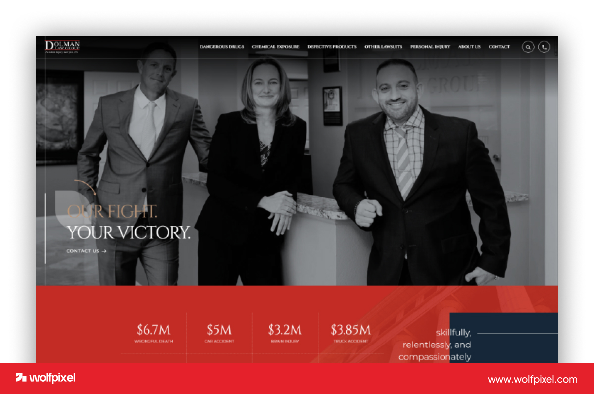
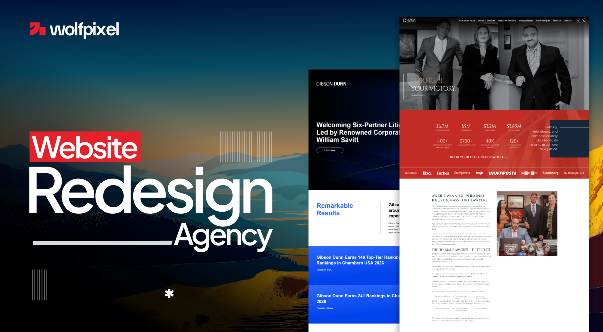
Dolman Law Group is a Florida personal injury firm that handles car accidents, premises liability, and other injury claims. Its site uses personality to stand out in a crowded market. The slogan at the top plays on a much larger competitor's "size matters" message, which is both funny and memorable. Attorney Matt Dolman's face greets you, case results are front and center, and the phone number is always within reach. If your market is full of look alike firms, a bit of confident voice goes a long way.

Bick Law LLP is an environmental law firm that advises companies on compliance and litigation. Its site proves a legal brand can be creative without losing credibility. Instead of gavels and scales, the firm uses witty animal imagery and animations that fade from black and white into full color as you scroll. It earned a Webby Award nomination, which is rare for a law firm. The takeaway is that a strong creative concept tied to your practice area is more memorable than another stock courthouse photo.

Quinn Emanuel is a global litigation firm that takes on high stakes business disputes for Fortune 500 companies and governments. Its site shows what authority looks like at the top of the market. The site uses refined typography, restrained color, and professional photography to signal that this is elite global litigation counsel. It has won multiple best in class awards for design. If your firm handles high stakes work, this is the reference for projecting seriousness without clutter.

Kirkland & Ellis is one of the largest and highest earning law firms in the world, known for corporate, private equity, and litigation work. Its site leads with values instead of a service list. The design is clean, mostly black and white, with simple sans serif type and a lot of white space. Navigation is short and deliberate. The whole site feels premium but purposeful, with nothing shouting for attention. For large firms, this is a masterclass in confident restraint.
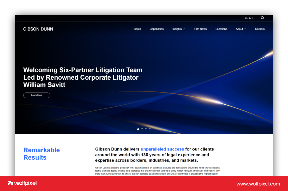
Gibson Dunn is a large international firm with a reputation for top tier litigation and appellate work. Its site frames everything around the client rather than the firm. Case studies sit in the main navigation as detailed, story driven accounts instead of buried press releases. The people search is one of the best in the legal industry, with photos and smart filters. The lesson is to treat your wins as stories and make your attorneys easy to find.
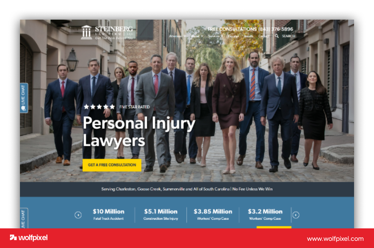
The Steinberg Law Firm is a South Carolina personal injury and workers compensation practice that has served clients for nearly a century. Its site shows how an old firm can feel modern. The site leans on video, web stories, and Q&A sections to turn complex legal topics into something easy to digest. There are over a thousand pages of helpful content behind it, which is part of why it ranks and converts. If you want to be the resource people return to, depth of content is the path.

Briskman Briskman & Greenberg is a Chicago personal injury firm that represents car accident and injury victims across Illinois. Its site turns information into an experience. It uses videos, infographics, and Google web stories to answer the questions clients actually ask, like whether they have a case after a car accident. Interactive explainers walk visitors through what a lawsuit feels like. The idea worth stealing is to answer real questions in formats people enjoy, not just walls of text.
Shaked Law is a Miami personal injury firm with decades of combined trial experience and service in several languages. Its site wins with bold, plain messaging. The hero copy promises to fight for the advantage, not just a level playing field, which speaks directly to clients who want an aggressive advocate. The visual hierarchy is strong and the language is human. Multilingual support widens the audience. Clear, confident words beat clever ones almost every time.

Newlin Law Offices is a small personal injury practice that offers free case reviews and serves clients in English and Spanish. Its site proves a small firm can feel personal and polished at once. A welcoming photo of the attorney sets a human tone, the call and free case review buttons sit at the top, and a bilingual option opens the door to more clients. It won a Gold dotCOMM award. For solo and small firms, warmth plus easy contact is a winning combination.
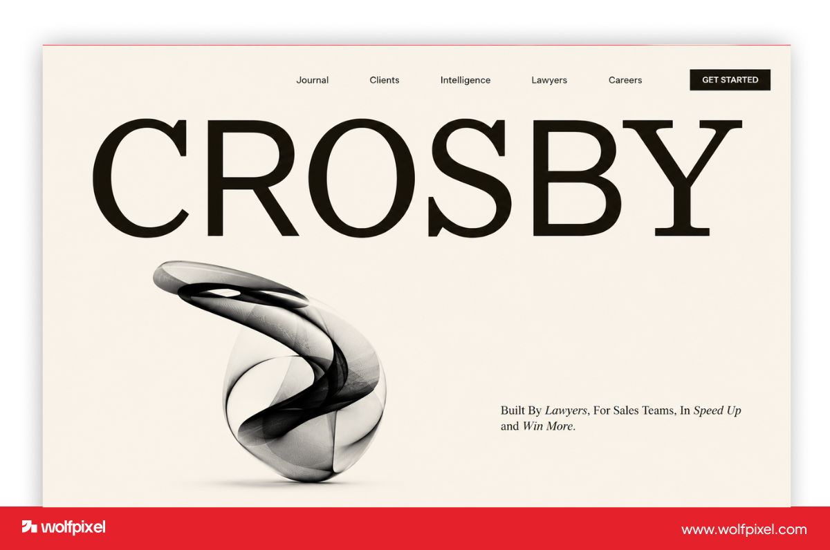
Crosby is a corporate firm that works with startups and fast growing companies, which shapes its whole approach. Its site looks more like a software product than a law firm, and that is the point. Clean photography, confident type, and a structured but relaxed layout make it feel fresh and current. It is a reminder that the "feels like a tech company, trusted like a 100 year old institution" balance is what stands out in 2026. If your firm wants to feel forward thinking, this is the direction.

Hudgell Solicitors is a UK firm with offices in Hull, Manchester, and London, handling personal injury, medical negligence, and civil liberties cases. Its site shows that friendly can also be high converting. It uses bright, contrasting colors to feel approachable and to separate its service areas so visitors find what they need quickly. Call back forms, click to call buttons, case studies, podcasts, and videos give people several ways to engage. The redesign reportedly doubled conversions year on year, which is the kind of result good design should produce.
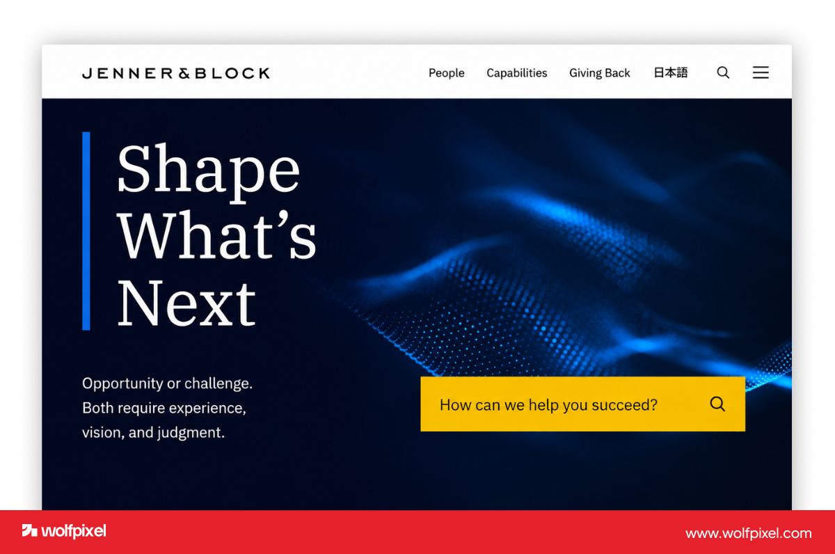
Jenner & Block is a major US firm known for litigation and high profile cases, and it was named a Law Firm of the Year by The American Lawyer for 2025. Its site lets the work speak. The site is clean, credible, and focused, with the firm's accolades carrying the weight instead of flashy effects. It is the opposite of trying too hard, and that confidence reads as trust. For firms with a strong reputation, getting out of your own way is often the smartest design choice.
If you want more inspiration, these are also strong examples to study:
At Wolfpixel, the pattern we see over and over is that a beautiful site is not the same as a site that books consultations. We build custom rather than starting from templates, because the firms that convert best have a homepage built around one clear journey, from the first scroll to the booked call. That means the case results, the reviews, and the contact button are placed where the eye actually goes, not where a template happens to put them.
Two habits make the biggest difference in our projects. First, we design mobile first, since most people will judge your firm on a phone before they ever see the desktop version. Second, we keep the content structured cleanly so search engines and AI tools can read and quote it, which is becoming a real source of new clients. We also run an AI UX audit on existing sites before any ongoing costs redesign, which tells us exactly where visitors drop off so we are fixing real problems instead of guessing.
Most small and mid sized firms spend between $2,000 and $10,000 on a law firm website in 2026, with fully custom builds running higher. A simple solo attorney site can start under $3,000, a custom site for a growing firm often lands in the $8,000 to $15,000 range, and large firms with many practice areas and attorney bios can go well past $20,000.
A few things drive the number more than anything else: how custom the design is, how many pages and practice areas you need, how much real content and SEO is included, and whether photography or video is part of the build. Remember the ongoing costs too. Hosting, maintenance, and SEO usually run a few hundred dollars a month and quietly add up over three years, so it is worth asking about them up front.
Turn more visitors into consultations.
The right law firm website design company understands legal marketing, not just visuals. A general designer can make something that looks good and still generates almost no leads, because legal search is competitive, local, and built around specific client questions. Look for a law firm website design agency that can show real examples in your size or practice area, explain how they handle mobile performance and SEO, and tell you clearly what you own after launch.
For website design and marketing for small law firms specifically, ask whether the team can grow with you. The best partners start with a clean, fast, mobile friendly site and then add content, SEO, and marketing at a pace that fits your budget. Ownership matters most of all. Confirm in writing that you keep your content, your domain, and ideally your platform, so you are building an asset you control rather than renting one.
Your website is either winning clients or quietly losing them, and for most firms there is no middle ground. The examples above show what good looks like, and the difference between admiring them and matching them usually comes down to having the right team.
If you want a custom, mobile friendly, conversion focused law firm website, the team at Wolfpixel can help. Start with a free AI UX audit of your current site, or book a call to talk through a redesign. We will show you exactly where your site is leaking leads and what we would build instead.




.svg)



.svg)

.svg)

.svg)

.svg)

.svg)
.svg)
