




 17 min read
 Published
Product design principles are short value statements that tell a product team what to prioritize when good goals compete. Nielsen Norman Group describes them as value statements that frame design decisions and support consistency in decision making. They are not rules about buttons and spacing. They are the tie-breakers you use when the right answer isn’t obvious.
I’m Masuder Rahaman, Founder & CEO of Wolfpixel. Our team designs SaaS, fintech and AI products, from dashboards with dozens of screens to mobile apps. Most lists of “product design principles” mix in visual design rules like contrast and balance, or repeat Dieter Rams. This guide does something different: it shares the ten principles we actually apply on SaaS projects, the trade-off each one settles and where you can see it in our work, and then shows how to write principles for your own product.
The short answer: good product design principles take a stand, explain why it matters to users and help a team choose between two reasonable options. The ten we use are: start from the job, answer the first question first, always show the system’s state, make trust visible, design for the first week and the fifth year, give every role its own product, treat empty and error states as real screens, be consistent but not uniform, make speed part of the design, and make it accessible from the first wireframe.
Key takeaways:
- Product design principles are not visual design principles or UX heuristics. They describe what one product values when goals conflict.
- A principle is useful only if its opposite is a reasonable choice. “Make it easy to use” settles nothing.
- In SaaS, most hard decisions are about density, roles, states and trust. Our principles are written for exactly those decisions.
- One product team should keep three to five principles it can remember. Ten is an agency set across many products.
- Principles only work if they are used in design reviews, documented in the design system and revisited.
How we wrote this: we reviewed the pages ranking for “product design principles” in November 2026, including Nielsen Norman Group, ProductPlan, HelloPM, Material and Apple’s Human Interface Guidelines, and read the published principles of Apple, GOV.UK, Atlassian, Salesforce, Intercom and Microsoft. Research figures are linked to the original publisher. The ten principles, the trade-off examples and the review checklist are our own, and project details come from our case studies. The full list is in Sources and method.
What are product design principles?
Product design principles are a small set of statements that describe what a specific product values most. They are written for one product and one set of users, and they are used to make decisions that no style guide covers.
The term gets confused with three other things. This table is the difference in one view.
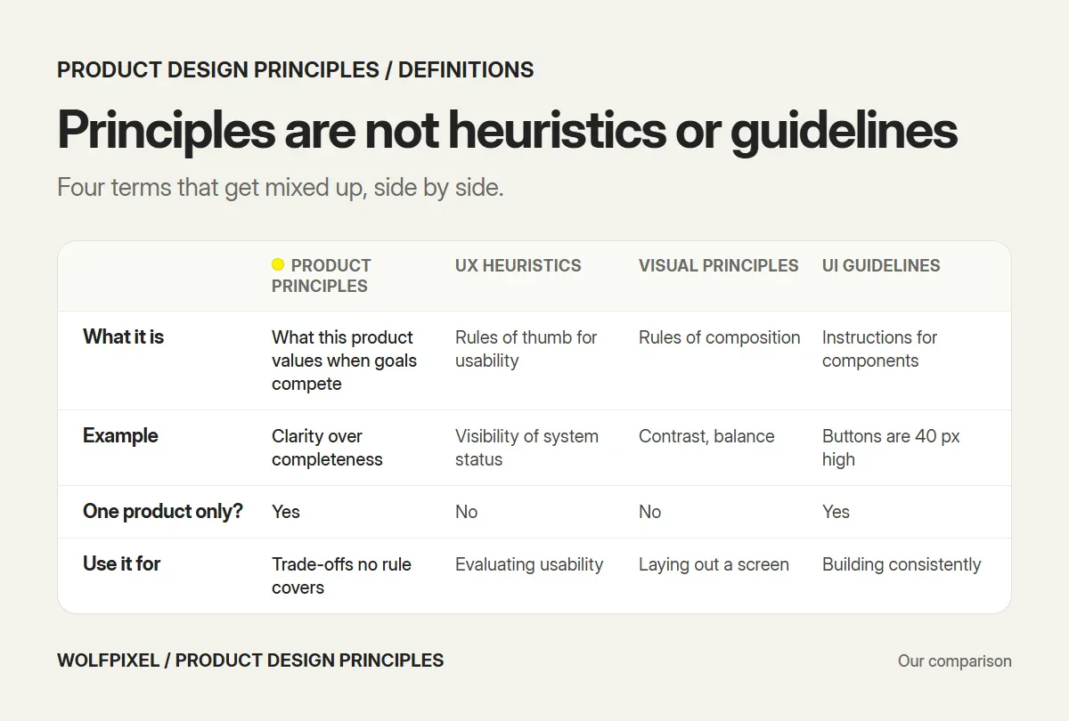
| Product design principles | UX heuristics | Visual design principles | UI guidelines | |
|---|---|---|---|---|
| What it is | What this product values when goals compete | General rules of thumb for usable interfaces | Rules of visual composition | Specific instructions for components and patterns |
| Example | “Clarity over completeness” | “Visibility of system status” (Nielsen) | Contrast, balance, hierarchy | “Primary buttons are 40 px high” |
| Specific to one product? | Yes | No | No | Yes |
| Who writes it | The product team | Researchers such as Nielsen and Molich | Design theory | The design system team |
| When you use it | Trade-offs no rule anticipated | Evaluating usability | Laying out a screen | Building screens consistently |
Nielsen Norman Group makes the same distinction: product design principles are different from general principles of good design such as heuristics, because they are specific to a product and its users. If you are looking for visual principles like balance and contrast, our guide to visual design covers them.
Why product teams need design principles
Every product team argues about the same things: how much to show on one screen, whether to add a setting, whether to slow users down with a confirmation. Without principles, those arguments are settled by whoever is most senior or most persistent. With principles, they are settled by what the product has agreed to value.
Principles also make design faster and more consistent across a growing team. When five designers work on different parts of a SaaS product, shared principles are what make the parts feel like one product.
The business case for disciplined design is well documented. McKinsey’s study of 300 publicly listed companies over five years found that companies in the top quarter of its design index grew revenues 32 percentage points faster and shareholder returns 56 percentage points faster than their industry peers. The same study found that more than 40% of companies weren’t talking to end users during development. Principles are one of the simplest ways to keep user value at the center of decisions as a team grows.
The 10 product design principles we use on every SaaS project
These are written for business software: dashboards, admin tools, workflow products and financial apps. Each one has the trade-off it settles, how it shows up in a SaaS product and an example from our work.
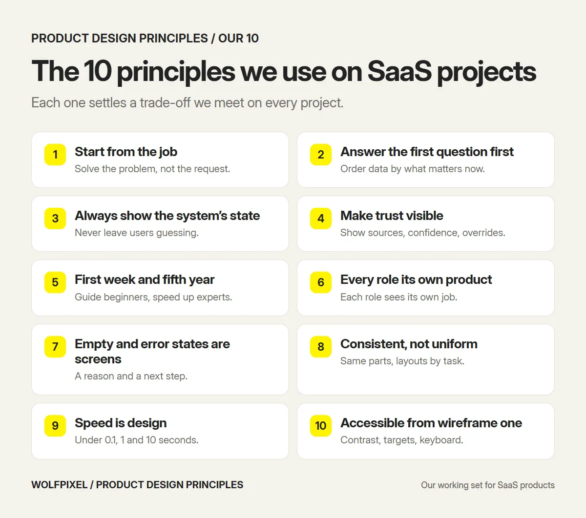
1. Start from the job, not the feature
The trade-off it settles: building what users ask for vs solving the problem behind the request.
Users describe solutions (“add an export button”). The job is what they are trying to get done (“send the numbers to finance every Friday”). We start every project by writing down the jobs, then design for those, and only then look at the feature list. GOV.UK’s first design principle says the same thing in four words: start with user needs.
In our work: for Core.hr, an HR platform, the real problem wasn’t missing features. It was that employees avoided dated HR tools, so attendance and leave data stayed incomplete. The design goal became a product people would actually open, which changed decisions from the home screen to the tone of the notifications.
2. Answer the first question first
The trade-off it settles: showing everything vs showing what matters now.
Every screen is opened to answer a question. A dashboard that shows every metric with equal weight makes the user do the analysis. We write down the question each screen answers and design the hierarchy around it, with everything else one step away. This is how we handle data density in SaaS: not by hiding data, but by ordering it.
In our work: the home screen of the ZenPay wallet answers three questions in order: how much is available, what can I do with it and what happened recently. Offers and rarely used features were moved out of the way, because every extra tap between opening the app and sending money is a small source of stress.
3. Always show the system’s state
The trade-off it settles: a clean interface vs an honest one.
Users should never have to guess whether something worked, is still running or failed. This is the first of Jakob Nielsen’s 10 usability heuristics, visibility of system status, and in SaaS it matters more than anywhere, because so much happens in the background: syncs, imports, automations, payments.
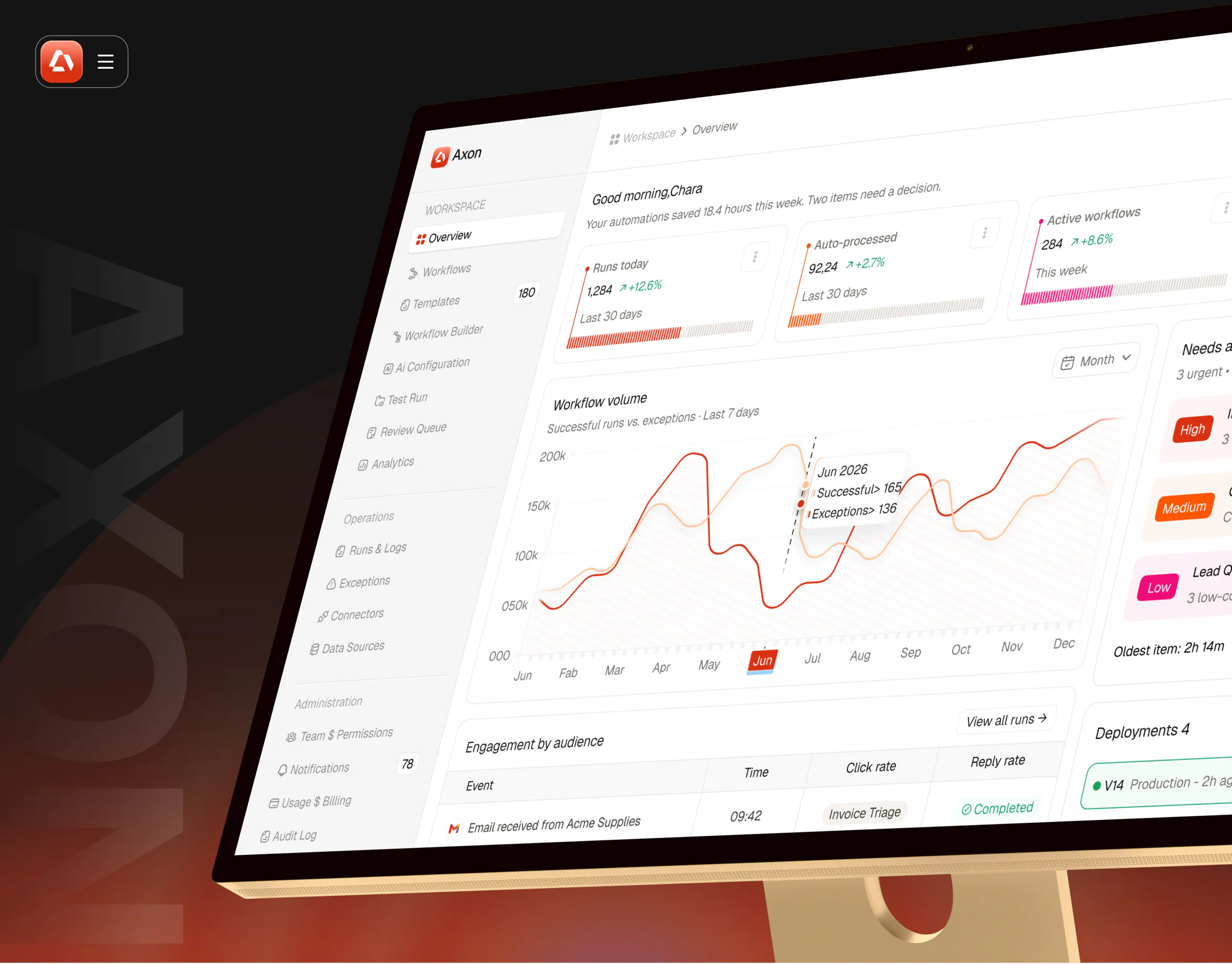
In our work: Axon runs invoice and data workflows for finance teams. A silent sync failure there costs real money, so every run is visible, every AI step has an explanation and the product has 82 designed interaction states, from running to waiting for review to failed.
4. Make trust visible
The trade-off it settles: a simple answer vs an answer users can check.
When software makes a decision for someone, especially with AI or money involved, people need to see why. We show the source next to the result, a confidence level where it applies and a clear way to override. It adds a little interface. It removes a lot of doubt.
In our work: the Nexfolio investment platform places AI forecasts next to the portfolio data they describe, with a confidence score so investors can judge how much weight to give them. In Axon, uncertain cases go to a person in a review queue with the source document beside the decision.
5. Design for the first week and the fifth year
The trade-off it settles: easy for beginners vs fast for experts.
New users need guidance and sensible defaults. Daily users need shortcuts, bulk actions and fewer confirmations. A SaaS product has both at once, so we design a clear default path and add speed for experienced users without forcing it on everyone. Atlassian’s principle “Guide mastery for greater value” describes the same balance.
In our work: ZapMail, a cold email platform, had to work for a founder sending a first campaign and for an agency running campaigns for several clients. Guided workflows carry the first group. Clear navigation and actionable analytics serve the second without extra screens.
6. Give every role its own product
The trade-off it settles: one interface for everyone vs an interface for each job.
B2B products are used by people with different jobs: admins, managers, contributors, external partners. Showing all of them the same screens means every one of them wades through what belongs to someone else. We map roles and permissions early and design each role’s main view around its own job.
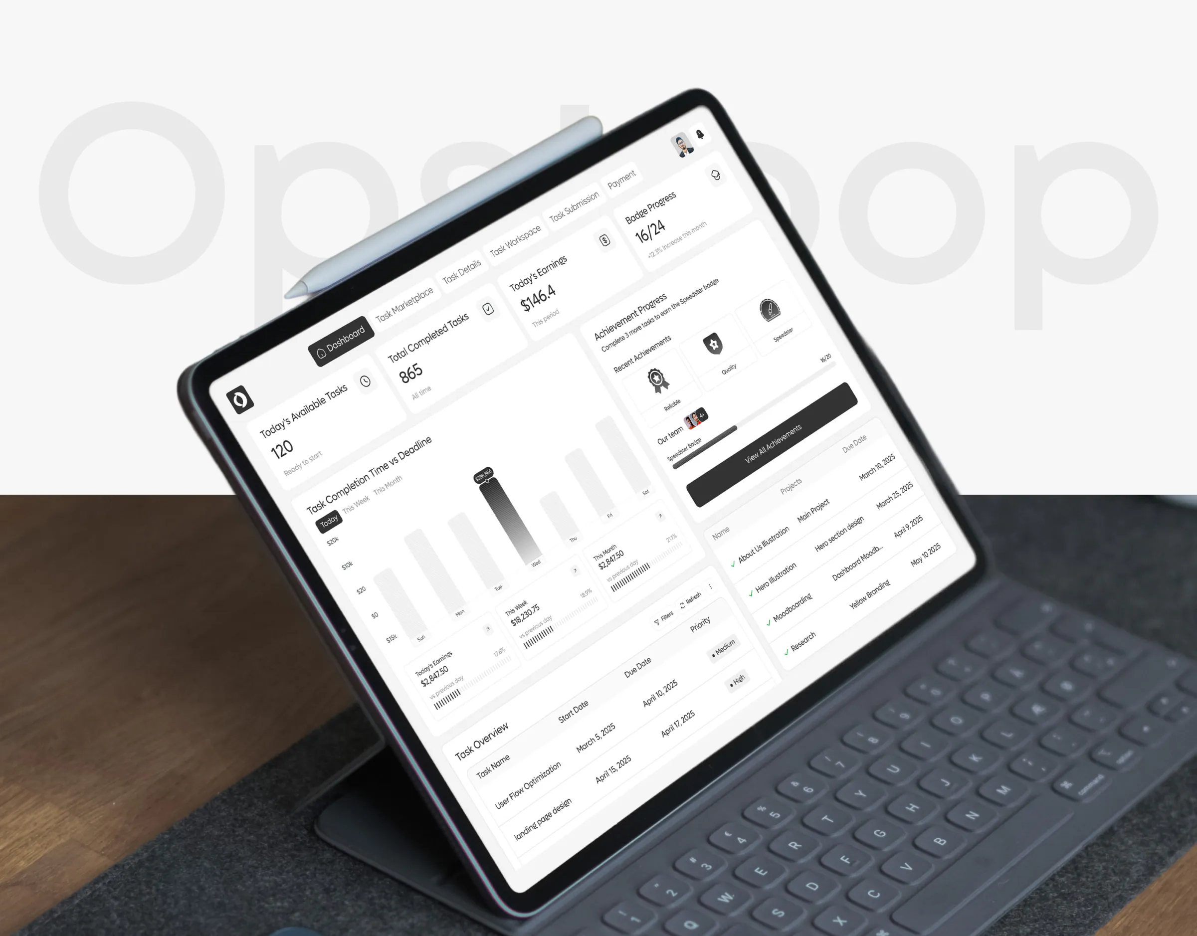
In our work: OpsLoop connects teams that create micro-tasks with the workers who do them. A platform that serves only one side loses the other, so task creators get one dashboard for status, quality and budget, and workers get clear instructions and transparent pay. Earnify follows the same principle for merchants and affiliates.
7. Treat empty and error states as real screens
The trade-off it settles: designing the happy path vs designing what actually happens.
In a real SaaS product, many screens are empty on day one, imports fail, permissions block actions and payments decline. These states are where users decide whether the product is trustworthy. We design them alongside the main screens, with a reason and a next step in every one. Nielsen’s heuristics include helping users recognize, diagnose and recover from errors for the same reason.
What we check: does every empty state explain what will appear and how to start? Does every error say what happened and what to do next, in plain language?
8. Be consistent, not uniform
The trade-off it settles: one pattern for everything vs the right pattern for the job.
Consistency means the same thing always looks and works the same way. It doesn’t mean every screen looks identical. A data table and a settings page should use the same components and tokens, but they shouldn’t be forced into the same layout. GOV.UK puts it as be consistent, not uniform. A design system is how we keep this principle true as a product grows.
In our work: for Core.hr we designed the brand, the website, the web dashboards and the mobile app on one design system, so an HR manager on a desktop and an employee on a phone recognize the same product, even though their screens do different jobs.
9. Make speed part of the design
The trade-off it settles: a richer interface vs a faster one.
Speed is a design decision, not only an engineering one. Nielsen’s research gives three limits: about 0.1 seconds feels instant, about 1 second keeps the user’s flow of thought and about 10 seconds is the limit for keeping attention on the task. We design so the most common actions stay under those limits: loading the frequent views first, showing progress for anything slow and avoiding heavy screens where a simple one works.
What we check: for every action that may take more than a second, is there feedback? For anything over ten seconds, can the user leave and be told when it is done?
10. Make it accessible from the first wireframe
The trade-off it settles: retrofitting accessibility later vs building it in.
Accessibility is cheapest when it is a design constraint from day one. We check contrast, target sizes, keyboard use and reading order while we wireframe. WCAG 2.2 requires a contrast ratio of at least 4.5:1 for normal text and targets of at least 24 by 24 CSS pixels, with some exceptions. In B2B, it is also often a procurement requirement.
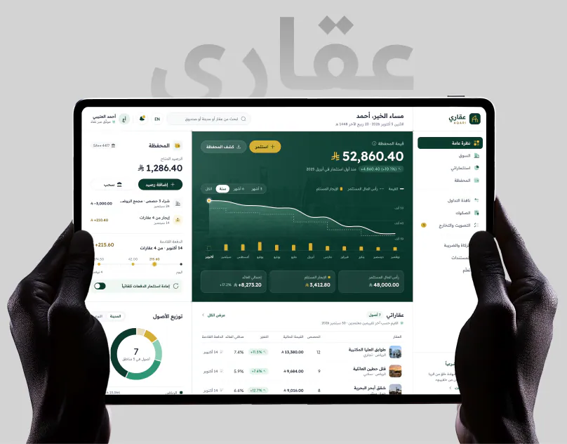
In our work: AQARI, a Saudi investment platform, had to work right to left from the first wireframe. Most fintech design systems are drawn left to right and mirrored at the end, which is where charts start reading backwards. Designing for Arabic and English as equals from the start avoided that.
How these principles settle real design debates
Principles prove their value when two good options compete. These are debates we have had on real product design projects and the principle that settled each one.
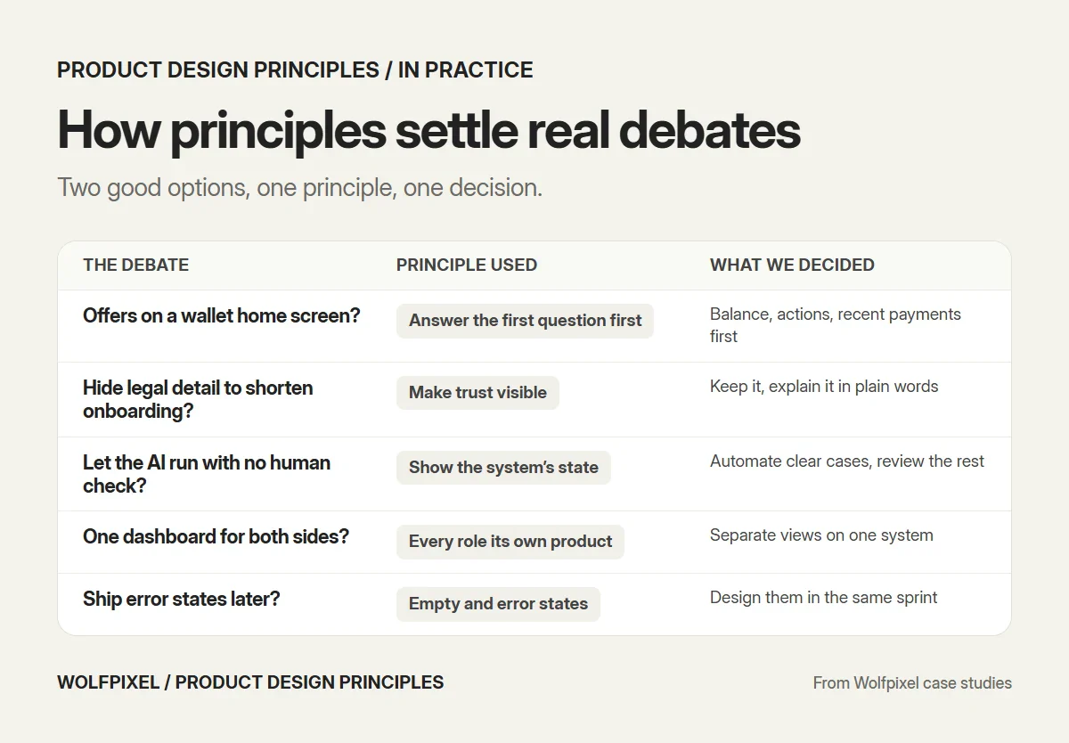
| The debate | Principle used | What we decided |
|---|---|---|
| Should a wallet’s home screen show offers and every feature? | Answer the first question first | Balance, quick actions and recent payments first. Everything else one step away (ZenPay) |
| Should an investment app hide legal and religious detail to keep onboarding short? | Make trust visible | Keep the detail, but explain it in plain language at the moment it matters (AQARI) |
| Should AI automation run without any human check? | Always show the system’s state, make trust visible | Automate the clear cases, send uncertain ones to a review queue with the source attached (Axon) |
| Should both sides of a marketplace share one dashboard? | Give every role its own product | Separate views for task creators and workers, built on one system (OpsLoop) |
| Should we ship the happy path first and add error states later? | Treat empty and error states as real screens | Design the states in the same sprint as the main flow |
Design principles from leading companies
Published principle sets are useful references, as long as you remember they were written for someone else’s product and users.
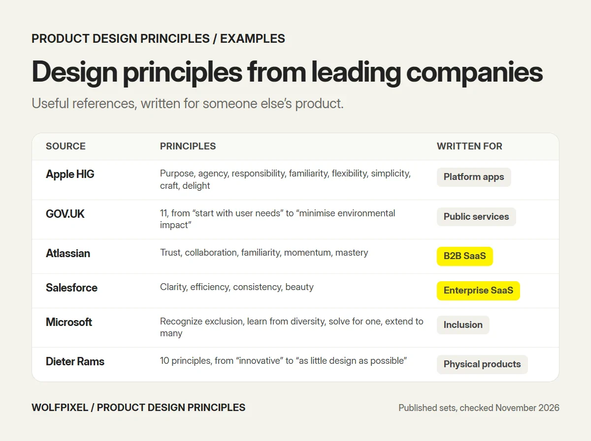
| Source | Principles | What stands out |
|---|---|---|
| Apple Human Interface Guidelines | Purpose, agency, responsibility, familiarity, flexibility, simplicity, craft, delight | Reintroduced in June 2026. A strong reference for consumer and platform apps |
| GOV.UK | 11, from “start with user needs” to “minimise environmental impact” | Plain language, written for services everyone must be able to use |
| Atlassian | Build trust in every interaction, connect people to collaborate better, match purpose and feel familiar, drive momentum from end to end, guide mastery for greater value | Written for B2B collaboration software, close to SaaS reality |
| Salesforce Lightning | Clarity, efficiency, consistency, beauty | Four short words for a very large enterprise product |
| Intercom | Five product design principles, plus R&D principles now in their third major iteration | Openly revised over time |
| Microsoft Inclusive Design | Recognize exclusion, learn from diversity, solve for one, extend to many | A focused set for accessibility and inclusion |
| Dieter Rams | Ten principles of good design, from “innovative” to “as little design as possible” | Written for physical products, still quoted everywhere |
Notice how different the sets are. Atlassian talks about collaboration and momentum because that is what its products are for. GOV.UK talks about everyone because a government service can’t choose its users. That is the point: good principles describe one product’s priorities.
How to write your own product design principles
Borrowed principles rarely survive the first real argument, because nobody on the team chose them. These steps follow Nielsen Norman Group’s method, with the additions we use with clients.
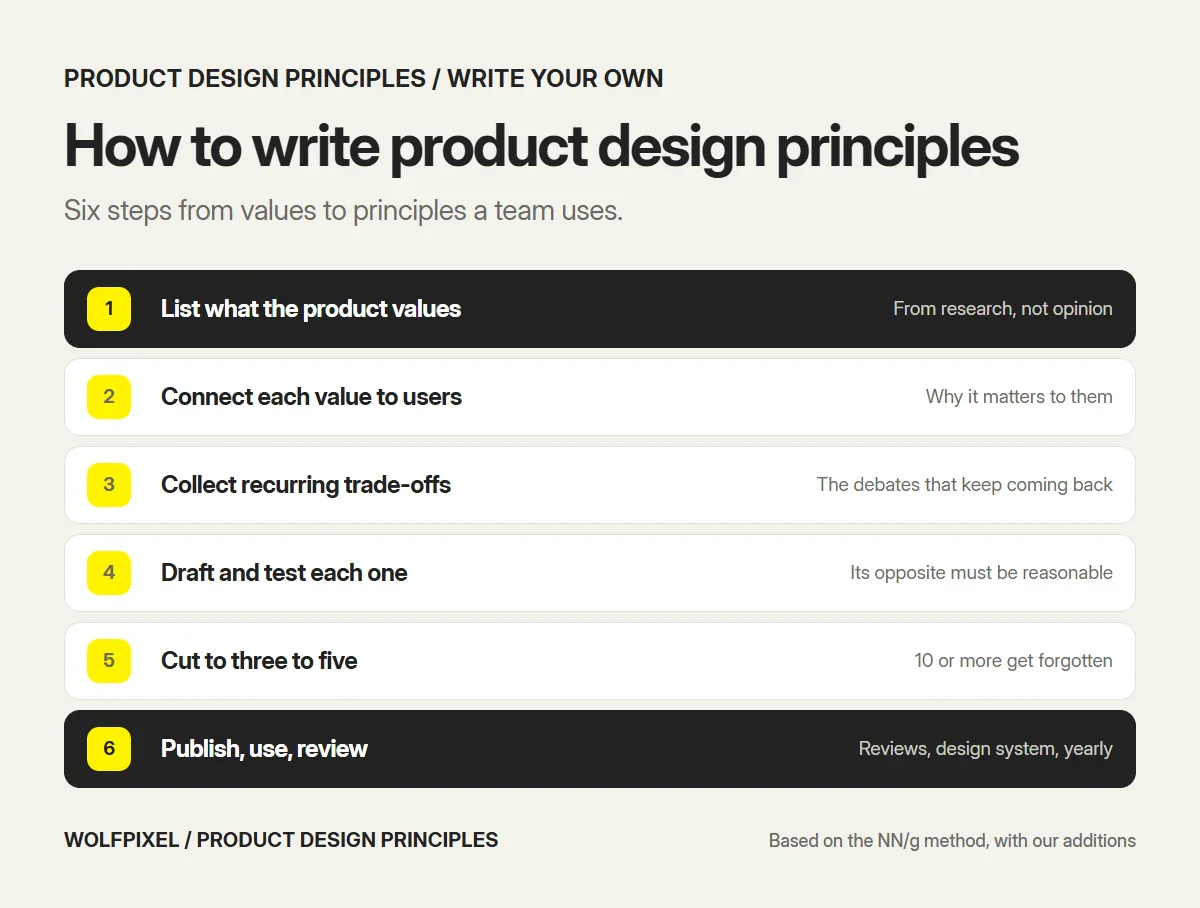
- List what the product values. Bring product, design and engineering together and list what the product must stand for. Use real user research, not opinions.
- Connect each value to users. For each value, write why it matters to the people using the product. If you can’t, it is a company value, not a product principle.
- Collect the recurring trade-offs. Look back at the last few months of design debates. The same three or four arguments usually come back. Your principles should settle those.
- Draft and test each principle. Write it as a short statement with one sentence of explanation. Then apply a flip test: a good principle is not a truism, so its opposite should be a reasonable choice for some other product. Nielsen Norman Group adds that each principle should take a stand, cover one value and not conflict with the others.
- Cut to three to five. Nielsen Norman Group warns that having 10 or more leads to many being forgotten. Shopify’s guidance points the same way: pick your top five.
- Publish, use and review. Put them in the design system documentation, refer to them in design reviews and revisit them once a year or when the product changes direction.
Weak vs strong principles
| Weak | Why it fails | Stronger version |
|---|---|---|
| “Make it simple” | Nobody wants it complicated, so it settles nothing | “Clarity over completeness: show what users need to decide now, and put the rest one step away” |
| “Delight users” | Too vague to apply to a settings page | “Calm by default: no animation or alert unless it tells the user something they need” |
| “Be consistent” | A rule, not a value | “Consistent, not uniform: same components everywhere, layouts shaped by the task” |
| “Users first” | Everyone claims it | “The admin’s time matters most: bulk actions before single actions” |
How to keep principles alive
Most principles die in a slide deck. These habits keep them in use.
- Name the principle in design reviews. “Which principle does this decision follow?” is a fast way to end a debate that is going in circles.
- Put them in the design system. Next to the components, with an example and a counter-example for each.
- Use them in onboarding. New designers, product managers and engineers should learn them in their first week.
- Audit against them. Once or twice a year, review a few key flows against each principle. Our UX audit process does exactly this for client products.
- Rewrite them when the product changes. Intercom says plainly that its principles are not rules: they exist to guide, not control, and it has revised its own set several times.
If you are building a new product, principles belong in the same early phase as research and user flows. They are the first thing we agree with clients when we design a SaaS product from scratch. Our guides to the UI/UX design process, user flow examples and SaaS design show where they fit.
How Wolfpixel applies these principles
On every product design project we agree the principles with the client in the first week, then use them to settle debates through to handoff. For SaaS products, they shape our SaaS design and SaaS redesign work, and they are written into the design system so the client’s team keeps using them after we leave. You can see them at work in case studies such as Axon, Core.hr and AQARI.
Sources and method
We reviewed every source below in November 2026.
- Nielsen Norman Group: Crafting product-specific design principles to support better decision making (Maria Rosala, August 2, 2020), for the definition, the method and the guidance on how many principles to keep.
- Nielsen Norman Group: 10 usability heuristics for user interface design (Jakob Nielsen, 1994, updated 2024), for visibility of system status and error recovery.
- Nielsen Norman Group: Response times, the 3 important limits, for the 0.1, 1 and 10 second limits.
- McKinsey: The business value of design (2018), for revenue and shareholder return growth and user involvement.
- W3C: Understanding WCAG 2.2, Contrast (Minimum) and Target Size (Minimum), for contrast and target size requirements.
- Apple: Human Interface Guidelines, Design principles (reintroduced June 8, 2026).
- GOV.UK: Government design principles (updated April 2, 2025).
- Atlassian Design System: Design principles.
- Salesforce Lightning Design System: Guidelines overview, for the four design principles.
- Intercom: Product principles (Emmet Connolly, February 9, 2022), for its principles and the idea that principles guide rather than control.
- Microsoft Inclusive Design, for the inclusive design principles.
- Vitsœ: Dieter Rams, ten principles for good design.
- Shopify Partners: Design principles (June 16, 2020), for choosing a top five and keeping principles visible.
Our own recommendations
- The comparison table, the ten principles, the trade-off examples, the weak vs strong examples and the habits for keeping principles alive are our own, based on how we design SaaS products at Wolfpixel. Project details come from our case studies.
Product Design Principles FAQs
What are product design principles?
Product design principles are short value statements that describe what a product team prioritizes when goals compete. Nielsen Norman Group defines them as value statements that frame design decisions and support consistency in decision making. Unlike UI guidelines, they don’t describe components. They tell a team which way to lean in a trade-off.
What are the 7 main principles of design?
Lists vary by source, but the seven visual design principles most often cited are balance, contrast, emphasis, proportion, movement, repetition and white space or unity. These are principles of visual composition. Product design principles are different, because they describe what a specific product values, such as clarity over completeness.
What are the 5 basic design principles?
There is no single official list of five. The most widely taught set is contrast, repetition, alignment and proximity, from Robin Williams’ The Non-Designer’s Design Book, and many lists add balance as a fifth. These guide visual layout rather than product decisions.
What are the 7 principles of UX design?
The best-known answer is Peter Morville’s user experience honeycomb, which says a good experience is useful, usable, desirable, findable, accessible, credible and valuable. It describes qualities of a good experience. Product design principles go one step further and say which of those qualities wins when they conflict.
How many design principles should a product have?
Usually three to five. Nielsen Norman Group warns that having 10 or more leads to many being forgotten. Our list of 10 is an agency working set used across many products. A single product team should pick and rewrite the few that matter most for its users.
What is the difference between design principles and design guidelines?
Principles say what to value, for example clarity over density. Guidelines say how to apply it, for example which button style to use or how much padding a card has. Principles help with decisions no guideline anticipated. Guidelines make routine decisions consistent.
What are Apple’s design principles?
Apple reintroduced design principles in its Human Interface Guidelines in June 2026. The eight principles are purpose, agency, responsibility, familiarity, flexibility, simplicity, craft and delight. They apply to apps on Apple platforms and are a useful reference for any product team writing its own.
What are the top skills for a product designer?
There is no official ranking, but most hiring guides point to three skills. They are understanding users through research, designing interactions and interfaces with prototyping tools such as Figma, and communicating decisions to product managers, engineers and stakeholders. Applying clear principles to trade-offs depends on all three.
Want these principles applied to your product?
Tell us what your product does and where users get stuck. A senior product designer replies within 4 business hours with a plan and a fixed quote.

Was this article helpful?

Written by
Masuder Rahaman
Founder & CEO | Brand Design Director at Wolfpixel
Masuder Rahaman is the Founder & CEO of Wolfpixel and the Brand Design Director with 8+ years of experience. He oversees Wolfpixel’s product design work for SaaS, fintech and AI companies. In this article, he shares the product design principles the team applies on every SaaS project, the trade-offs they settle and how to write principles of your own. Wolfpixel offers the product design services discussed in the article.
View all articles